STA Handbook doodles
STA Handbook Doodles
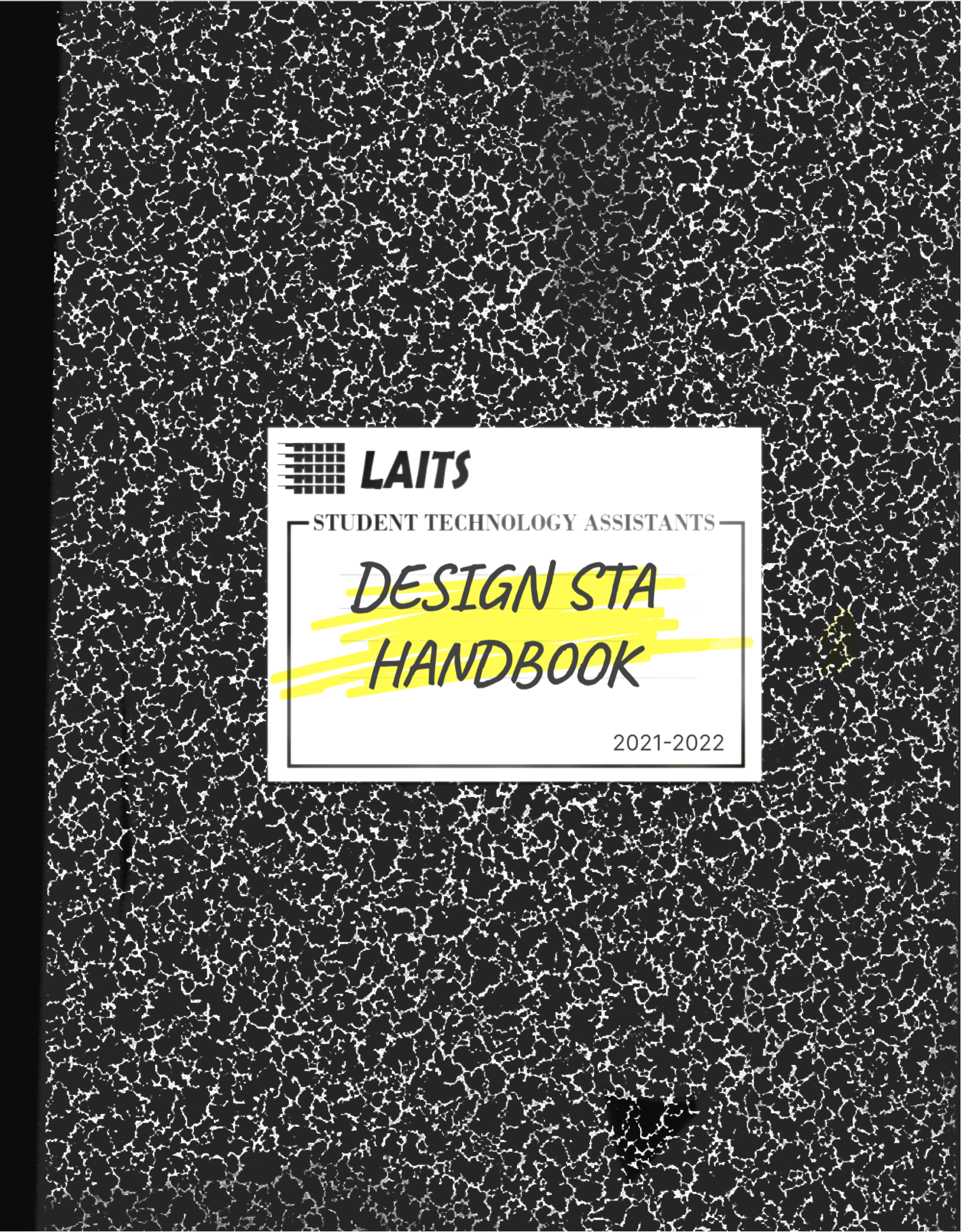
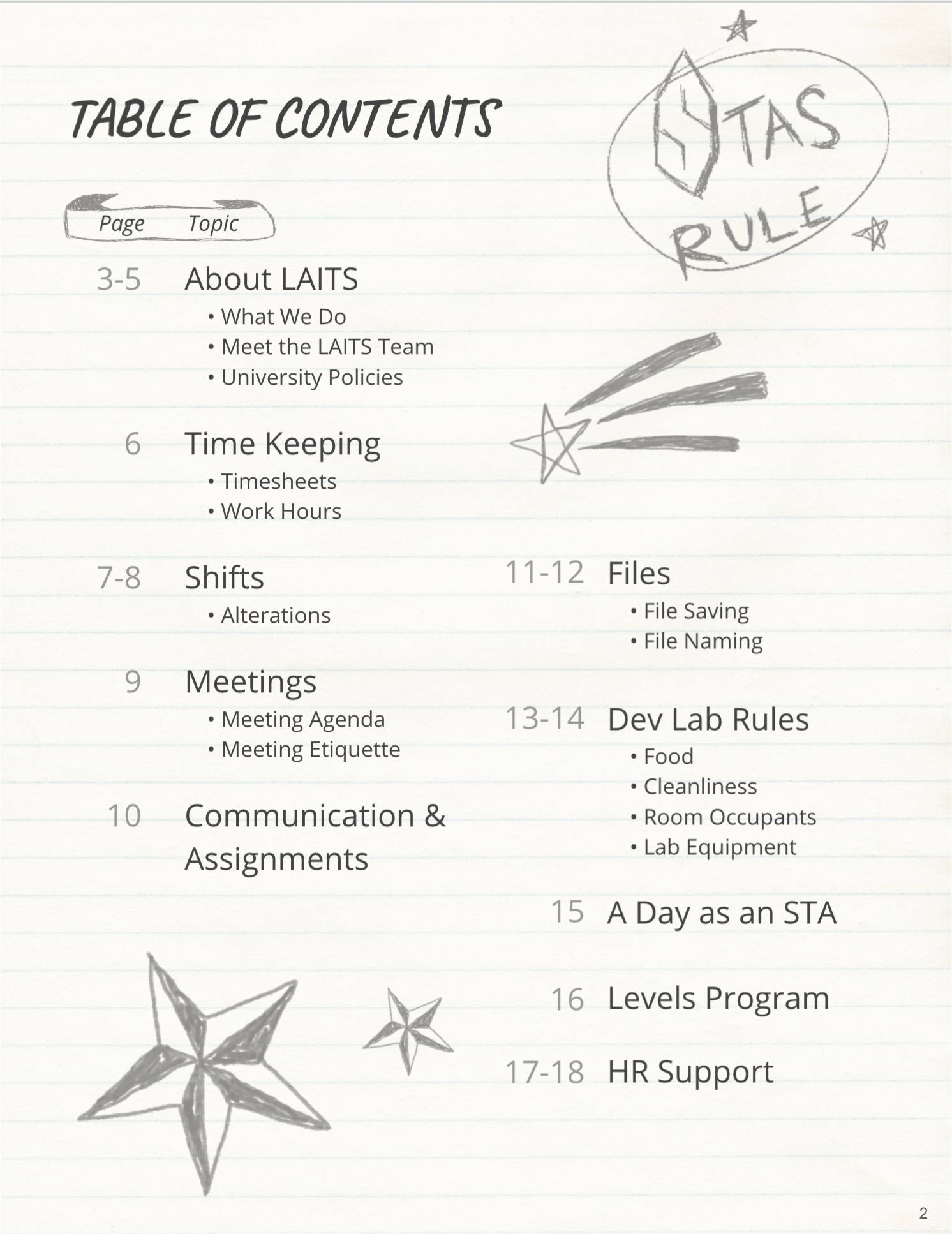
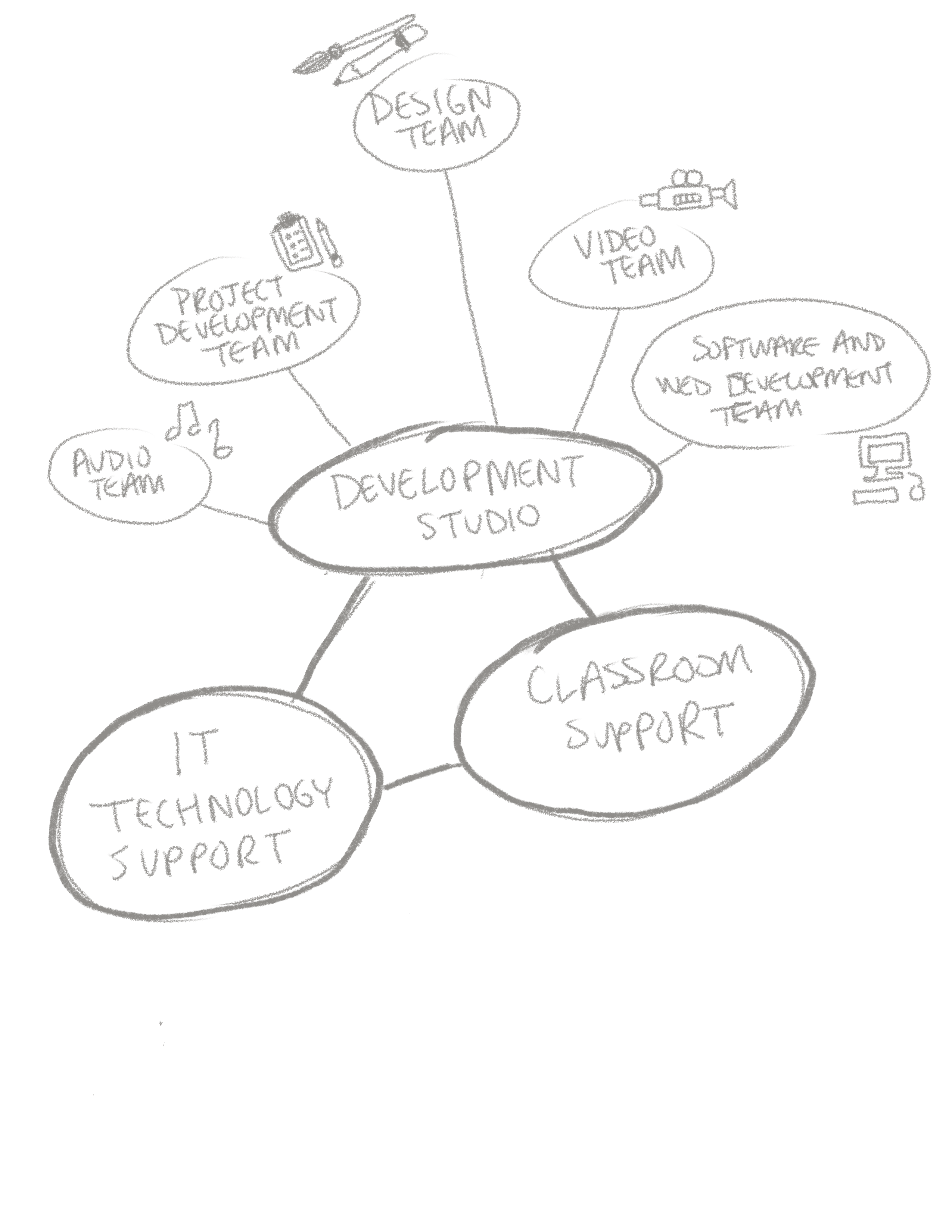
I helped Maddy in making a couple of doodles for our STA handbook. The handbook is undergoing some edits now that we are going to be coming back to the office and hiring new people as well. The doodles look a little messy but that’s kind of the whole theme of our handbook, Maddy created it to be like a composition notebook belonging to a student with doodles to enhance the written content inside. Honestly, I think it’s a clever idea and it’s the most visually appealing handbook I’ve ever gotten for a job before and I’m not just saying that cause I helped work on it!
Humanities Logo
Humanities Identity Logo
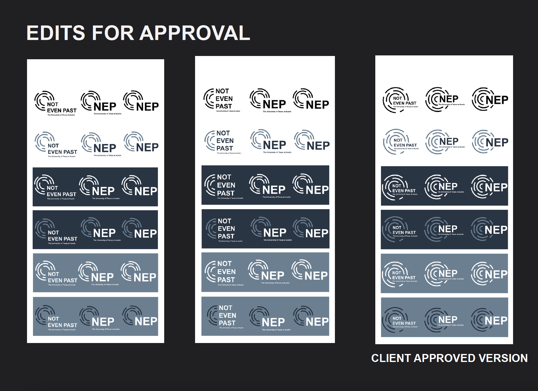
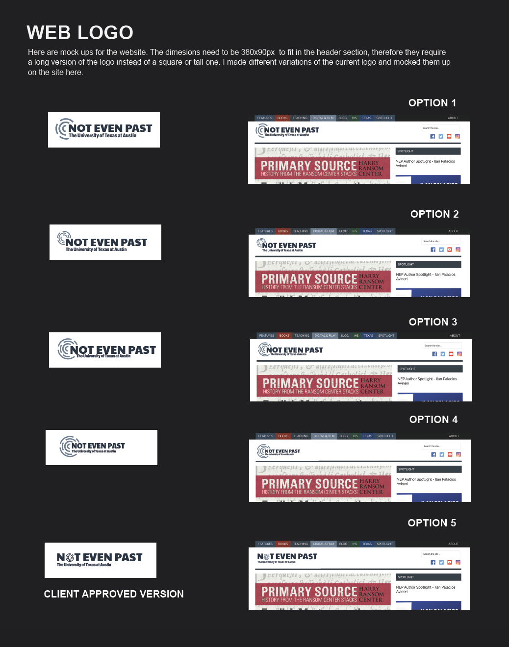
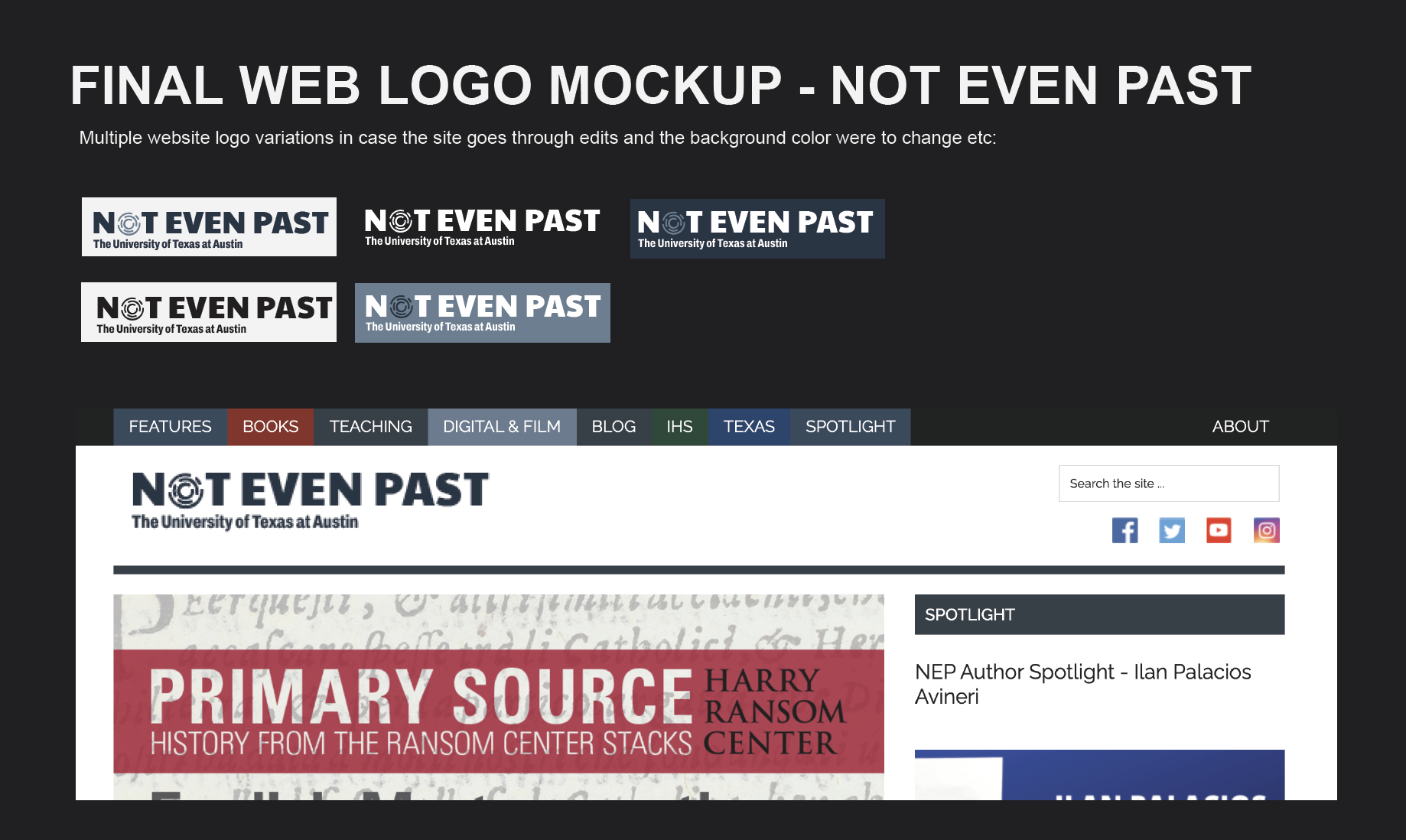
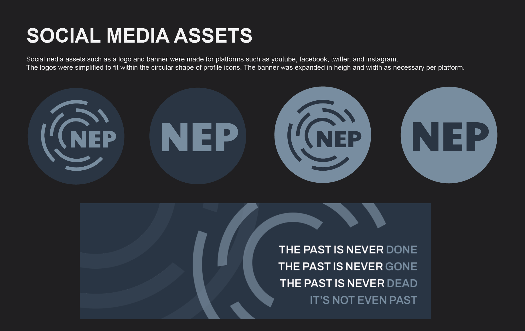
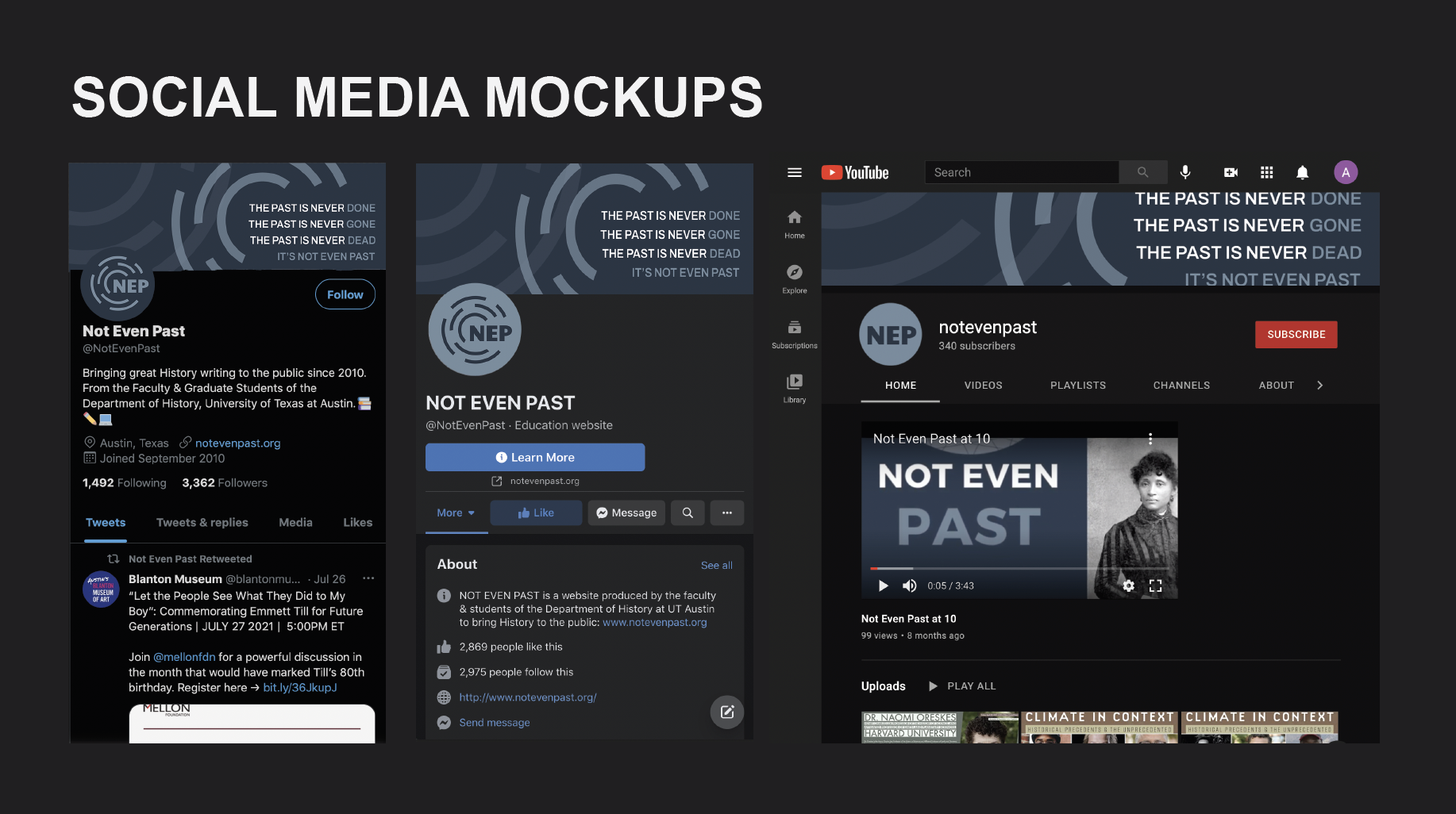
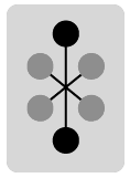
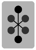
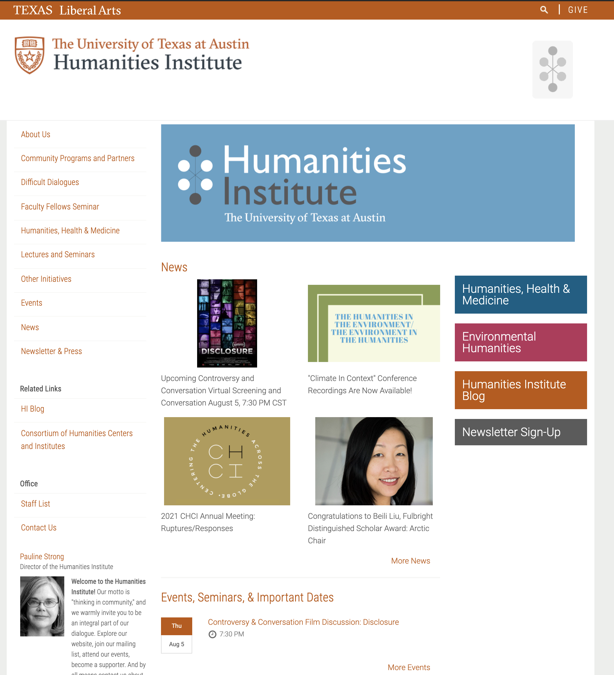
I was given the mini project of creating an informal identity logo for the Humanities Institute. The logo was one given to me from their formal logo. The top draft is what the client approved of and the bottom draft is the edits I had to make to get it to look as close to the client’s approval as possible. It’s a little difficult because no matter how dark you make it Cascade will turn it to a lighter gray but I think I got it close enough.
Scanning at the Office
Scanning at the Office
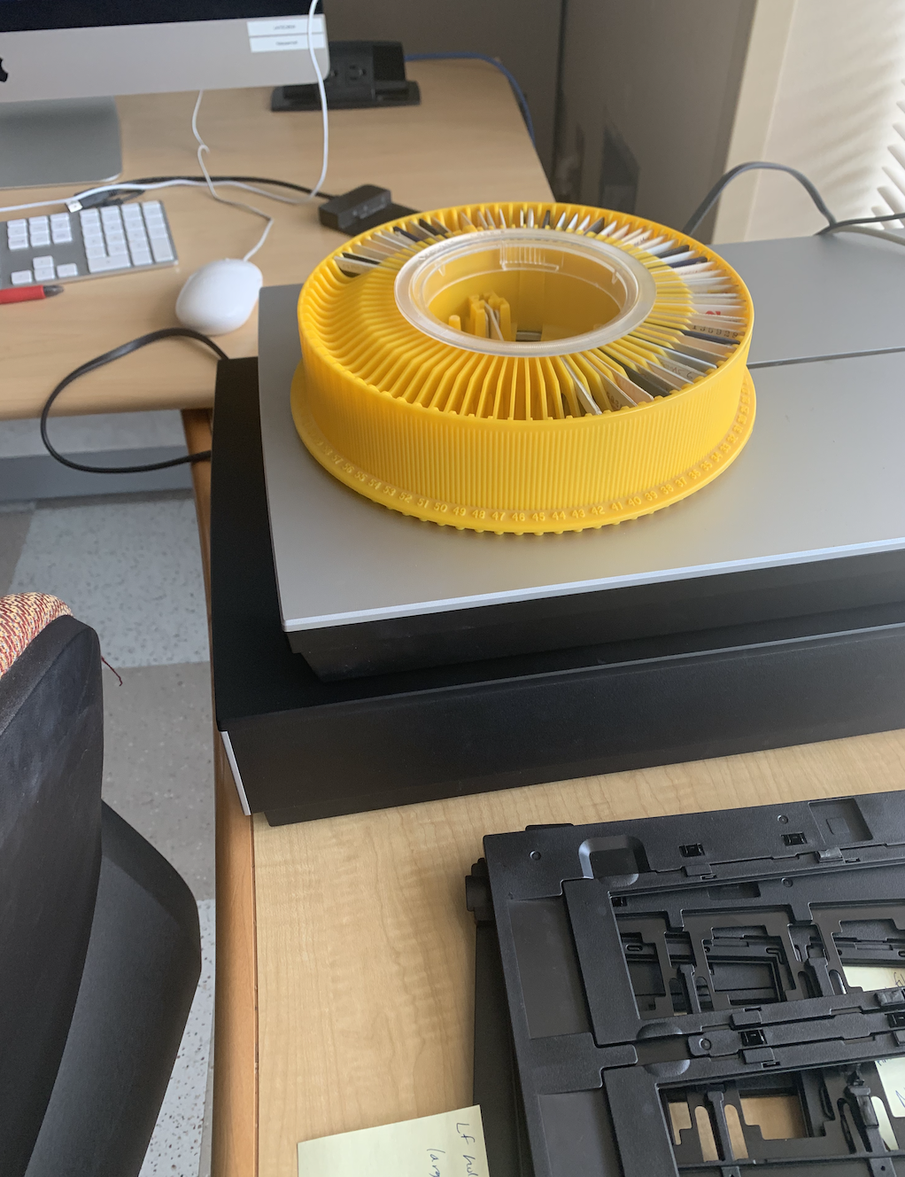
As the title says we are scanning at the office. Ingrid and I. It is nice to be working outside the house. Though there was so much stuff to move around and needing to ask for a lot of help with things because we couldn’t find stuff or access was restricted to things. Alas, we got the images scanned anyways in a single shift so it all worked out. (:
Updating Course Graphics
Updating Course Graphics
The history professor for HIS315K is teaching a HIS315L course with an additional instructor. I updated their course graphic going through a handful of iterations on layout and wording. Once that was completed Suloni had me put together a 2 professor layout for MASTER TEMPLATES STYLE A since we did not have a version for that. I made sure to include two-line and one-line titles for courses.
Here are all my different layout edits for the homepage banner. Edits included changing the picture to be a warmer temperature to match the temperature of Dr.Ozanne and then moving around the order of them on the left or right sides. I also did a blue overlay edit per Suloni’s request. Next thing that was clarified after the first drafts was that the title of the course was different and that they wanted different wording for the professor’s name. From there I did compositional edits of the components until we found one that was balanced.
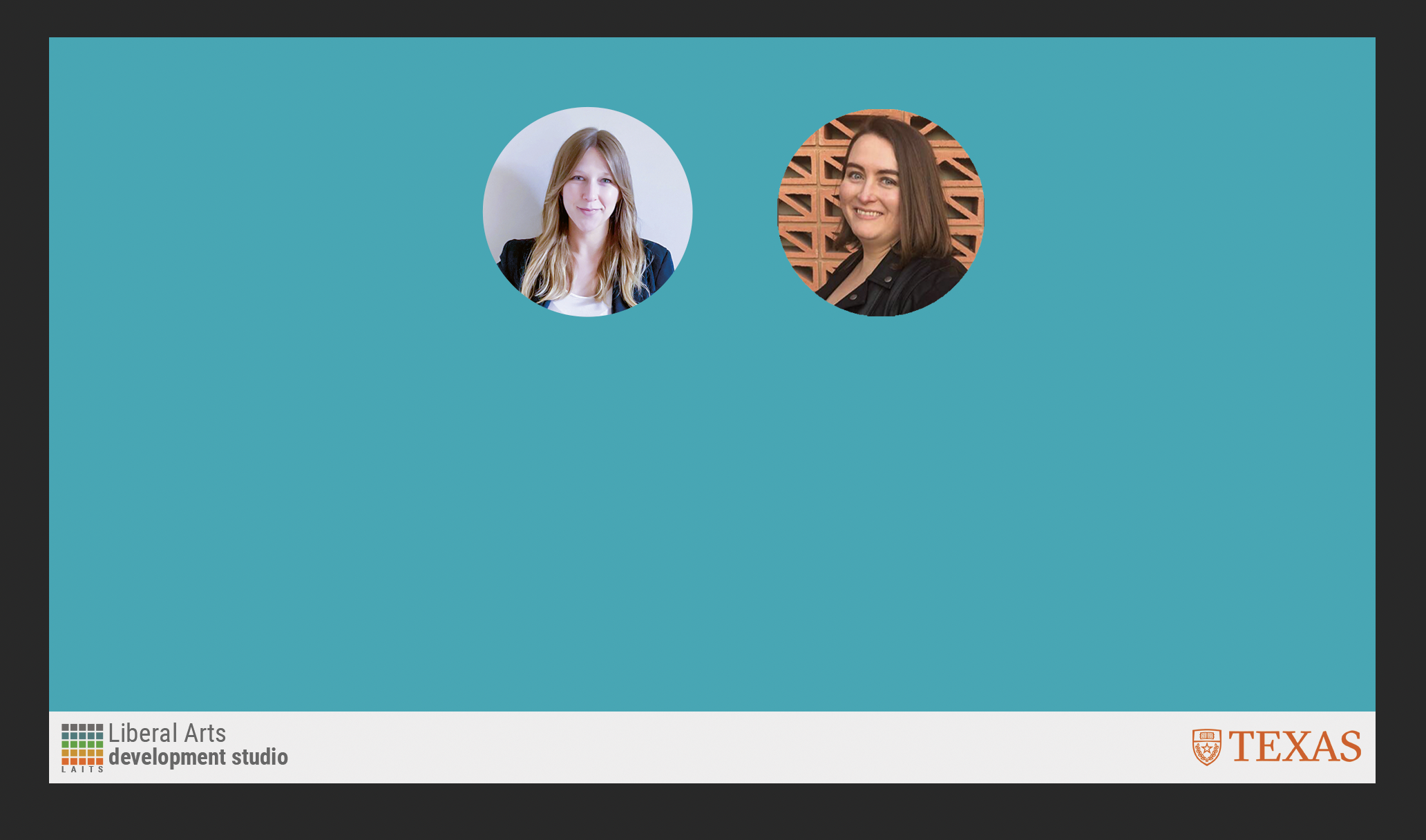
Once all the final edits were approved I moved onto the template edits for a two-person layout. Here is what they look like:
Updated Edits for Course Graphics
- « Previous Page
- 1
- …
- 10
- 11
- 12
- 13
- 14
- …
- 50
- Next Page »
