• We are STAs
    • Asha Rountree
    • Haley Ma
    • Kate Shih
    • Kyra Lee
    • Nicholas Peasley
    • Sasha Kenney
    • Shanda Horm
    • Shriya Atreya
    • Tomas Marulanda-Mesa
  • We were STAs
  • STA Presentation
    • STA Presentation 2017
    • STA Presentation 2016
  • Testimonials
  • Resources
  • Home

STA Blog

Abriella Corker

Abriella Corker

Photo Id Submission

September 14, 2021 By Abriella Corker

PHOTO IDS


I edited some photos IDs today. I decided to blog them because they had some meaningful edits done to them that I think are good to show and address for STAs to see.


This first image in the top right corner was very over-exposed so I selected the area with the selection tool and lowered the exposure. Then I selected the figure and brought out the brightness so that less of the face was in shadow and more visible.


The second image was a little yellow and too close to the face. The background looked a bit low contrast with the head as well. I adjusted the color balance in the mid-tones and highlights to make it more red-blue and less green-yellow. Then brought in contrast to the background and tried to crop the image as close to the guidelines with the chin sticking out a bit past the boundary.


The last image was well composed. The only issue was that it was submitted with a heavy icy blue filter over it that looked unnatural. I color balanced shadow, mid-tones, and highlights to get rid of the blue, lower the green, and bring out more red and yellow.


Filed Under: Fall 2021 - Spring 2022

Design Fundamentals – Branding Training

September 13, 2021 By Abriella Corker

DESIGN FUNDAMENTALS – BRANDING TRAINING


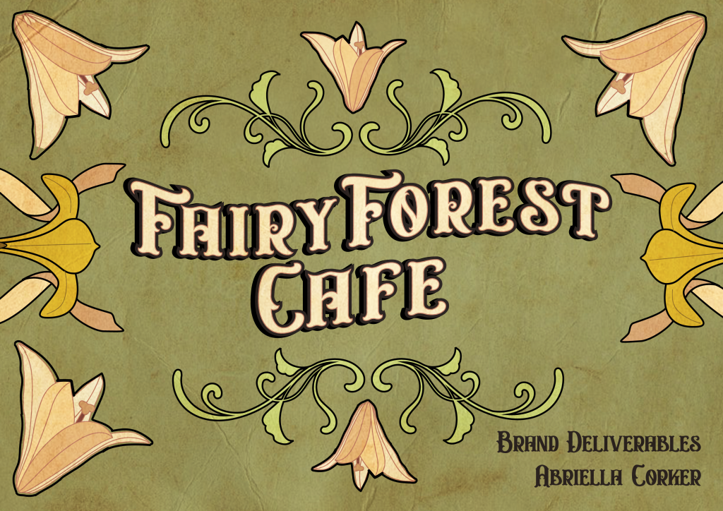
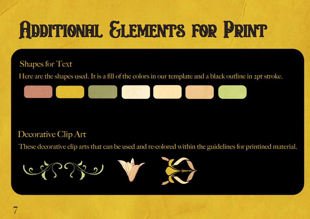
Athena wrote a training on how to develop a brand and creating a brand book. It was one of our most recent trainings we have had made for the STAs so I was going through it for user testing and feedback. There was a lot of good information in there and a lot of other things to edit in or edit out. I went ahead and completed the full training so that my asset can be an STA example from the training, and then I will go in and make the structural changes the training needed. I was giving feedback to Athena but she has graduated and moved onto to great things so I will finish the task under the direction of Maddy! Click to see my PDF Below:


FinalBookBranding


Here was the Brief of the Project:

Café Restaurant  – 6 to 7 hours

  • Name: Fairy Forest Cafe
  • Mission statement: Our mission is to inspire wonder and magic in the day-to-day. We are a 24-hour cafe welcome to all those who wish to enjoy a warm beverage, mingle, study, read, or just sit and enjoy the ambiance.
  • 3-5 adjectives: whimsical, natural, cozy, fresh, relaxed
  • Messaging: Magical
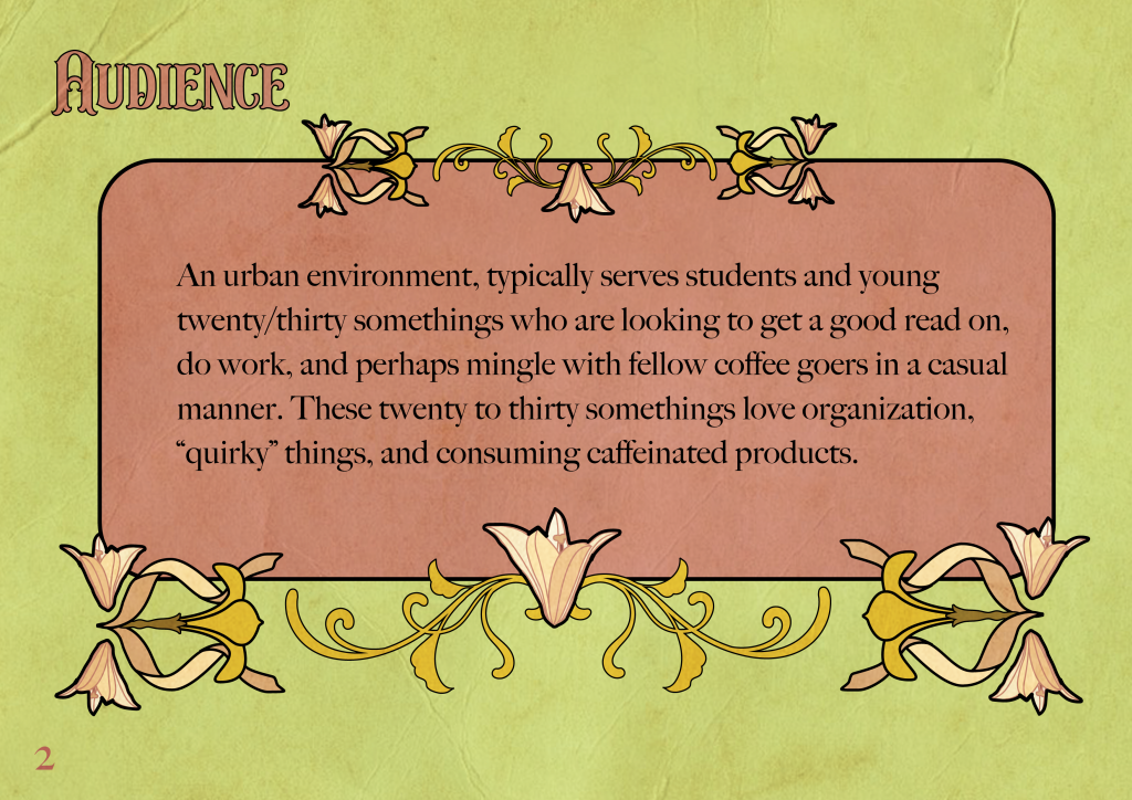
  • Audience: in an urban environment, typically serves students and young twenty/thirty somethings who are looking to get a good read on, do work, and perhaps mingle with fellow coffee goers in a casual manner. These twenty to thirty somethings love organization, “quirky” things, and consuming caffeinated products.
  • Type of restaurant – coffee, desserts, refreshments, and some light food (think sandwiches and soups). Like halfway between Bennu and this cafe (El Bosc de les Fades)


Filed Under: Fall 2021 - Spring 2022

Interactives for Medical Bill Project

September 1, 2021 By Abriella Corker

INTERACTIVES FOR THE MEDICAL BILL PROJECT


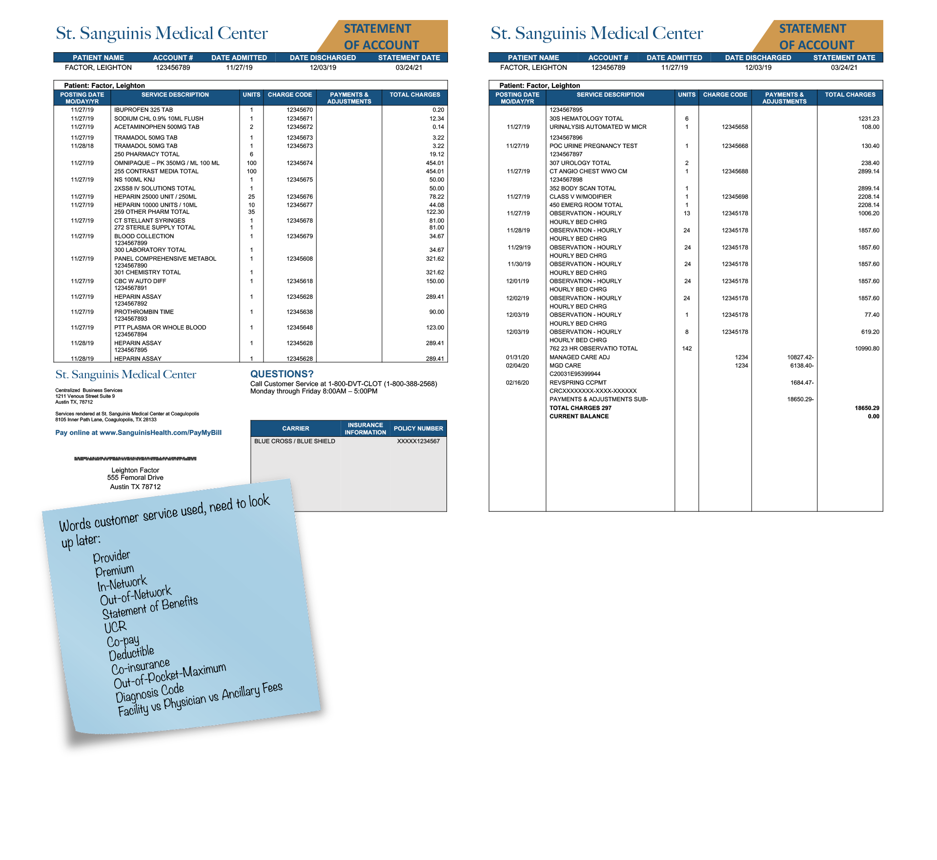
Here are interactives I made for the medical bill project. Essentially, this is an example image of what a standard medical bill looks like. The graduate students who are working on this project want to help make medical bill breakdowns more understandable and accessible to the public. To create these interactives I needed to add clickable elements near different parts of the bill (the orange and blue circles). Then once the circle is clicked a pop-up window with a description of the component and a highlight on the word clicked will appear. I included exit buttons for each window as well so that they can be exited easily.


Initially, I had made this as one big file but it started lagging and got overly complicated and cumbersome to edit. To work around this I broke up the bill into 3 parts. A left, right, and bottom page that can then be assembled through code onto the website by Estella or Thuy. These are the final edits using the client feedback given to me after our first round of drafts.


Click to view:

  • https://laits.utexas.edu/canvasser/canvasser_content/medical-bill-bottom/medical-bill-bottom.html
  • https://laits.utexas.edu/canvasser/canvasser_content/medical-bill-rightside-true/medical-bill-rightside-true.html
  • https://laits.utexas.edu/canvasser/canvasser_content/medical-bill-leftside/medical-bill-leftside.html

Filed Under: Fall 2021 - Spring 2022

Dell Medical Flow Chart

August 30, 2021 By Abriella Corker

Dell Medical Flow Chart


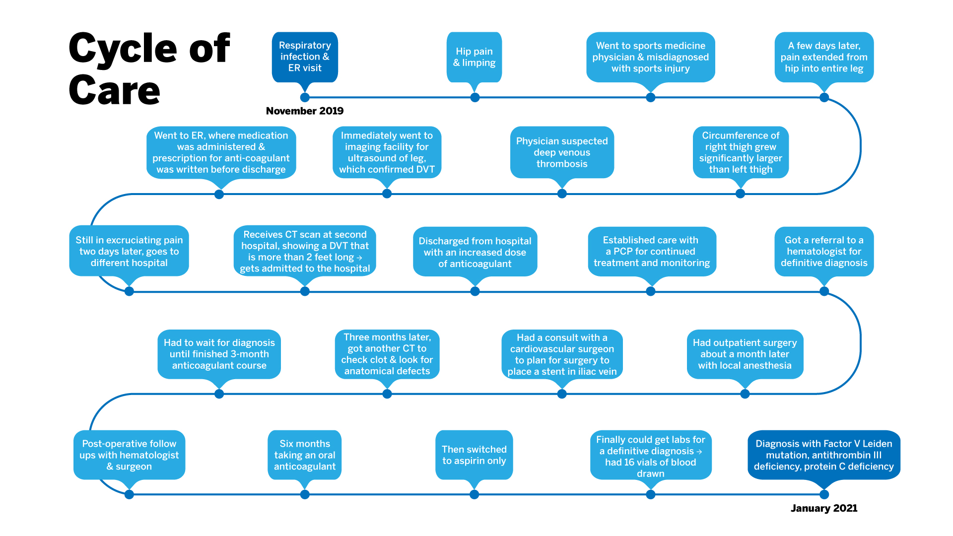
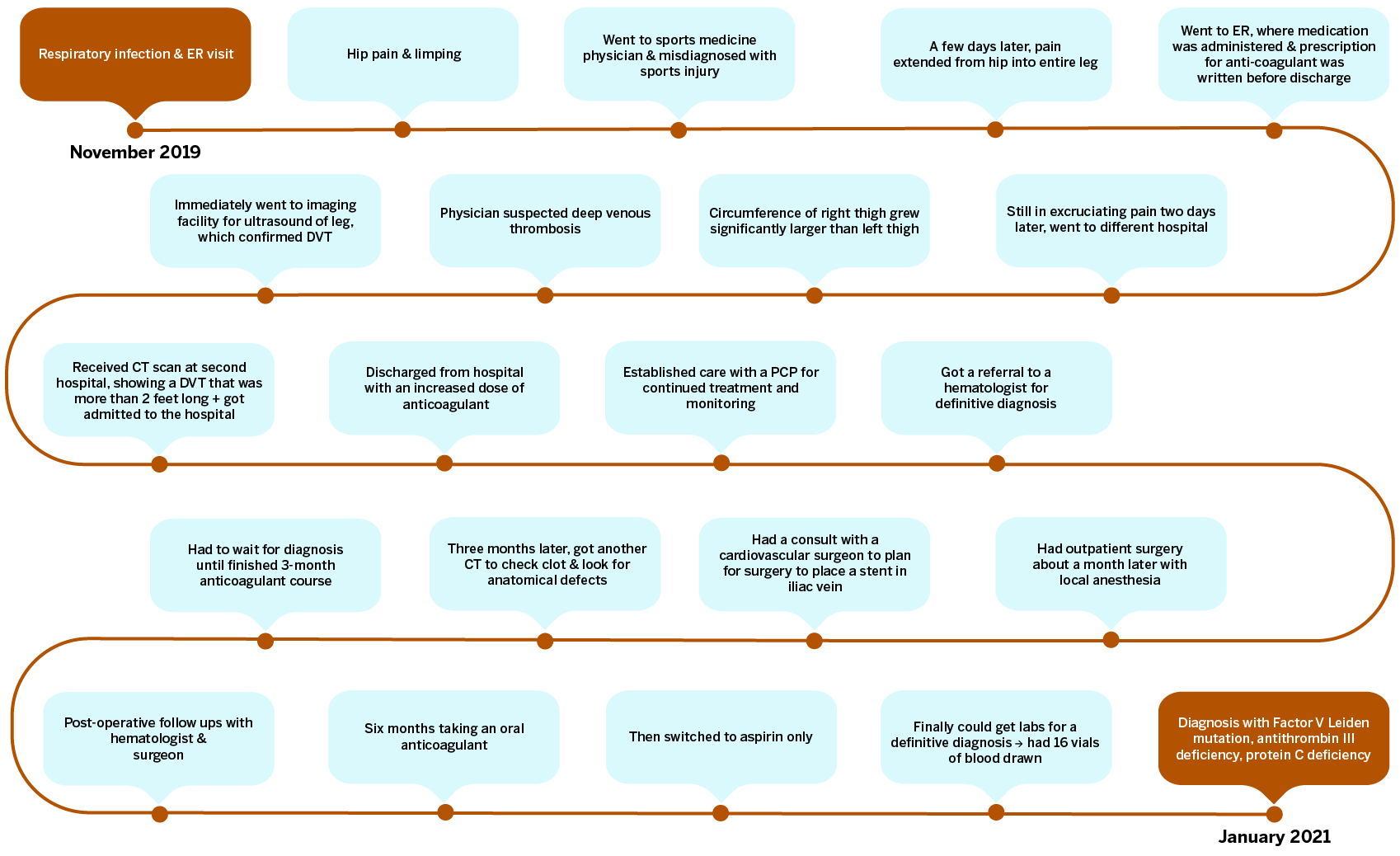
The Dell Medical team got back to us letting us know of edits they wanted made. One was for formatting issues such as a smaller title all on one line and a spanned image in the format of an SVG so I altered my export to have no margins and titles so that in the code on the site contains those aspects instead and are easily editable. The clients also wanted burnt orange and light blue instead of the all blue flow chart. It wasn’t specified how they wanted it on the chart so after a couple of variations the light blue bubbles with burnt orange lines seemed to be the most readable and visually pleasant to look at. There was also a request for even padding within the text boxes so I formatted all text to be a paragraph with built in 10px padding all around and then lined up the text boxes to edges of the bubbles, all the bubbles were made the same size as well. The last edit which was the most difficult was that they wanted all the text bubbles and points to stack vertically but because there were 22 bubbles and we did not want 11 rows or 2 rows it was not possible for all bubbles to line up exactly. Instead I compromised on a varied stacked layout where it alternates row to row.

ORIGINAL EDIT:

FINAL EDIT:

Filed Under: Fall 2021 - Spring 2022

COM 302 Extra Assets

August 30, 2021 By Abriella Corker

COM 302 Extra Assets


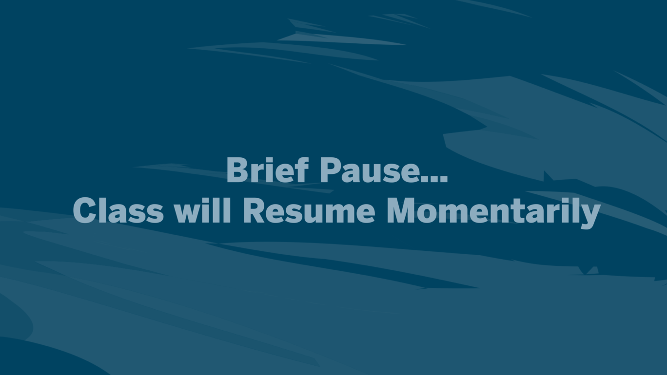
The professor wanted additional slides made for her class where they take a break time and when there is a brief pause. Left over from our palette were the darker colored backgrounds. I decided to go with the dark blue because it wasn’t too contrasted and loud against the text. I didn’t add a rectangle or icon behind the text either and centered it so that the students feel like the break time is visually different from the course content but still within the aesthetic of the course.


Filed Under: Fall 2021 - Spring 2022

Button Edit

August 19, 2021 By Abriella Corker


Button edit for ECO 304 K. I edited a single button. Replacing the TA button to the “Contact Team Econ”.

Filed Under: Fall 2021 - Spring 2022

  • « Previous Page
  • 1
  • …
  • 8
  • 9
  • 10
  • 11
  • 12
  • …
  • 50
  • Next Page »

link to LAITS home page

Video STA Home

© 2025 Liberal Arts Instructional Technology Services | Production Credits