FEBRUARY 2025
— 2025 STA PRESENTATION ROSTER POSTER(S) —
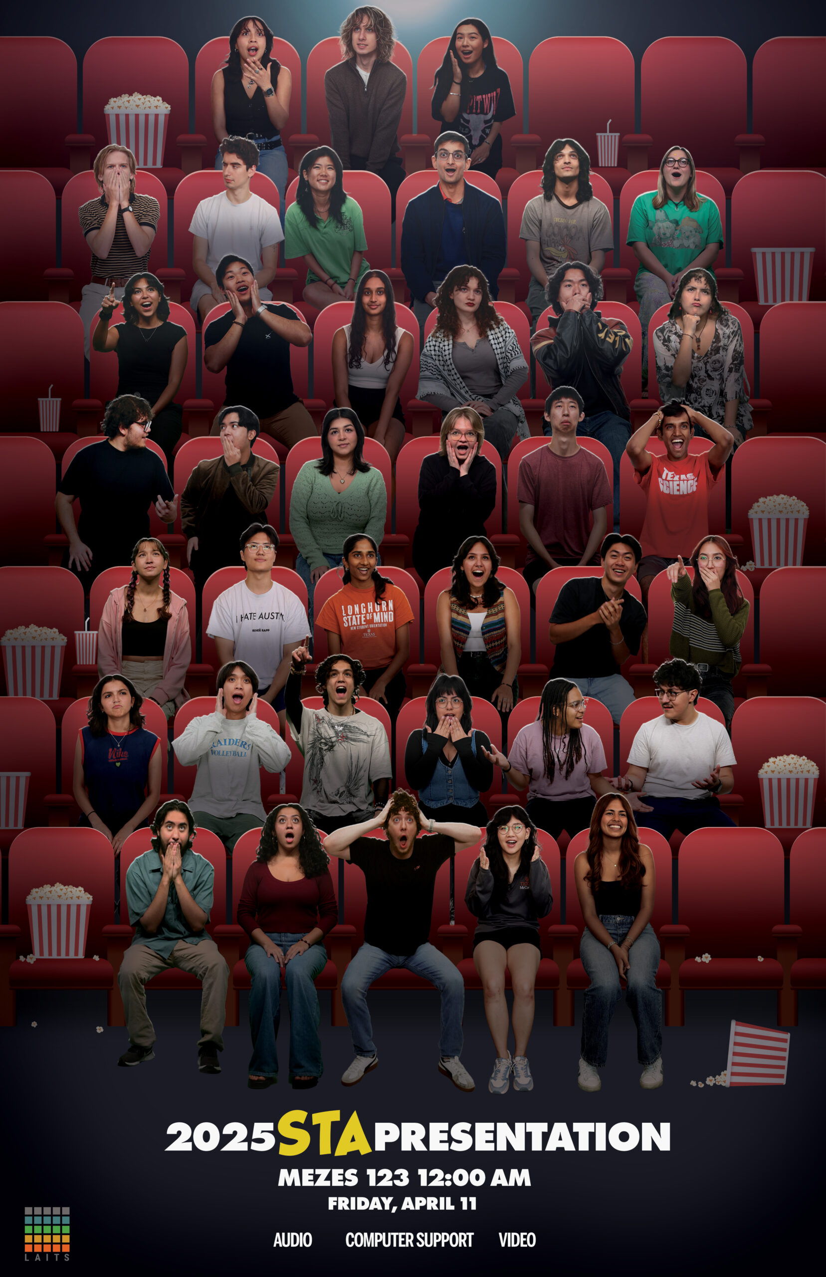
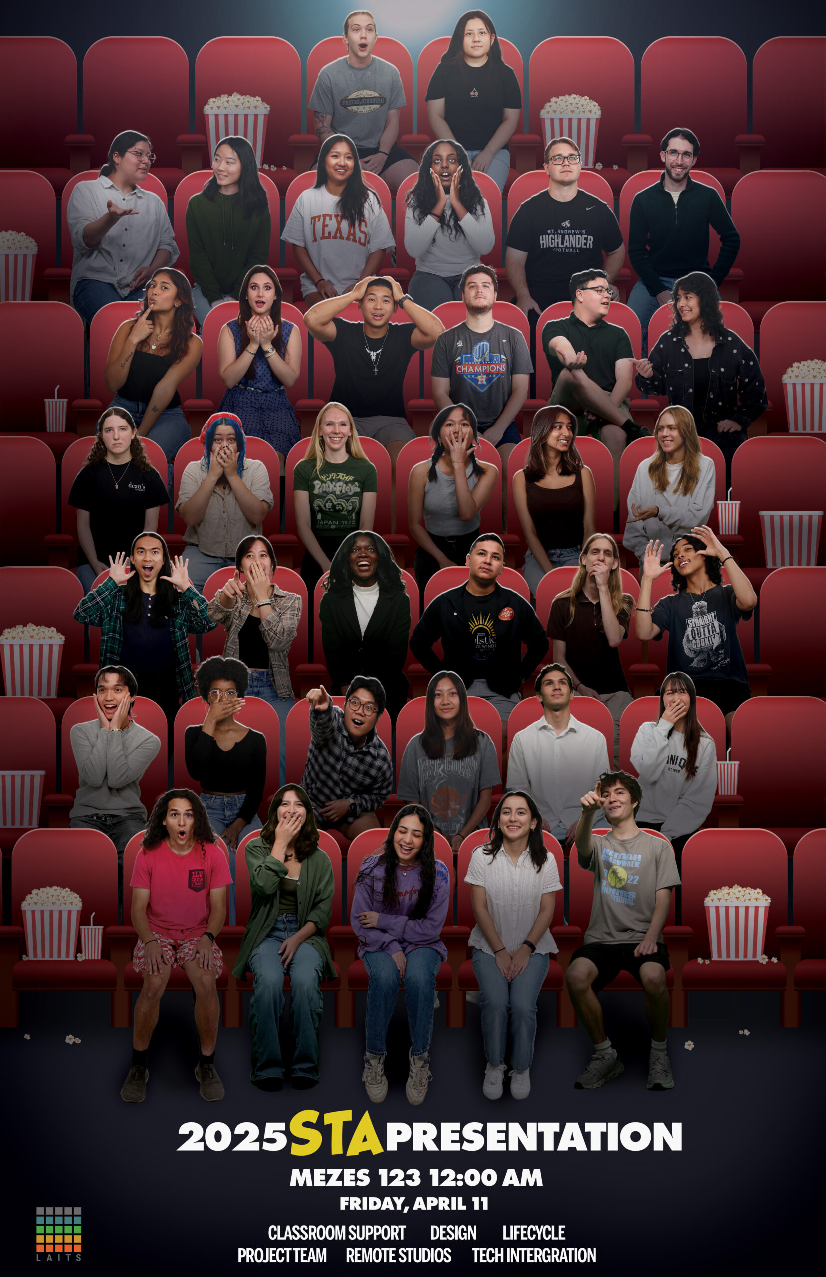
I was still working on the STA Presentation Roster Poster(s) going into February. The due date for the project was the 28th. I was grateful that I got the overall foundation of the posters done so all that was left was making edits to lighting, text, and props to decorate the scene.
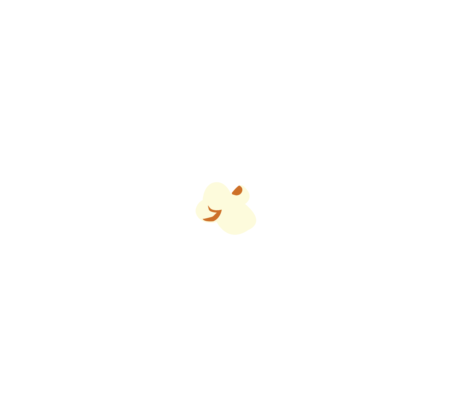
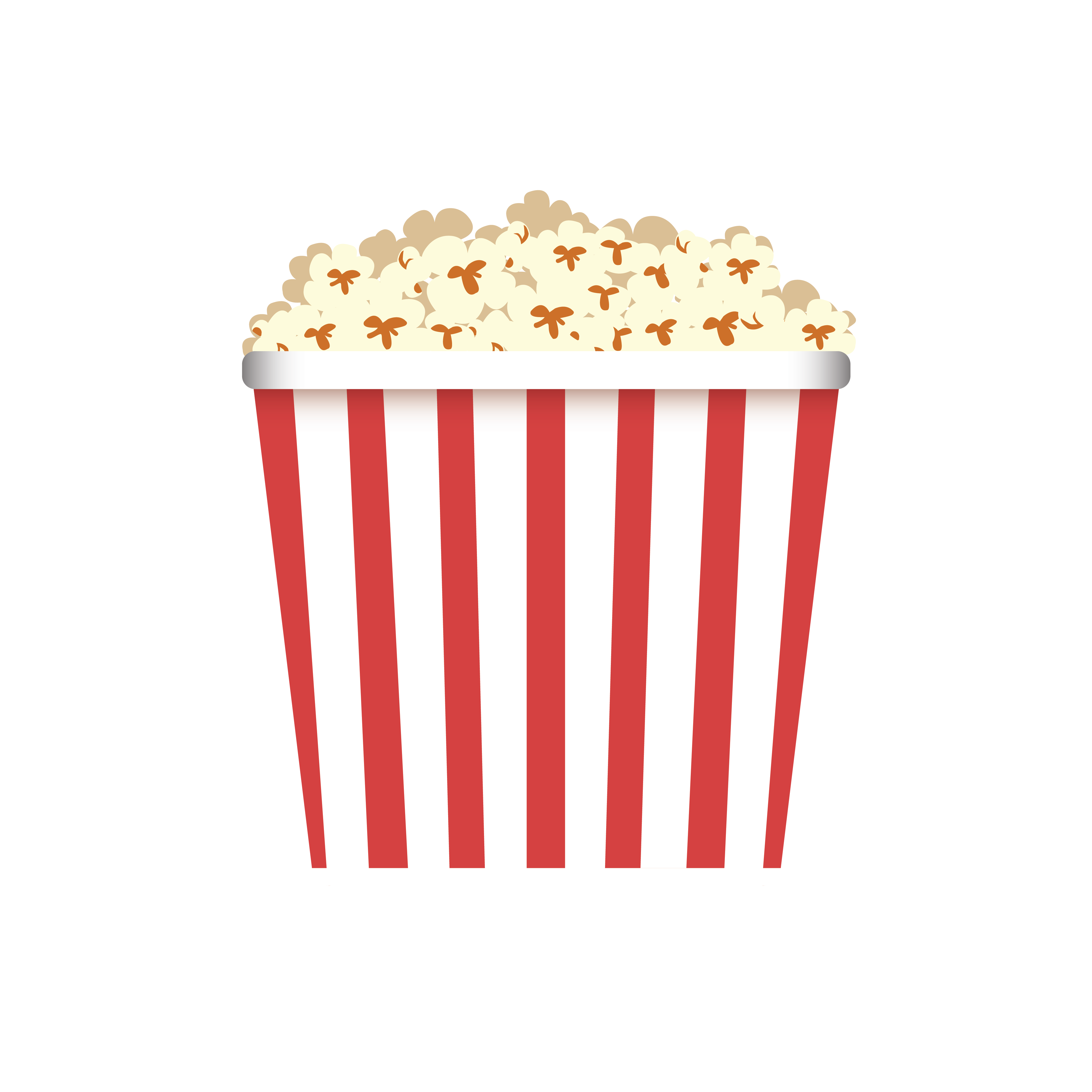
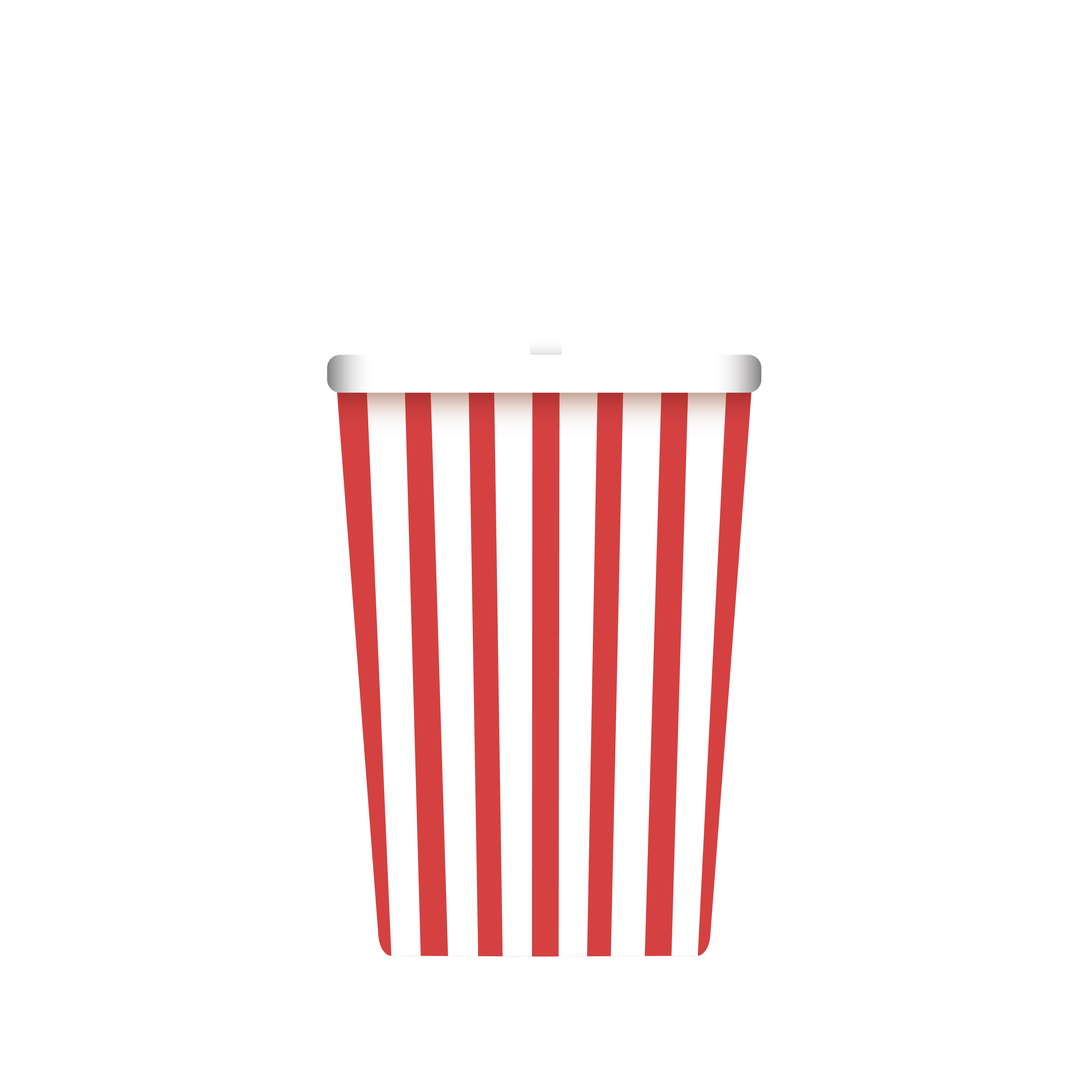
Regarding the props, I went back to Illustrator to create some popcorn buckets and a drink.


Here is the first iteration of the posters with the props:
— IPE PROJECT —
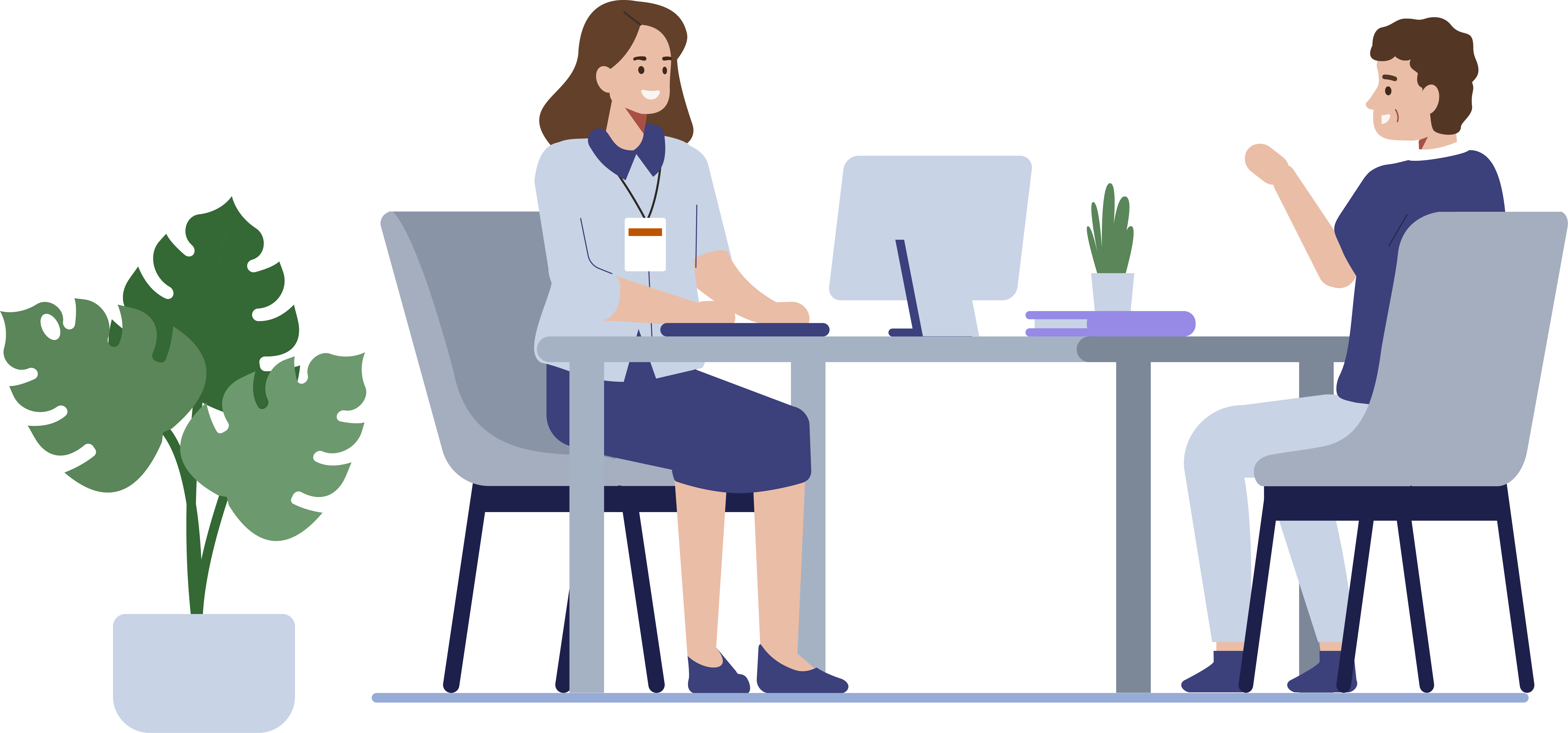
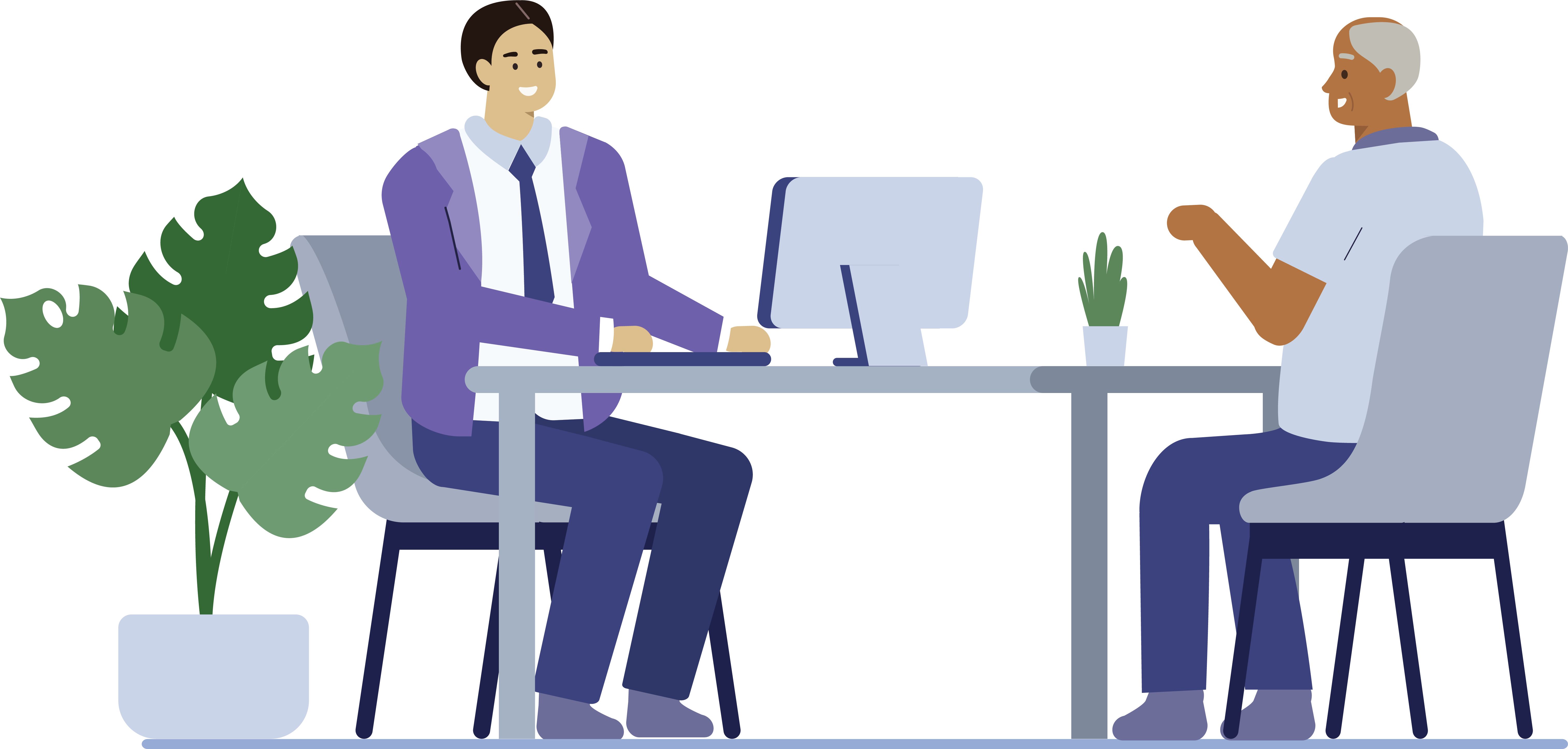
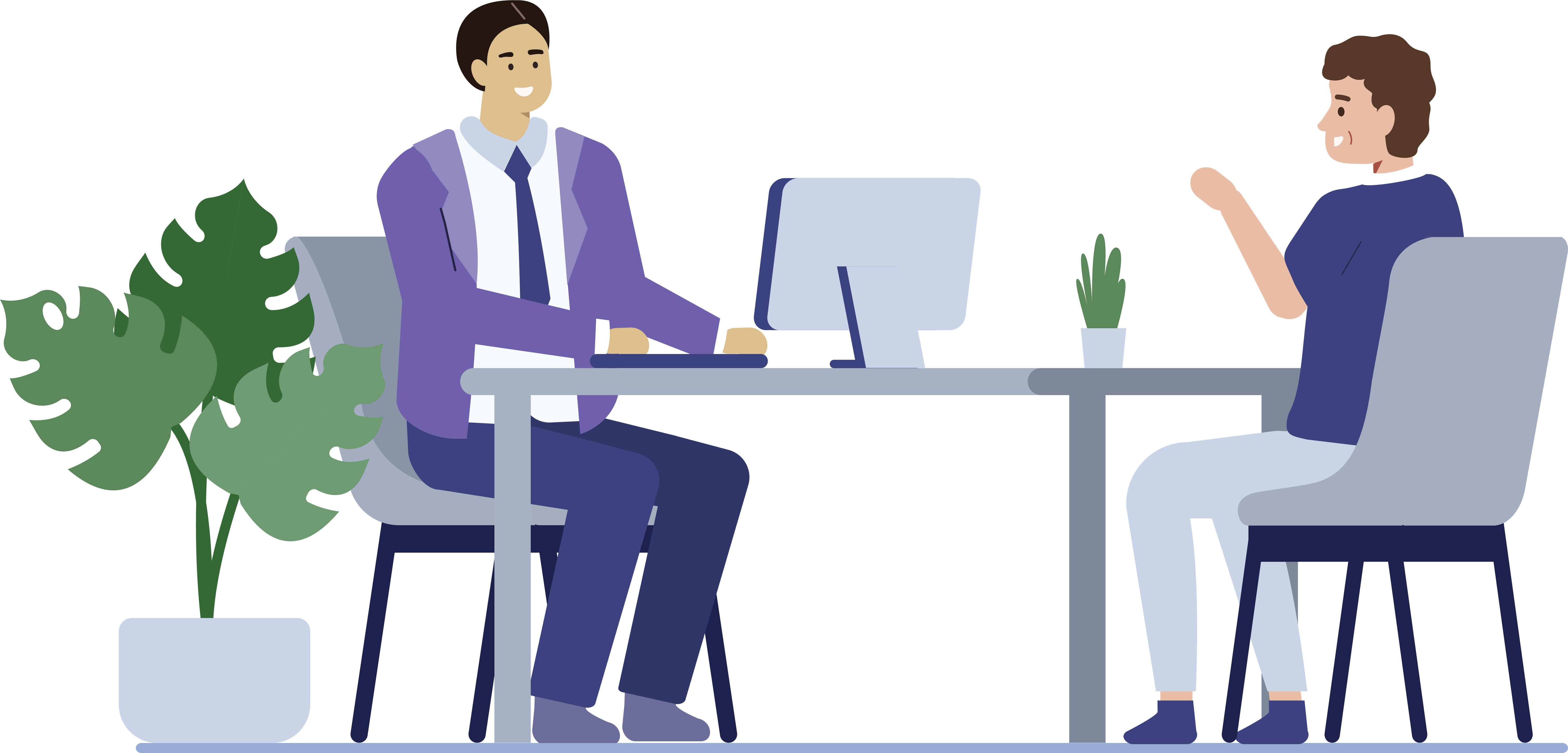
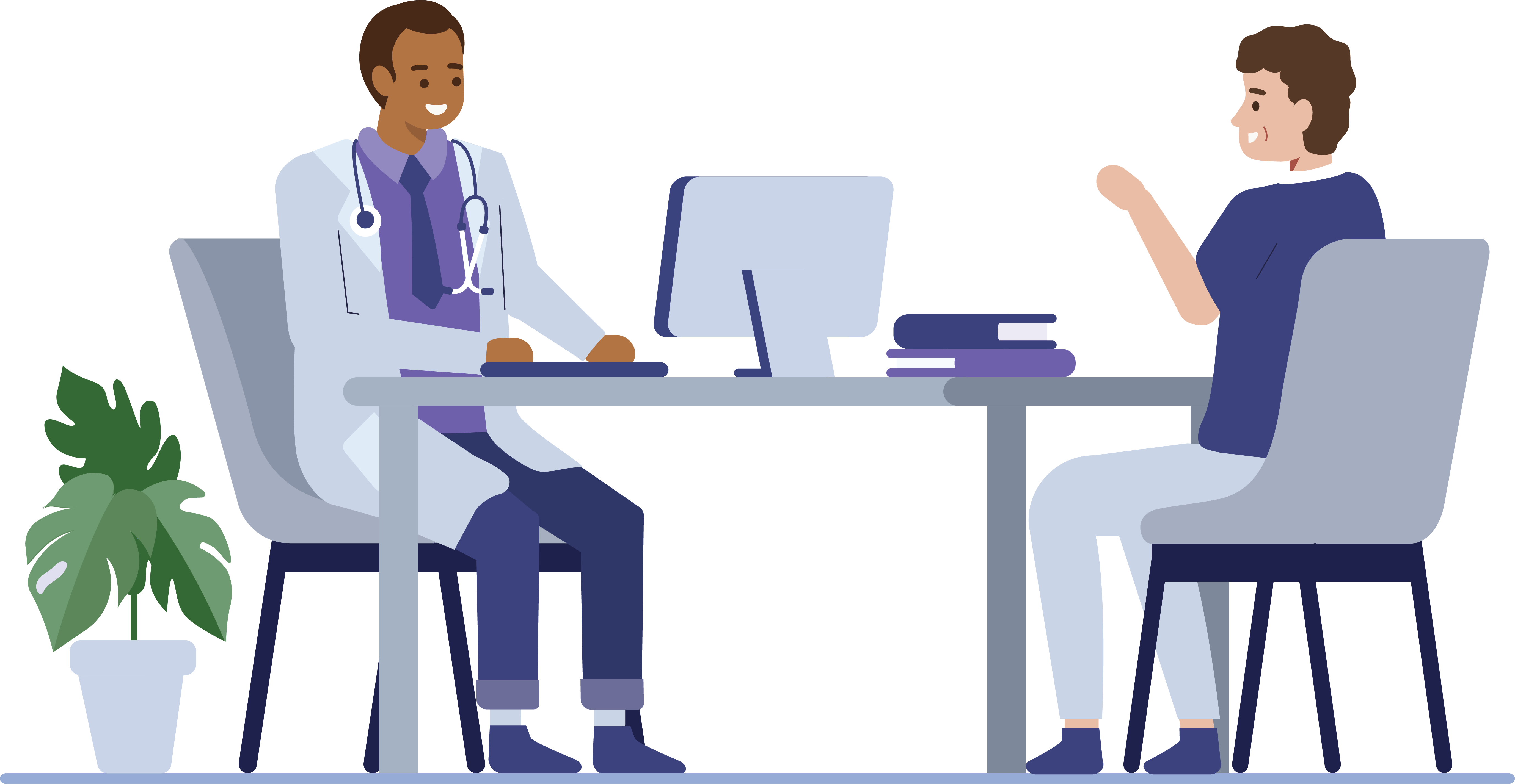
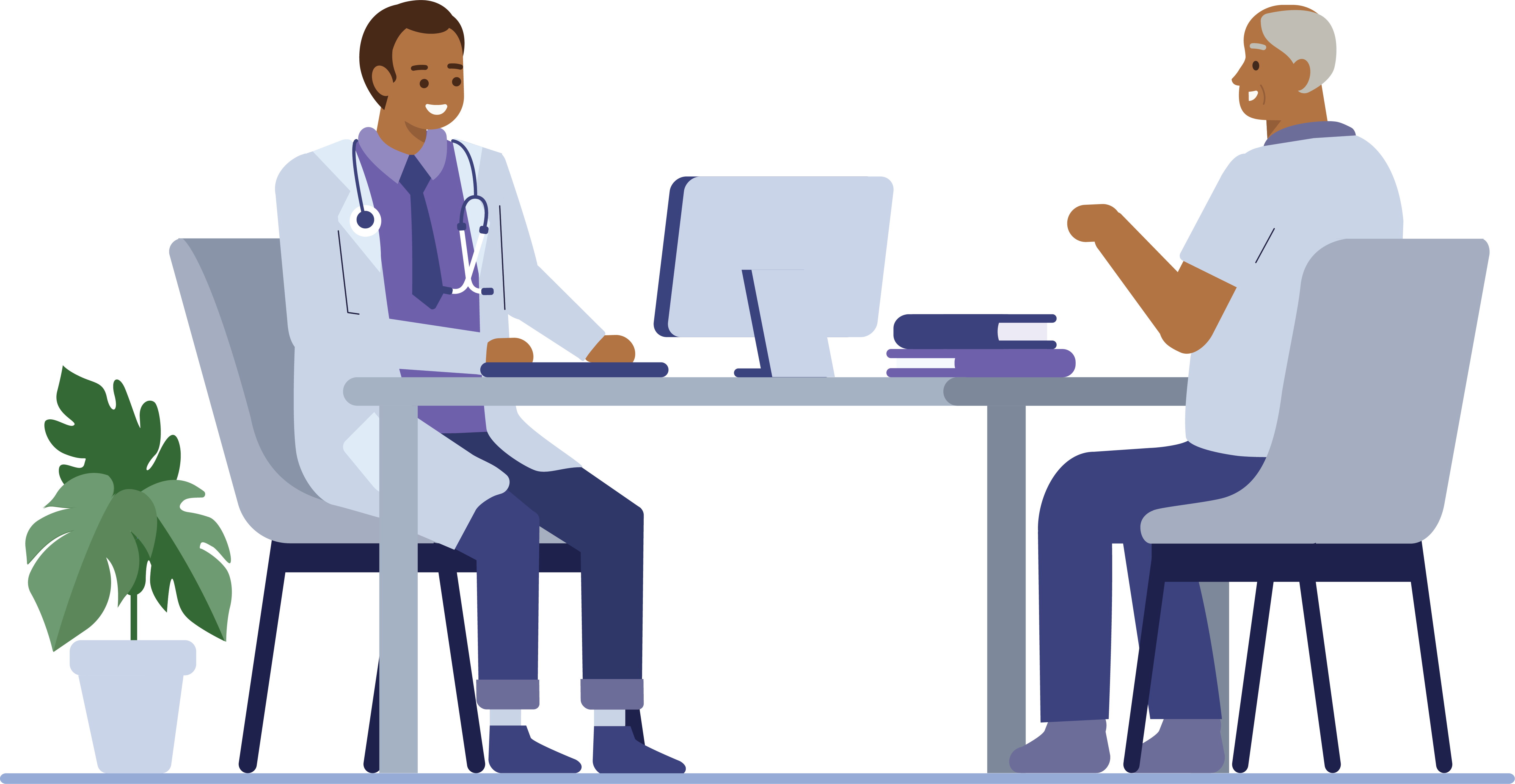
I was back to working on some IPE assignments this month! Lila updated me on some scenes that were required and I went ahead and worked on them:

I also worked on additional icons needed for the animations. I created a calendar, phone, and pill bottle:

Overall, I like being able to revisit this project! It’s fun making scenes or illustrations and I love being tested on what I’ve learned in Illustrator up until now.
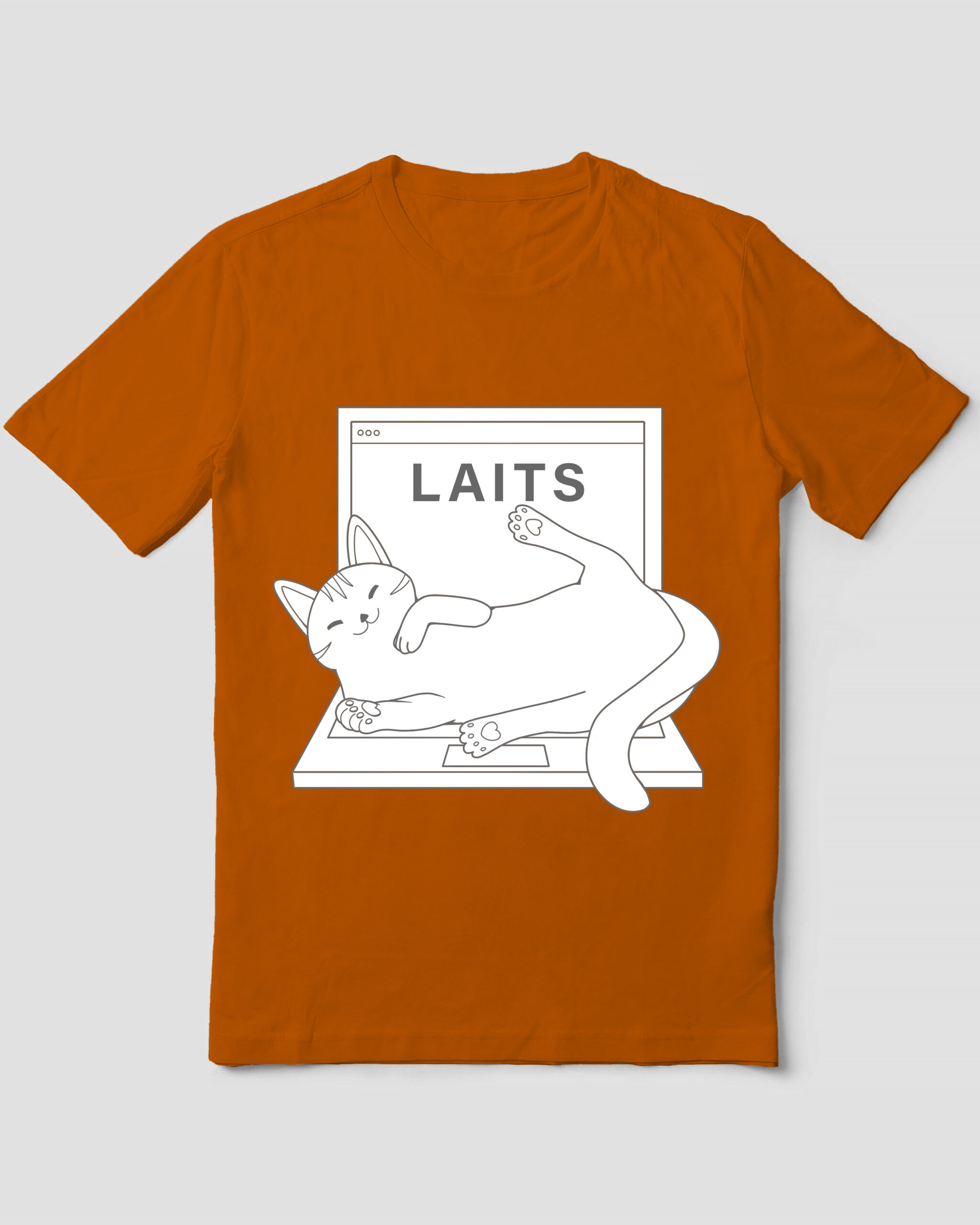
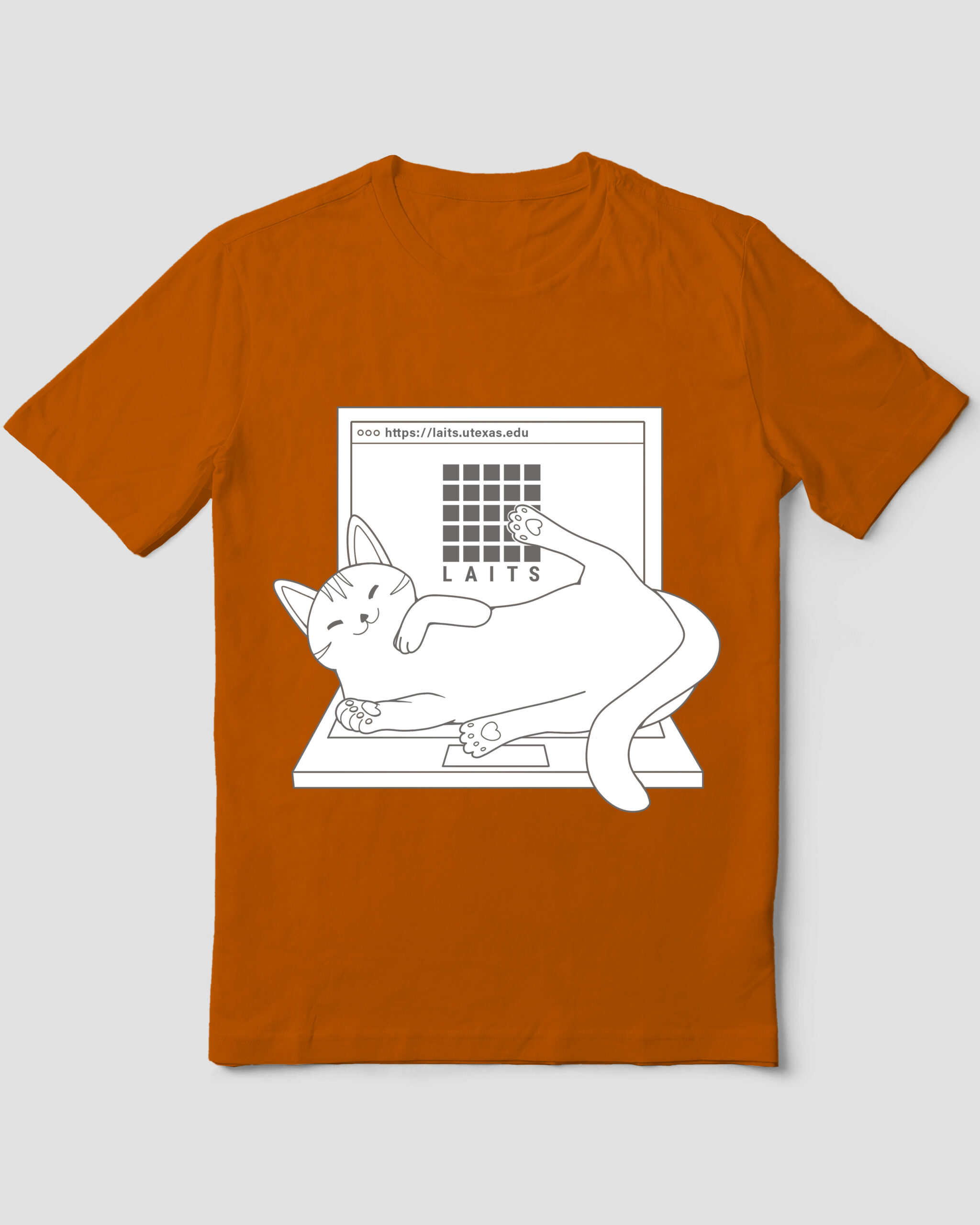
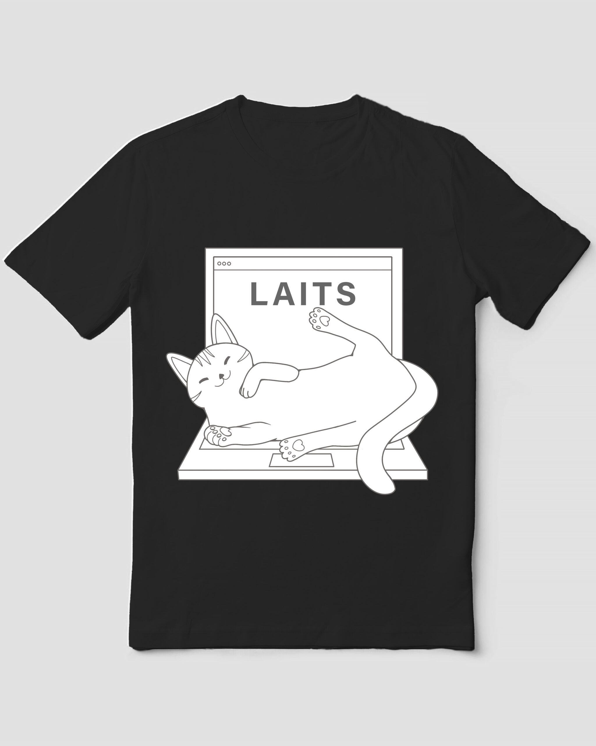
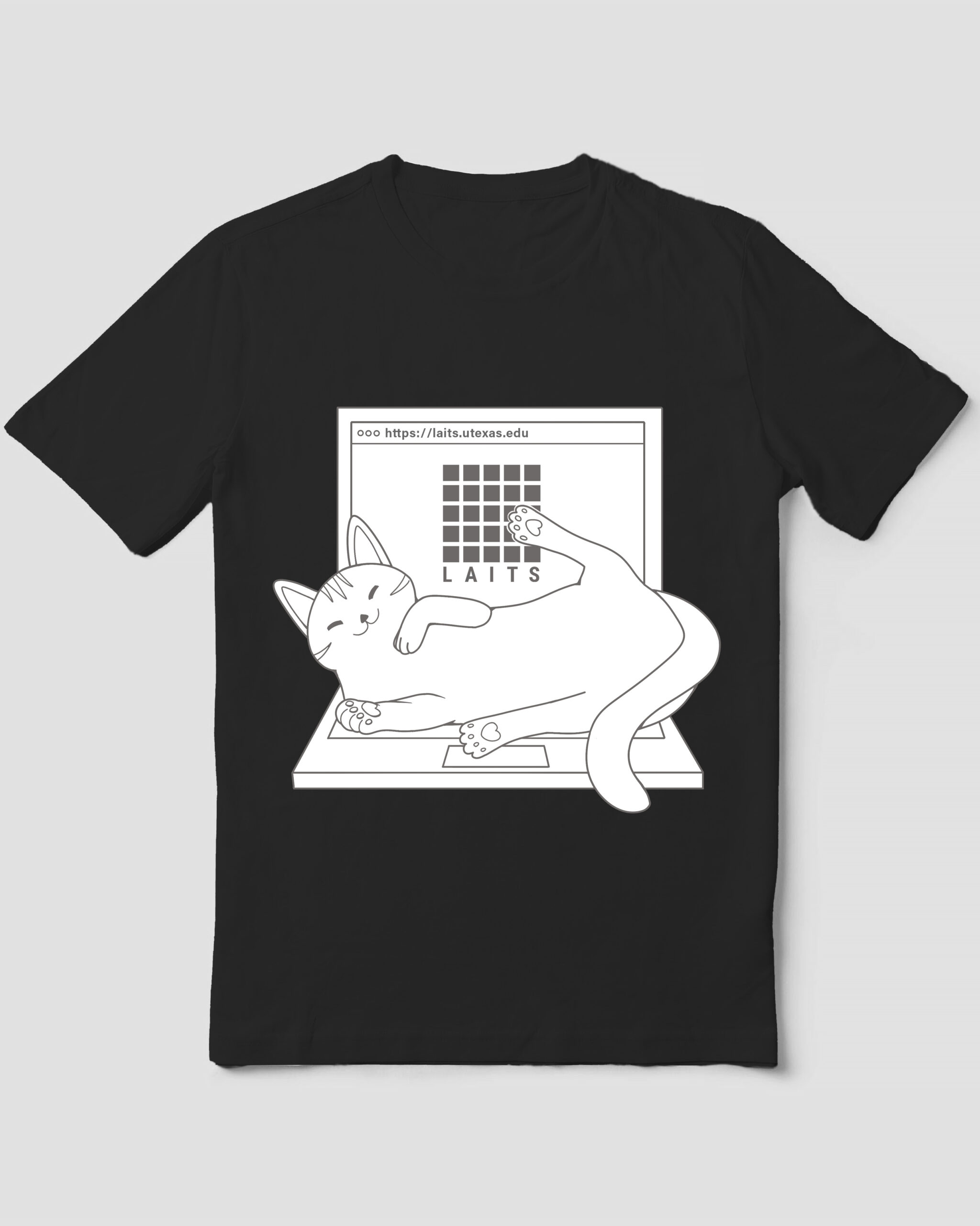
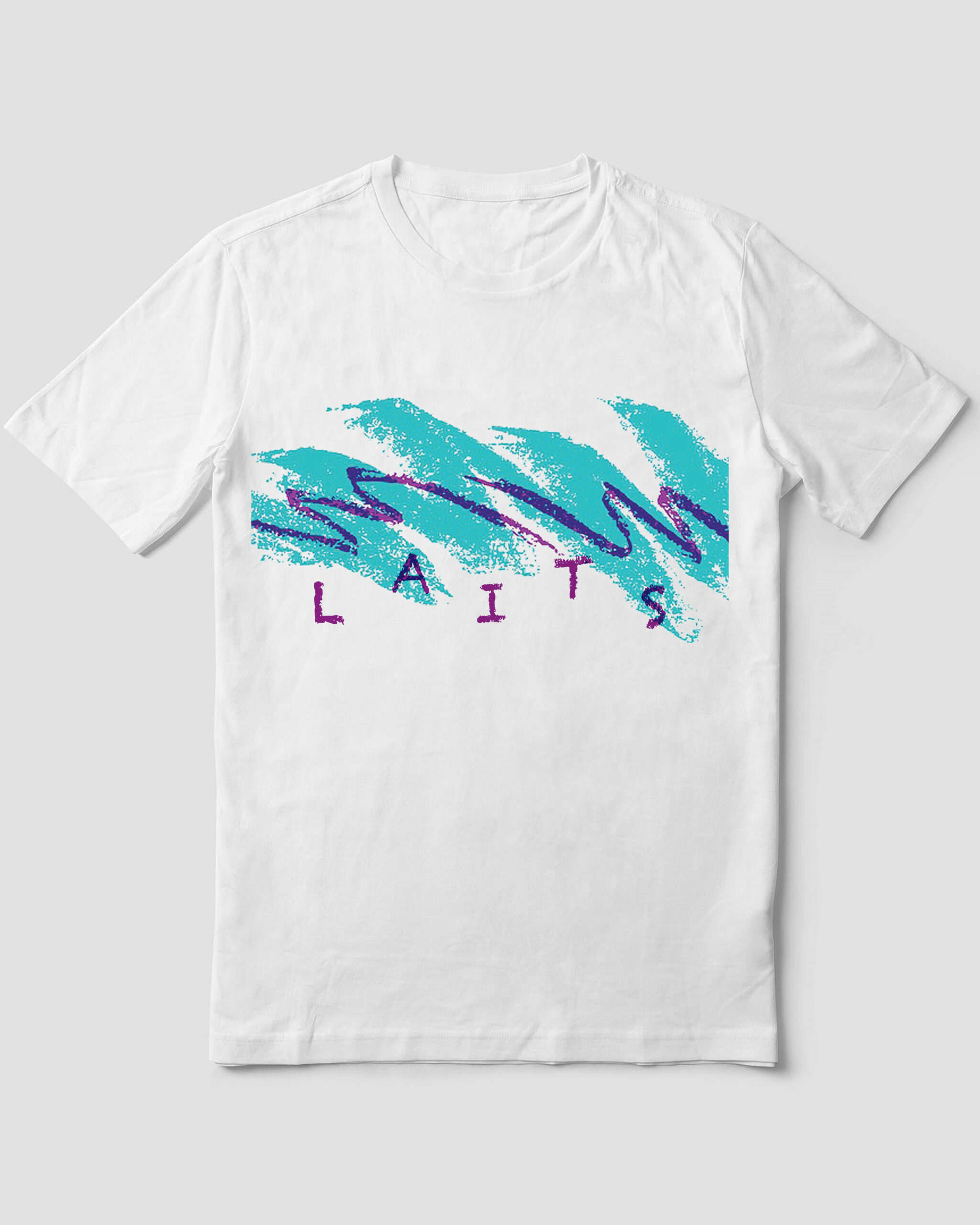
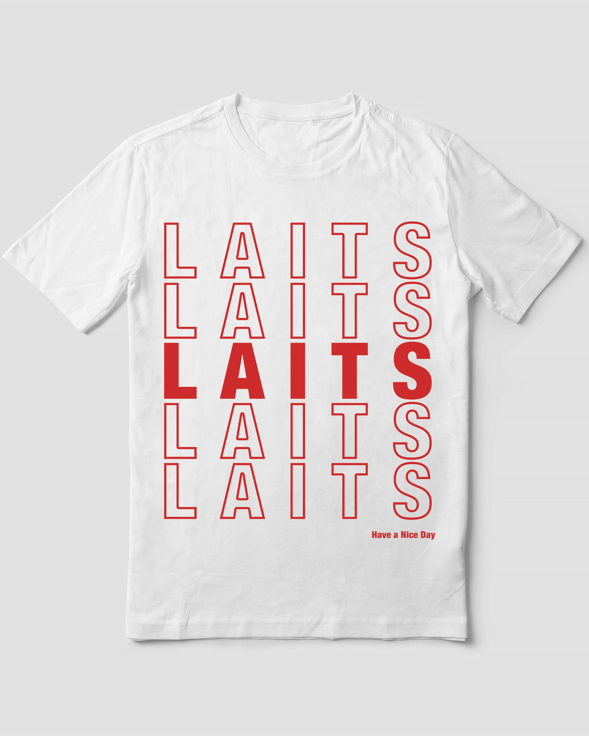
— 2025 LAITS T-SHIRT MOCKUPS —
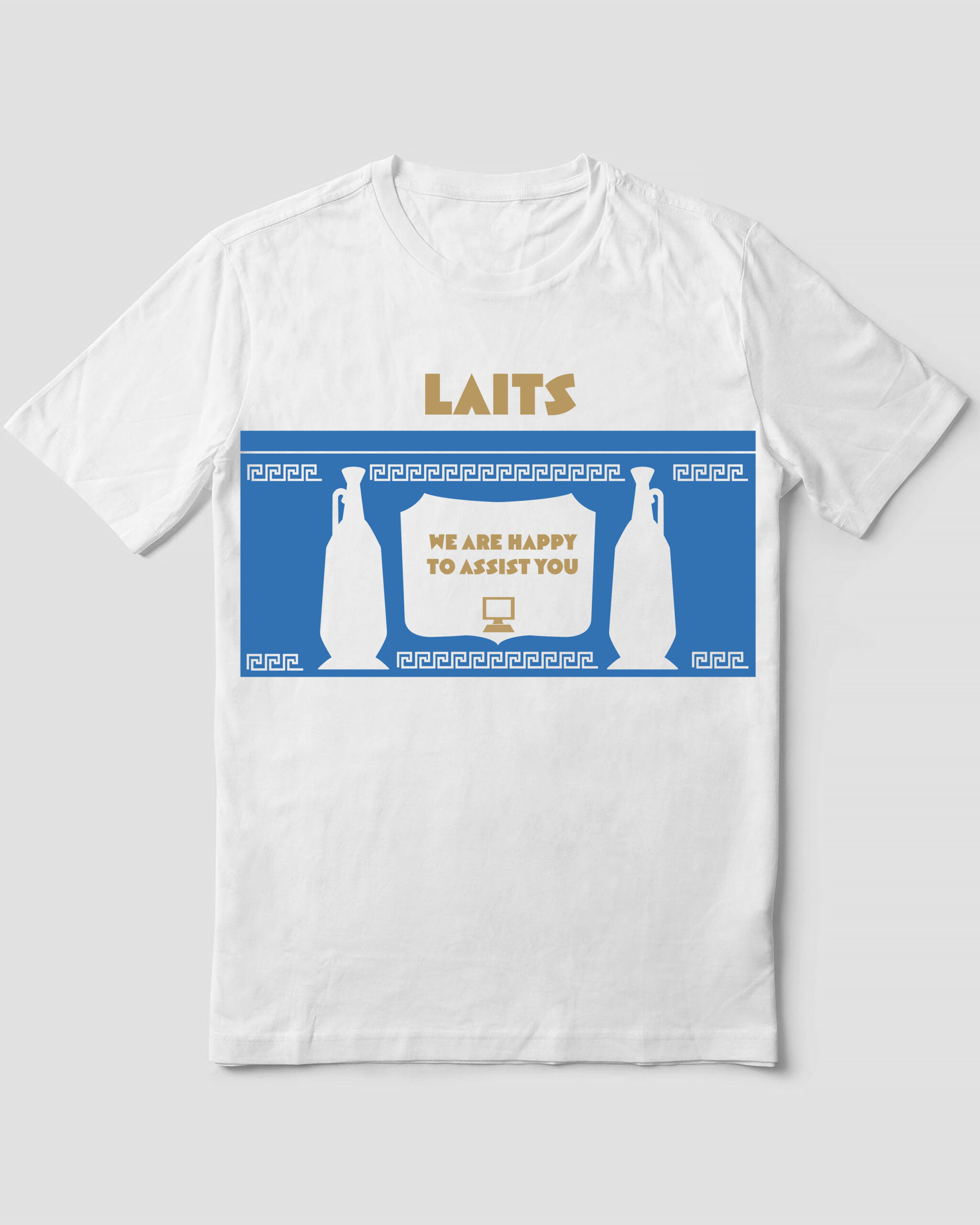
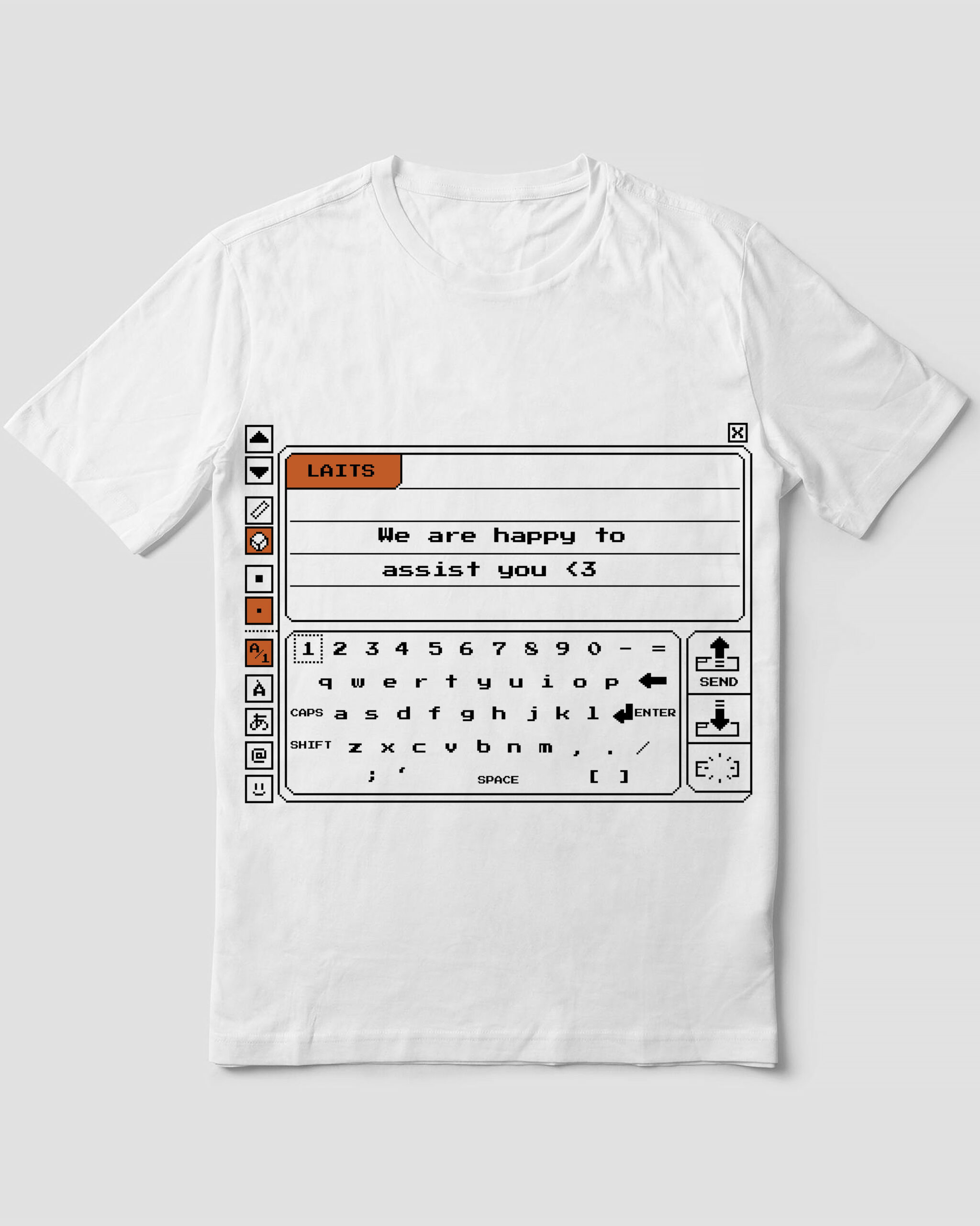
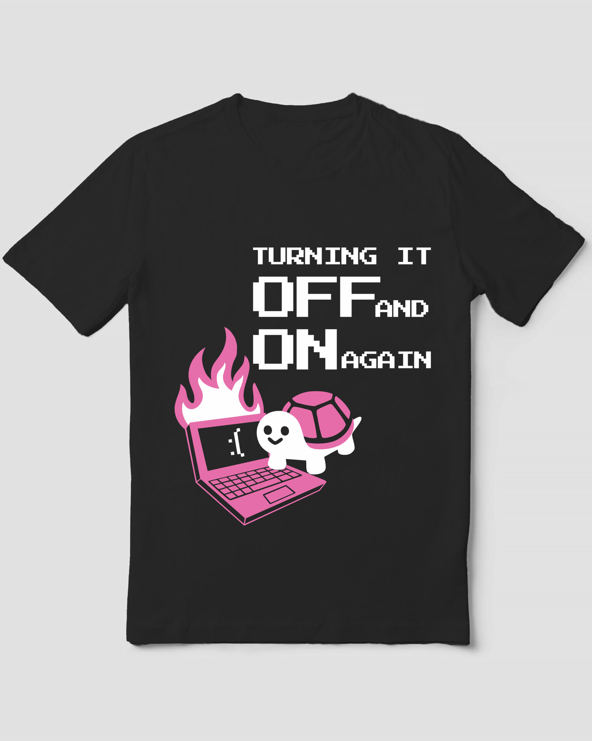
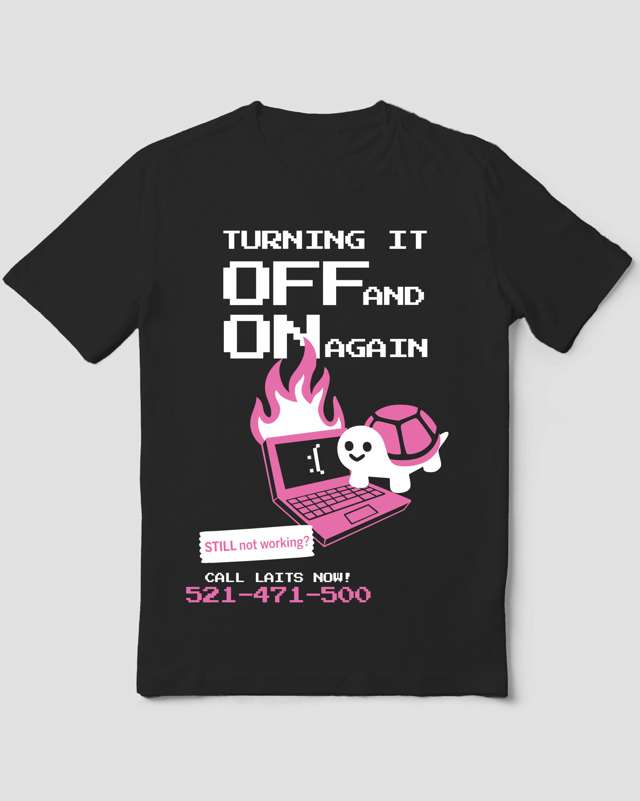
My last project for February was creating high-fidelity mockups for this year’s shirt. I was provided 6 sketches from the project team and would use those as a reference.
The first shirt was based on the classic disposable cup design. This design was simple to recreate and helped me discover the select-color range tool in Photoshop!

The second shirt is inspired by the classic “thank you” bag. This one was also easy to recreate and I discovered another feature in Photoshop! I learned there was an outline option for text and used that for the “LAITS” red outlines.

The third was another callback to a classic design with this one being inspired by the iconic NYC coffee cup design. This design was a bit more difficult to recreate since I couldn’t easily do it in Photoshop. I took the design into Illustrator and recreated the design there since I could manipulate the assets without losing quality.

The fourth was the most difficult for me to recreate! This one was inspired by the Nintendo DS version of Pictochat. It took a while for me to recreate the design in Illustrator and having to restrict it to two colors was an additional challenge. Despite that, this one turned out to be my personal favorite!

For the fifth design, I was tasked with simplifying the poster design for the shirt. I struggled the most in balancing the elements of the design and having the catchphrases on the shirt make sense without including all of the original ones. I ended up with two mockups for this design: One that is the simplest and another that has more of the elements from the original poster. Looking at these, I personally feel there is still a bit of balancing issues, but I still like them! (The slack turtle is adorable)

The sixth design I took into procreate to draw. This design was also difficult because of the 2 color limit; however, Leilani’s suggestion of changing my lineart to gray helped the design standout on the black shirt.