Design STA Hiring Flyer
Project Overview: Design a visually engaging flyer that promotes hiring for Graphic Design and Web Development Student Technology Assistants (STAs).
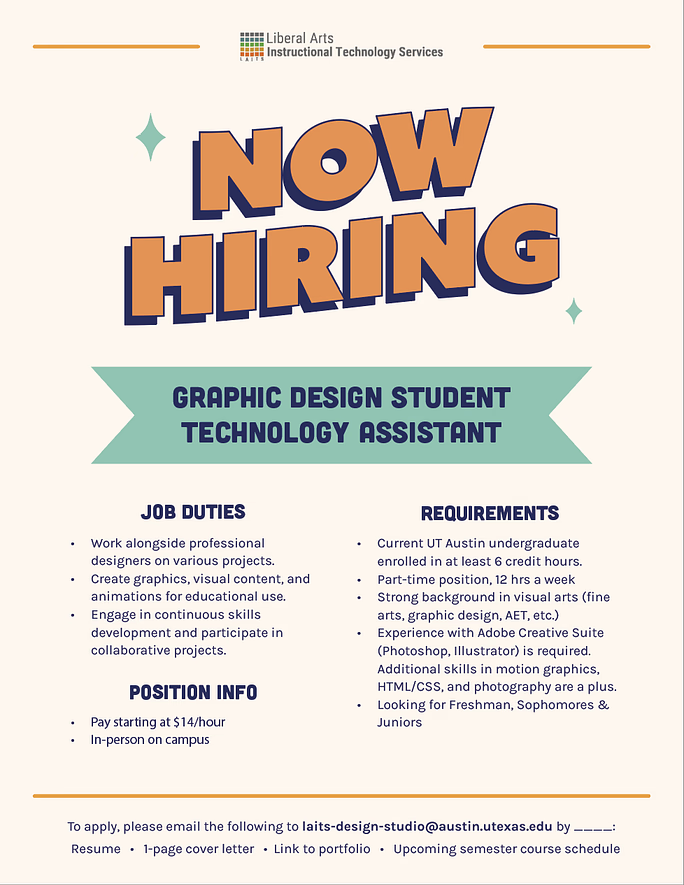
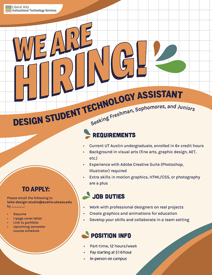
This project was a large learning curve for me. One of the bigger hurdles was balancing design with practicality (fitting all the required text onto the page). The first drafts either didn’t have a clear message (left) or were too text-heavy (right). Even after condensing the information and playing around with the colors and elements, nothing was really working.


As Leilani (the Art Director) and I discussed possible edits to the above drafts, I created a third option that is more visually engaging, but that ultimately ran into the same problems: did not look like a graphic design hiring flyer and was too busy.
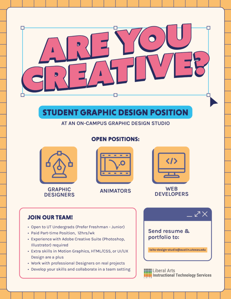
At this point it was decided that the flyer should have more visuals. The text was condensed even further to include a new hook (“Are you creative?”), the job title, 3 open positions, a few bullet points about the job, and how to apply.
With this feedback, I modified the very first draft to lean more heavily into a graphic design/digital look.
My Final Thoughts: I’m not entirely happy with the final design. I think it’s a little static and the background is plain, BUT it does have more of a graphic design-vibe and a clearer hierarchy than the previous versions. Overall, I learned a lot about designing layouts and what to prioritize when creating a poster with a purpose. I think in the future I’ll spend more time in the thumbnail step so I have more stability when jumping into Illustrator.

