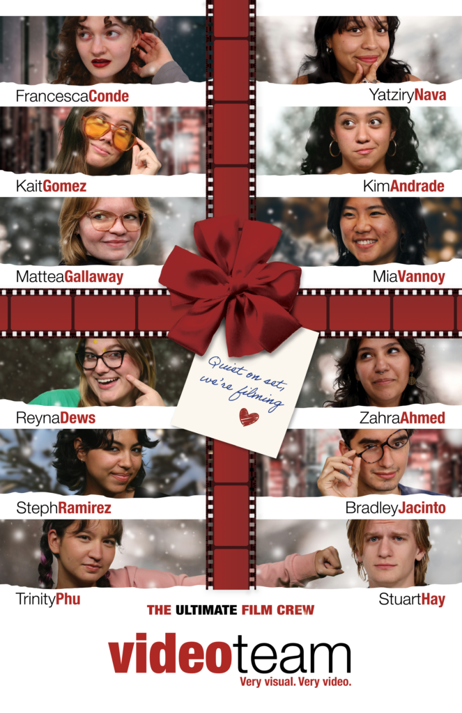
Fall STA Roster Posters
Video Team
Project Overview: Design a poster based on the “Love Actually” movie poster that showcases the video STAs.
What I Learned: For this project I got to practice my photo editing skills by adjusting the lighting on some of the STAs to make them look uniform with everyone else. I also practiced my layout design skills when creating the spaces to place each of their headshots.
Notes: One of my favorite parts was deciding which headshot to use for each STA. I tried to create a balance of looking at the camera vs. not and looking to the left vs. the right to make the final product look cohesive and as playful as the original poster. Overall, I really like how this turned out!
Tech Integration Team
Project Overview: Design a poster based on the “Men in Black” movie poster that showcases the Tech Integration STAs.
Process/What I Learned: This poster presented some new challenges. First, I focused on creating the title. After I found a font that looked like the original, I added a gradient to make the edges of the words darker than the center. Then, I created the light rays to go behind. To do this I used the Radial Blur effect in Photoshop on a brush stroke of blue/white. After adding the stars and submitting for feedback, I was given the suggestion to add the suits, watches, and sunglasses. To do this, I cut out the suits, sleeves, and watches from the original poster. I then used the warp tool to fit the suits to the STAs as accurately as I could without distorting the photos. I also cut out Drew’s hair and each of their hands to layer on top of the suits. Here’s them without the suits for reference:
Notes: I’m glad we decided to go with the full Men in Black outfits. I think it’s fun and makes the whole poster come together. It also allowed me to practice cutting out objects in Photoshop.


