Summer 2023 UTFC Print Ads
Project: UTCF Advertisement
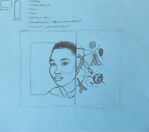
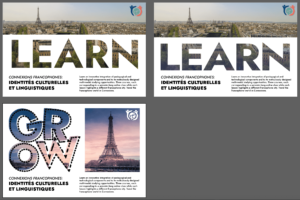
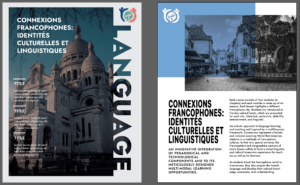
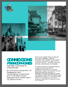
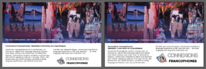
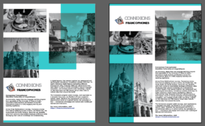
Notes: The process of designing an ad for the UTFC textbook has been an educational and enriching journey, one that has profoundly impacted my growth as a designer. The collaborative process of mocking up various logos and textbook ad placements allowed for an in-depth exploration of visual composition and placement, making me more attuned to the iteration processes of graphic design.
A pivotal aspect of this project was the recognition that the provided text was not final. This underscored the indispensable role of well-crafted content in effectively conveying the ad’s message, reinforcing the notion that design and content are linked, and that they should evolve in tandem. This realization sharpened my understanding of the importance of close collaboration with copyediting services, as the quality of content is equally as crucial as the visual design.
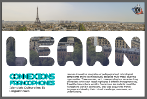
The request to move away from stereotypical representations of French culture, particularly images of Paris and the Eiffel Tower, presented a captivating creative challenge. It necessitated an exploration of alternative imagery that authentically represents the rich tapestry of the francophone world, pushing me to think outside the box and break free from clichés in design.
In summary, this project has been instrumental in enhancing my grasp of the interplay between design and content, reinforcing that successful design emerges from a harmonious relationship between the two. It has also heightened my awareness of the significance of cultural sensitivity and the need to challenge preconceived notions in design, ultimately making me a more versatile and culturally conscious designer.
