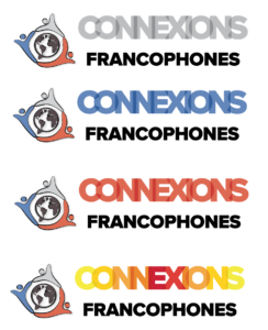
Summer 2023 UTFC Logo
Project: UTCF Logo
Notes:
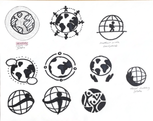
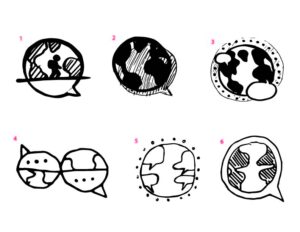
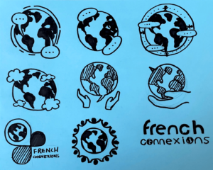
Designing a logo for the UTFC textbook was a transformative experience that deepened my understanding of logo design and its nuanced aspects. The initial stages involved the crucial task of outlining key sections and call-to-actions, which served as a foundation for the logo’s design. The concept of travel, language, speech, and internationality was a multifaceted challenge that required thoughtful exploration. The globe and speech bubble combination emerged as a compelling visual metaphor for an international community and effective communication. The iterations and experimentation with the layout of the Earth and the speech bubble allowed me to strike a balance between subtlety and clarity.
One pivotal moment in the design process was finding a way to represent continents and languages without being overly literal. The idea of rendering continents as speech bubbles and incorporating dots around the Earth to enhance the sense of connectivity added a layer of whimsy that aligned well with the tone of the project. It was a lesson in the power of visual metaphor and how it can communicate complex ideas in a simple yet evocative manner.
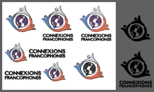
The challenge of demonstrating connections among cultures and people was particularly instructive. The suggestion to have people around the globe touch to symbolize these connections prompted me to think deeply about the logo’s narrative and its ability to convey a sense of unity and harmony. It underscored the importance of storytelling through design and the need to engage the audience on an emotional level.
The feedback to focus on Africa, Europe, and North America while making them more recognizable in the design taught me about the importance of balancing symbolism and clarity, especially in a logo intended to be scaled down to small sizes. This fine-tuning process enhanced my attention to detail and my ability to make design decisions that prioritize the core message.
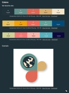
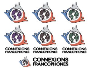
The request to change the logo’s color scheme to blue, white, and red to reinforce the link to French culture and to outline all the people in black, with additional adjustments to character colors, emphasized the power of color psychology and cultural references in design. It taught me that color choices can significantly influence the viewer’s perception and understanding of a visual identity.
In summary, the process of designing the UTFC textbook logo was a rich learning experience. It sharpened my skills in symbolism, cultural representation, and visual storytelling, making me a more thoughtful and versatile designer capable of creating designs that effectively communicate complex ideas while engaging and resonating with the audience.
