Fall ’23 STA Roster Poster
Project: Fall 2023 STA Roster Poster
Client: LAITS
Completion Status: Due Sep 22
Staff guidance: De’sha
STA team members: Leilani
Description/plans: I’ve been working on different layouts/ideas for the STA Roster Poster. I have been testing various patterns and shapes to try and capture the essence of Carnival without it being too literal. My overall color palette for these drafts was influenced by the inspo references I’ve gathered thus far. It’s hard to create a balanced design with so many patterns and shapes, but these elements are very prevalent in Carnival visuals.
Poster #1: Audio, Design, Project Team, Video, and Tech Integration (34 STAs)
Poster#2: Classroom Support, Computer Support (35 STAs)
Mike ended up really liking the last draft, so that’s the direction we’re heading in as of right now:)
Branding: Logo Design Training
Project: Fintastic Shack logo design
Client (hypothetically): Fintastic Shack
Description/plans: Your client is The Fintastic Shack: a newly founded family-owned seafood restaurant. The family is very friendly, fun, and loves a good pun, so they would love it if you could incorporate some of that humor into your design.
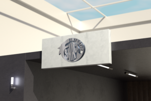
Update: I mocked up the two logos on some business assets to get an idea of what the vibe brand will exude with each logo/ color variation. I honestly don’t have a strong preference for either one, but keeping in mind this is a family-owned restaurant (who has a sense of humor) the red color might be a more fun color concept for them.


