Branding: Logo Design Training
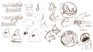
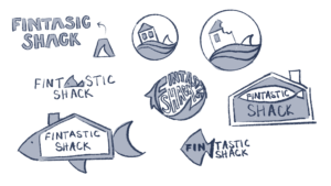
Project: Fintastic Shack logo design
Client(hypothetically): Fintastic Shack
Description/plans:
- Your client is The Fintastic Shack: a newly founded family-owned seafood restaurant. The family is very friendly, fun, and loves a good pun, so they would love it if you could incorporate some of that humor into your design.
I tried to incorporate a fish or house/shack motif in every logo variation since the family’s restaurant name itself is a play on words.
Carver Wall Label
Project: Carver Wall Label
Client: Carver Museum
Completion Status: Started August 25, 2023
Staff guidance: De’sha
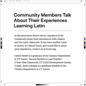
Description/plans: This label will be used in the Carver Museum. Document solutions will be printed, so we need to ensure it is a print-ready PDF file for the final asset. Add a header and body text that fits the style of the existing exhibit labels and make sure it is legible.
This project was overall pretty simple. We just ran into a minor hiccup with the fonts of the model pdf not processing into Adobe Illustrator, but it was sorted out quickly. I’m not sure if this is the final text for this graphic, but I am told we will receive it soon.
Animate Simple Course Graphic
I’ve always wanted to obtain a better understanding of Adobe After Effects because it seemed like a vital tool for professional video editing. Firstly, I created my backgrounds and text assets in Photoshop and imported them into After Effects as separate layers. I gradually compiled images of printmaking tools from the Noun Project and used Illustrator to image trace them (cleaner edges for resizing). I used a lot of experimentation with masks, speed, and transformations to make the course graphic animation come to life. The inspiration for this course graphic came from a printmaking class I took during the Learning Tuscany program this summer. Sadly Enrique has left UT Austin, but I wanted to make something to commemorate the printmaking class. Although the graphic isn’t super polished, I am very proud of completing it and gaining more After Effects knowledge.
Creating an 8-bit Animated GIF
While I wait for tasks to start rolling in I decided to complete the Animated GIF training. I don’t use Photoshop very often when drawing, let alone animating so this was a nice change. The process was easy to follow but I’m wondering if I can create more complex GIFs with more practice.
Race Lab Logo
Project: Resilience and Adversity (in) Children’s Ecology Lab Logo
Client: Professor Ibekwe-Okafor
Completion Status: Aug 21, 2023
Staff guidance: Maddy, Valerie
STA team members: Luisa
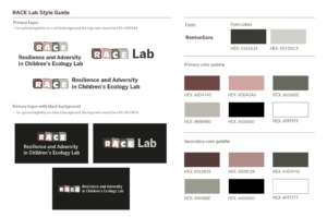
Description/plans: Create a well-organized style guide for the professor to refer back to during the development of the research website. The style guide should be specific and easy to understand for the client.
When I left for summer I handed off the RACE Lab logo assignment, which I believe was passed to Maddy (I hope the new PR position is treating you well!) and then to Luisa (grad school will be awesome!). On my first day back in the office, I was asked to create a style guide for the professor to reference for color palettes and fonts. Valerie asked me to specifically outline when certain font colors should be used, so there would be no confusion about the color switches. It felt nostalgic to revisit this project since I was initially assigned to it last Spring semester by Maddy:’) I’m glad it was completed and I hope to see it uploaded on the website sometime in the near future!
Reflection: I was surprised to hear the RACE Lab logo assignment wasn’t finished yet, but it was the perfect task to transition back into LAITS with. I remember having a lot of fun brainstorming ideas for this logo and receiving feedback from the client and Maddy. It feels almost ironic that I started this assignment last year and now I’ve wrapped it up with the style guide:)


