Week LXXV
Biostats logo
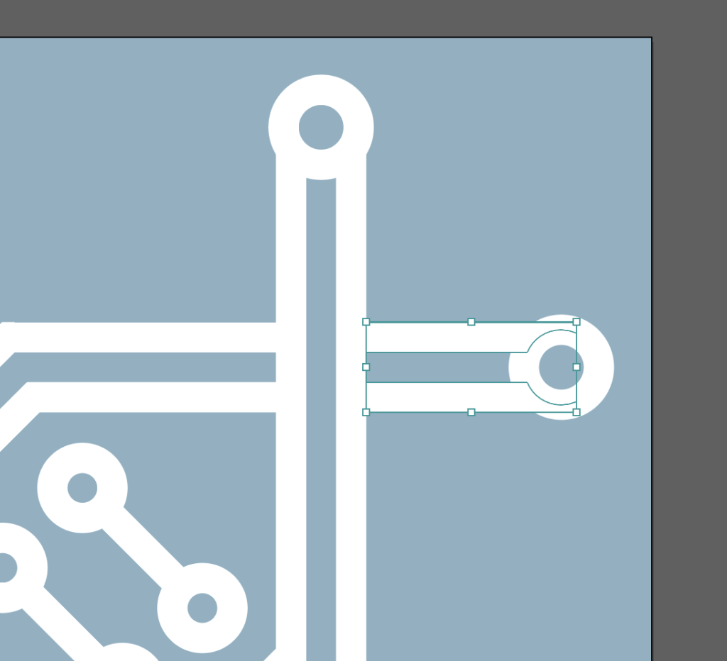
Mostly just worked on this this week! One thing I did was make the vector logo an actual transparent vector. The old version had a lot of opaque fills for the overlapping sections. 
It took some creative use of the pathfinder tool to slice it up the right way.
Unfortunately the end result isn’t that impressive at a glance because the goal was to make it visually identical to the old version, but trust me that it took a lot of work.
Also, the animation. This went through a lot of iterations, most of which I didn’t export, but here’s the final (?) one.

