Week 14
Project: More Psych Lab Migrations!
Project: Developmental Cognitive Neuroscience Lab Website
Client/Prof: Department of Psychology
Started on: April, 2023
Completion status: Complete
Staff guidance: Stacy Vlasits, Marianne
Description/plans: Move more content from the current existing lab website to an updated theme.
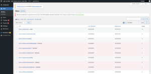
Thought that the Chruch-Lang lab was the last website I was going to migrate? Well you thought wrong. There are multiple psych websites that still need to be migrated since a lot of them are using outdated templates and logos. The David Buss lab, is the next site that I will be migrating and there are many more psych lab sites! All of these sites are part of a multi-site on Word Press. A multisite is a cluster of websites under the same dashboard that are managed/maintained by the same people. So at the moment I am a superadmin for all of these psychology lab sites T-T.
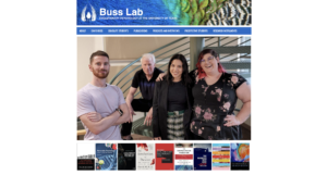
This is what the current David Buss lab website looks like:
You can take a look at it here.
I am going to move all the content of this site into the template that I previously posted about that Marianne made once again. The workflow for this task is to make a clone of the new template and just save/copy all the photos, elements, and content from the previous website into it. This is fairly simple in hindsight but sites can have a ton of content and moving everything over can actually be quite tedious. After the first migration I did last week, this one was much simpler. Because of WP’s very block modular layout across most of its themes, I could copy and paste block elements instead of have to photo each photo or paragraph one by one in the website. Another thing is making sure all the component look good and respond well in the new template.
Two of the pages I spent the most time on were the Books and Graduate Students (Current lab members) pages. This was mostly because I have to download the images and resize them so that the layout of the page would look cleaner and so that all elements would have the same dimensions.
The home page is also a challenge since I’m attempting to replicate the look of it in the original website while also making it responsive.
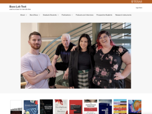
This is one of the first ways I layout the cover image and the books out. I thought it was sort of awkward looking, all the books were different sizes and they did align with the cover image. To top it off the cover image was just oddly large and while it have have fit that mid-2000s vibe in the original, it’s not cutting it in 2023.
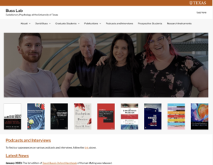
This is what I decided on (picture below). I cropped the height of the cover image and made it wider and also cropped/resized all the books images so that they would be the same dimensions. I used a lot of containers to accomplish this, all the the slot where the books are in are containers. Check it out here


