Week LXVIII
A few things this week. One of them I actually got to design from scratch!
TGDP 6
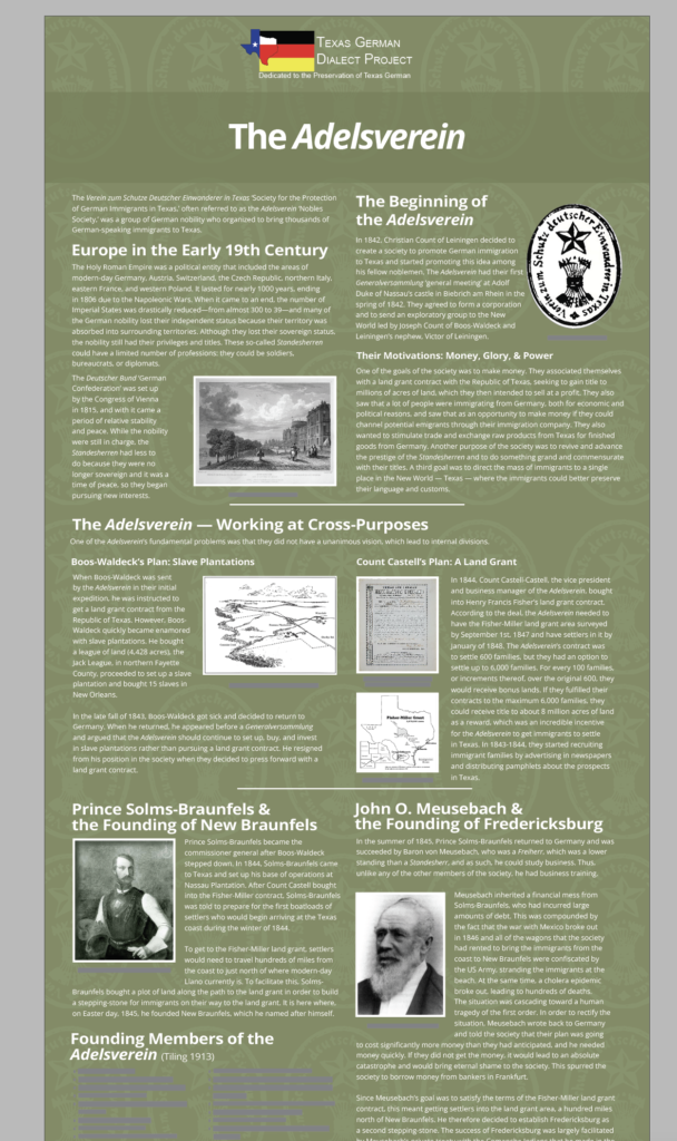
Several rounds of edits which consisted of a lot of tiny line edits. For the last one, I finally got around to a background. My first idea was a more intricate escher-y pattern, but I think simple works best here.
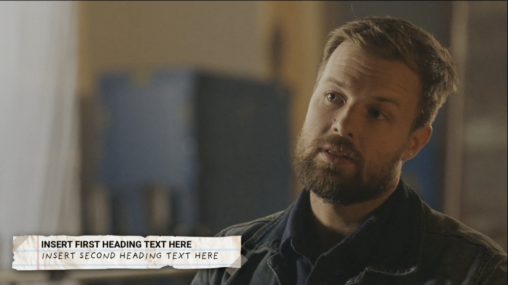
STA Presentation – Lower Thirds
Yay! A design project for me, and I got to use grainy textures?
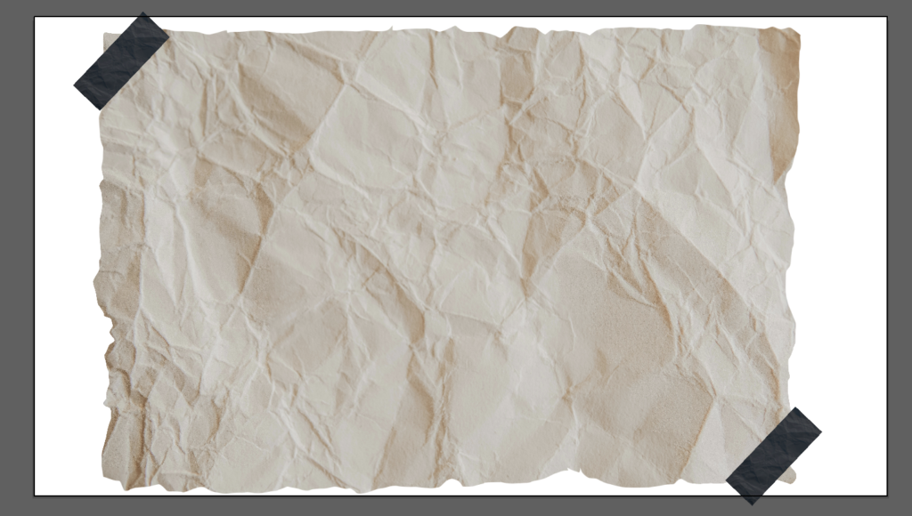
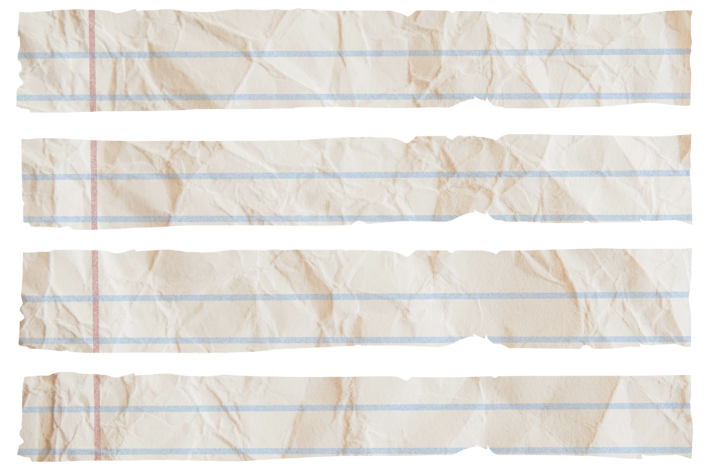
Unsplash has a good paper texture, which I trimmed the edges of as a test. I also used it for the tape, cropping and darkening it.
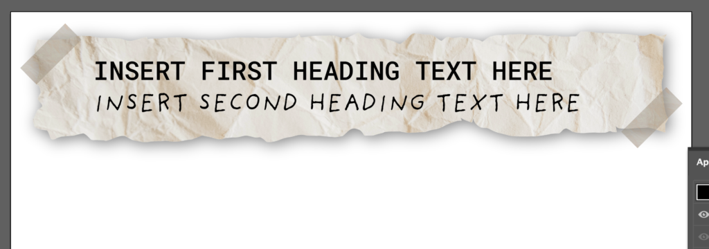
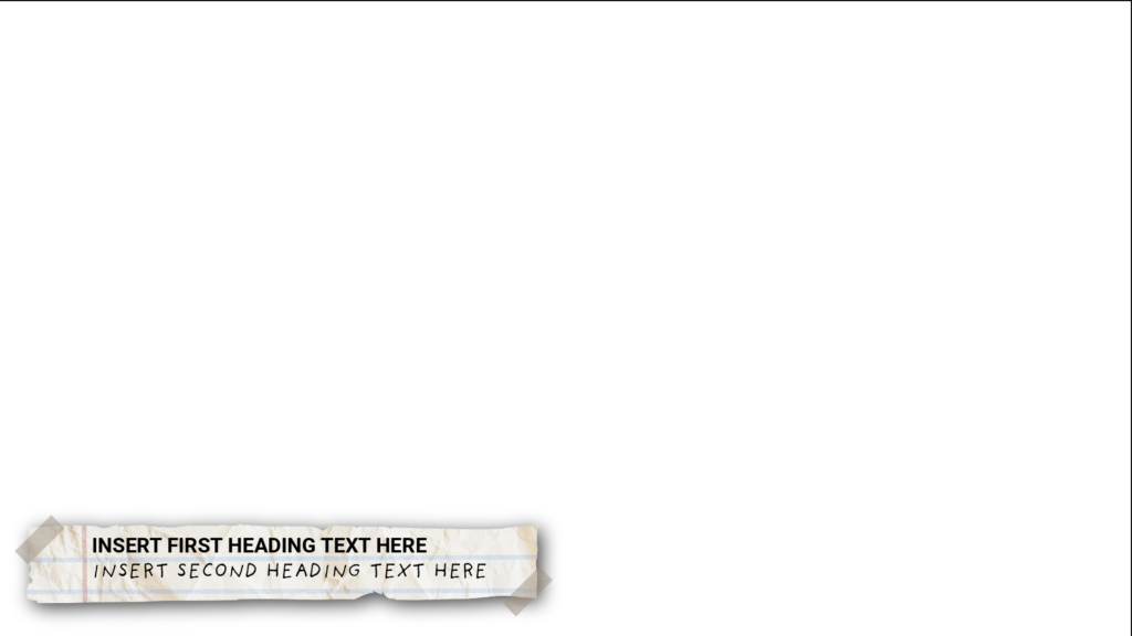
Maddy suggested clear scotch tape, and maybe some kind of Roboto if we want to mix fonts with the handwritten one.
Then, I got the suggestion “Something now is feeling pirate map-y and we want to feel more school notebook-y.”
I cropped several variants in case we need to mix it up. Here, below, is a mockup of it with a shadow effect.
That was the most fun design thing I’ve gotten to do in a while. Sadly, it only lasted a couple days.
STA Presentation – GSD Posters
So, it turns out I’ve been chosen to present! I don’t have much to show off visually yet. The powerpoints have a template, and I’ve just started sketching an outline. Soon, I’ll have… something to show. It will be an interesting narrative, because the GSD posters were more of a logistical than a design task – we had a template, and most of the actual work was photo sourcing, but it was an art to coordinate all of it I suppose.
