Meaningful Brand Systems pt.1
For the first activity in the meaningful brand systems training, I was supposed to conduct research about the College of Liberal Arts’ Website. I found it interesting how their site is strongly influenced by UT’s branding, but they also find ways to be unique in their design. Here are some of the notes I took while researching the site.
Conducting a Brand Audit
College of Liberal Arts at UT
Visual Material:
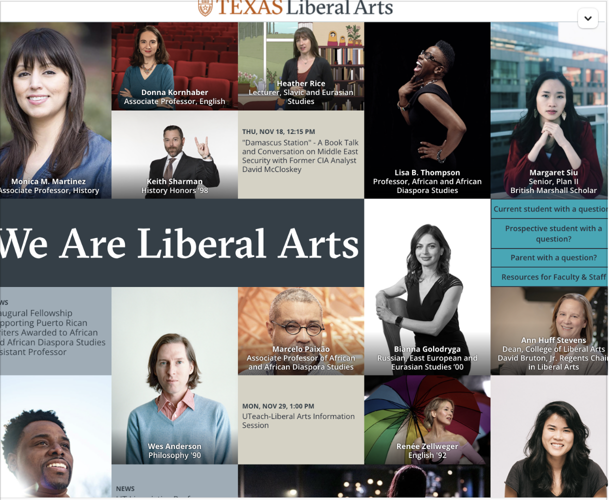
- Homepage “banner” is used the showcase members in the department. This department uses photography instead of illustrations on the site. Also, the poses of the members on the banner convey “audacity” similar to UT’s branding.

- They still use UT branding for the site. The only difference is that “Liberal Arts” is attached at the end.

- The site also uses the standard UT branding colors. They mainly use the tan (#d6d2c4), the light gray/blue (#9cadb7), burnt orange (#bf5700), and dark gray/blue (#333f48).
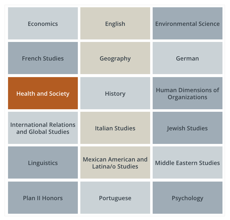
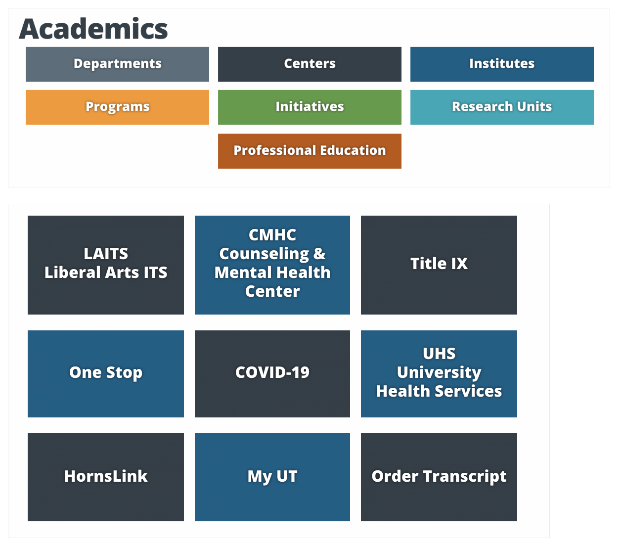
- On other parts of the site they will use different color schemes with the UT secondary branding colors.


- In terms of Typography, the College of Liberal Arts utilizes the UT chosen typeface of BentonSans in different variations.

- The Liberal Arts motto is “Translating a liberal arts education into a world of opportunities.”
Assess Findings:
The college of liberal arts stays really close to the branding standards of UT as a whole. They use the same color scheme, typeface and imagery. I believe that liberal arts is a little more creative in how it utilizes UT’s branding, because at first glance it feels different. Therefore, I believe the organization of the sight is quite unique.
This showcases the the college of liberal arts has the same vision for success for their students. Just like in their motto, they talk about creating “world opportunities” which translates to UT’s slogan, “what starts here changes the world”.
In terms of the site, there are a few inconsistencies with the padding on some of their headers but overall, it is a well executed site.
Final Questions and Reflection:
After reviewing UT’s branding Guidelines, it is now easier for me to notice what is in brand with UT. I never knew that even the way the professor’s photos where taken where a part of how UT branded themselves. Overall, it think that has just showcased the subliminal messages UT has been providing to their students. I see UT as a school that thrives for success no matter the obstacle and being in this environment, I have learned to reach in the same way.
With all the resources and opportunities UT provides, it is had not to take risk and go towards your goals.
What I have learned:
- I really enjoy taking notes and analyzing different parts of a brand.
- This training has given me a lot of insight about how to construct my own brand or how to work with other brands that are already formed.
- That there are a lot of components that work together to make a successful brand identity and a strong one will have “subliminal messages” that represent who they are.