Web Accessibility Training
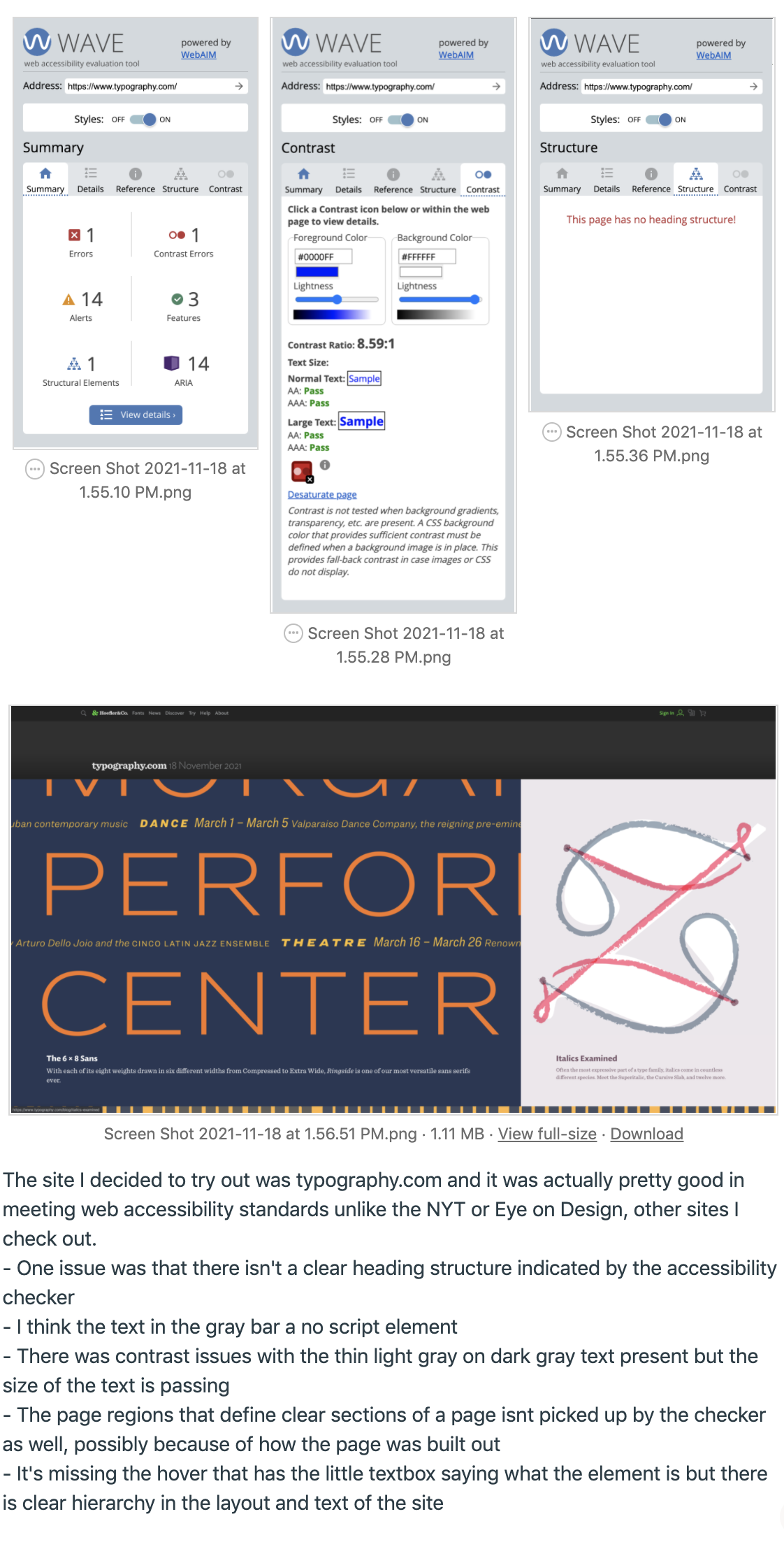
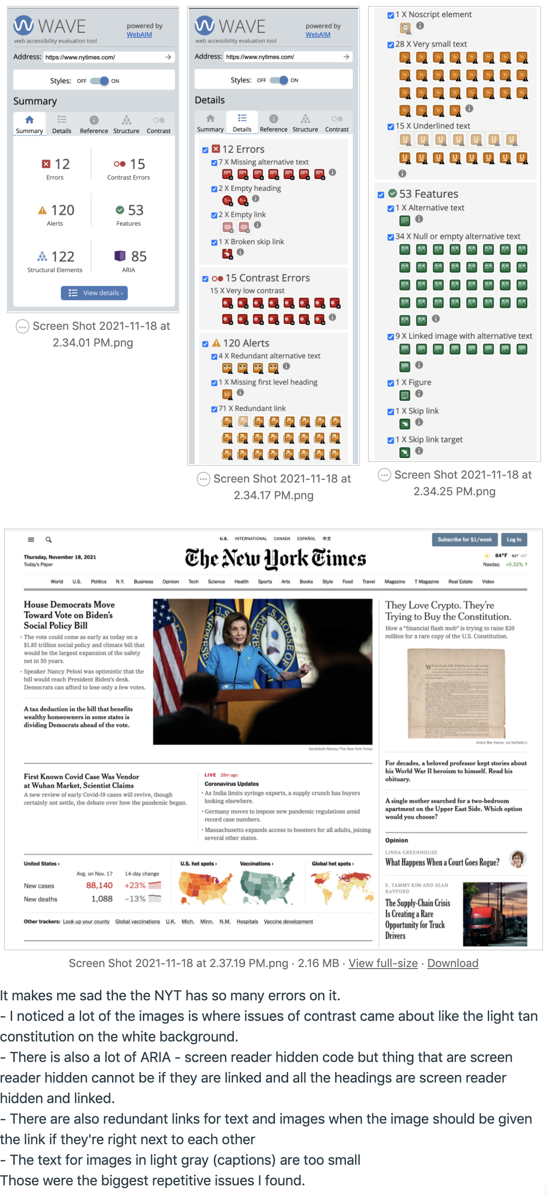
For the web accessibility training I reviewed typography.com and the New York Times. Surprisingly, the NYT website had a lot of accessibility issues and is not a friendly site for visually impaired individuals. Typography.com did very well besides not having a clear header. After that I looked at a FIGMA site that was mocked up and had to quiz myself by listing out as many things wrong with it as possible and then compare it to the answer sheet.


