Hello!
Most of this past week has been dedicated to beginning the AFR 303 Project.
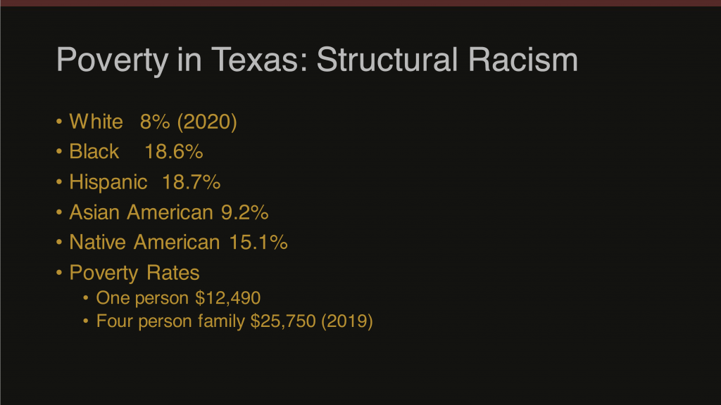
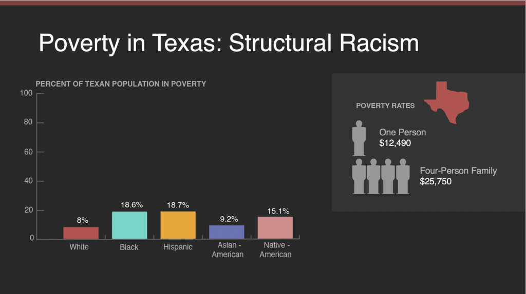
I worked with Abriella and Sheryl to create graphics for the slides for the lecture on 9/29. We had a deadline Monday 9/27, which will be consistent for our lectures in the future. The first graphic I created was for a slide documenting the rates of poverty in Texas by race. The initial slide we got was a bit hard to read, but fortunately not too confusing.
The primary issue here is visual spacing and lack of illustration. Without a graph, the statistics sit in a more abstract zone that may be harder for students to comprehend. Additionally, the slide is very left aligned and there’s a lot of negative space on the right that can be worked with.
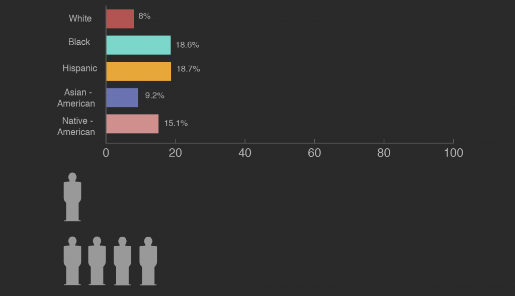
I used Maddy and Abriella’s stunning style guide to guide me through the process of making my first graphic. As I was getting used to the process, I struggled a bit to figure out how to align a large bar graph on a 16:9 slide. I went through some trial and error…
This version worked to omit vertical negative space but had the same problem as the slide above – too much space on the right.
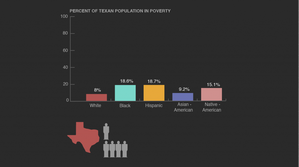
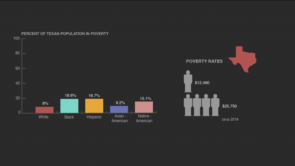
This version was an improvement, but the two segments were cramped and there was a ton of space on both the left and right sides that could be utilized. I kept moving things around until finally I determined that side-by-side seems to work the best. (I also decided to add a little Texas next to the people statistics because (a) it helps the graph signify that this is in Texas and (b) it is cute.)
This way both graphs get enough space, and since the graph is pretty short horizontally, the negative space is less than if they were stacked vertically.
On the final slide, Maddy added a separate small, lighter box around the Poverty Rates graph which really helped segment the two graphs. Seeing this has inspired me to use that technique in my next set of graphs!
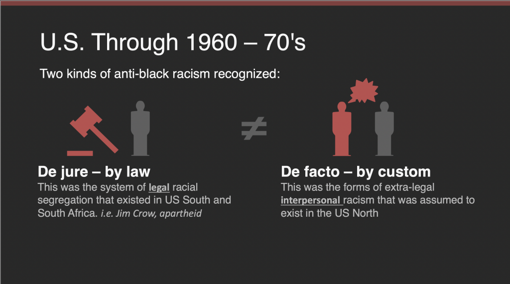
For the second slide, I created a graphic for the terms “De Jure” and “De Facto.” The initial version I had was a bit too busy, and Abriella assisted me with creating a version that is a bit easier on the eyes.
Maddy added this into the slide and made it look great!
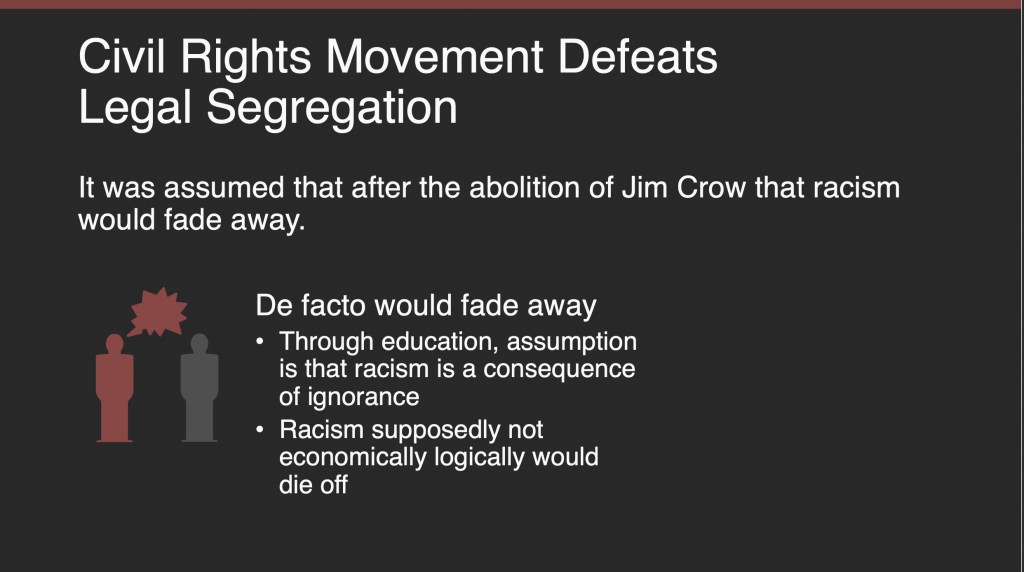
I definitely agree with the decision to make the not equal sign much smaller. The De facto slide graphic was also used on another slide:
I will get my assignment for next week either at the end of today (?) or (more likely) tomorrow. This has been very fun to do so far, and I am excited to create more now that I am more familiar with the style guide and formatting.
Wrapping up the Animation Stinger refresh…
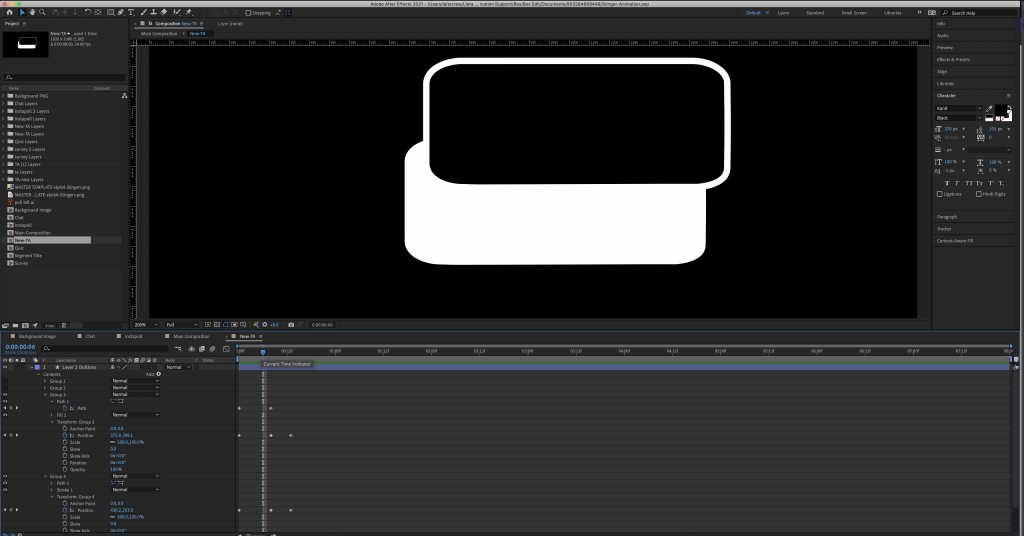
After over a month of work, it seems the Animated Stinger refresh project is coming to a close. Ideally, it should be completely finished by the end of next week. I’ve set a personal goal to try and get it done by Thursday the 30th, although time is an infinite, false vacuum and there may be some mistakes to be fixed. But generally. I’d like it to be done. Soon. Here is a sneak peak of the TA stinger animation:
look at her go!
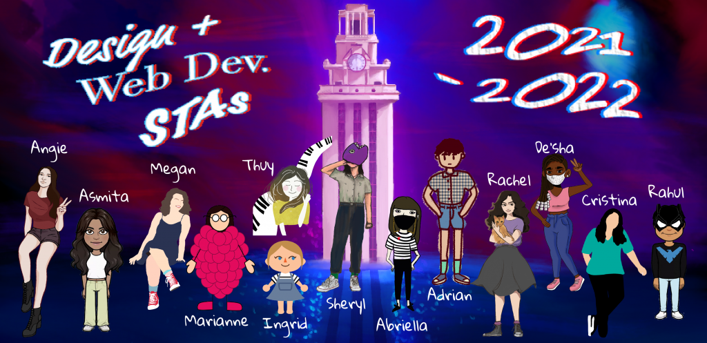
Finally, the Blog Banner.
The gods of Art and Fortune have blessed me (for once), and my blog banner was chosen for the website.
As you can see, I was delirious from sleep deprivation while creating this, and ended up creating UT in an alternate dimension, My initial idea was to have everyone on a moon crater, but I ended up playing around with making the bottom area water, and this sort of happened. As a result, everyone is walking on water in the final rendition…
Everyone’s caricatures are so well-made and cute that it made it extremely entertaining to place them into the banner. I wanted to put everyone closer to the middle, but alas there was not enough space. If you are on the ends, please do not fear, because that’s where the anime protagonists always sit in class. Anyway… please let Marianne know that I apologize for thinking she was grapes and not raspberries. And thank you all for voting for mine!
Now I must stare at my own art all year. Will this bother me? Probably, but maybe it will be a test of strength.
