FTT – Portfolio Tips
Hi y’all! I recently noticed that I am just a few days away from my 200th day of work! So definitively tune in because next post, will be dedicated to that…
Moving on, today I wanted to talk about the portfolio tips Maddy and Valerie gave us on this past Fun Times Tuesdays meeting. I already have a portfolio of my own in development since last summer, but it is definitively not a polished gem and still needs so much more time and attention. But I am done with my summer class now, so I should have plenty of time to dedicate to this matter. This meeting could not have come at a better time!
The first thing they talked about in the meeting was the different site builders there are. But, on that matter I am already biased in favor of Wix, since it’s a site I’ve learned to work on since I was in the 6th grade. (Fun fact: the first page I ever built was a site on Koalas, the different types there are, and stuff like that. Sadly, I can’t link it due to the fact that it was built with Flash and has since disappeared.) I don’t have the premium version, though. But I think that’s probably going to be something worth getting to upgrade my site. I don’t know much about the benefits yet, but I know it allows you to add a favicon, and ever since I learned what they were working as an STA, now I really want to make one for myself.
Moving on, they talked about owning a domain for your portfolio, which is something I definitively need to get. Right now, my portfolio is linked as cvn2010.wixsite.com/portfolio, which is not only a really long title that’s hard to remember, the “wixsite” kind of takes away some of the professionalism out of it. Also, they said Google Domains is a great and cheaper way to purchase domains compared to GoDaddy. So that’s what I’ll be using.
Concerning, what goes into the portfolio, I’m glad to say I’m already good on the One-Off’s department, since I have a bunch of different mockups I’ve done for my advertising classes in the past. However, I need to do better on the Case Study department. The thing is, I have the content for that (also from my advertising classes), but it’s not something I’ve added into my portfolio just yet.
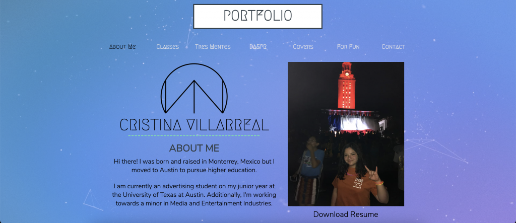
Considering the general formatting of my portfolio, that’s something that’s always concerned me since I started it, because, as of right now, I don’t think it looks very professional and I also don’t think I’m taking advantage of the space, either. Right now, it the main page looks like this (the background image is a gif, though, I really like that):
(It’s the logo from the Logo Design KB for me…)
Also, as you might have noticed, I have also not added a freelancing tab yet. But to be honest, I’m going to wait till this week’s Fun Times Tuesday meeting to even consider that. As of right now I wouldn’t really know how to approach that topic.
Anyway, the final piece of advise I wanted to talk about was something I specifically asked for: would it be better to have more pages with less content or less pages with more content? The answer was pretty much, it depends. But, upon further elaboration Maddy and Valerie helped me realize that overall I just (personally) need to have less content on display on my site. It’s not about the quantity of content you put out, but the quality of it, and I definitively have projects I’m not necessarily proud of on display in my portfolio… I’ll have to change that.
All in all, I really learned a lot from this presentation and I’m glad we had the time and opportunity to talk about that. Maddy, Valerie, if you are reading this, thank you very much, and stay tuned for my updated portfolio (coming soon to a theater near you)…
