Part 1: Design Updates
OCILL
Even though there isn’t much to show graphically, the content transfer project from OCILL to Canvas for Intensive Turkish 1 and 2 is well underway and making great progress. As of today, we have transferred content fully from the first course and most of the exercises have been approved by the client.
Some takeaways I’ve learned from this project as I hand it off to Poonum and Angie:
- Client communication: as long as there aren’t any misunderstandings, projects are bound to run smoothly. Our communications with the client professor have thankfully been clear and constant.
- Team communication and coordination: a fundamental aspect to working with a team, even if working remotely, is making sure everyone is on the same page
- Written documentation and file structure convention: a really helpful way to keep the project organized
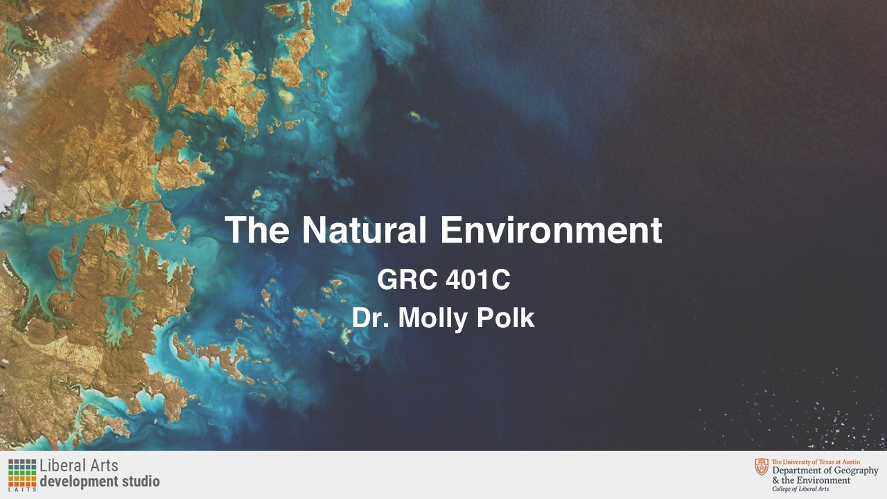
GRC 401C: The Natural Environment Course Graphics
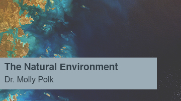
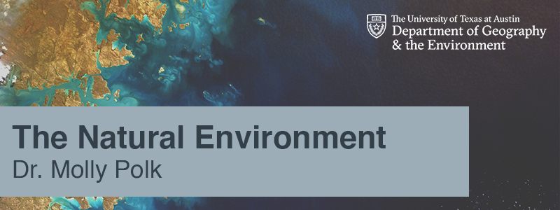
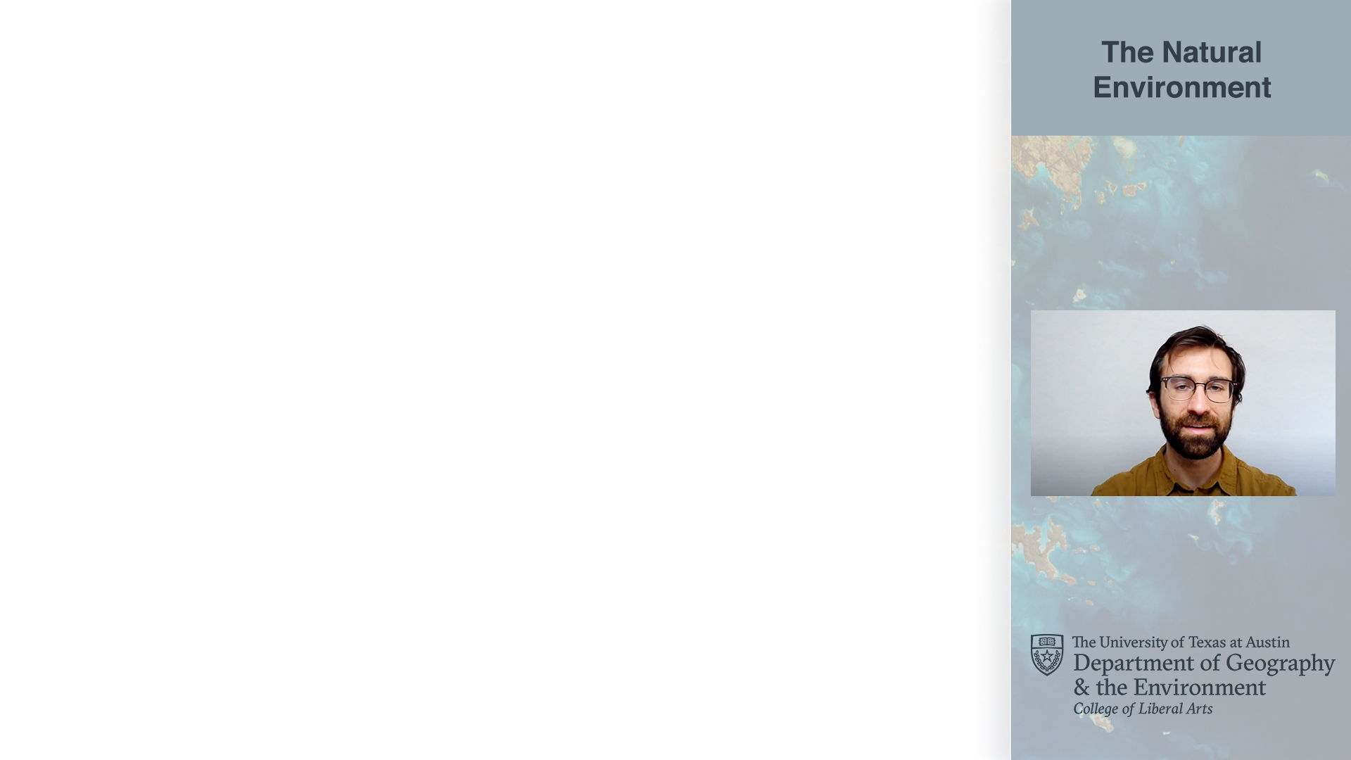
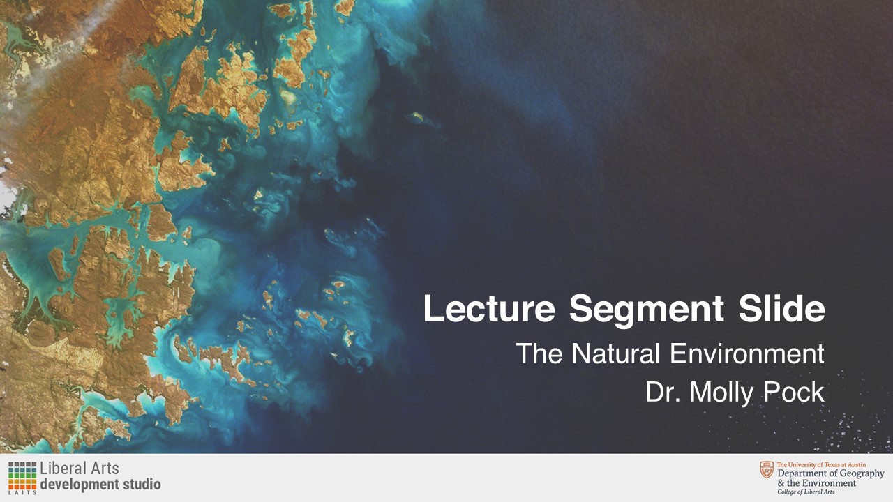
After some feedback from the client, I created a semi-final set of graphics using a specific background image and text box color:
Cascade Web Dev Services Revamp
Even though I wasn’t able to work on this as much as I would’ve liked given that OCILL took more of my time, I really enjoyed going back to Cascade and thinking about how the Web Development Services site for COLA could be redesigned to be more helpful, intuitive and straightforward.
To start, I created a set of four buttons that would act as links to an appropriate help email address. The idea was to design these as simple and straightforward as possible, while still looking consistent with the COLA website style. Consequently, I created minimal monochromatic buttons using UT’s grey and white and Roboto Condensed, the same font used in the COLA websites. Below are examples of how these look:
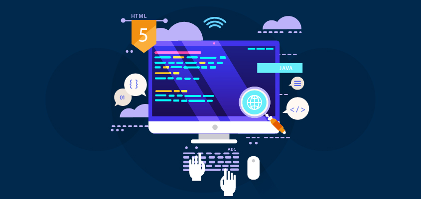
Moreover, I’ve also been looking into the design of the banner for this site. I’ve been using images like the ones below to get ideas as to how can Web Development Services be expressed visually:
As of right now, I have been looking into a similar design that also uses UT’s grey and white (to match the buttons) and Roboto Condensed. So far, I’ve only done two design iterations but I am sure another STA can do much more with these to fully convey what Web Development Services entails in LAITS. Here are my designs:
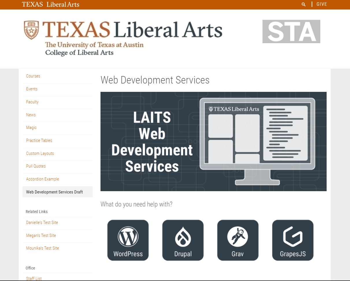
Finally, the below image is a mockup of how the website could look with the items I’ve designed so far:
Part 2: Farewell Letter
Dear Design STA Team,
As my STA appointment comes to an end, I would like to express how grateful and satisfied I am to have worked with such an incredible group of designers, developers, and most importantly, people. Through my experience with LAITS, I am confident to say that I have gained an invaluable set of skills (both soft and hard) that I know I will use and keep improving for the rest of my professional life. Working as an STA was the best thing that could’ve happened to me as someone who is always looking to try new things and work in engaging projects from their inception through completion. It is especially satisfying to see stuff I’ve been involved in around campus, go LAITS!
To Suloni, Valerie, and Maddy, thank you so much for being such a helpful, inclusive, and supporting group of supervisors. It is very refreshing to work for people who see you eye to eye and are very easy to talk to about anything ranging from the dumbest questions about logging into Cascade all the way to cool facts about boba drinks.
To the rest of the STAs, I consider myself lucky to have worked along with such an awesome group of people from such different backgrounds and ways of thinking. You all have taught me things about design and life that I would’ve never thought I would learn in a part-time student job. I am sure that you will all be very successful in your career paths and I can’t wait to see what you end up doing later on.
I hope to visit you all in person soon and keep in touch through social media or on campus.
Thank you again for everything,
Miguel Yapur
