Student Success Tool Logo Final Update
Welcome to the last episode of the saga of designing the upcoming Student Success Tool logo! This has really been a nail biter, but we have finally chosen an official logo for the app, and I’m excited to share it with you. But first things first, Here’s what happened after last week’s update and before getting to the final logo.
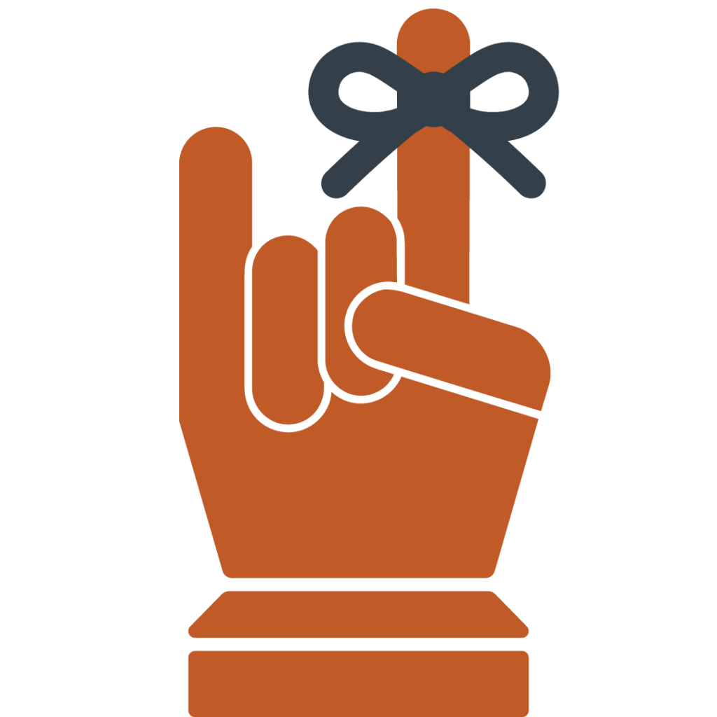
After making suggestions for the client on our pitches for the Ribbon Reminder logo and the Calendar logos, she got back to us with their comments. First she said they really like the Calendar logo, but that they prefer to more forward with the Ribbon Reminder logo. Then, she said that the general consensus among their team was that they preferred the front-facing Hook’Em Ribbon Reminder logo, rather than the back-facing index finger Ribbon Reminder logo that we had suggested. So that’s the one we moved on with. The team also wanted to make a slight adjustment to the logo and add a rounder edge on the thumb of that design, so I did that.

However, it didn’t take long before the team came up with a new adjustment they’d like to try out. This time it was trying to move the thumb down so it could hit both folded (middle) fingers. So, Valerie provided some inspiration pics for me to try and emulate, and I got down to business. But after I made that design come to live it was clear to all of us that the previous version was a more successful design. This is what that newer edit looked like though…
Nonetheless, the following is the final design chosen for the Student Success Tool app that will be featured in the UT app store. Unless there are further edits to be made, this is the end of the road for this project. Thank you for tuning in!
