Data Exploration and Visualization
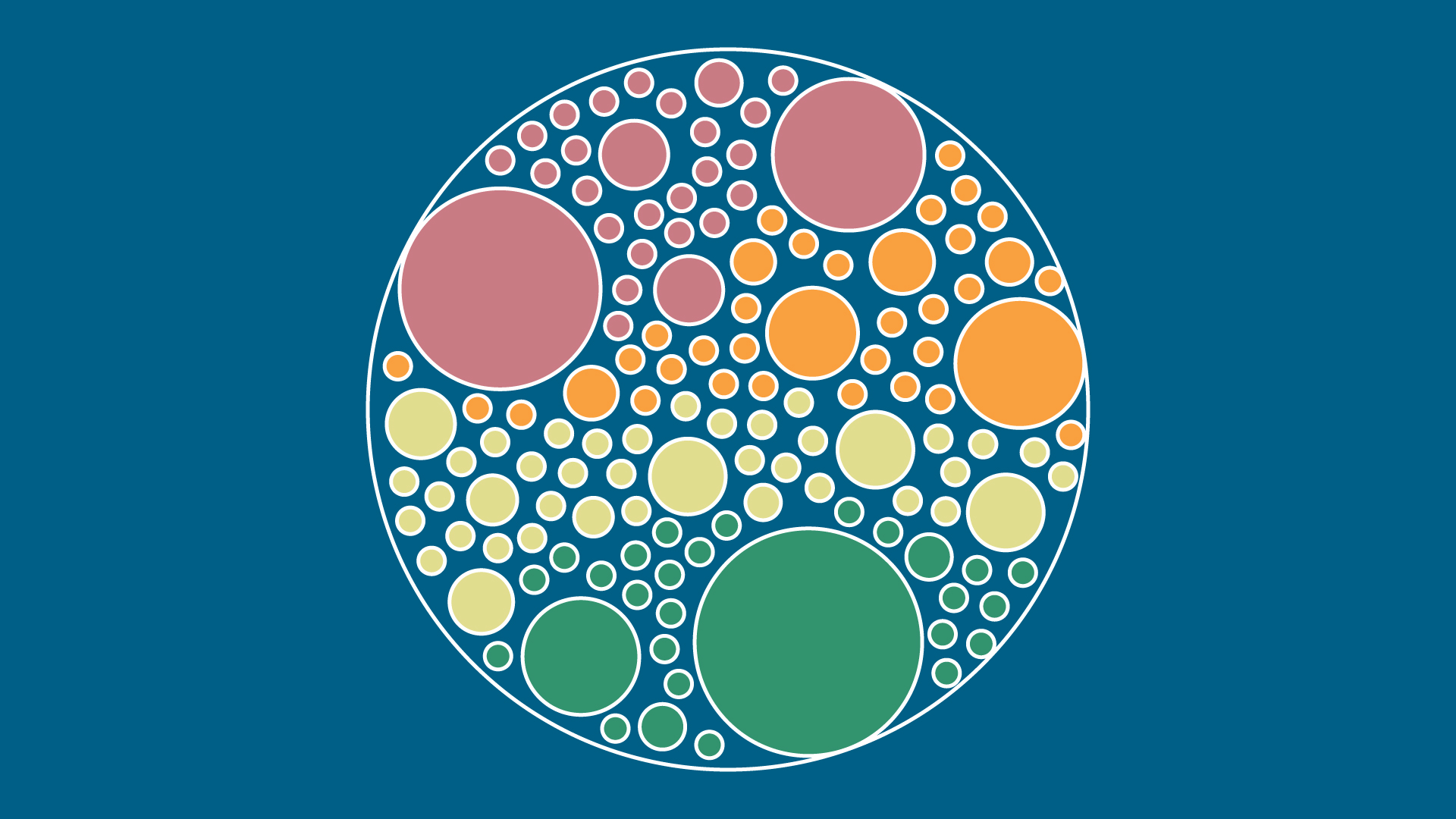
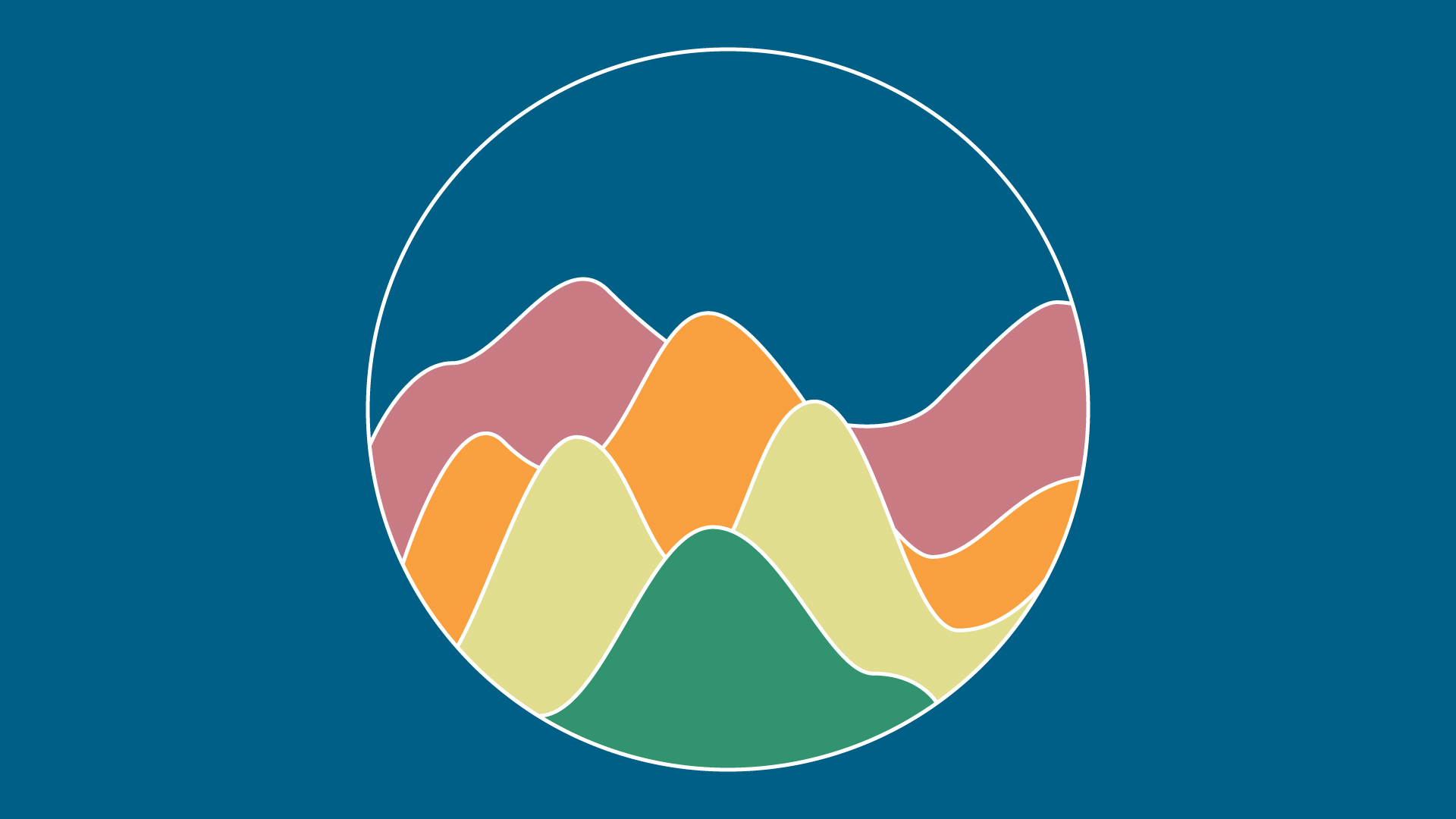
Below are some graphics I’ve been brainstorming to show Aidan on this CSMS course. The professor wants to stay away from conventional bar graphs and pie charts, and instead display information in key ways. I came up with radar charts, bubble charts, stacked graphs, and others seen below:
MSISP LinkedIn Profile Pic
I’m waiting for a client’s approval to start designing an icon similar to the one below, replacing “Moody” with “MSISP”:
New Curriculum Feedback
Throughout the week, we began giving feedback to each other on our new basic trainings.
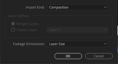
Abriella has been working on the After Effects: Logo Animation Training, and she pointed out there was some specific instructions that weren’t correct for importing files into AE that would result in having all her layers show up at the center of the composition.
After some research on this issue, I corrected the instructions to specify that STA’s need to change the import mode to retain Layer Size:
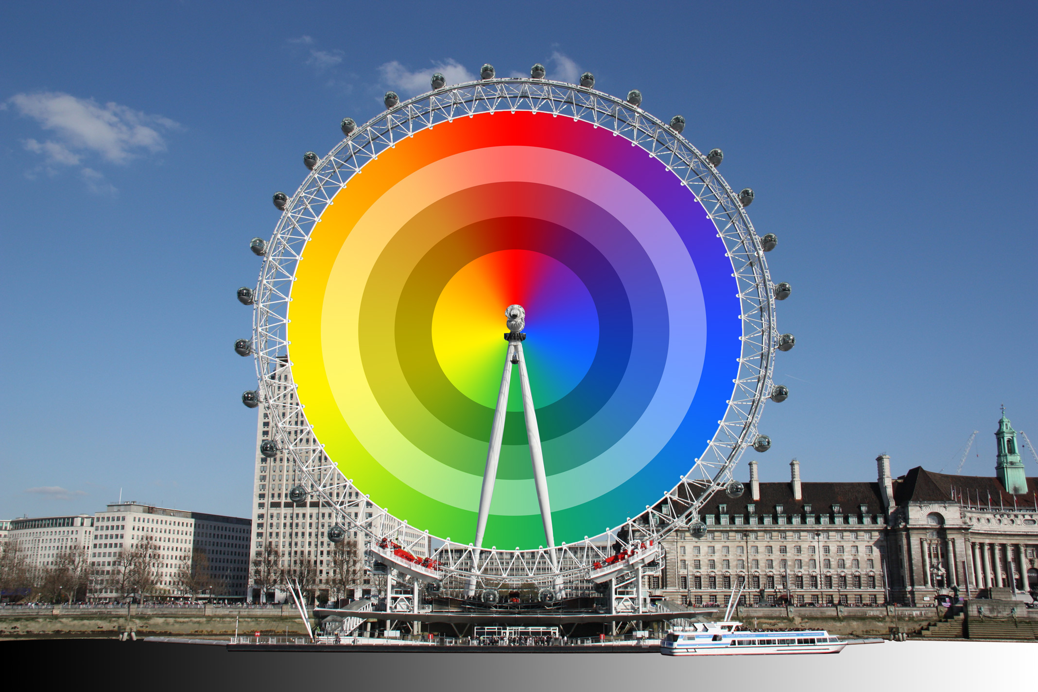
Additionally, I went through the Color Theory KB, written by Cristina, and gave her some comments on what could be improved. I went through both activities listed in this post, creating color wheels and color palettes:
Photo ID’s
I worked on three of these on Tuesday and Thursday:


