GOV 365W Course Graphics
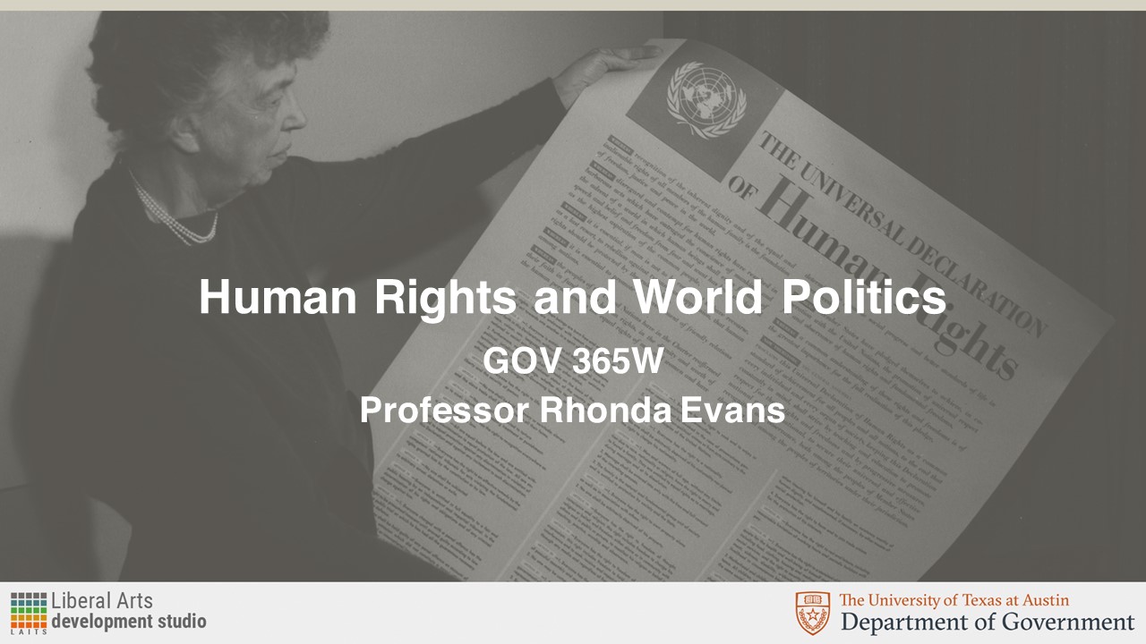
The professor for GOV 365W, Human Rights/World Politics, initially requested just two PPT mockups of using this image as the background:
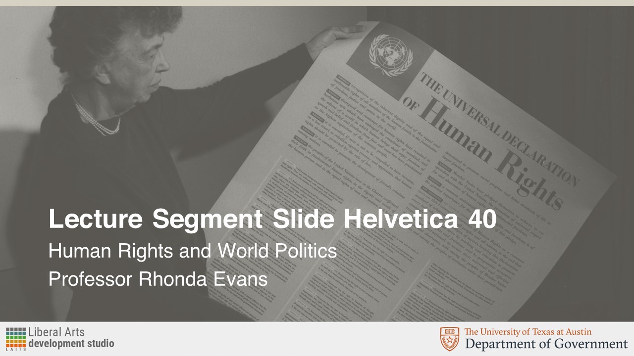
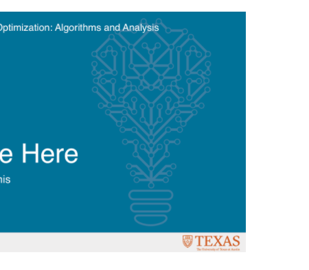
The request called for this image to be overlayed in UT’s Sandstone color. These were the resulting Course Title Slide and Lecture Segment Slide assets:
Later on, the professor requested the following Canvas assets in Sandstone color as well:
Once I got feedback from the client, I was asked to provide them with versions of the Canvas homepage banner and Dashboard graphics in a shade of blue. The reason for this was that the professor feared there wasn’t enough contrast and wanted to “see something brighter, like a turquoise or blue.” Consequently, I chose three different shades of blue on UT’s secondary palette, and these were the results:
As a way to increase contrast, Maddy asked for the background to be kept in black and white and have only the text box be colored in:
I think these look really good and give more contrast between the image on the background and emphasizes the text box for the course on the front. I like the “blue 1” and turquoise options more since they give more of a pop than the “blue 2” version. As for legibility, I think the “blue 1” version is the easiest to read out of the three colors.
CSMS/MSDS Graphics for Animation
This week, I was given the description of five CS courses. The design brief asked for graphics that could be turned into short animations and followed the style guide of previous graphics made for these courses:
ALR: Automated Logical Reasoning (CSMS) – Graphics
Course Description:
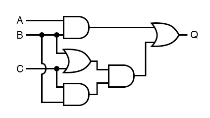
A lot of things in a lot of areas of computer science like Artificial Intelligence, programming language, and Databases, boil down to automated logical reasoning. How do you automate logical reasoning and applications about that especially about program correctness?
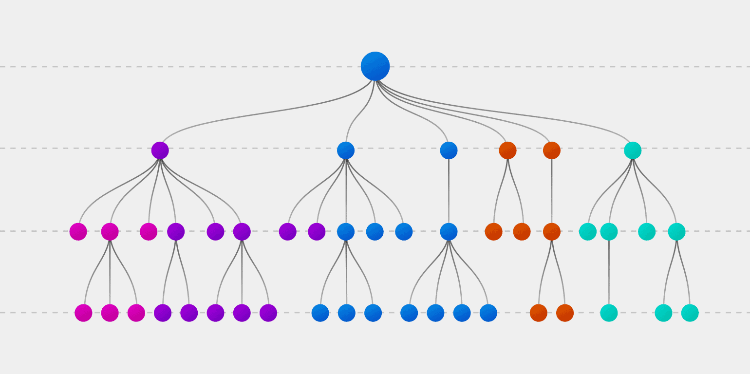
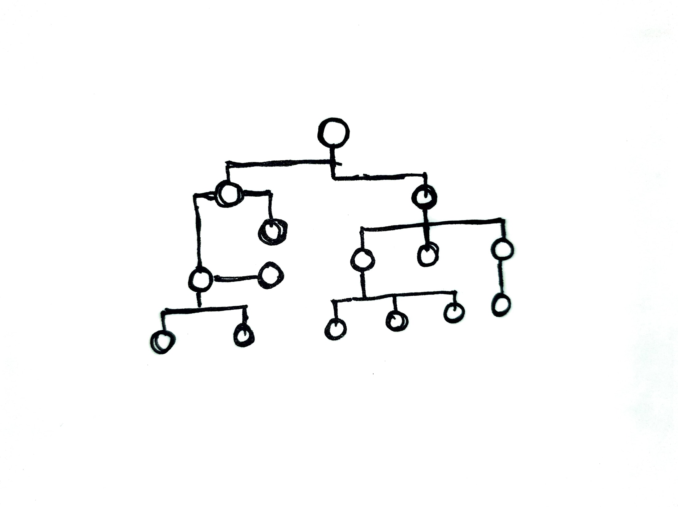
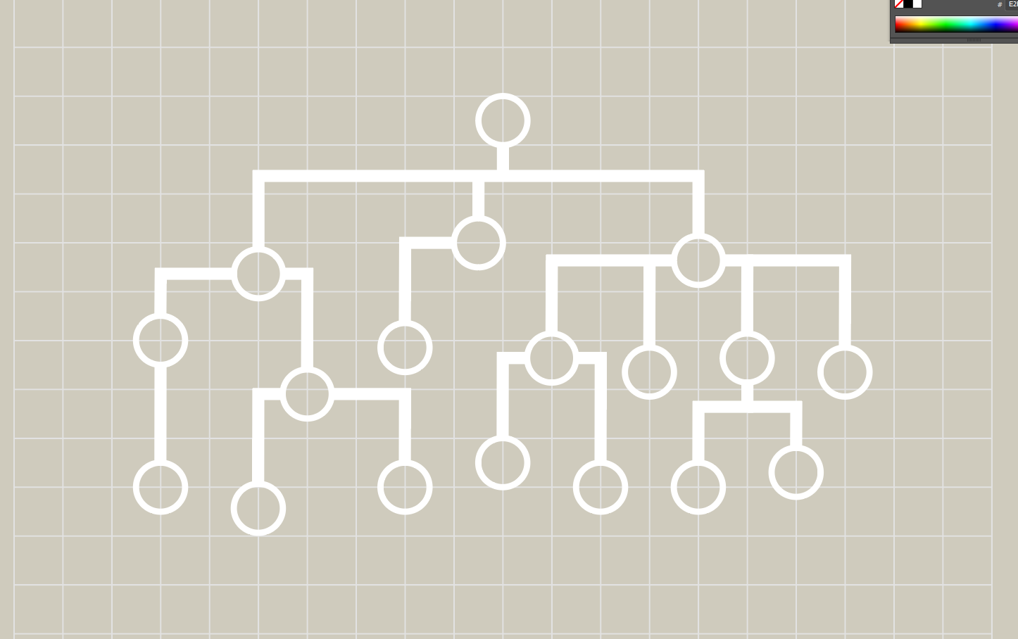
Maddy and Aidan initially liked the idea of a decision tree to reflect the logical reasoning behind computations. Initially, I came up with three different ideas:
1. Decision Tree
2. “Correct Decision”
3. Lightbulb: kind of a combination between the previous two options and also reminiscent of the lightbulb design used for the “Online Learning and Optimization: Algorithms and Analysis” course.
Based on feedback for these, we decided to move forward with the Decision Tree version.
The first version used larger nodes and the lines had different stroke weights:
Maddy pointed out the question of keeping all line weights consistent or emphasizing the difference, like shown between these two images:
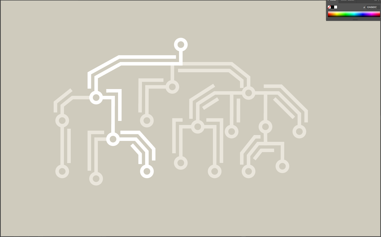
After some feedback from Aidan, we went ahead with consistent line weights and node sizes more proportional to a real-life PCB:
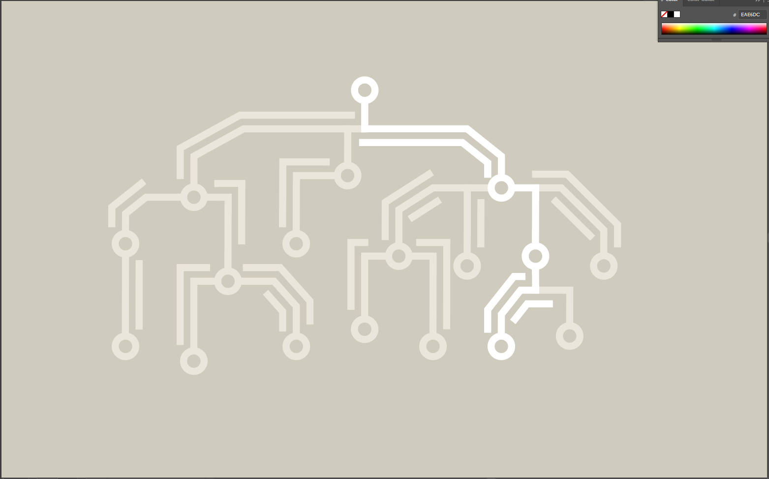
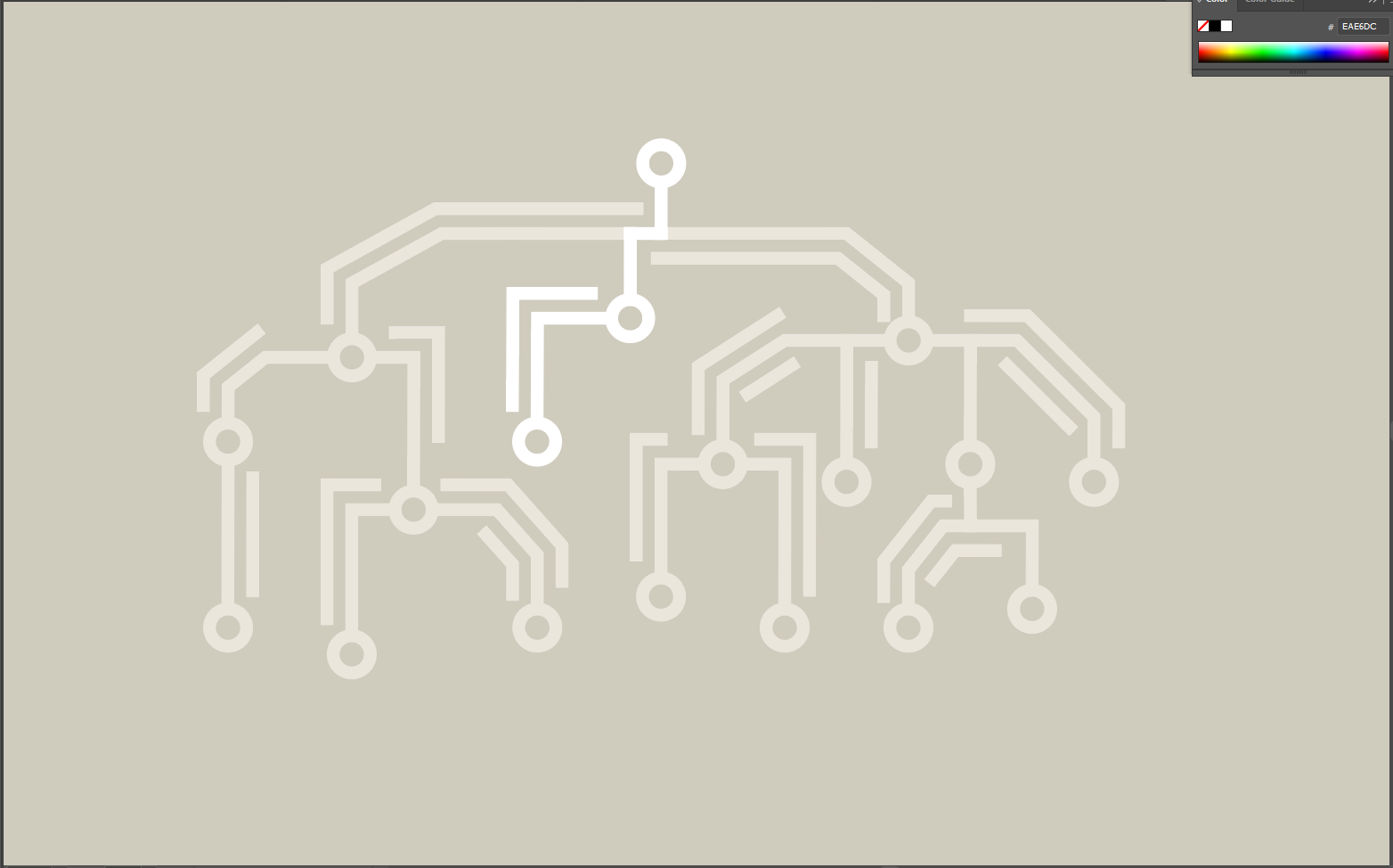
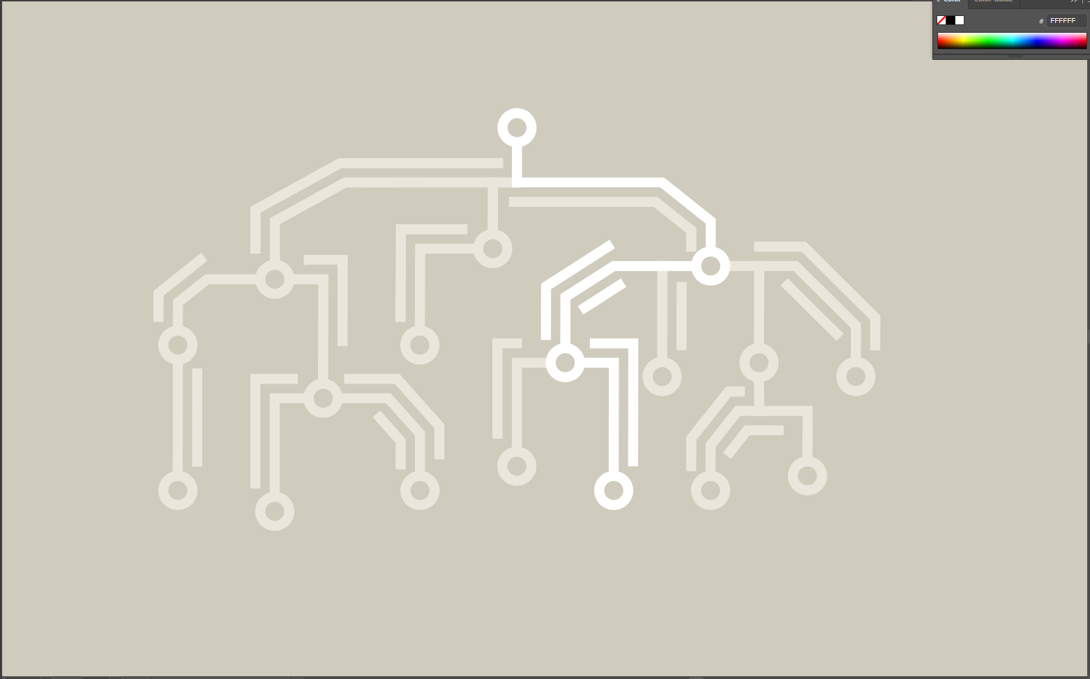
The resulting graphic started looking much better. Here are four images that depict “frames” of a possible way this graphic could be animated:
Later on, Maddy gave me some feedback and asked me to consider a grid layout and a more consistent path direction. This is what the graphic looks like at the moment:
SIMPL (CSMS) – Graphics
Course Description:
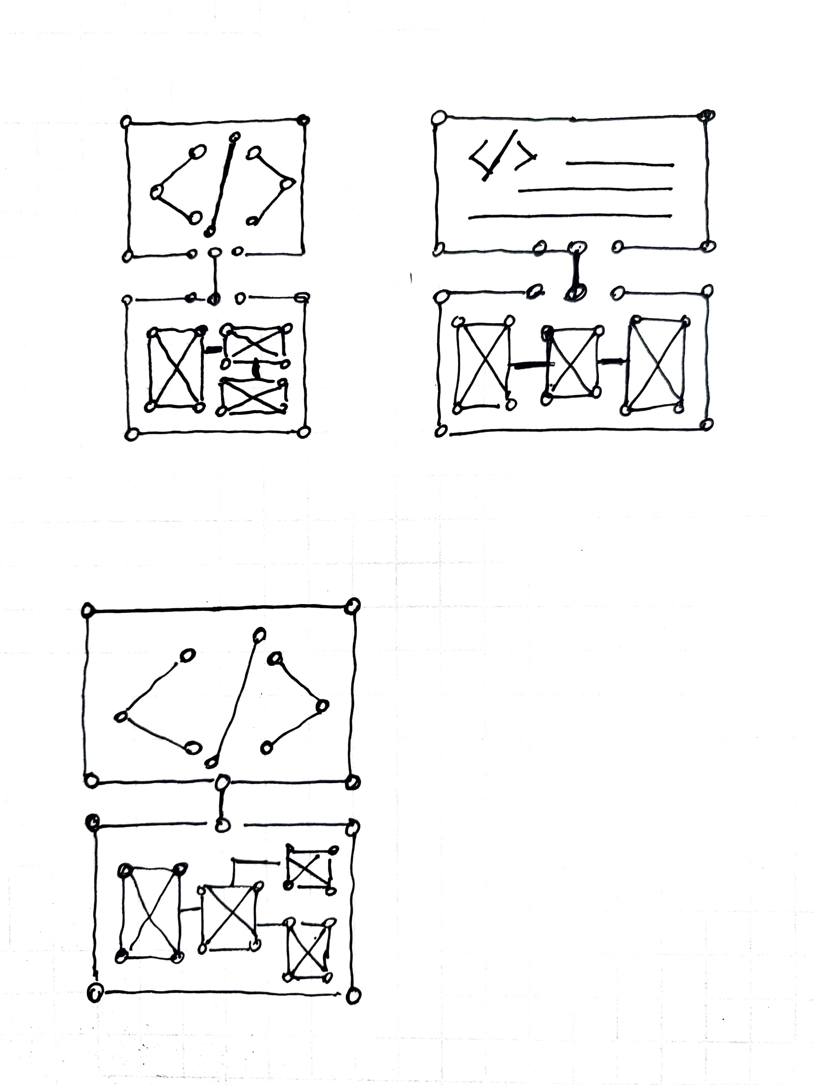
Bridging the gap between high-level programming language structure & low-level implementation details.
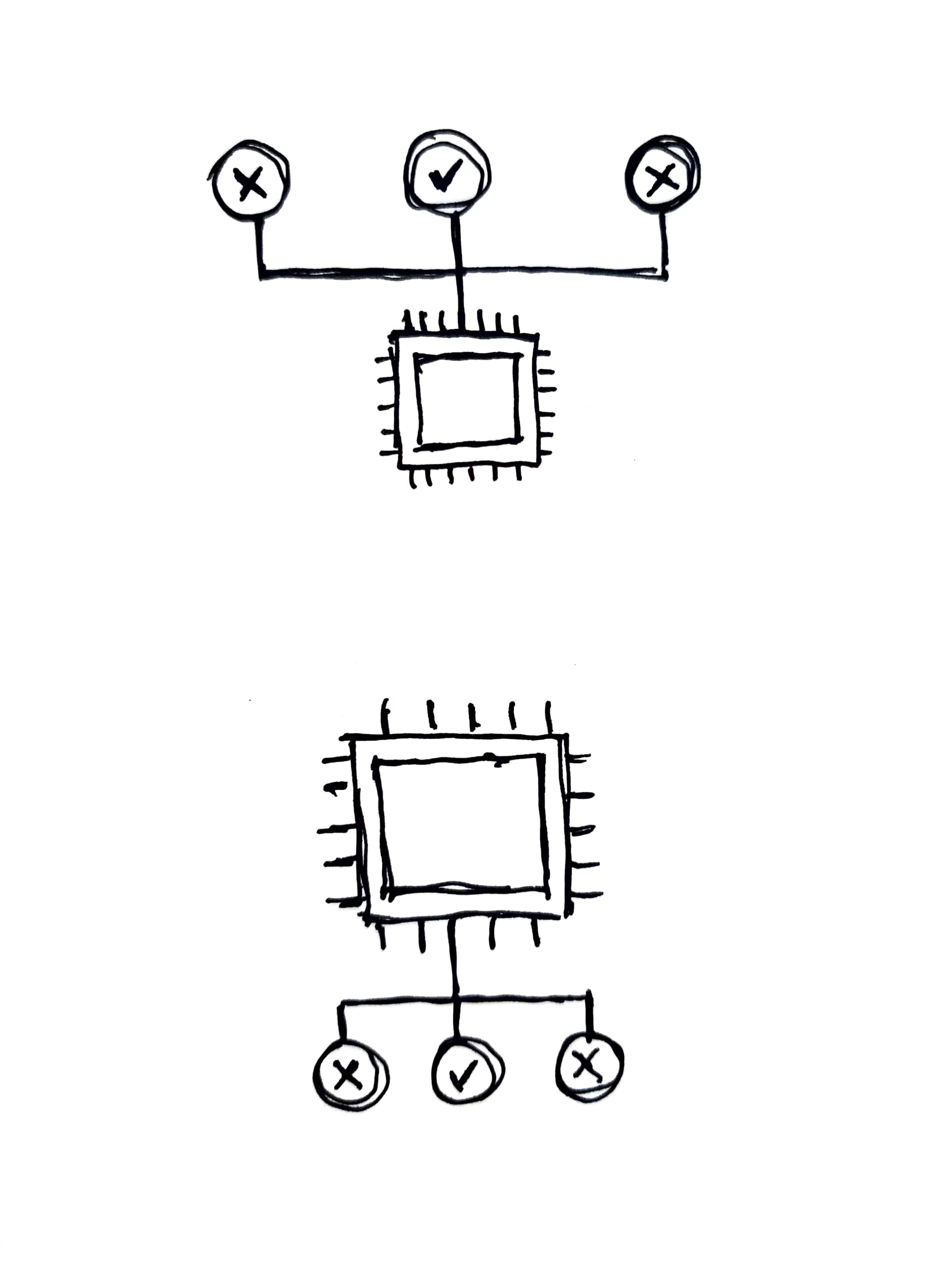
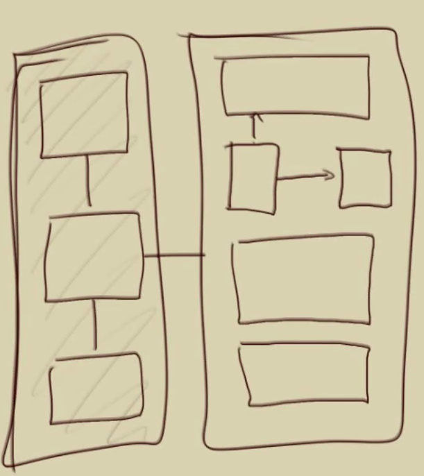
Aidan’s first sketched proposal:
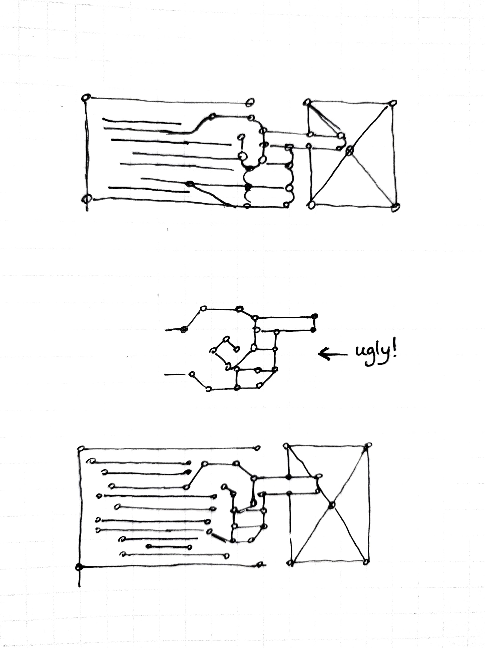
Initially, I came up with three different ideas:
1. Vertical bridge, 2. Multiple boxes and connections, 3. Abstract hand
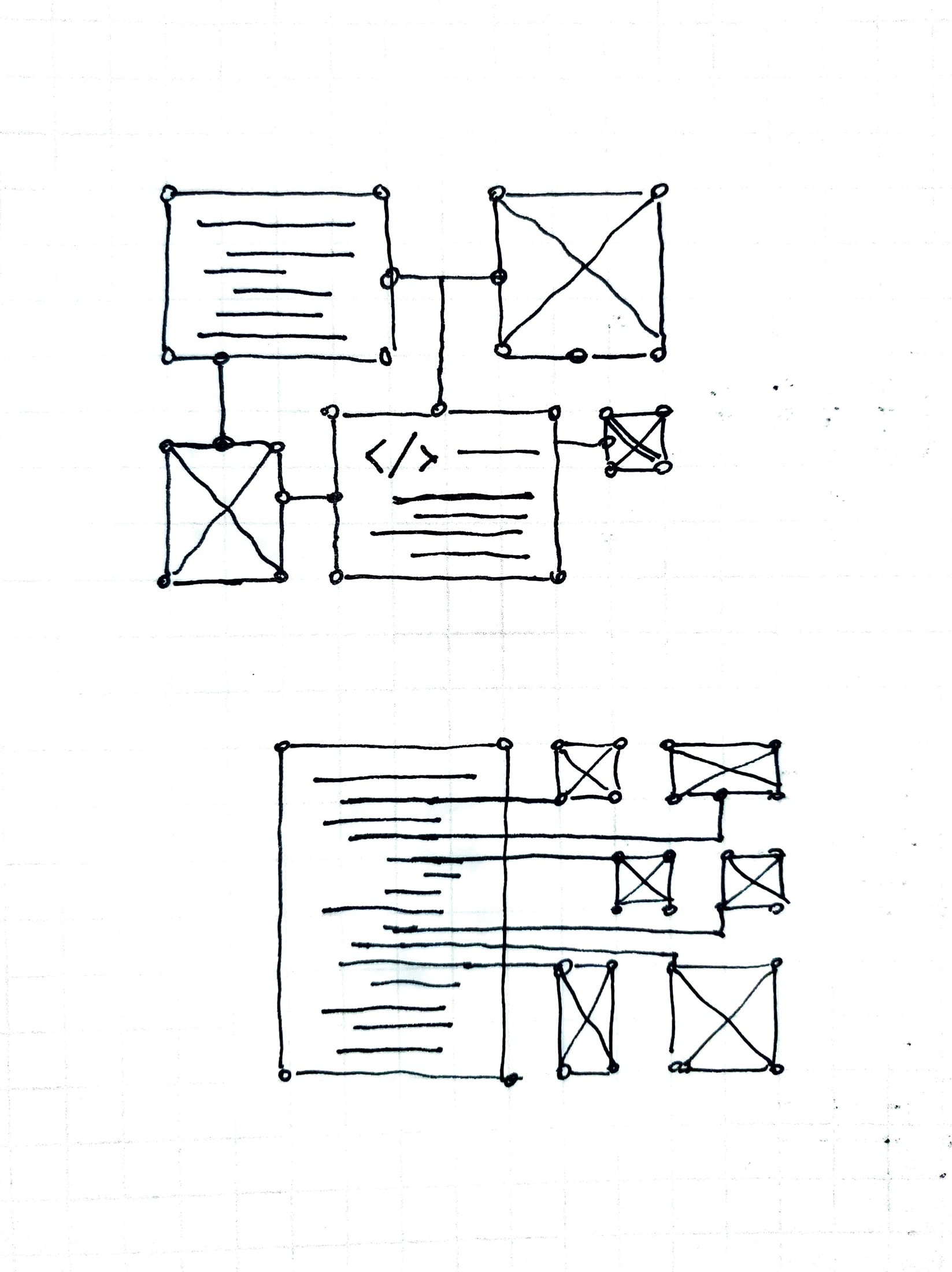
I wasn’t too convinced about these and asked Thuy for some input. She gave me some more details on the class description and gave me these graphics to work with:
Based on these, I met with Maddy and decided to try these shapes using the same style guide for nodes and paths outlining important shapes:
As for now, I’m looking to see if it would make sense for these to go together. These are some “frames” of what these would look like animated:
And another version of the digital circuit layout that spells out SIMPL:

