This week I picked back up on a logo training I was working on before winter break in Illustrator. I wanted to create something I could use on my food blog (shameless plug chefpnut.com). I started our with a simple chef’s hat design:
Angie noted that having the wordmark within the logo would impede my ability to scale the design smaller and larger. She also pointed out that because my design is very line-based, color options were limited. I adjusted accordingly, making the utensils larger to create spaces for color blocks, and moving the wordmark below the logo. I also changed the font because new year new me. Here are the three vaiations of the logos: one black and white, one full logo, and one with initials for the wordmark.
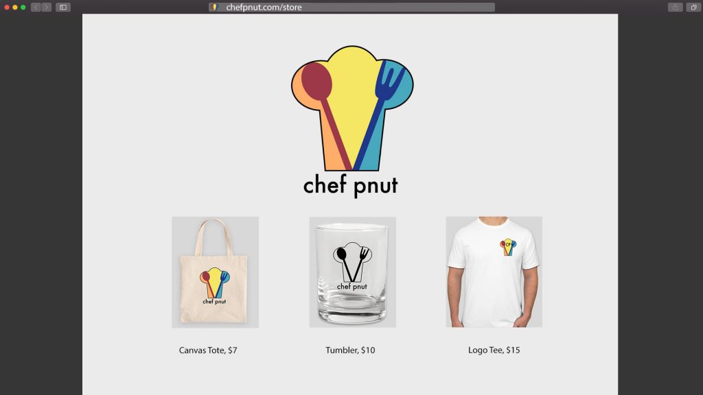
I then positioned these logos onto some merchandise, and positioned those mockups onto a webpage:
This training was pretty fun! Logo creation requires more attention to detail than I thought, as you really need to make sure the design is adjustable for products of varying sizes and shapes. I sometimes feel like I’m in a rut with the way I tackle creative design projects, but maybe this is just my style? I really love line work and creating line work, and I always steer towards primary color blocks. Some self-reflection is in order, me thinks. I’m hoping to rebrand my cooking blog soon so once that’s done I’ll post an update here of the logo ~in action~ hehe


