AFR Course Graphic
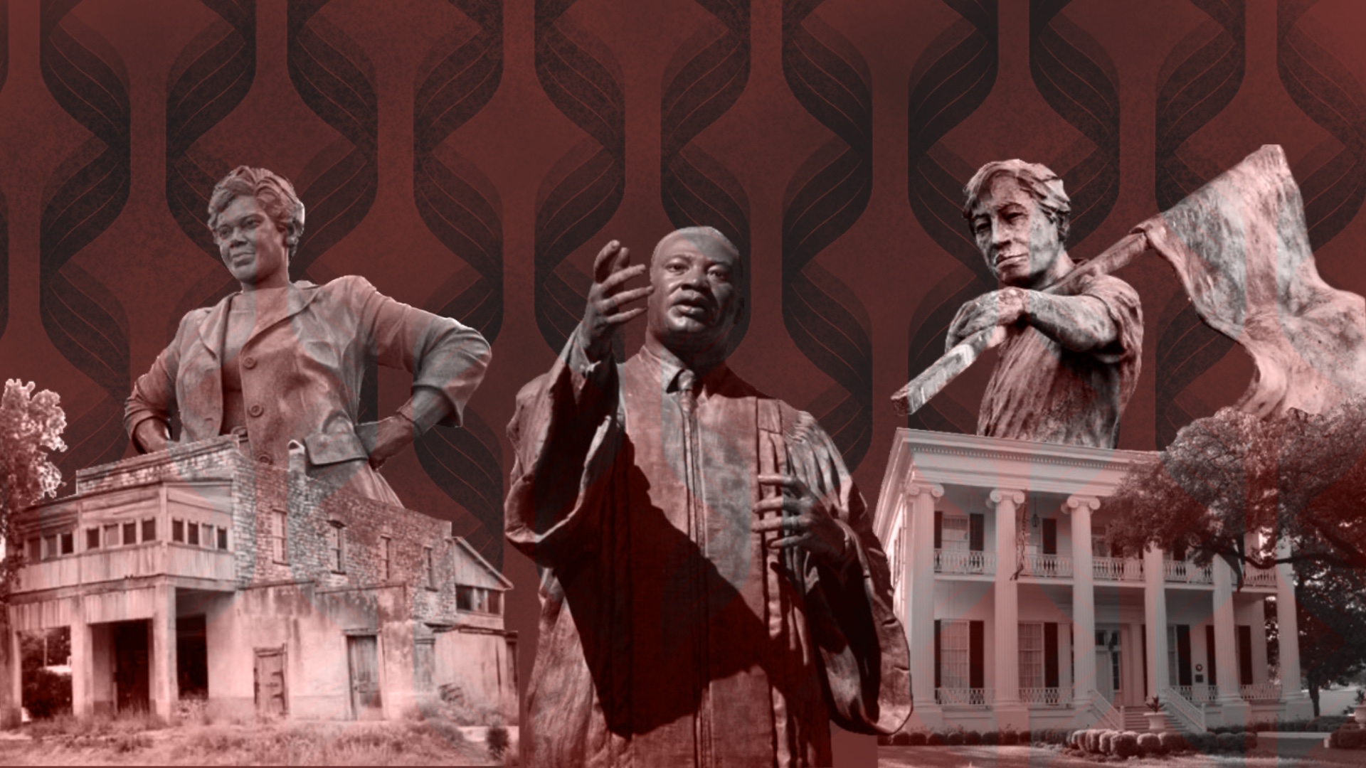
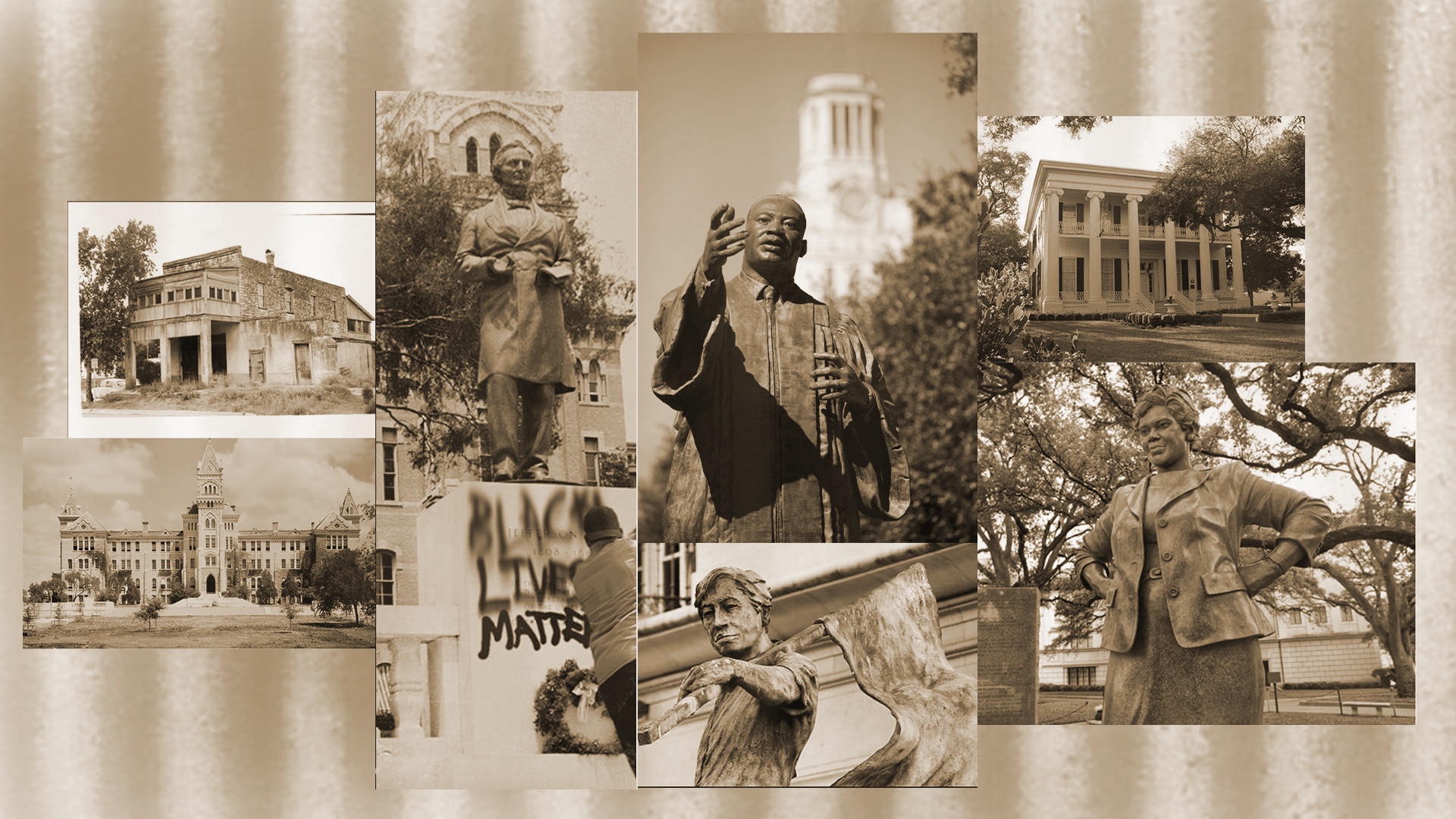
I’m currently still working on the AFR course graphic. The first design I create was kinda spontaneous, but I learn from that design to create something that would be blocked by the professor.
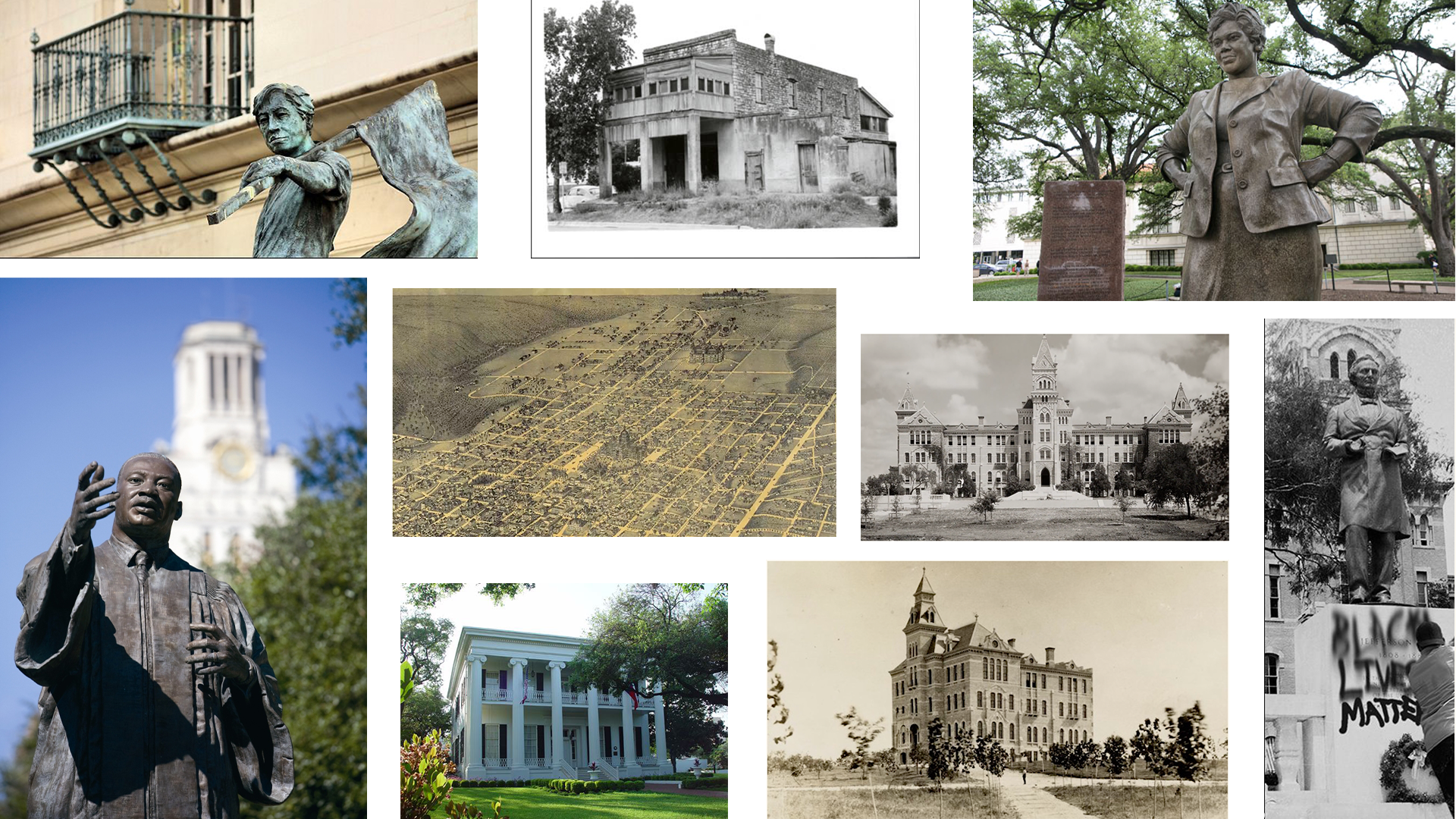
I wanted to go with a grid or collage for the graphic, but the grid that was created was still missing something with the design.
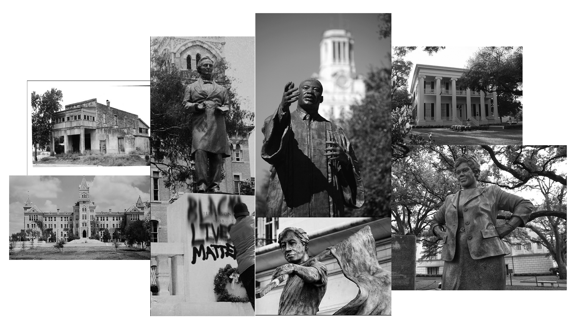
I decided to go with a collage and bring more character the the layout of the images.
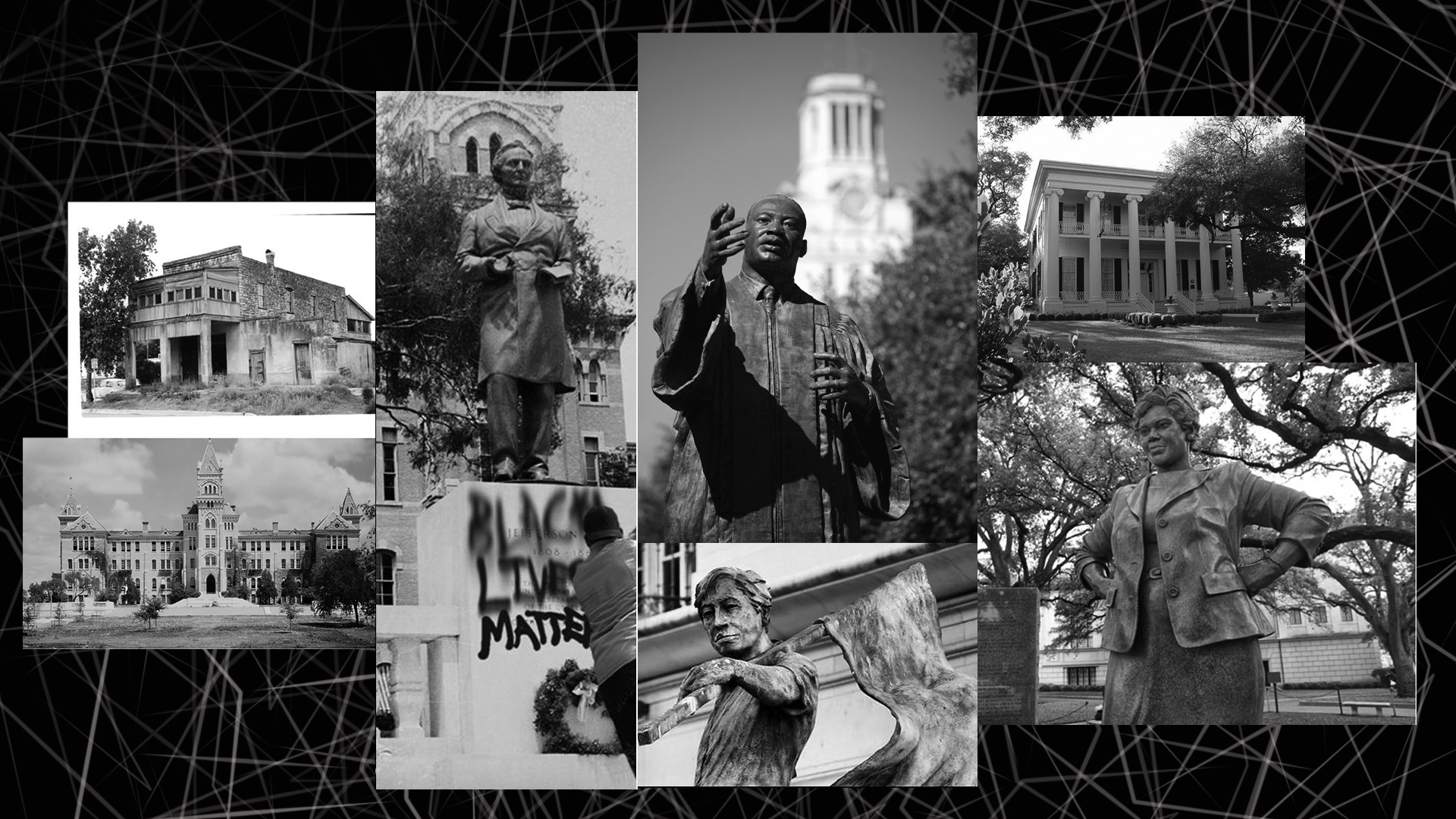
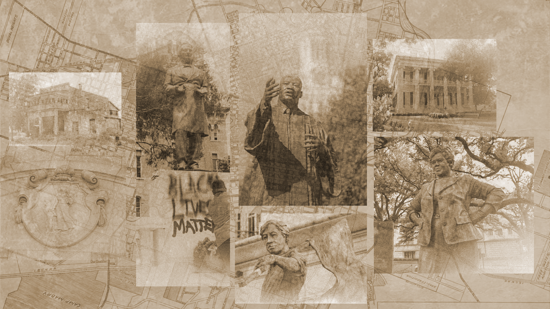
Once I created the basic structure of the graphic, I was able to incorporate different design elements in black and white and sepia.
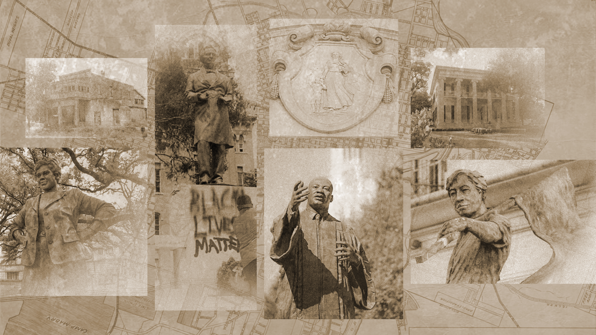
We decided to go with the sepia color and have the images more spread apart. In addition, we added a textured overlay with the map design in the background. I also edited the pictures to look older than their original format.
With some additional changes to the graphic, such as the change in location of the pioneer woman and MLK. I was able to create the final design for the course graphic.
For the desk skirt and vertical monitor I had to make similar changes to the design to make them consistent and connected.
AFR Canvas Graphics
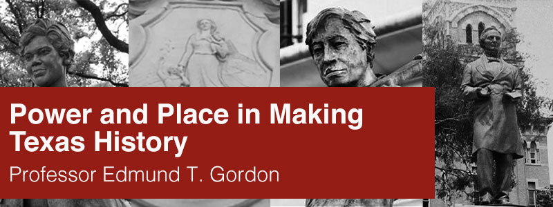
The next part of this project was creating canvas graphics. Originally the canvas banner and dashboard had MLK in the center. But the professor preferred to replace the image with the pioneer woman. In addition, we wanted to change the graphic to a lighter shade of red.
These are the final results of the canvas graphics with the callout buttons.
Overall, this was an exciting project to work on. I learn so many different applications for photoshop and I was able to create some visually appealing designs for the professor.
