Chatter: Branding/Logo Update
Happy new year!!! 🎉 🗓
2020 was… something… But it did give me the chance to start working here, so that’s undoubtedly something I’m grateful for! Nonetheless, I do hope 2021 is easier on all of us…
Anyhow, here’s an update on the Piazza Replacement Saga.
After Phase 2: starting my own logo drafts, we concluded that Draft 4 [see in previous post ] was my final draft and the one that got presented to the Chatter team along with 4 more options created by some of my STA peers. Well, as it turns out the Chatter team picked that one as the official direction for the logo… yeeey!
But the branding and logo were not yet finalized. There were refinements to be taken care of before finalizing anything. Moreover, the main concerns we kept in mind for the refinements were:
1. Circle vs no backdrop circle
2. Eye vs no eye
And the subsequent issues on size, spacing, and placement.
The journey on deciding these changes was like so: first I was asked to make 4 new drafts for the refinements to tackle points 1 and 2. One with no circle and no eye, one with no circle but with eye, one with a circle and an eye, and one with a circle but no eye. Those versions looked as follows: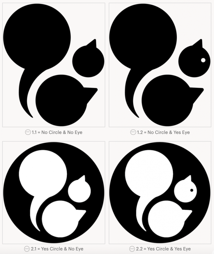
From there, we decided to focus on version 2.2. But there were definitively things to work on regarding the general spacing between the shapes, the size of both the eye and the backdrop circle, as well as the placement of the eye. The next batch of refinements looked as follows: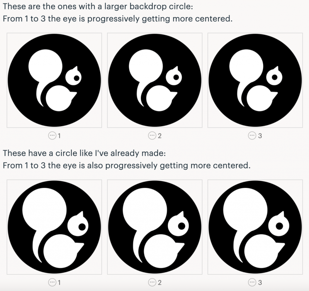
Once comments were made on the spacing between shapes and the size of the backdrop circle, issues concerning the eye size and placement remained. So I adjusted the size of the eye to the suggested size, and made the following three versions versions to decide on the placement: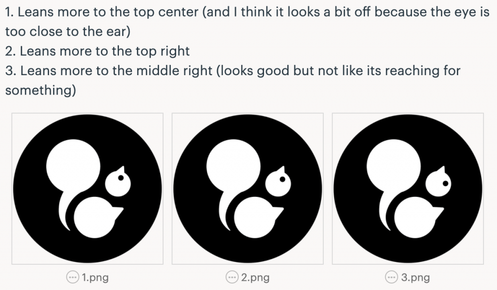
Afterwards, I had a brief meeting with our design coordinator Maddy to make some further adjustments together. The main modifications we did were to rotate the shape of the head counterclockwise in order to preserve the “reaching” feeling we want the squirrel to embody to symbolize “reaching out to someone” or “reaching for knowledge” considering that’s part of Chatter’s purpose. After changing that it was easier to decide the placement for the eye.
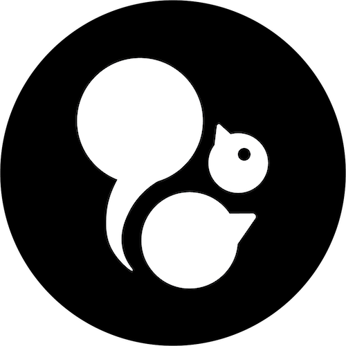
Furthermore, the following is the current version of the Chatter logo (temporarily finalized but still subject to change if suggested/requested by the Chatter team).
 Finally, I was also asked to suggest some more fonts for the wordmark in order to match the Chatter’s brand personality. If interested, in the previous post you can see my original font suggestions. The following were my new suggestions:

