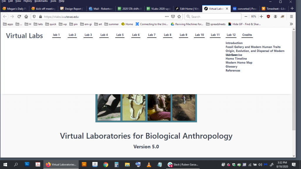
So I was requested to take a look at the VLabs site, mainly the navigation space. What we’ve noticed is that as content is added, things just don’t effortlessly handle themselves; overlapping section names and a navigation bar that takes up way too much space are the main culprits. Additionally, though, there are a variety of styling oddities or misaligned/unevenly spaced elements that were to be fixed as well. Here was the before:
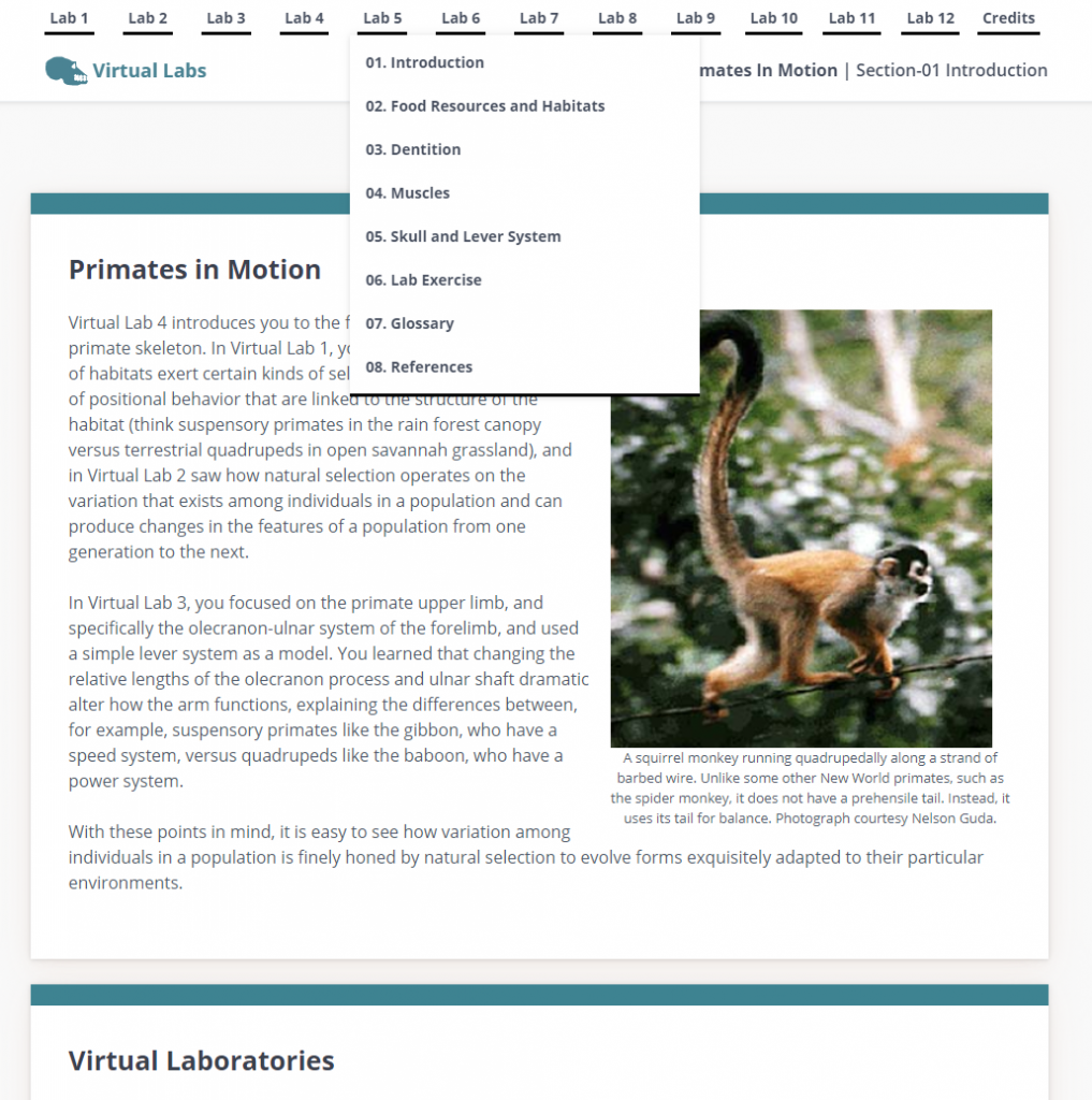
And here is the after:
Centering/aligning things in HTML/CSS is actually a fair amount more involved than it looks. The nesting of elements is extremely important, and there a variety of ways to achieve the same result due to compatibility requirements that makes juggling the differences in styling also difficult. Another challenge in this project specifically was having to do this with Grav templates. As a CMS, Grav allows the creation of templates which multiple HTML pages will follow, as it dynamically pulls the content and then styles all pages the same. Syntax differs from regular HTML, and so I had to edit these templates to re-nest some elements such as the section title and the site logo together so that I could cleanly align them together below the labs. In the end, I learned a fair amount on editing these templates and gained more experience on elegant solutions to styling problems.

