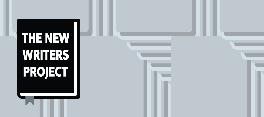
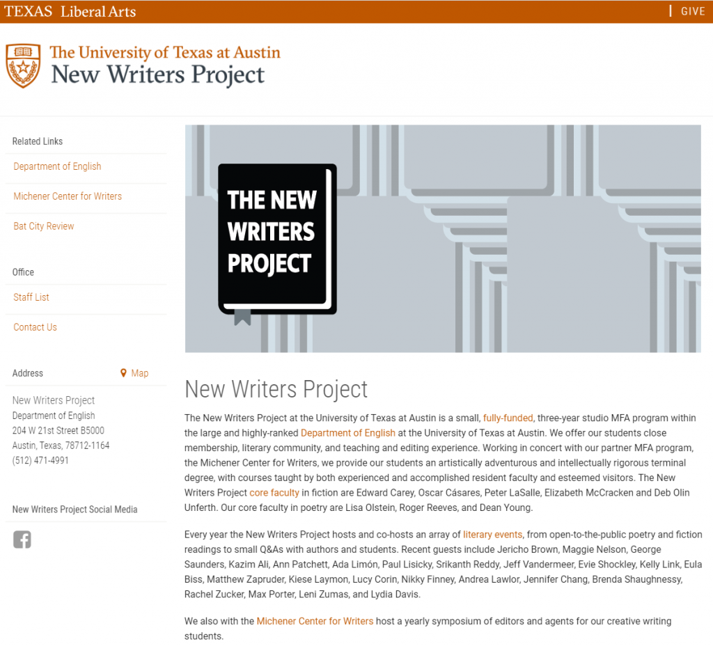
If you look back a couple posts, you would see how my work started on making a new icon/banner for The New Writers Project. At First, I started with trying to construct a physically proportional 3D icon as the book, but quickly began to notice its lack of clarity and visual “punch” due to its perspective. And so, I began experimenting with a sort of flattened, fake 3D perspective that i ended up liking a lot more. The rest of the time was spent on getting a colorful interesting background and better font choice for the banner. I played around with the shapes I used for the book, and layered them in a stair stepping geometric fashion. I liked the interest it adds to the banner without taking away from the icon itself, and it fills the empty space well, especially in context of the entire page.
