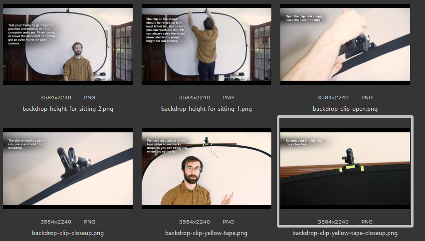
I’ve begun work to annotate some photos that help instructors set up in-home studios for classes. There is a strict appearance for shadows, text, and arrows which I’m following, and almost all of the photos I’ve gotten have had the need for a stronger gradient beneath to make the text visible, but maybe I should be looking to find darker elements in the photo to place the text instead.
