STA Cascade Site!
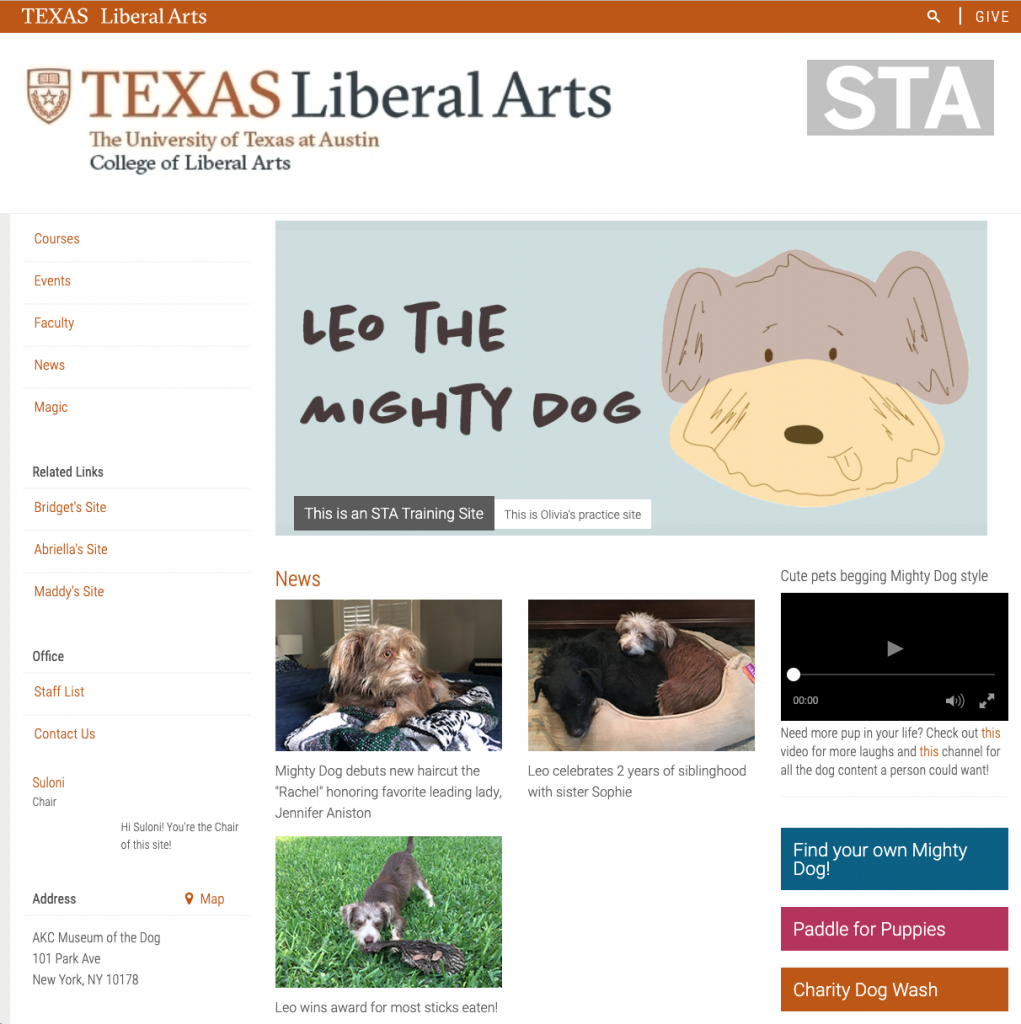
Each STA was assigned the task to create a personal cascade site with a theme. This past week I completed my own site and the necessary cascade tutorials. My site is themed after my dog Leo because my family and I think he’d make a great cartoon superhero. We were tasked to create three news articles and two events for our page as well as create a banner, embed links, videos and include faculty and contact information pages on our site. This assignment really helped me learn the process of building out a cascade site for clients and it was fun to put my own spin on the project.
V-Labs!
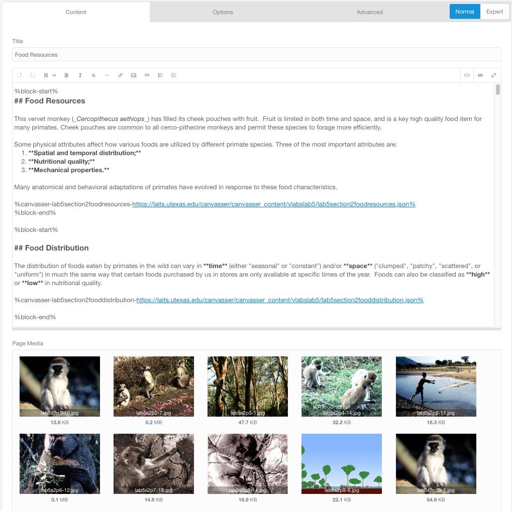
My recent work on V-labs focuses on “last looks” of the site and interactives. This includes following a checklist to insure HTML content, grammer, and interactives are correct and match up with the Flash site. As I begin working on a new section, I open both the Grav site and the Flash site to compare while keeping in mind the style guides created for our Canvasser interactives.
Checklist –
As you perform your LAST LOOKS, assignments, COMPARE the FLASH pages with the GRAV pages, while using the checklist below.
1. For content accuracy: -We want to ensure that the Anthropology students have all that they need per lab, per-section, so that they can study and learn the complete and accurate information they need to pass their exams.
2. Interactives though the lens of pedagogy (SORT OF!)
“how knowledge and skills are imparted in an educational context, and it considers the interactions that take place during learning”
*** Make sure that the redesigned interactives have enough content to be able to stand stand alone, and deliver the lesson the students need to learn. Interactives should not to depend on the html page text content to make sense.
3. For consistent visual style: We want to ensure that Anthropology students have a consistent experience as far a visual and conventions go, from page to page, from interactive to interactive.
…………………………………………..
LAST LOOKS CHECK LIST
CONTENT CHECK – IS IT ALL THERE?
1. All of the Content needs to be in the section HTML TEXT VIDEOS INTERACTIVES
HTML TEXT – COPY EDITOR
2. all of the HTML text has to be correct – ex: words like “Click Here” need to be edited out of the HTML – spelling needs to be corrected -if words runtogetherw/ospacing , correct the spacing -if words need to be bolded, bold them
CONTENT FLOW
3. All of the content needs to flow and be laid out as best as possible – “group” text & other content from separate cards into one card if it helps content flow better
& indent sub headings as needed to show sub-content in the flow of one card. – Center video as needed, or if it’s a list of videos right align?
DOES IT ALL MAKE SENSE?
INTERACTIVES & HTML
3a. All of the Interactives need to be sensibly laid out and pair sensibly with the HTML text, but not depend on the html text.
3b. This step is mostly necessary for the older Interactives & the ones that are not “teal”: Is there enough context (text and images) in the interactive for the interactive to make sense? if the text was edited & re-worded does the resulting text support the content of the interactive? ** It is ok if there is some redundancy btwn the interactive ontent & HTML content.
3c. When you see that visual conventions are not following the style guide for Interactives make a note on basecamp and on the spread sheet. ***ALSO let us know that this needs to be re-worked for the content in the interactive to make sense for the student trying to learn the points. – ____________________________________________
(TEAL DEAL)
4. Valerie will keep track of the teal replacement Interactives on the spread sheet and will make corresponding new to-dos on bc for these.
A part from checking that all content is present, the flow of the page must read well and display a consistent layout to other pages of the site. Content flow has been my biggest challenge during last looks as we are deciding the “standards” for these pages as we go. Most of my work involved repositioning and formatting the HTML content and images in the Grav site in order to improve page layout. I also spend a decent amount of time labeling images!


