For our STA meeting this week, Suloni had us visit the Rise of Everyday Design exhibition at the Harry Ransom Center. Here are some things that I thought were cool!
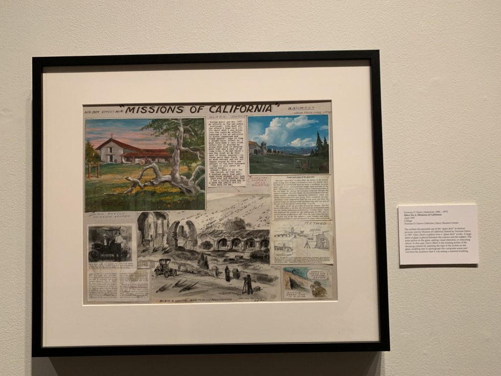
Glass Shots: It turns out people have been editing photos wayyy before the invention of Photoshop! Shown here is something called “Glass shots”. What they would do is set up a glass panel in front of the camera and have artists paint over the scene, and the camera would capture it.
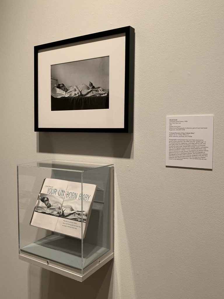
Here is another example of old day photo editing. The original photo is displayed on top (notice the cat). Then the edited version is displayed on the bottom in the pamphlet (the cat’s gone!).
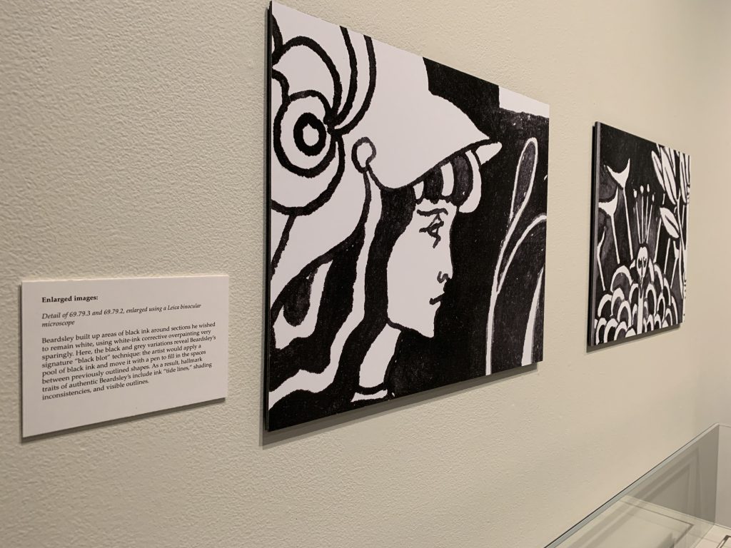
Negative Space & Ink: While these images are pretty simple looking, I liked the waves of the lines and the contrast between the white and black ink.
Photography: This image was an old photograph from the late ’30s. This piece caught my eye because it seemed really modern for such an old image (photographers today are still doing things like this)!
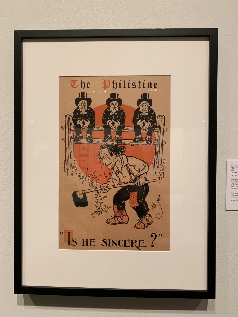
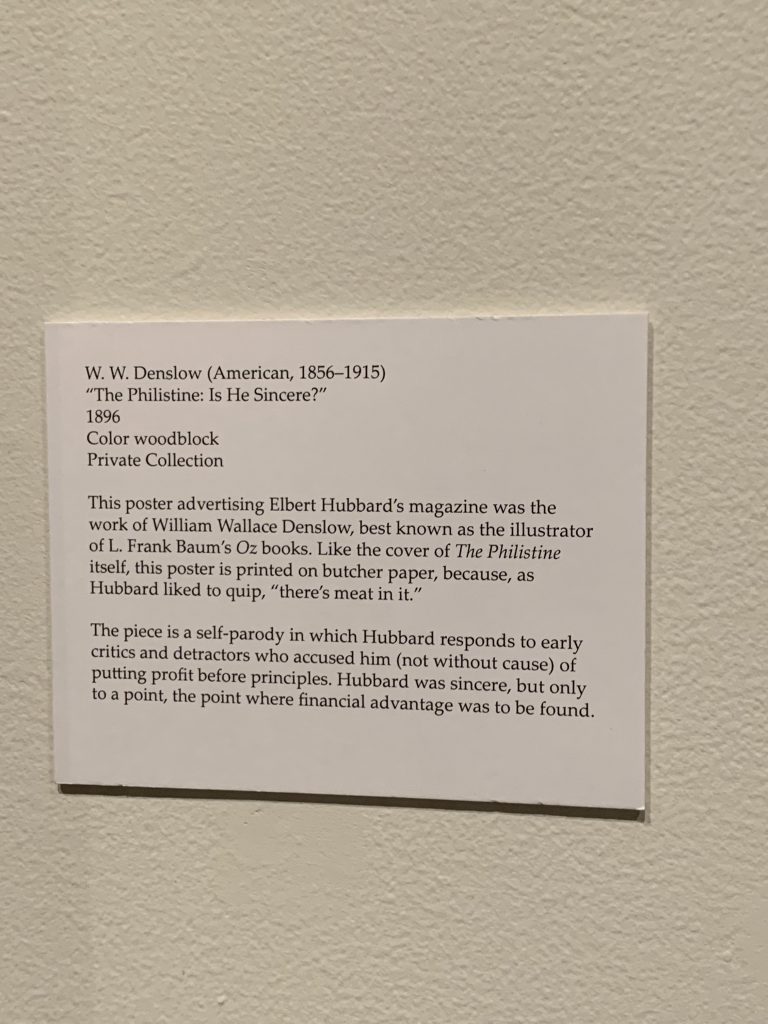
Print Design: This is a poster that was part of the exhibition that I thought was interesting. It had an interesting vintage yet modern feel about it. The lines and typeface was really nice to look at.
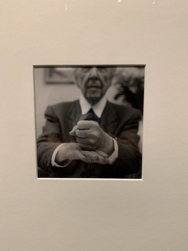
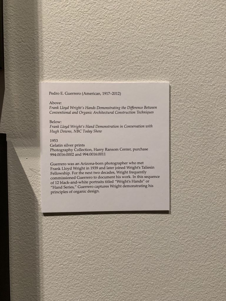
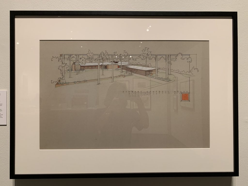
Architecture: This is an image of one of Frank LLoyd Wright’s designs. This part of the exhibition spoke to me because I actually went to one of his houses in Chicago. I remember it being really beautiful and modern. His incorporation of nature into his designs is super aesthetic and unique.
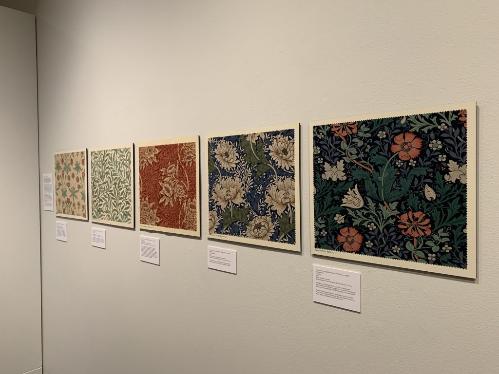
Morris & Co: Nothing too crazy here, but I really liked looking at these fabric designs. I wish I had some in my apartment!
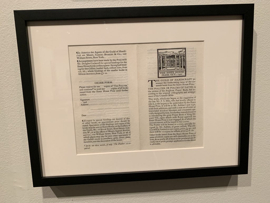
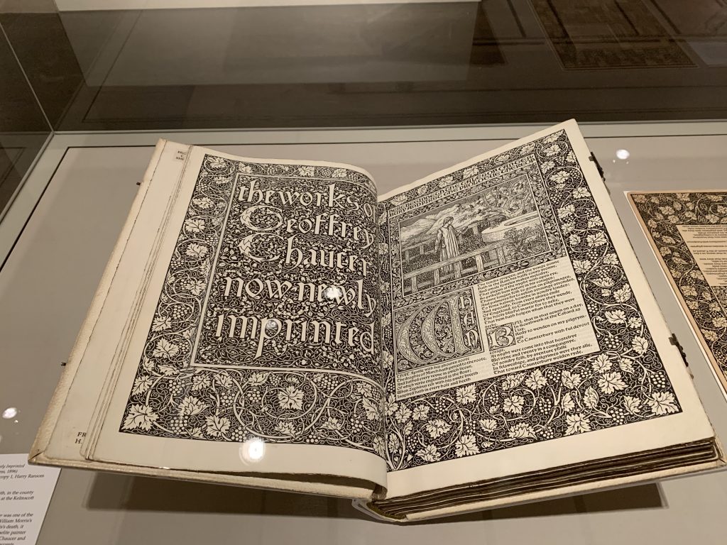
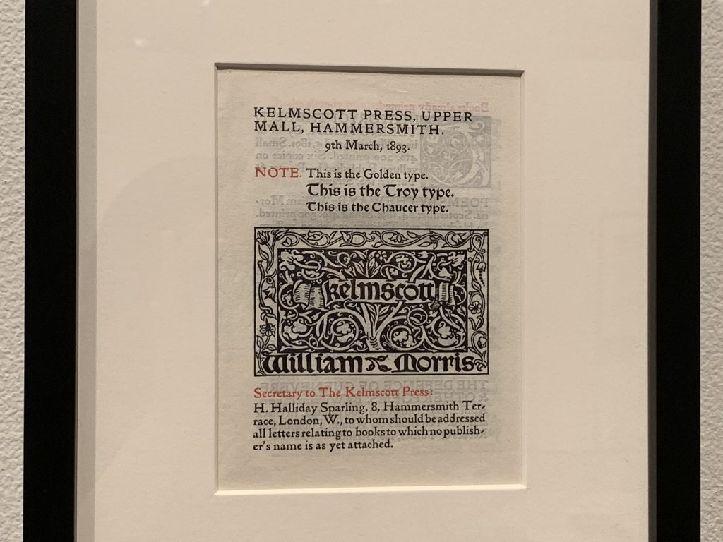
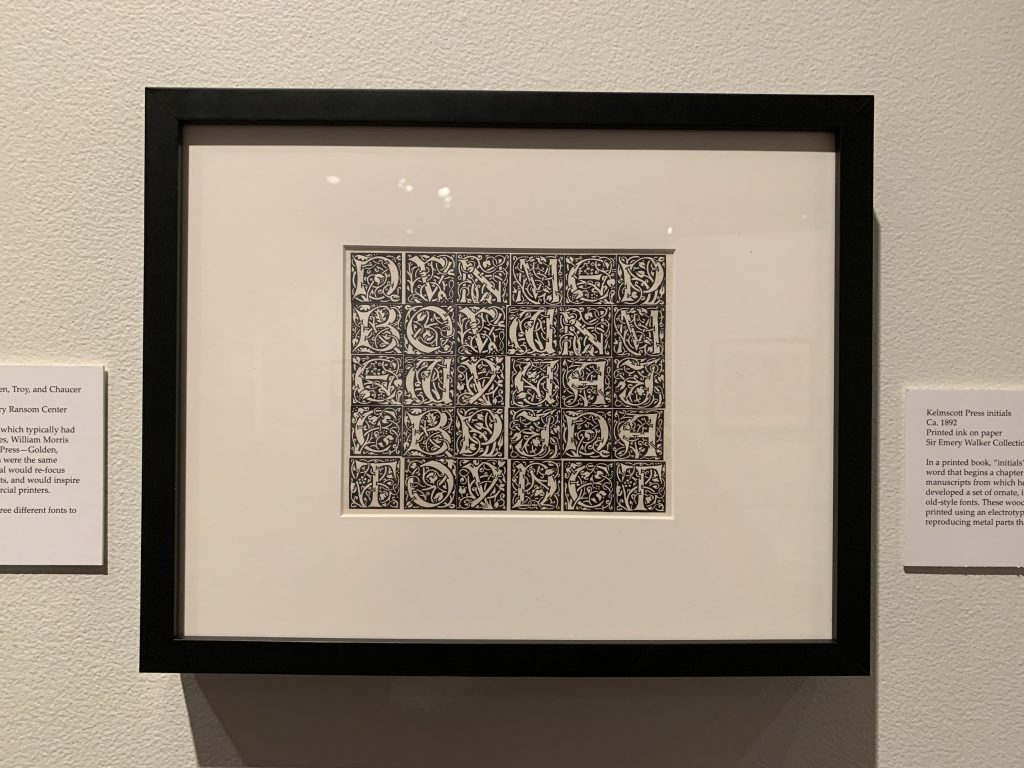
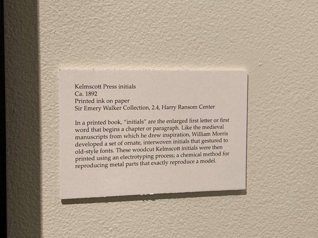
Kelmscott Press & Typeface: The rest of these images show printed books with some really pretty fonts.
Reflection
One of the first pieces I saw in the exhibition was the glass shot. This particular piece was super interesting to me because it really showed how innovative artists and photographers were. The idea of painting on glass on top of a natural scene has a very imaginative and almost childlike aspect to it. This also really spoke to me because it’s clear how this idea has been translated through time to Photoshop. It’s really cool to see the history of photo-editing and the creative aspects to it.
I also really enjoyed looking at and learning about the Kelmscott press and various typefaces that were created along with it. The books and fonts that were displayed were sooo beautiful. There was even a whole page that looked like a painting! I would love to have a book like that. Fun fact: I also learned that the first letter of each chapter that gets enlarged is called an “initial”. The typefaces especially, it was really cool to see how some of the fonts that we use today are still reminiscent of the ones displayed!
Overall, I’m happy Suloni gave us the chance to see this exhibit! It’s been a while since I’ve just relaxed and went to a museum environment. I enjoyed this experience and learned things I didn’t expect to!
