ARH301
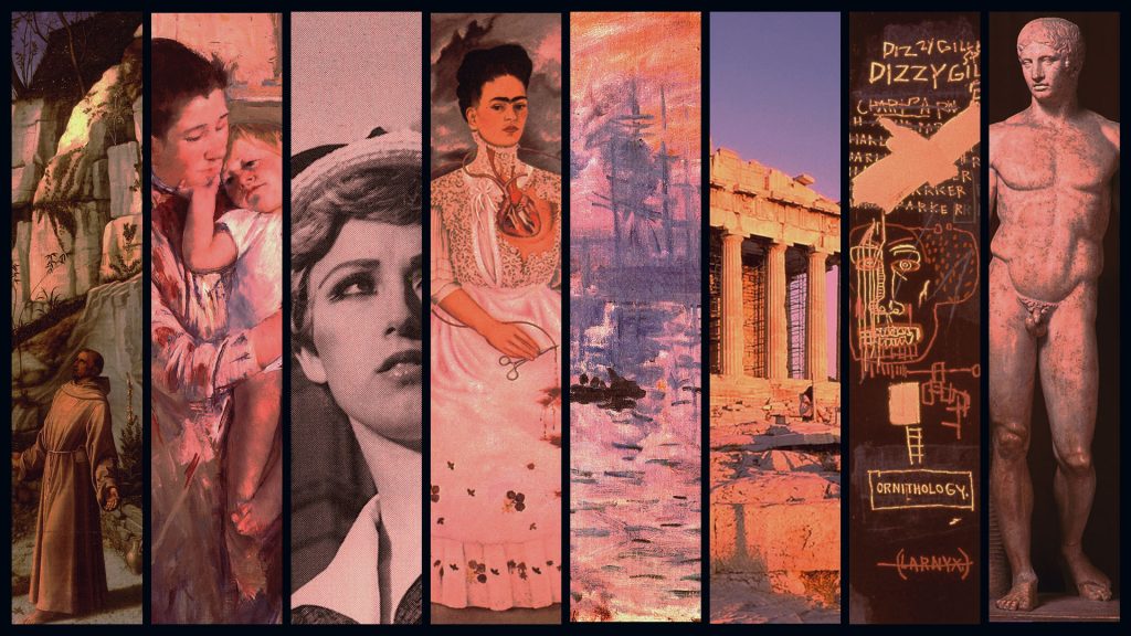
This week we decided on a final version of the digital display for ARH301. This is the one which ending up looking best on the screen, which has an extremely blue tint for some reason. It took a lot of experimenting with color balance, brightness, contrast, etc, to get a version that doesn’t look muddied out or overly blue, but I think we got it to work eventually. Because other STA’s are going to be working on more digital displays for other classes, I’m going to try to post screenshots of my layer organization and/or share my .psd file so that others can see what my process was (and so that we can be consistent across all our designs)
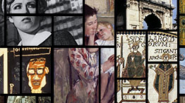
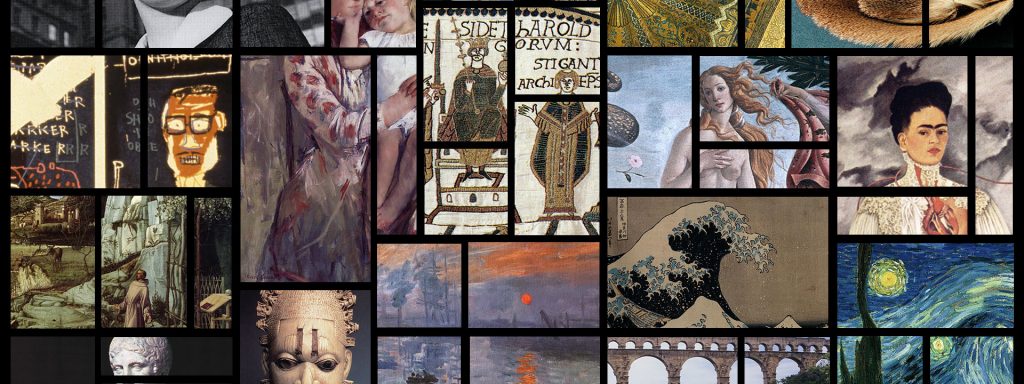
Also, it was requested that I make 2 versions of the grid design for online use. The 800x300p image will be used as the home page picture and the 262x146p as the dashboard picture that students will see when they login to their class online on Canvas.
The four images (desk skirt–which I’ve posted on my blog below, wall monitor, Canvas home page and dashboard) will all be used in Dr. Johns class this coming fall, and I’m really excited that my designs are going to be used.
RUS
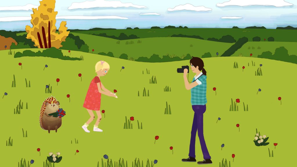
I also have an updated (almost finished) version of my RUS illustration, and other than that I’ve been working on photo IDs and more objects for the Russian animations, which I will post on my next blog.


