For the past few weeks I’ve been working on several websites for LAITS, just fixing css for various pages.
One of these is the Life and Letters page that Subrat worked on a lot last semester.
Most of the design hasn’t changed, but one thing Subrat didn’t get around to was making the site mobile responsive.
The menu is still subject to change in design by the client so we just left it unstyled.
For the collection pages they look like this.
Full-size design:
Mobile Design:
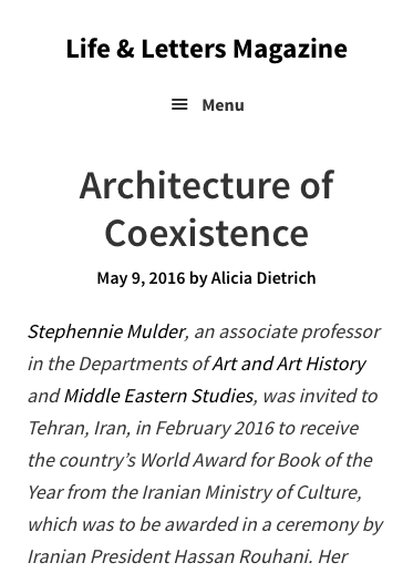
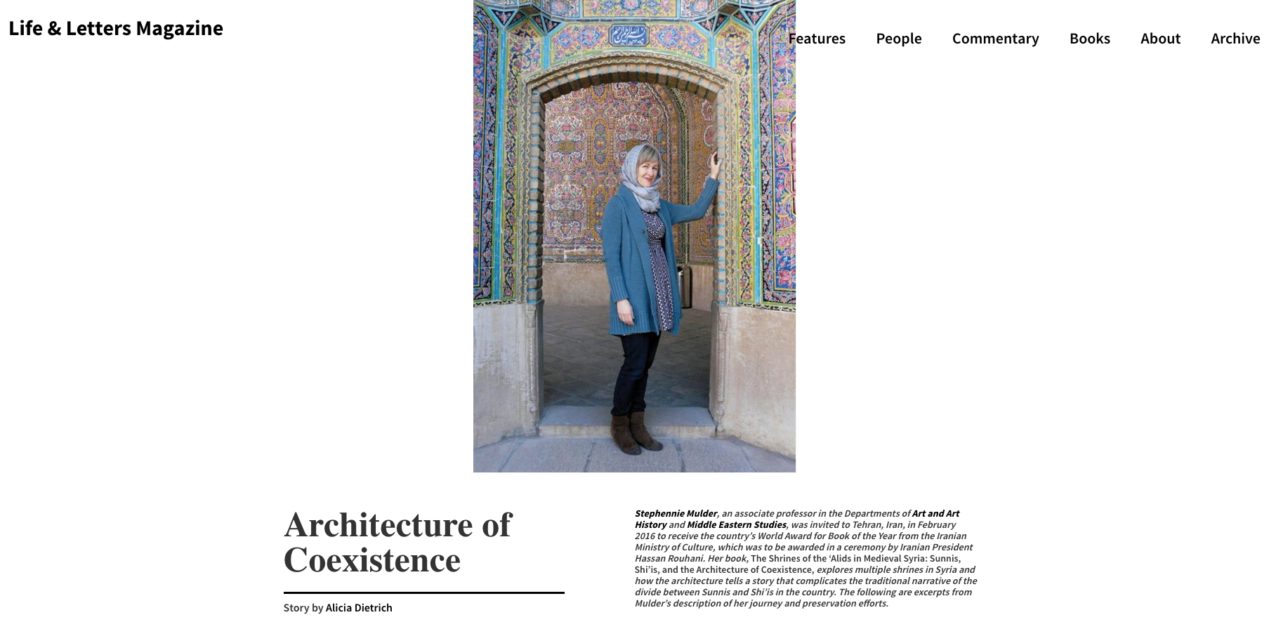
For the single pages they look like this:
Full size:
Mobile Design:
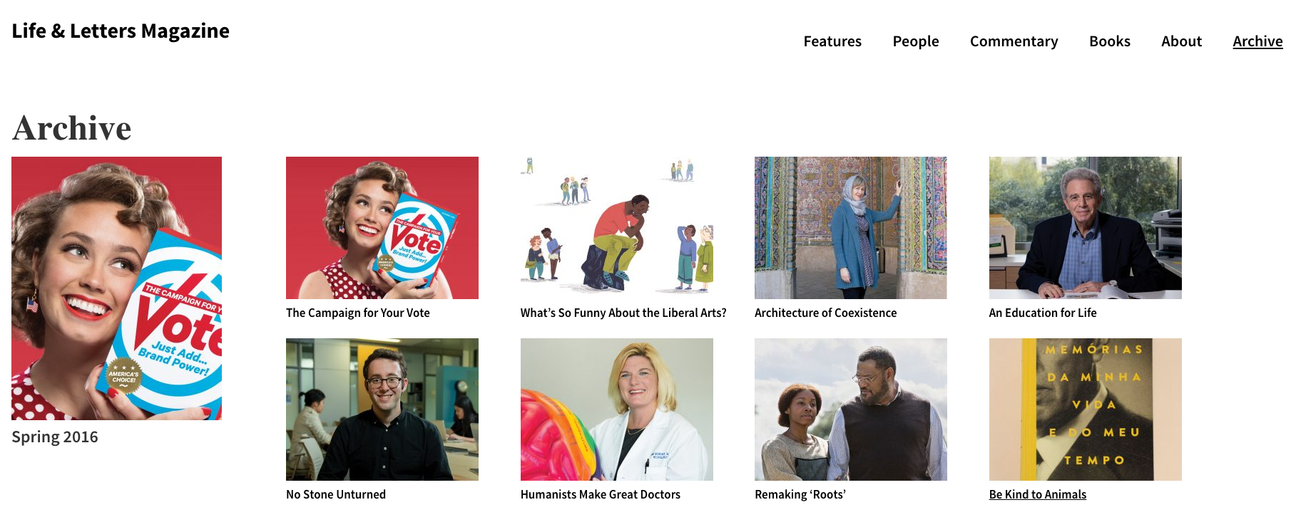
For the archive pages they look like this.
Full-size design:
Mobile design:
In addition to adding mobile responsiveness, I also fixed several minor css errors throughout the page, corrected some of the php and cleaned up some of the javascript.


