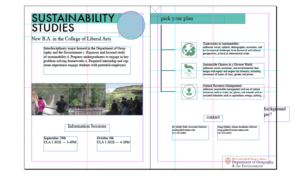
First rough mockup of the print flyer, focusing on layout. Text and some images are set in place.
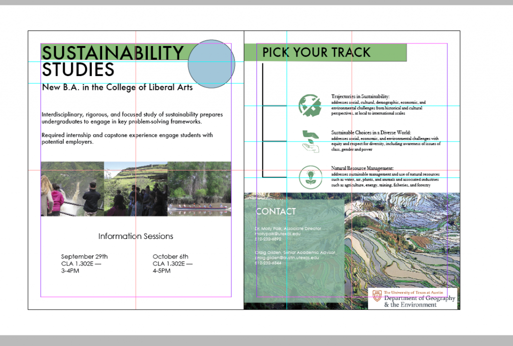
Second mockup, focusing on fixing typography. More general ideas for layout, such as for the contact section.
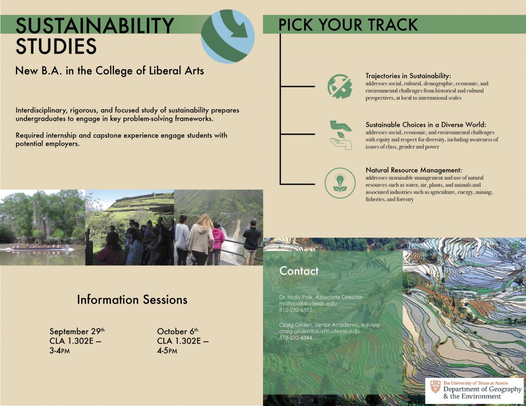
Close to final mockup, front and back spread shown: background color is switched from white to match the general orange/brown from the ‘Terrace field’ picture. “Contact” is lowercase to match “Information Sessions”. The three tracks fill the space on their page. The globe logo has been placed. “Pick Your Track”, branch base and ‘Contact’ section all aligned.
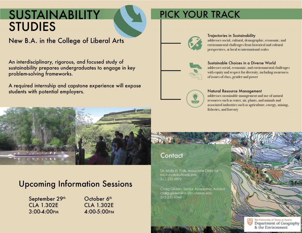
Finished front/back brochure. Two photo strand instead of three to fill white space better, spacing is improved, text enlarged, and the Contact section is more readable.
