Web Design and Development – Erica Ndubueze
Back End Development – Stacy Vlasits
Supervisor – Suloni Robertson
Web Design and Development – Erica Ndubueze
Back End Development – Stacy Vlasits
Supervisor – Suloni Robertson
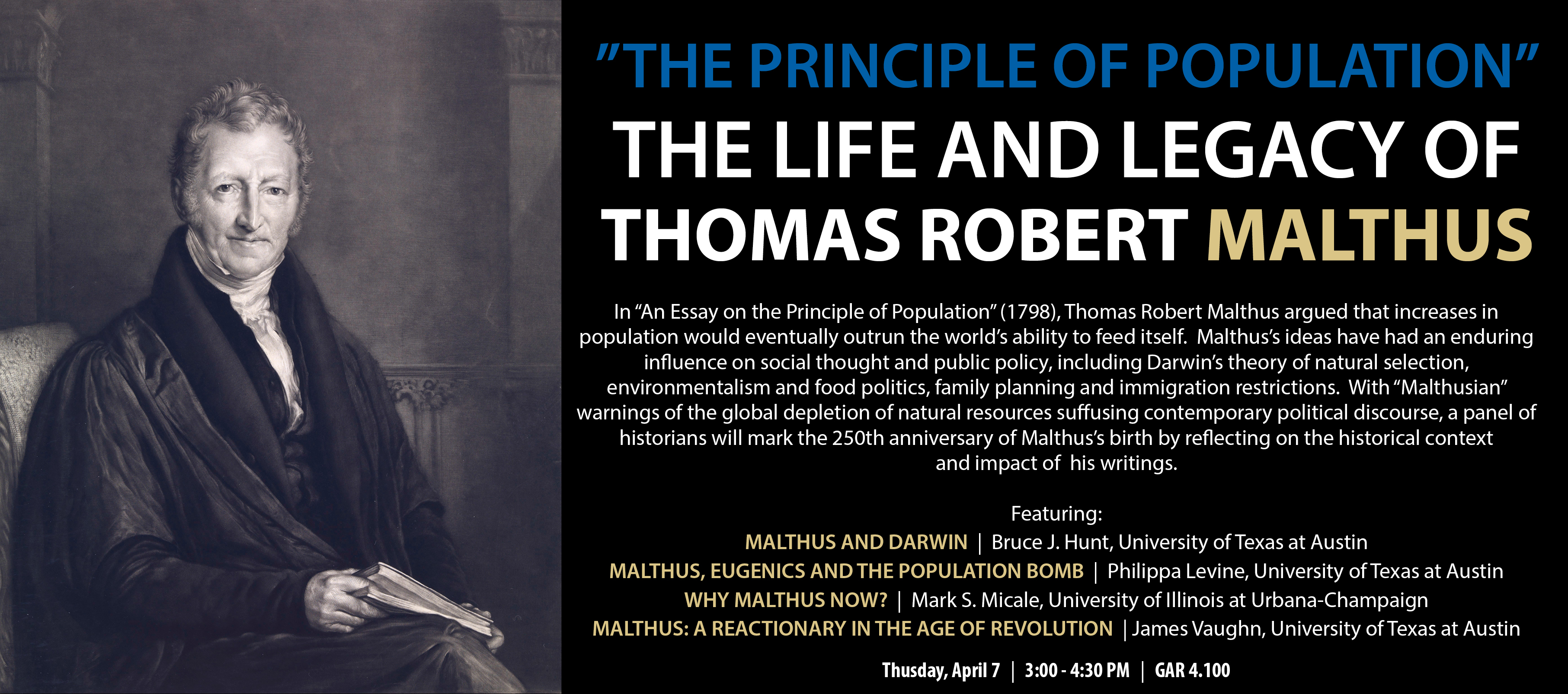
The COLA history department requested to have their homepage banner changed to advertise an upcoming panel.
They submitted this graphic to be edited:
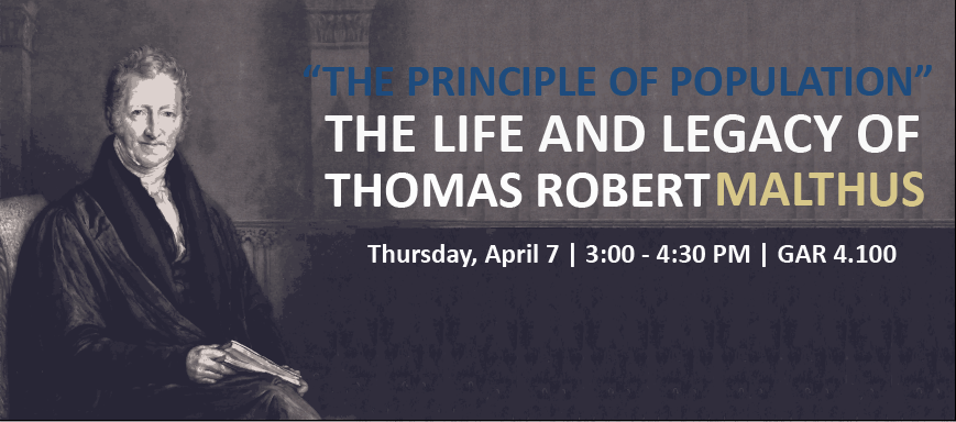
Suloni and I agreed that the graphic was a little text heavy to be a banner. I created two drafts of the banner for Suloni to choose from. Here is the first graphic, that she did not select:
And here is the product we submitted to the client:
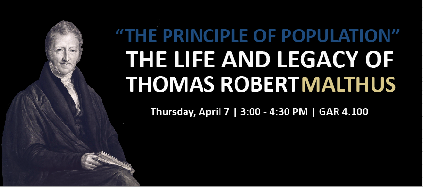
We agreed that the black background looked a lot cleaner and made the text more readable. In the end, the client decided to design their own graphic and did not use our recommendations.
Project: CAAS Flyer Design/Layout
Client: Sona Shah and Madiha Haque

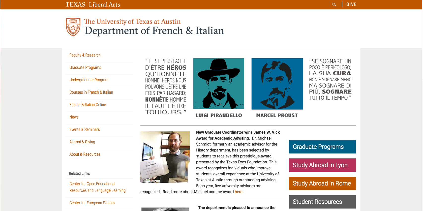
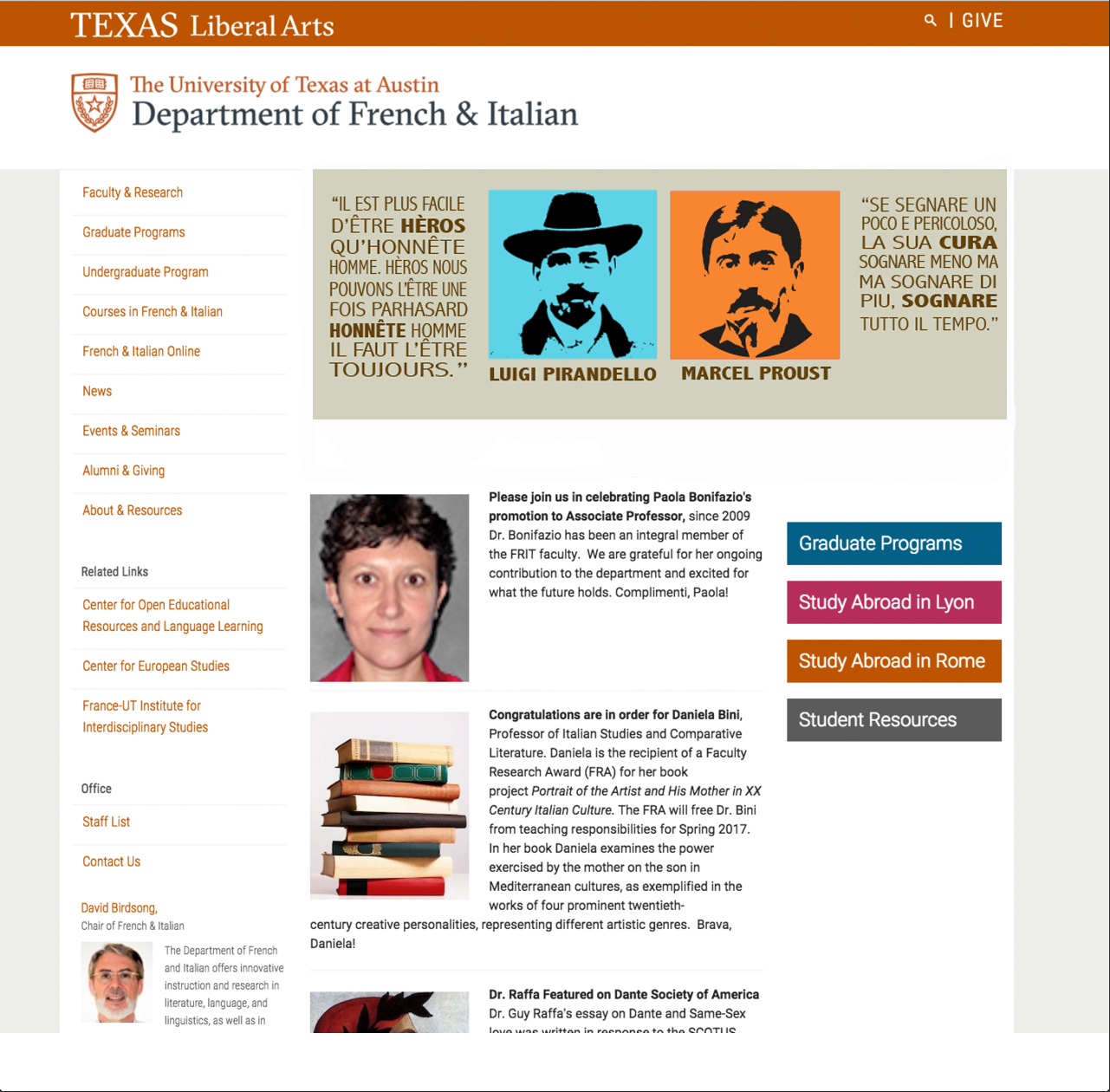
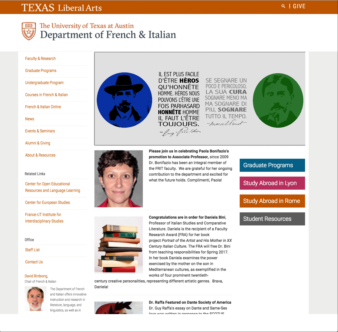
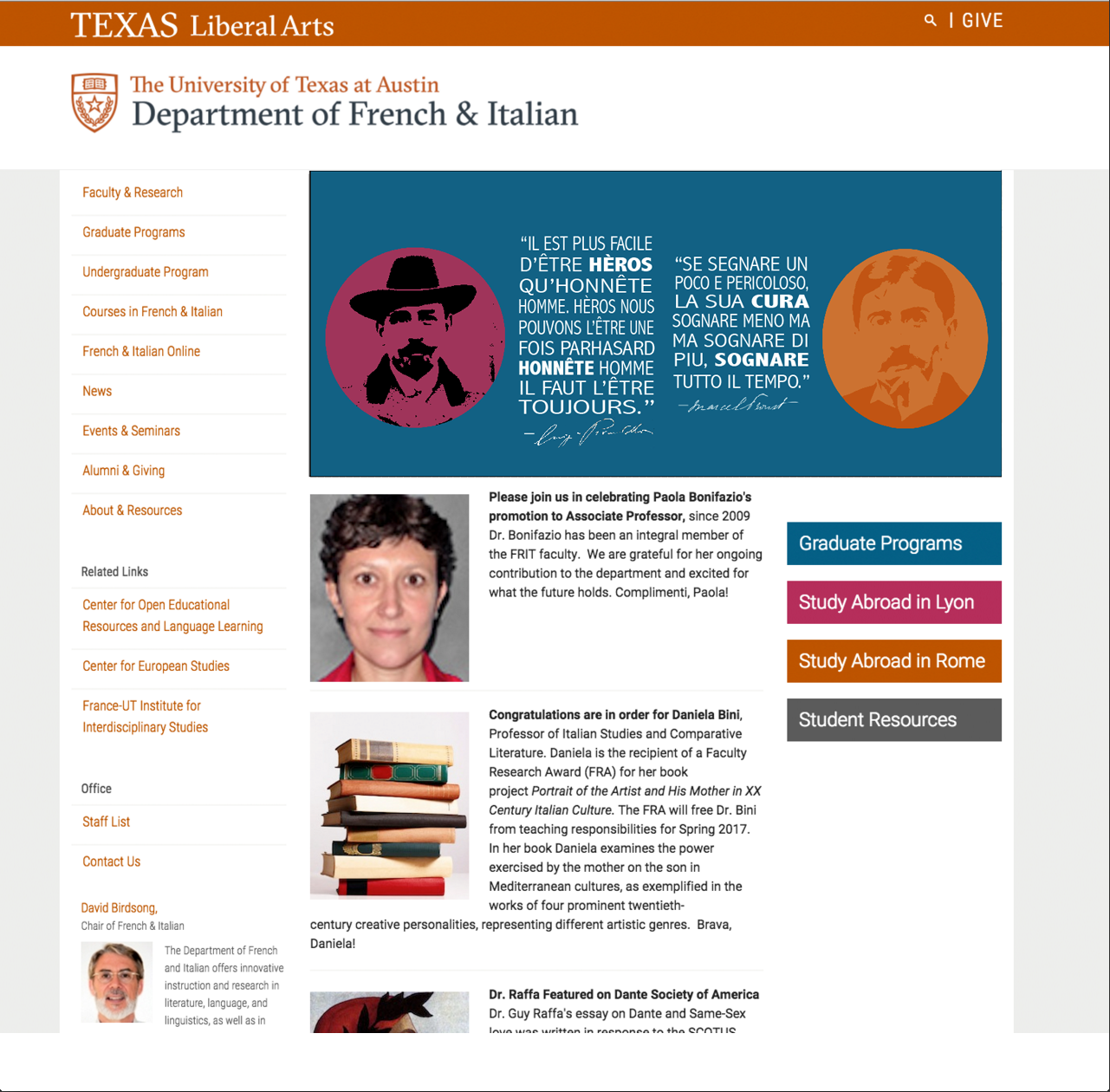
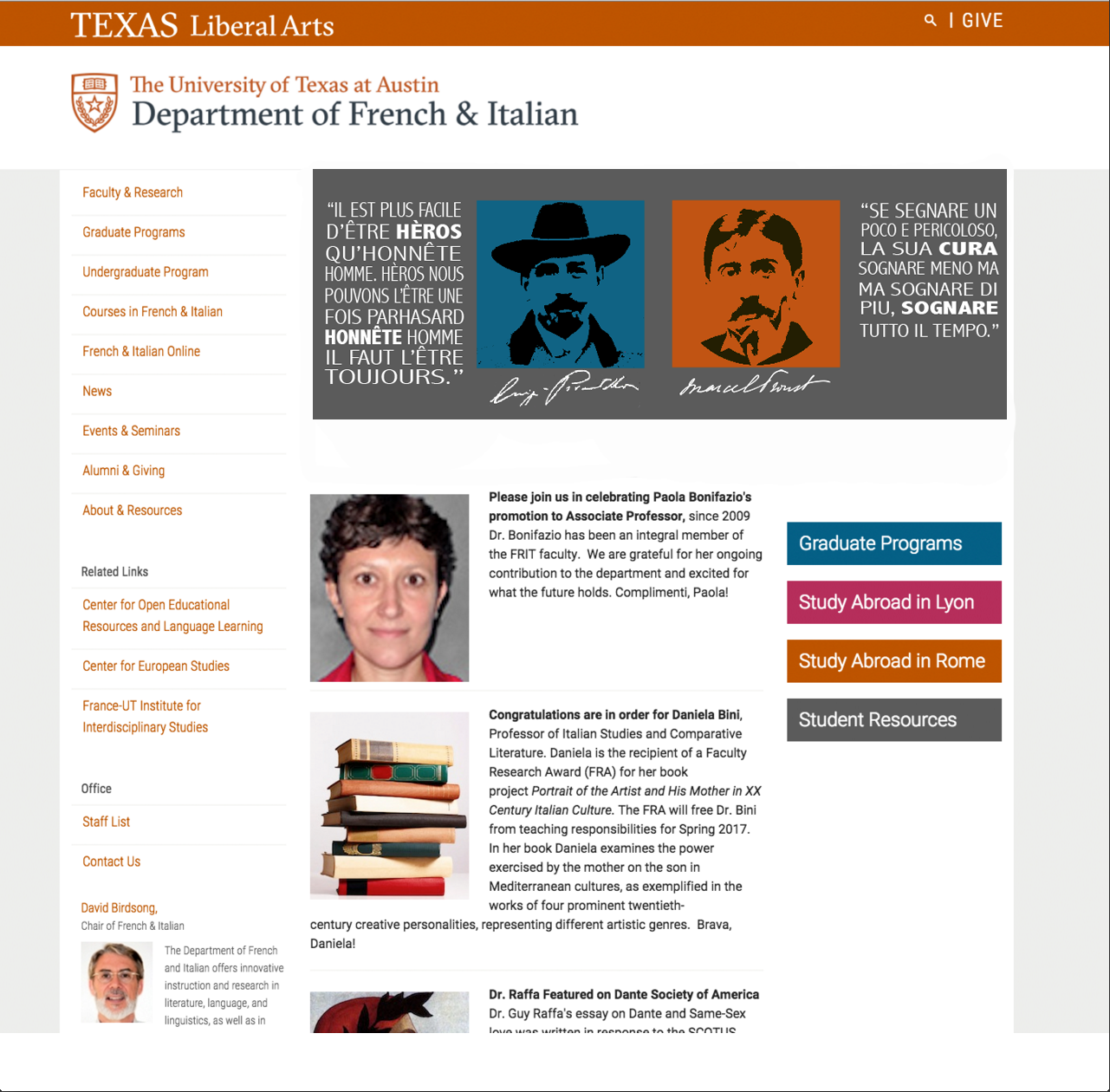
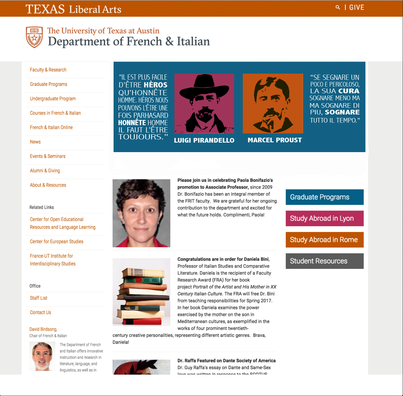
Since the beginning of this semester, I have been working on a redesign for the banner on the French & Italian COLA webpage. This is my first major graphic design endeavor, and I’ve learned a lot along the way.
The client was hoping for a banner that would equally represent both the French and Italian departments. He provided two quotes that he really enjoyed; one from a famous French person and one from a famous Italian person. There were certain aesthetics he was going for, based on an old Italian film poster. I started with a very rough draft that Andre had created and sort of had it evolve throughout a series of drafts.
Here is the final product, published on the French & Italian home page:
Here are the options we submitted to the department for approval:
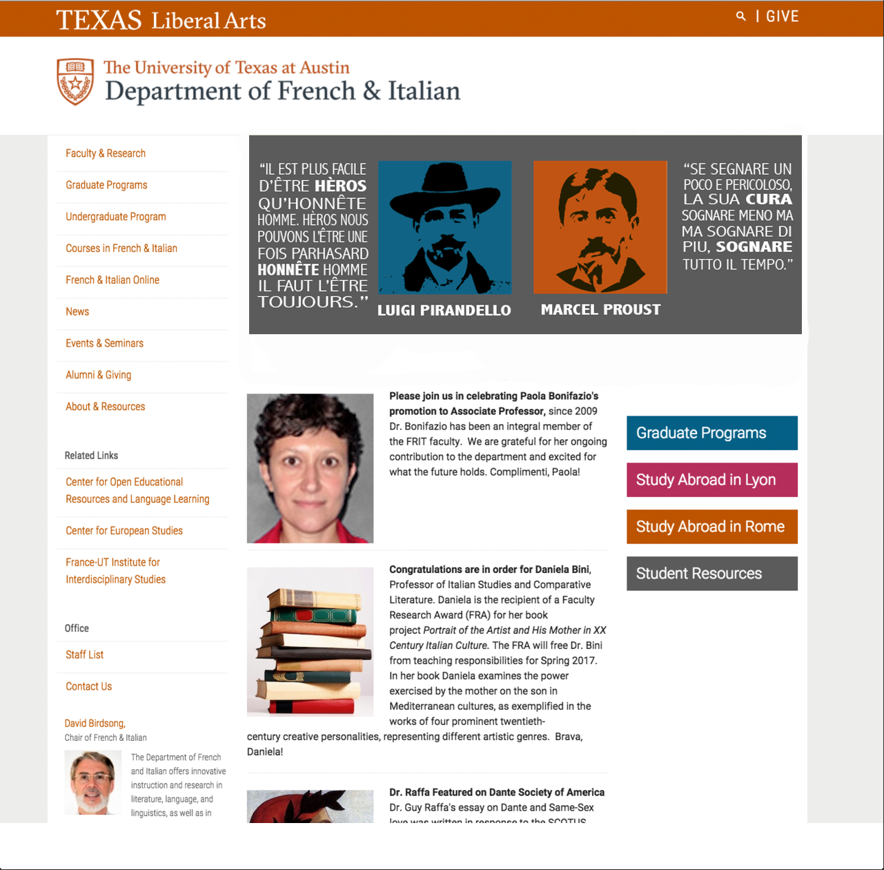


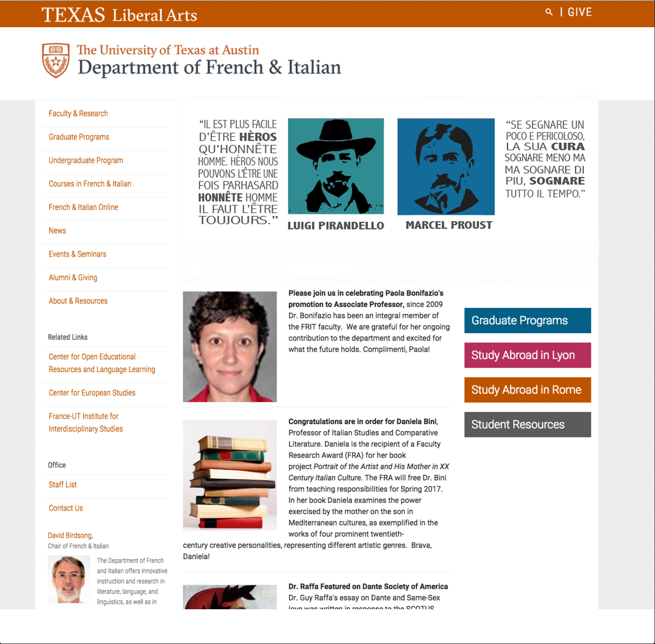

Here are the first couple of drafts or so, to give you an idea of what the evolution was like:

I recently helped Andre repair a couple Feature Archive pages on the COLA website. The pages all had similar issues: broken links, missing text and wrongly sized images. This was my first time editing the COLA website through Cascade and I found the CMS very easy to use.
The following pages are what I fixed:
Here are some samples of what the pages looked like before and what they look like now:


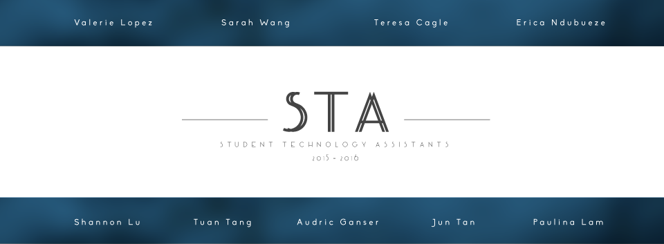
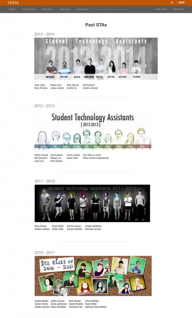
As you have seen, the STA page looks different.
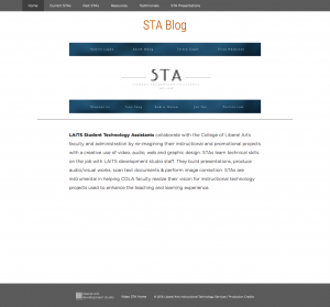
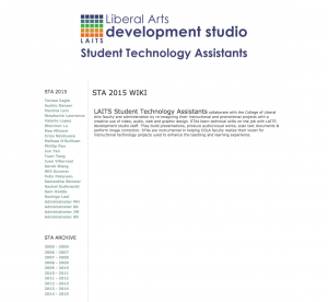
If you look at the old STA blog and the current blog, you’ll see many differences. The STA blog is used to showcase what the Student Technology Assistants were working through their time in the program. In the current STA blog, you’ll see a more organized navigation. The front page will show the STA banner of the current school year. The navigation separates the current STAs from the past STAs so students who are no longer in the program will be archived in the next school year.
My client and supervisor, Suloni Robertson the STA blog to be redesigned, easy to maintain, and responsive. It was decided to move the platform of the website from Drupal to WordPress because of WordPress easy interface. I sketched out the layout and then began to create wireframes on Illustrator. I organized the boxes to show the amount of information and the kind of information that the page will contain. I wanted to get a rough look on what the website would look like.
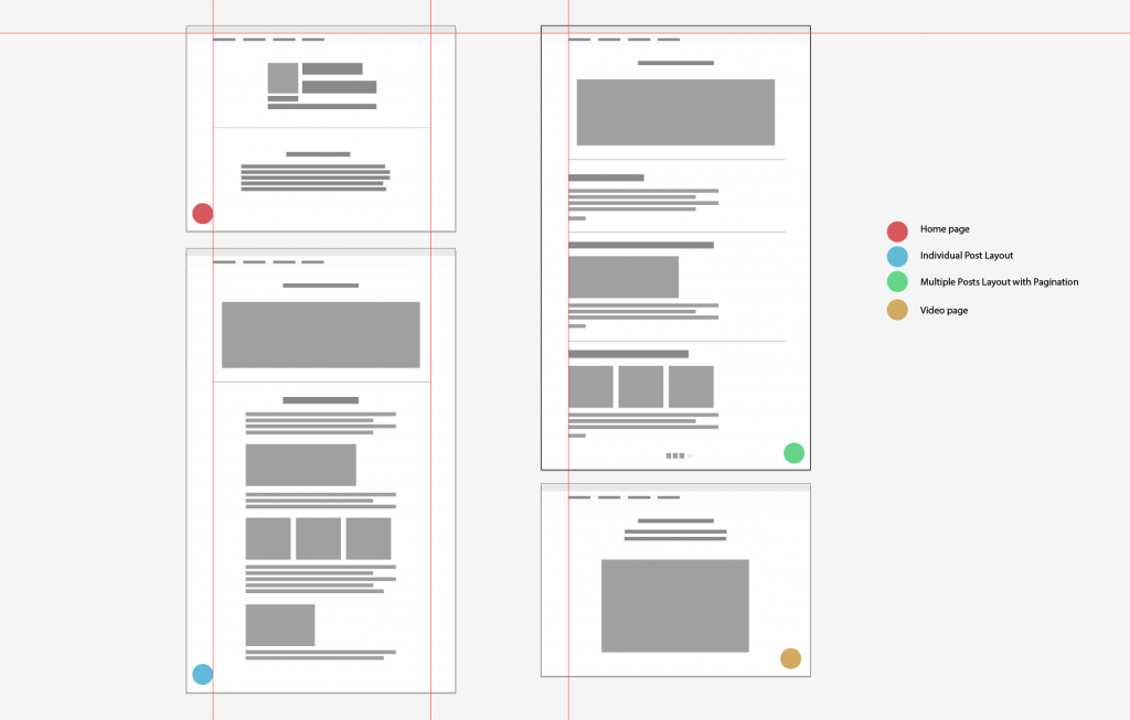
Suloni wanted a page that will have the current STAs, past STAs page, a video testimonial page and a page to hold STA presentations when they present what they have done towards the end of the school year. I placed colored circles as labels to indicate which page had what kind of content.
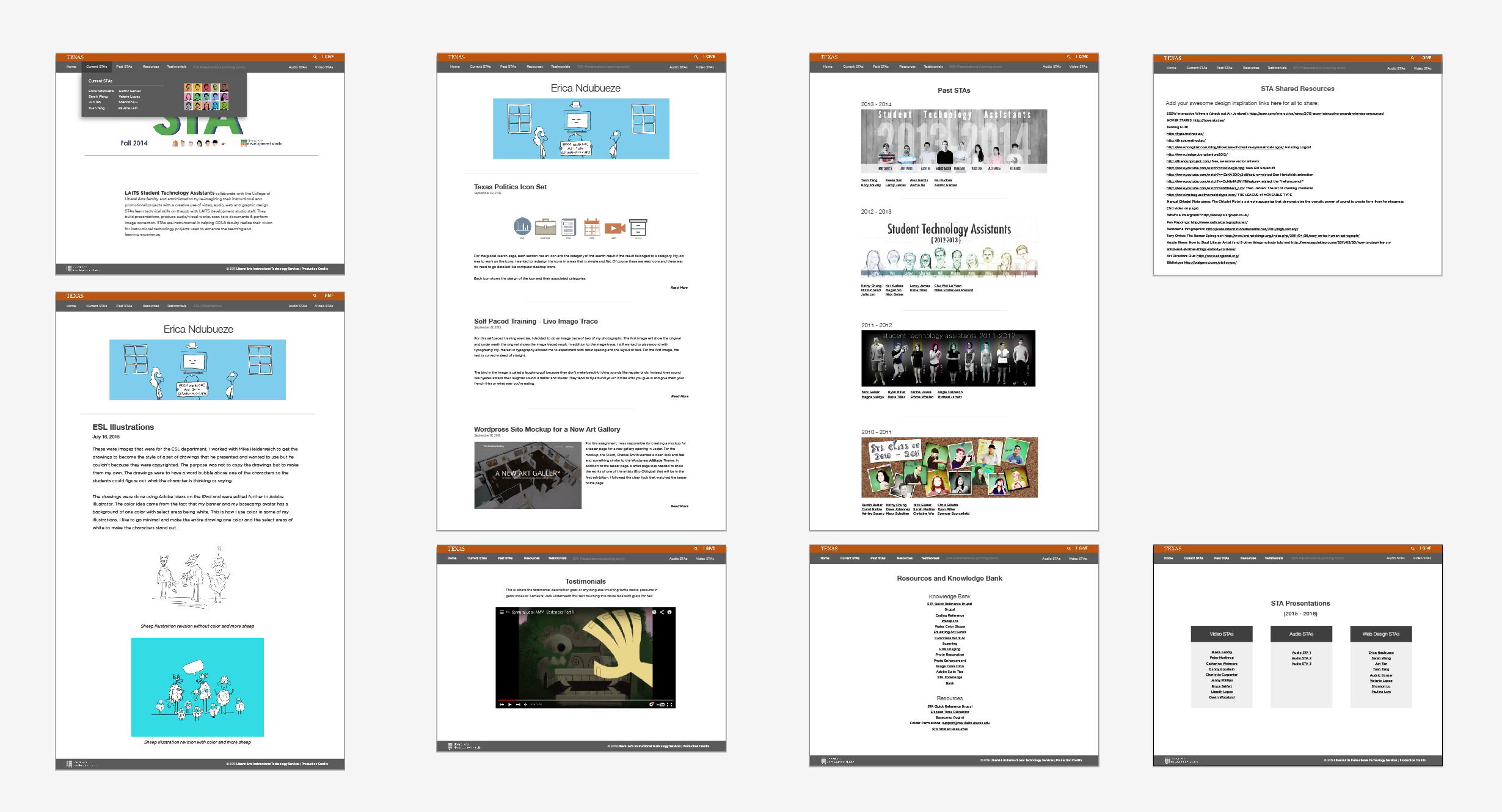
The next step was to turn the lo-fi wireframes into an actual mockup. I wanted a clean and minimal look. This was important because people will read the content so I didn’t want a font that was hard to read. To ease readability, I slightly changed the color from black to a very dark grey, increased the line height to give the text breathing room and I chose a sans-serif font because… the old site had sans-serif text. I didn’t want to transition the site from sans-serif to serif. I wanted the blog to feel like a blog and not a textbook.
I wanted to address a couple of problems with the old STA site and create design solutions for them:
The next challenge was to transfer data from the old site to the WordPress site. All posts and images needed to be transferred to WordPress. Information such as post date and the author also needed to be transferred. I chose to be responsible for writing a script that will transfer all that data. With the help of one of the developers, Stacy Vlasits to help me get the xml data from every post written in the old STA blog since the launch of the Drupal site. I decided to write the script in Java because I was taking an online MIT introduction to programming course during my free time. The course covered Java and I wanted to put my Java learning into use after a few weeks. I also used a Java XMLBuilder Library which made creating XML files much easier than doing it the raw Java way. I had to convert this giant XML file (26.3 MB) to a WordPress formatted XML. I used a sample WordPress XML file to use as a model so I can input the right data into the correct XML nodes. It took me the entire month of december, including the winter break, to create the script, import it to WordPress, categorize the STAs according to the school year (to help with archiving), and reassign posts that had incorrect authors or had no authors.
After importing every user, I wanted each STA to have their banner appear at the top of the page when they enter their page within the blog.
Stacy created a script that pretty much did that. I uploaded all of their banners in their profile page. Instead of acting as a profile picture, the banner acts as a header image for each user.
The next and final challenge was to change the style of the site to match my mockup. I had never manipulated a WordPress theme before, I wanted to learn how to do that as it will help me know WordPress more.
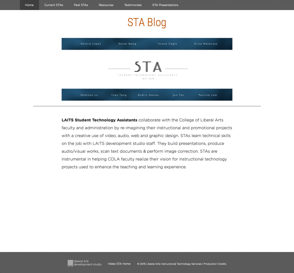
Here is the front page that includes the STA banner of the current school year or 2015 – 2016 if you are reading this many school years later. The tricky part was to make the footer stay at the bottom. The original theme had the footer siting halfway to the bottom of the page.
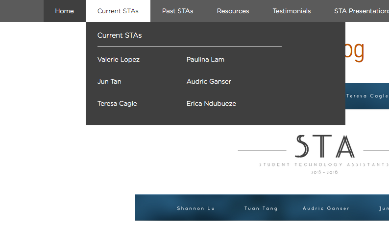
Another tricky thing that I had to handle was the drop down. In the mockup, I wanted a multicolumn drop down.
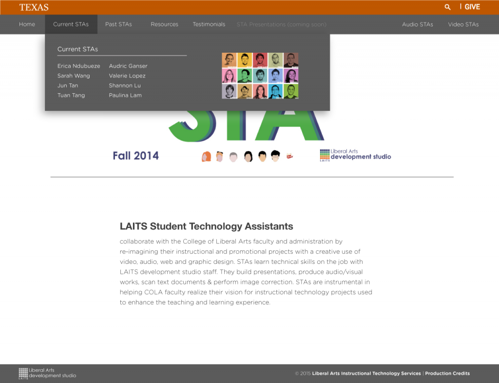
I removed the idea of the image within the background because, it’s appearance was repetitive and unnecessary. The banner is on the homepage and when you click on the current STA link instead of hovering over it, the banner is there.
That was the entire process of me contributing to the redesign and coding the blog from November to early January. Here is the banner of the front page that I designed while designing the STA webpage.