• We are STAs
    • Asha Rountree
    • Haley Ma
    • Kate Shih
    • Kyra Lee
    • Nicholas Peasley
    • Sasha Kenney
    • Shanda Horm
    • Shriya Atreya
    • Tomas Marulanda-Mesa
  • We were STAs
  • STA Presentation
    • STA Presentation 2017
    • STA Presentation 2016
  • Testimonials
  • Resources
  • Home

STA Blog

STA Guidelines

July 5, 2011 By support


Please Review STA guidelines:

Clocking-in is essential before you start on work or shifts

– Clock in for work, Dev. lab & Media Lab shifts and for meetings

– Clock-in for meetings held outside the Dev. lab.

– Clock out for lunch or breaks & clock back in for work

– All work done for LAITS should be done in the Dev. lab, not at home or other locations.

time sheet calculator: http://www.elapsedtimecalculator.com/Elapsed-Time-Calculator.aspx/http://www.miraclesalad.com/webtools/timesheet.php

Work Hours

Summer STA training = 6 hrs a week

Suloni can authorize more or less hours, only if necessary.

Always check-in with Suloni if you need to spend more time on a project,

or if you have an emergency and cannot fulfill your hours.

Time sheet & time card turn in

On time sheet turn-in day Alexis sends a notification through sta-list e-mail.

Give Suloni your time sheet & card to check and sign

Alexis will pick-up time sheets paper clipped to your time cards that are left in the slot by the time-clock only at 4:30pm

*STAs must go to the office and leave time sheets and cards directly with Alexis if they are ready any later than 4:30 pm.

Alexis is in the office until 5pm.

*If you cannot get your time-card and time sheet to Alexis by the due date/time, you must e-mail your time sheet pdf directly to Alexis:

alexisrueda@austin.utexas.edu

(Acct# 19-1652-0020)

Summer dev. lab rules

– During the Summer keep the door locked at all times. Do not leave the door unlocked.

FALL & SPRING:

– During the school year, leave the Dev. Lab locked and alarmed if you are the last person in it.

– If you work after 4:45 in the Dev. Lab, work in a locked room.

– On week-ends and after 4:45, if you lock yourself out of the Dev. Lab and you need to get back in, you can try to call another STA and get help, call list will be in basecamp.

Keys

– Do not plan on working between 12midnight and 6am. The building is locked between 12midnight and 6am.

– You can work M-F, Sat. & Sun.

– You are provided with a code for the keypad.You choose your pic#

– Do not loose or share your key, key pad code, or pic #

– If alarm is set off: call UT police immediately 471- 4441 and give them the pic#.

– Never label your key with rm#’s or any personal information.

– If you loose your key, let Suloni know ASAP.

Lab Users

– Do not have friends or family in the Dev. lab.

– The Dev. Lab is for use by STAs and authorized staff only.

– If students wander to the lab, let them know that the general use computer lab is down the hall way for them to use.

– When COLA faculty come into the lab, please greet them and ask them how you can help them.

If they need help on a request that cannot be completed during your shift hour, take down their name and e-mail and project description and e-mail this information to me.

– We help College of Liberal Arts Faculty exclusively in the Dev. Lab.

Equipment rules of use

– Dev. Lab computers cannot be used to do commercial work.

– If you have outside projects, please do not use the Dev. lab or your work hours on non-LAITS projects.

Meetings & shifts are required not optional, failure to fulfill these requirements can result in termination.

– Attendance is required at weekly STA meetings to share progress with other STAs

– Three absences are tolerated per semester for Media lab shifts Dev. lab shifts and STA weekly meetings.

– If there is an emergency, STAs must get specific permission from Suloni. This must be done in a timely fashion. As always, there are exceptions when one is sick, but even so, notifying Suloni as soon as possible is important.

sta-list@utlists.utexas.edu

– e-mailthe sta-list to communicate absences & to request help from fellow STAs to fill shifts for the Media Lab and Dev. Lab.

– Respond to the list if you are available to help with such requests.

Assignments

– Do not trade or share assignments unless you are authorized by Suloni

Saving work

– Save all of your work to the STA volume regularly.

– Store un-merged versions of your psd files & raw uncompressed image files to the STA volume in your STA folder.

– Do not leave your work saved only on the desktop, STAs have lost large amounts of works in progress by neglecting to save back to the volume.

Collaboration

– Ask Suloni for feedback on your work in e-mail & post the path to the folder you are working in.

Basecamp for project communication

–https://liberalartsits.basecamphq.com/clients

Use basecamp regularly to communicate about projects with clients, project managers, & web development staff if your project group members use basecamp predominantly.

Testing code

–WWW>laits.utexas.edu>sta

Use the sta folder in the WWW volume for css html on projects before they go live.

Problem support

– If you are locked out of a folder e-mail support@mail.laits.utexas.edu for help.

Use your full name and eid

describe your problem in clear detail

always cc Suloni

– e-mail joemess@mail.utexas.edu if you encounter a problem with hardware, software, scanners, or the printer

– Contact Tim Fackler fackler@mail.utexas.edu if you need to discuss a work matter that you do not feel comfortable talking to Suloni about.

– Contact UT ombudsman for issues that you feel cannot be resolved with our help.

The ombudsman is a “neutral third party providing assistance to students who have University-related complaints of a nonlegal nature”

http://www.utexas.edu/student/registrar/catalogs/gi01-02/ch5/ch5g.html
 

Filed Under: General

HTML, CSS, PSD, and Illustrator

June 20, 2011 By soods

July 5-15 (times TBD)

STA Orientation

Suloni & Ashley – Go over STA Rules with new STAs

Ran – STAs get their portraits taken with Ran in the studio

Senior STA’s- Show new STAs how to use wiki, hands on session


July 6-7 Wed/Thurs:Ai & PSD with Ashley, Suloni, Ran

Assignments are started during tutorials.Students work on training assigments July-August. Specific due dates for pieces TBD.

– Ran take photos of UT statues/people/self around campus. STAs use photos : post editing and realistic Illustrator tutorial.

– PSD Brushed metal and glass icon tutorial

– Chinese Paper Art Ai tutorial

Friday July 8: Scanning & Image correction with Chris

– Chris does a hands on tutorial and gives feed back on basecamp.

Monday July 11: HTML/CSS with Ran

– Ran leads coding tutorial.

(Students may art work from tutorials above for site design?)

Filed Under: General

Emulating an Art Genre

May 16, 2011 By Ashley Solano

How do you emulate an art genre using Ai?(Chinese paper art)

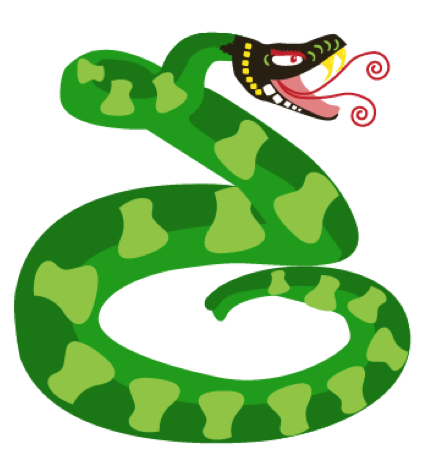
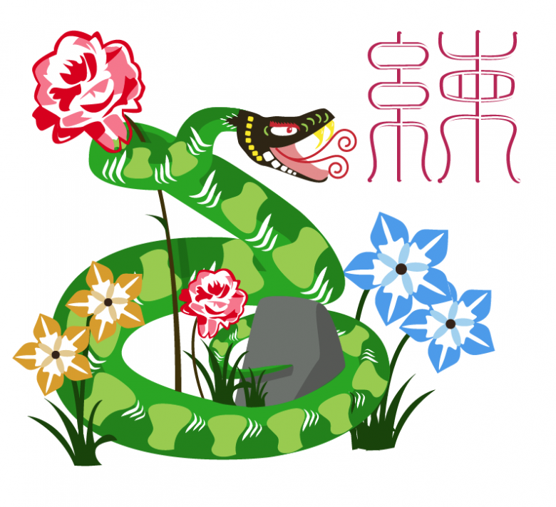
In this tutorial, we will be making a snake in Illustrator in the Chinese paper cut art style.

Here is our finished product:

STA WikiWikiWiki image

This tutorial is divided up into 6 different parts.

1.Basic Shapes

2.Swirl Tool

3.Patterns

a.Head patterns

b.Body patterns

4.Using pathfinder to cut out shapes

a.Simple cut outs

b.More complicated cut outs

5.Flower cutouts

6.Additional things


BASIC SHAPES

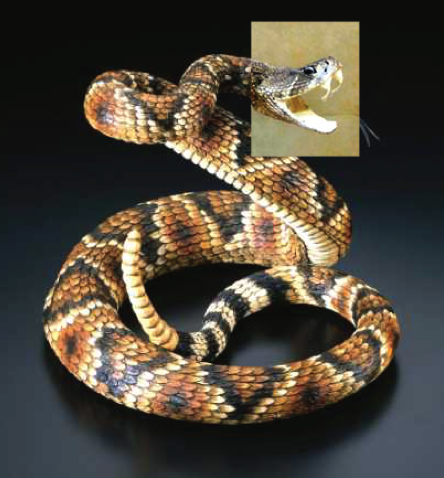
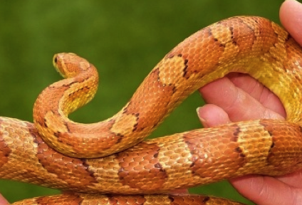
1. Find reference pictures for your animal. I had to use two different ones because the head on one of the pictures was not as cool looking as the other one. (You can worry about your background images after your animal’s done) Lock the layer that your reference pictures are on.

STA WikiWikiWiki image

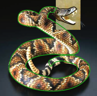
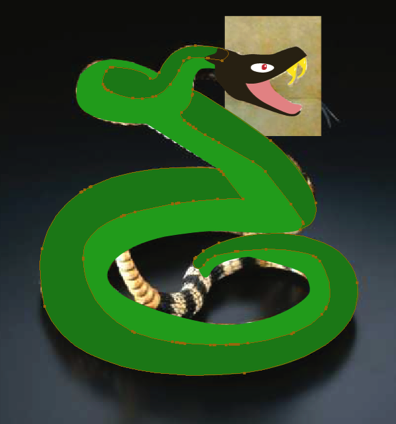
2. Make basic shapes for the snake using the pen tool. Be sure to make them closed shapes so you can fill them in with color later. In this case, I chose to make the head a different color from the rest of the body. This style of art tends to be very bright so make sure to pick out bright colors.

Aside: This project also called for the head to be detachable from the rest of the body (the animal heads were going to be used as icons for the navigation of the site). You do not need to make the head of your animal detachable.

STA WikiWikiWiki image

I took some liberties with his tail, just as a personal choice. Ill later wrap the end of the snakes tail around a small rock.

Tip: You can make one big shape for the base color (in this case, the light green part of the snake). However, once you get to the darker shading, those should be separate shapes.

STA WikiWikiWiki image

Tip: LAYERS. LAYERS. For the love of god, use layers to your advantage. Name them, divide them, organize them. Youre going to have a LOT of shapes and paths by the end of this, you dont want to waste half of your time just trying to find that one shape you made two days ago.

Tip 2: SAVE OFTEN. That can never get said enough.

SWIRL TOOL

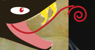
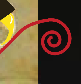
A tool that comes in handy occasionally is the swirl tool. I used this to make the ends of the snake’s tongue. If you already know how to use the Swirl tool, feel free to skip ahead to the next section.

The swirl tool can be found with the line segment tool.

1. Pick your color for your swirl, in this case, its red for the tongue.

2. Use the pen tool (or the arc tool) to make the base of the tongue.

STA WikiWikiWiki image

3. Use the swirl tool to make the tip of the tongue.

STA WikiWikiWiki image

Tip: While still holding down on your mouse (or if youre using a tablet, while still keeping your pen on the tablet), use the up/down arrows on the keyboard to adjust the length of the swirl to whatever you want.

4. Rotate the swirl so that it matches up with the end of the curved line from step 2.

STA WikiWikiWiki image

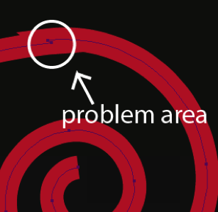
5. Not done yet! Connect the two pieces by selecting the endpoint of the curved line and the endpoint of the swirl. (Any easy way to do this is to just hit Q on the keyboard and then circle the two endpoints) Then join them together by either going to Object > Path > Join or by simply hitting Command + J .

STA WikiWikiWiki image

6. The point where the two pieces meet is still a little jagged. So use the Delete Anchor Point Tool (keyboard shortcut: hit the minus key) to delete one of those two endpoints you had just joined.

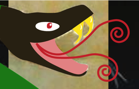
Done! Now just copy, paste, and adjust this and youve got a forked snake tongue.

STA WikiWikiWiki image

PATTERNS

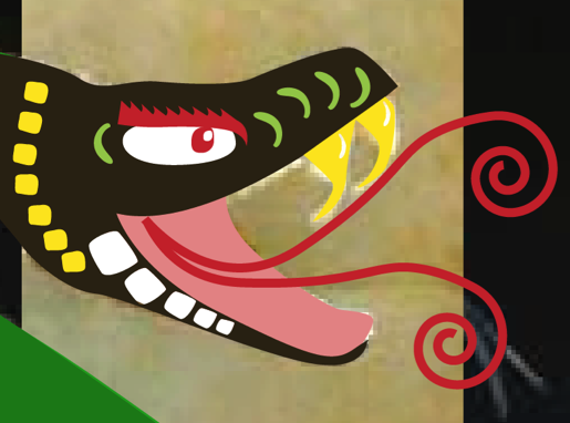
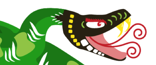
Patterns are a necessary part of paper art style. First I’ll start with the head.

STA WikiWikiWiki image

Head patterns

This part is pretty simple and flexible so Ill only have this one picture as a reference. Youll learn how to cut out all the whites shapes later in the tutorial.

1. Choose bright colors to contrast the darker colors of your animals head. White shapes will be used later for cutouts.

2. Choose and draw a shape suitable for your animal that you can repeat as a pattern.

For the head, I chose to do rounded rectangles (hand drawn with the pen tool, not made with the rounded rectangle tool). This gives the snake’s face a scale-like feel to it. If your animal is more on the furry side, your shapes should be more like fur. I also did some apostrophe type shapes just because I thought they looked good.

3. Be sure to copy and paste your shapes to make everything regular. The shapes themselves don’t need to be precise but copying and pasting the shapes repeatedly gives the illustration more structure. Keep your pattern simple. Something too intricate will not look good when repeated.

Tip: Change the size of your shape dependent on perspective. This will definitely come in handy for the snake’s body.

4. Dont forget to use both white and colored shapes.

5. Give him some angry eyebrows. (Easy way to give the eyebrows a jagged shape is to make one curvy triangle shape, copy/paste it repeatedly, then connect it all together).

Tip: Do not swamp your animal’s head with too many patterns. A little pattern goes a long way. Dont be afraid to scrap a pattern completely if it doesnt fit your animal. Look up other paper cut outs online to see what patterns they use if you need inspiration.

Body patterns

I made the pattern I did based off a snake’s scales. I actually used a separate reference picture for this one. I based my body patterns off this:

STA WikiWikiWiki image

Making the pieces bigger in certain areas when the perspective is closer creates depth, just like in the reference picture.

STA WikiWikiWiki image

Dont forget to add white shapes for the cutouts.

STA WikiWikiWiki image

Tip: For the snake, I had to make sure the patterns followed the direction of his body. Be sure you do this too for your animal. It will make it look better and less like you just copied and pasted everything (despite the fact that thats exactly what you did).

STA WikiWikiWiki image

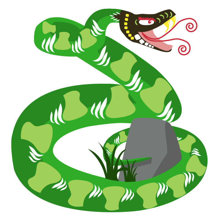
I added the rock and some grass as a personal preference.

USING PATHFINDER TO CUT OUT SHAPES

It just wouldnt be a paper cut out without actually cutting the shapes out. This part can be tedious but it helps in the long run. This section is divided into two parts.

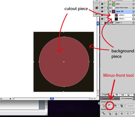
Simple cutout: For white cutouts that have only one color/shape underneath it

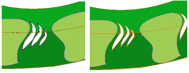
Multiple cutout: For when your cutout shape is on top of two or more layers. For example, the white cutouts on the snake body: it’s on a dark green layer and a light green layer.

If you already know how to use the Minus-Front tool in Pathfinder, all you need to know is to cut the white pieces out of the main shapes so that there’s one big piece with holes in it rather than one big piece with lots of little white pieces on top of it.

Simple cutout

1. Select your white cutout shape and your background shape at the same time. You can do this by holding down both the apple key + shift, then clicking both shapes. For this Im just going to do a really simple shape.

Tip: To make things easier, make sure the white cutout shape is on the layer directly above your background layer. When there are other shapes in between, layer order gets a bit tricky.

STA WikiWikiWiki image

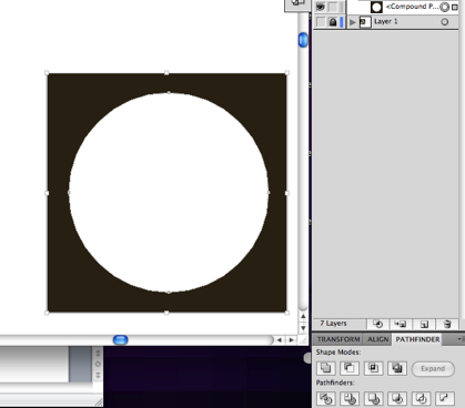
2. With both shapes still selected, open pathfinder (window>pathfinder). Click on the Minus-Front tool. This will automatically erase your white cutout from your background image, merging it into one oddly shaped image.

Here’s what it looks like after cutting out the piece (notice how its just one shape with a hole instead of two separate pieces)

STA WikiWikiWiki image

Tip: If you have multiple white cutouts, you can save time by selecting all the white shapes and the background at the same time, then using the Minus-Front tool. Much faster than tediously selecting every white shape individually.

Multiple layers underneath cutouts Snake Body

1. Duplicate your cutout. As stated before, pathfinder Minus-Front automatically gets rid of your cutout shape layer. You need this shape for both layers, so duplicate it before proceeding. You can do this by copying the shape and pasting it in front. (command+c then command+f)

2. Select one copy of your cutout and one of your background images. In this case, the dark green layer.

3. Use pathfinder Minus-Front tool.

Now the dark green layer has the cutout, but the light green layer underneath doesn’t. This is where your duplicate white piece comes in handy.

4. Select your duplicate white shape and your light green background layer at the same time.

5. Use pathfinder Minus-Front tool.

Done! Now you have a proper cutout for both green shapes.

Tip: This process can be used for cutouts on top of 3+ colors too. Basically, you need the same amount of cutouts as you do background layers.

Here’s an example of what it looks before and after cutting out the shapes:

STA WikiWikiWiki image

Here’s how everything looks after I added the rock and fixed the tail

>>> FLOWER CUTOUTS

Now it’s time to give a background for the animal. Find some reference pictures of flowers or plants that you think would be suitable. There are two approaches you can take with the flowers. You can either do the same method as you did with the animal (one big piece with cutouts and patterns) or you can simply make many little shapes to make the flower.

Here is the first method. I didn’t really base it off any reference pictures in particular.

1. To make the petals make one side of a petal. This will make sure everything’s symmetrical.

STA WikiWikiWiki image

2. Copy this shape and paste it in front (apple+c, then apple+f). Then flip it horizontally (object > transform > relflect vertical at a 90 degree angle).

3. Move the second shape so that it lines up with the first shape, then join them together with pathfinder.

STA WikiWikiWiki image

4. Copy and paste this petal, placing the shape so that it begins to form the flower like this:

Tip: I used the rotate tool and rotated each piece a multiple of 72 degrees (360 degrees divided by 5)

STA WikiWikiWiki image

5. Fill in the middle piece and join all the pieces together (pathfinder tool).

STA WikiWikiWiki image

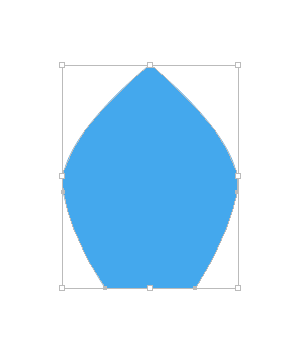
6. Now it’s time to make cutouts. Here is the shape I made (using the same method I did for the petals):

STA WikiWikiWiki image

7. Repeat step 4, this time with your cutout shape.

STA WikiWikiWiki image

Note: Do NOT use the minus-front tool to cut these shapes out yet! You’ll do this at the end.

Also: At this point, it’s okay if the middle of the flower doesn’t look too great because you’ll be adding some pattern shapes to cover it up.

8. Now add one more shape (I did ellipses) as well as a circle on top of your base shape. Feel free to pick any other shape.

STA WikiWikiWiki image

9. Adjust the cutouts so that none of the dark blue is seen underneath the center pattern you just made. Move them around to make them look better.

STA WikiWikiWiki image

10. Finally, cut the white shapes out of the big blue shape using the minus-front tool and you’re done!

This is the second method. Here’sthe flower I chose for this style.

STA WikiWikiWiki image

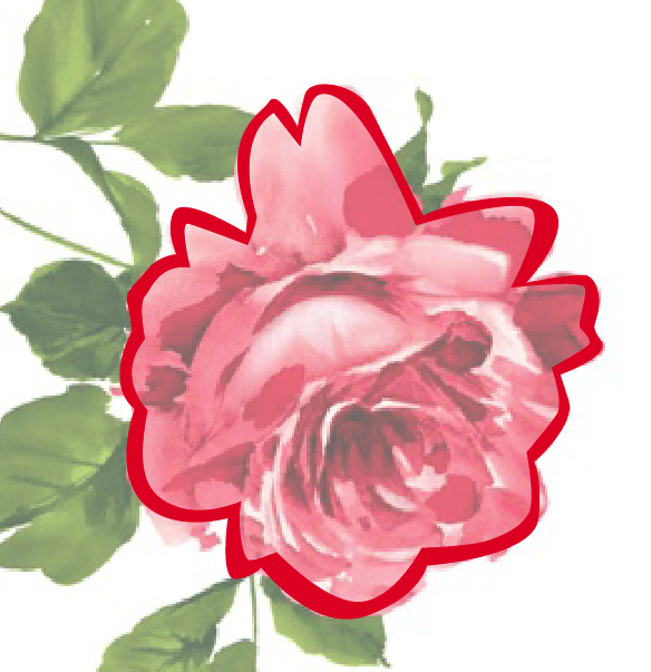
1. Make an outline of flower. An easy way to do this is to make one shape outlining the whole flower, then making a copy of that shape and making it smaller. Then use what you learned with pathfinder and use the minus-front tool to delete the smaller shape to leave an outline.

STA WikiWikiWiki image

2. Start by making the darker shapes using the pen tool. You don’t have to be very precise or get every single dark shape, just enough to get the feel of the flower petals.

STA WikiWikiWiki image

3. Then make the lighter shapes with the pen tool underneath the darker ones. Make sure to leave enough white space to make it look like a cutout.

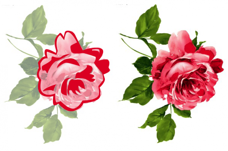
Here’s how the finished product looks. (For reasons I can’t remember, I didn’t do the leaves)

STA WikiWikiWiki image

ADDITIONAL THINGS

Youll notice my snake and the reference snake do not actually line up perfectly because I decided to throw a rock into the mix and make the snake hug it with its tail. Feel free to not follow the animal reference picture perfectly. If you think your animal would look better in a slightly different position, dont be afraid to change it.


Helpful Links

http://www.sinopaperart.com/chinese-paper-cut-gallery.htm

This website served as a reference a lot throughout this project for everyone involved. There are three different sets of the zodiac animal paper cut out art that you can look at for inspiration.

Filed Under: General

HOW TO GET FOAM A FLAT DRAWING TO A 3D CARICATURE

May 5, 2011 By Ashley Solano

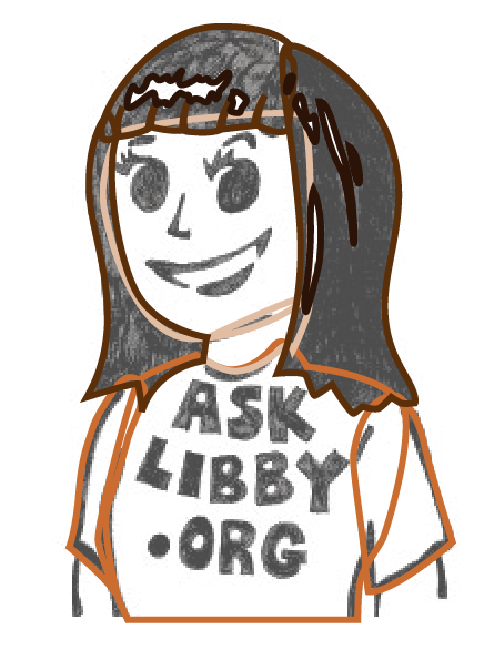
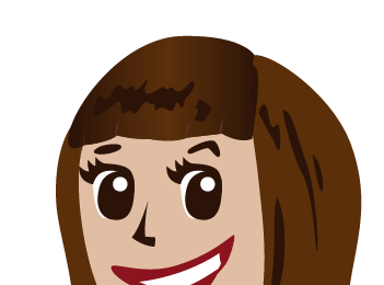
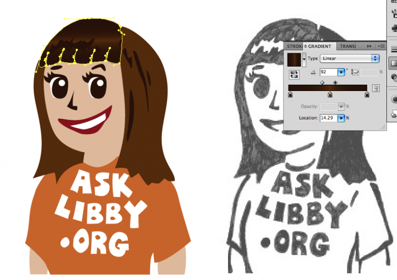
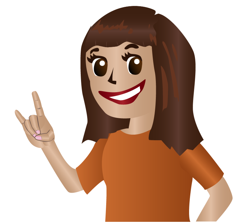
In this tutorial, well be going over how to take a flat drawing (left) and make it into a 3D caricature (right) in Illustrator. This illustrator assumes you know how to use the pen tool.

STA WikiWikiWiki imageSTA WikiWikiWiki image


This tutorial is divided into 5 different parts

1. Basic Shapes

2. Using Swatches

3. Adding Gradients to add depth

4. Adjusting your gradients

5. Specific Tips: Hands

BASIC SHAPES

1. First begin by setting your main drawing at a lower opacity (about 70% should do) Lock down original drawing layer so that you dont accidentally move it etc.

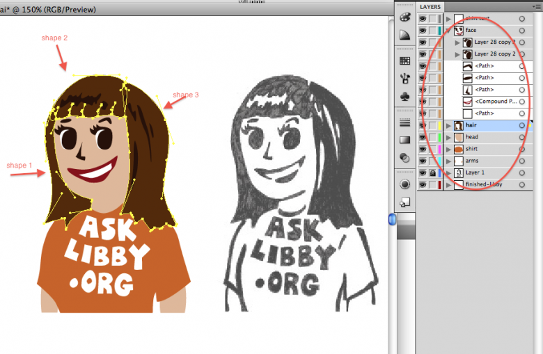
2. Make outlines of the basic shapes using the pen tool, making sure they’re all closed so you can fill them in with color later. Right now, color doesn’t matter, so just color-pick it or choose at random.

STA WikiWikiWiki imageSTA WikiWikiWiki image

Tip: Make good use of layers to separate certain regions of your drawing (for example: hair, face, shirt, etc).

Tip 2: Avoid making single shapes for big parts of the drawing. For instance, I used three separate shapes for Libby’s hair. This will help in the future when adding gradients.

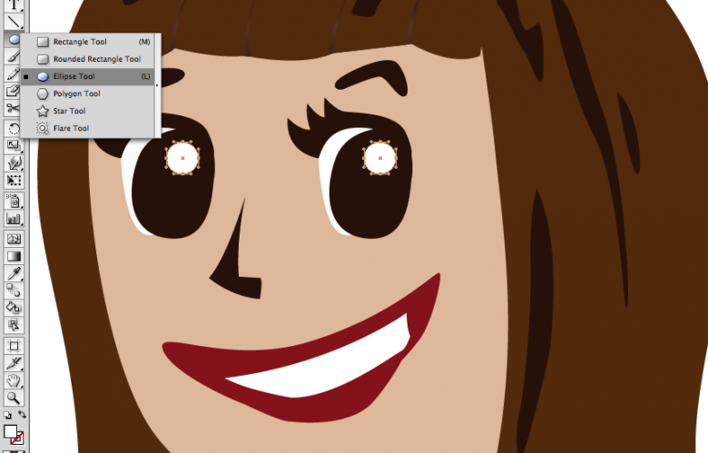
3. For symmetrical shapes like circles or squares, be sure to use the elliptical or rectangle tools to make them as precise as possible. For Libby, I didn’t use the elliptical tool for her pupils, but I did use it for the eye shines, which I added to the illustration after tracing everything.

STA WikiWikiWiki image

USING SWATCHES

This next step will help make adding gradients much easier for you.

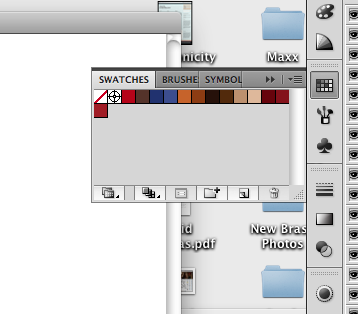
1. Choose your basic colors: I chose orange for her shirt, dark brown for her hair, and a light cream color for her skin.

2. Make sure swatches is open (window>swatches) and drag your colors one by one to your swatches. This will give you a color palette for later.

STA WikiWikiWiki imageSTA WikiWikiWiki image

3. Now pick colors for your gradients. First start with your base color, than make it darker (or lighter). Notice the different shades in my swatches.

4. Once you’ve done that, drag that to the swatches like you did for the base colors.

Now your color palette is ready.

ADDING GRADIENTS TO ADD DEPTH

Adding gradients is an easy way to depth to your illustration. It makes the shadows and contours of your shapes pop out without being too drastic. It can be found in window>gradients. It can also be easily opened underneath the color picker.

For this example, we’re going to do Libby’s hair.

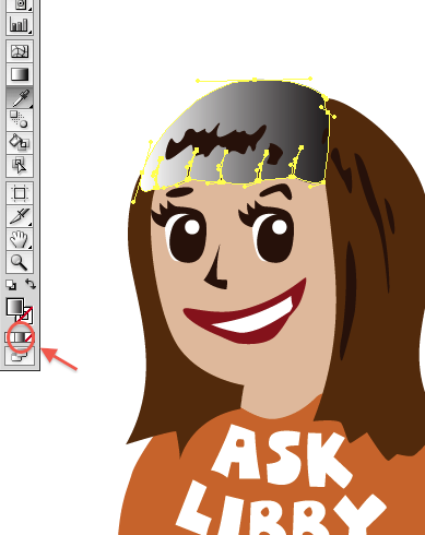
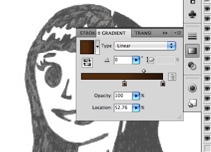
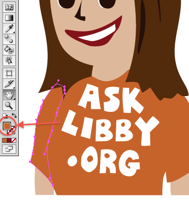
1. Highlight the piece you want to fill with a gradient (in this case, Libby’s bangs). Then, click the gradient button on the left.

STA WikiWikiWiki image

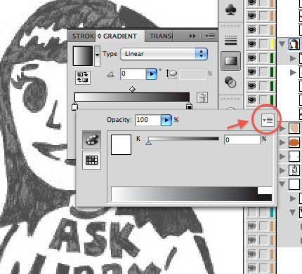
Normally in Illustrator, this takes your shape and automatically makes it in a black/white gradient. And usually, it’ll be on the black/white setting.

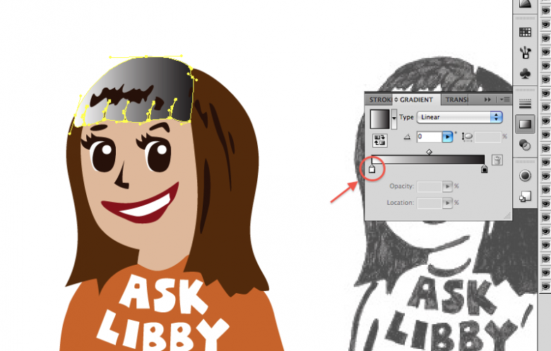
2. To change the gradient color setting to RGB, click on the gradient toolbox, and double-clicking one of the mini boxes underneath the gradient.

STA WikiWikiWiki imageSTA WikiWikiWiki image

2a. In the dropdown menu in the right corner, click RGB.

2b. Click out to exit this menu and do the same for the other box to make sure it’s on RGB setting too.

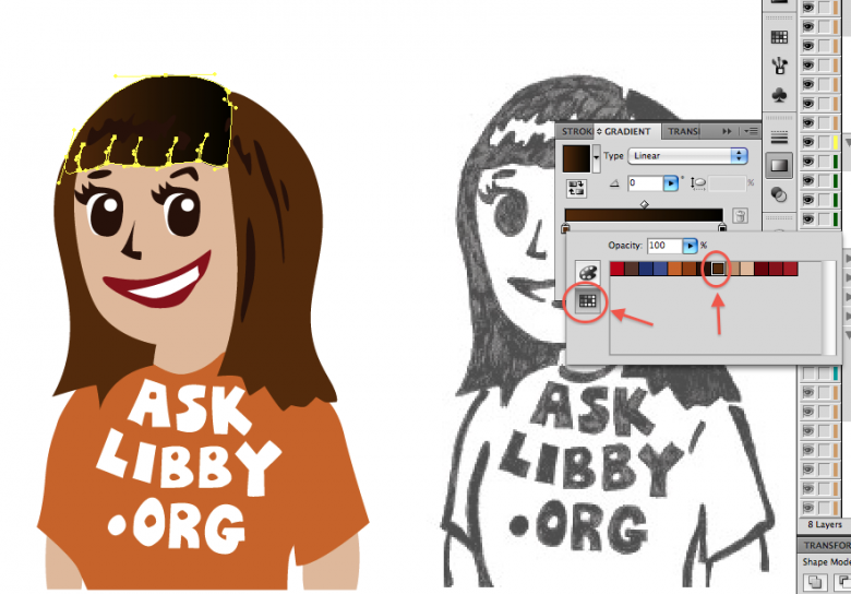
3. Now that your settings are in order, double click one of the boxes underneath the gradient again, doesnt really matter which right now. This will open up your color palette. If your palette is not showing, click the swatches button on the left.

STA WikiWikiWiki image

4. Choose your color from your color palette. In this case, it’ll be dark brown for the base color of Libby’s hair. After that’s done, exit that menu by clicking out of it.

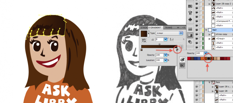
5. Now click the other box on the gradient. This will be for the shadows of Libby’s hair. Using the same steps used for the base color, choose the shadow color (even darker brown).

STA WikiWikiWiki image

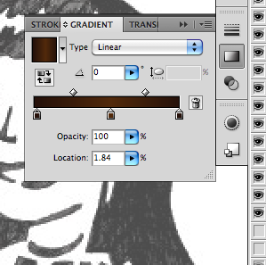
Libby’s bangs don’t go from just dark to light; it’s goes from dark to light and back to dark. So

6. To add one more gradient, click on the gradient scale. This will add another box that you can fill. Do this for the other dark side of the hair. You can move the colors around so that it’s in the right order.

Here, Ive moved the lighter gradient towards the middle to make room for the third color.

STA WikiWikiWiki image

Now Ive added the third color.

STA WikiWikiWiki image

ADJUSTING YOUR GRADIENTS

STA WikiWikiWiki image

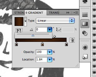
Libby’s bangs’ highlights are horizontal, not vertical. (Notice how awkward that looks) So fix this by changing the angle.

Use the dropdown angle menu in the gradients toolbox. You can change it by either entering a number between -180 and 180 or by sliding the triangle left/right. Its usually easier just to use the slider at first.

STA WikiWikiWiki imageSTA WikiWikiWiki image

Now the highlight runs at the right angle.

Tip: Another way to adjust your gradients are the diamonds above the gradient scale. This adjusts how the gradient transitions: it can either be a gradual change or an abrupt one. Feel free to mess with it and find out what looks best.

Now that you know how to add and adjust gradients, you can apply this to all your other shapes (tshirt, face). Keep in mind it’s not necessary to do it for every single shape (I didn’t use it for Libby’s hair shines or her teeth)

Tip: be mindful of where your layers are. Make sure your detail shapes aren’t covered by bigger shapes on top of them. Adjust the order of your layers to suit your illustration.

SPECIFIC TIPS: HANDS

Hands are a pain in the butt. Here’s one way of illustrating them in Libby’s style.

STA WikiWikiWiki image


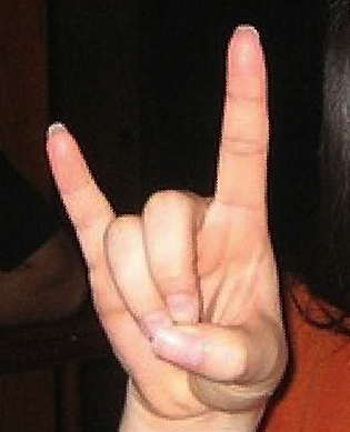
Find a reference picture for a hand. Drawings in this case won’t really do. Find a good reference picture that has the same shape and position as the one you want. Skin tone doesn’t matter at this point cause you’ll just be using your color palette.

For this example, I’m going to use a picture I found through google of someone doing the Hook ‘Em Horns signal. (I adjusted the angle to suit Libbys hands)

STA WikiWikiWiki image

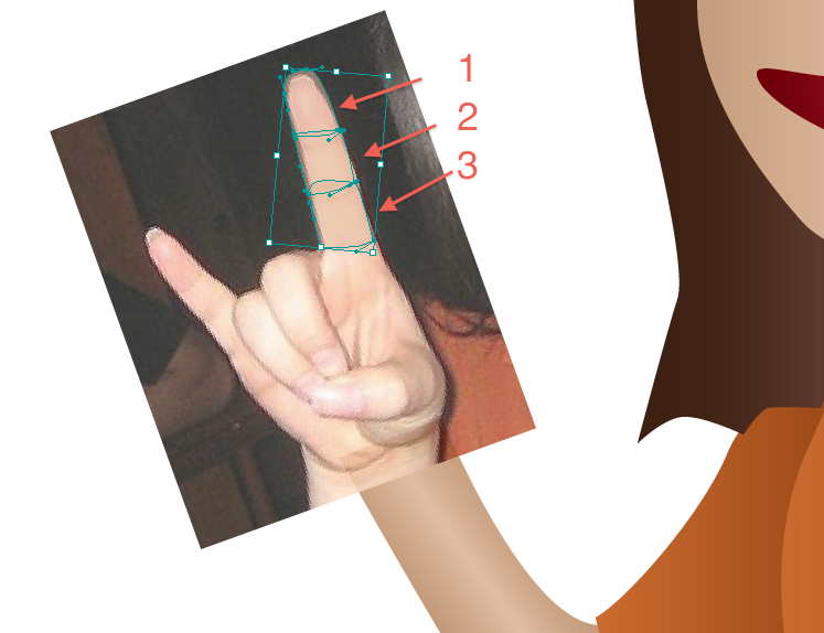
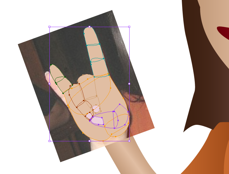
1. Start by making shapes for the fingers. Do NOT make only one shape per finger. Instead, do one shape per joint. This will give the fingers more depth and will make them look more natural.

STA WikiWikiWiki image

Ive turned the opacity down on the finger pieces to show the shapes and how they match up with the reference picture.

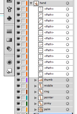
Tip: Layers. Layers. Layers. You will have a lot of shapes for the hand alone so be sure to make and label your layers (one layer for pinky, one for thumb, another for pointer finger etc).

STA WikiWikiWiki image

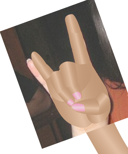
Once youre done doing that for all the parts of the hand, youll have something looking like this:

STA WikiWikiWiki image

I even added the nails. Ignore the fact that her pinky and the reference pinky dont line up.

Now its time to add the gradients just like we did with Libbys bangs.

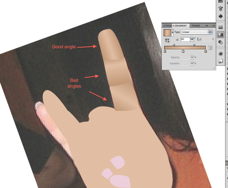
2. Using the same colors you used for the skin, add gradients to all the different shapes of the hands. Take your time with each shape and make sure the gradient angles are correct. It’s a bit painstaking to do this for every shape, but the outcome is worth it.

STA WikiWikiWiki image

Here are examples or good and bad gradient angles and how they effect the hand as a whole.

STA WikiWikiWiki image

Heres how it looks after all the shapes have had gradients added to them.

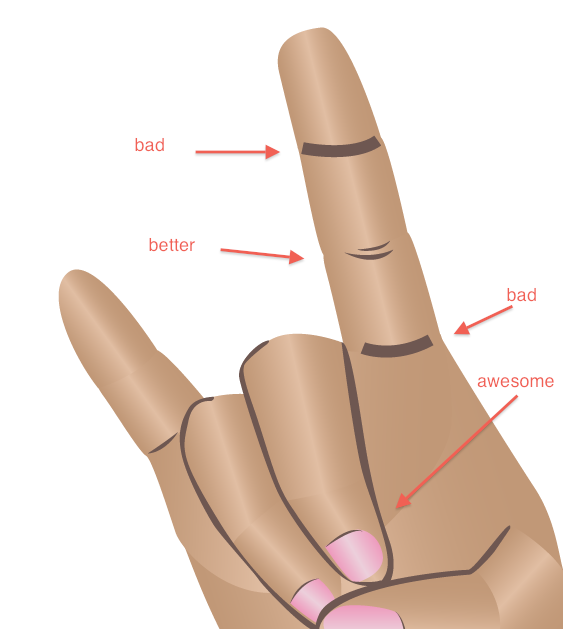
3. For one final touch for the hands, add lines to accent the knuckles and/or joints. Avoid making lines with the pen tool with a single stroke and leaving it at that. Instead, make a closed shape and fill it in with a solid color.

STA WikiWikiWiki image

I also added accent lines for the nails.

4. Adjust and touch up the hands; this usually means making sure the gradients line up properly and figuring out where to add outlines. Zoom out every once in a while to make sure it looks good at a distance. Sometimes you have to make the hands smaller or bigger dependent on the style of the cartoon. In Libby’s case, she’s got pretty big hands in proportion to her body. But it looks good.

Then you’re done!

STA WikiWikiWiki imageHook ’em!

Filed Under: General

Water Color Shape Illustration

April 27, 2011 By Kathy Chung

Watercolor Illustrating Method

Basics:

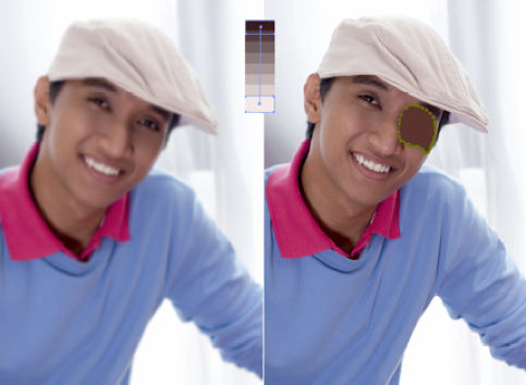
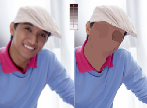
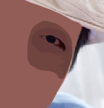
This method uses many shape paths and transparencies. The transparent layering of shapes creates the modeled surface of the subject you are drawing.

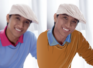
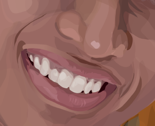
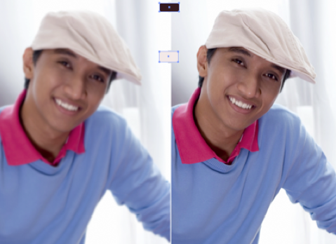
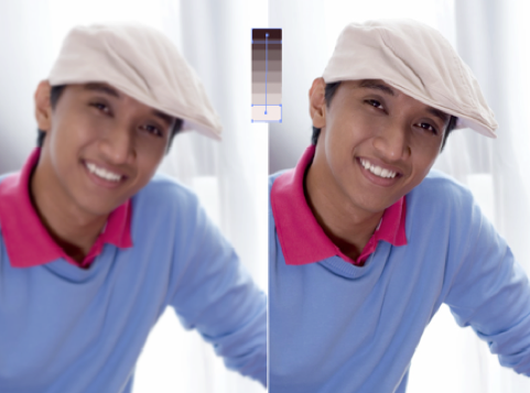
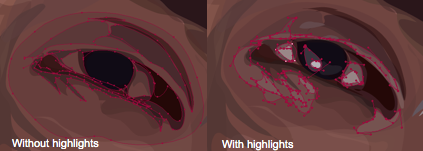
Before and After Close Up
STA WikiWikiWiki image STA WikiWikiWiki image

In this tutorial, you will learn how to…

  1. Observe the colors that create the dimension
    1. Its very important to understand how light, dark and colors create a three dimensional form. Notice where the light sources is coming from and where highlights need to be. Notice what shadows are present.
  2. Light sources, shadow, highlights areas directed, close up, pinpoint
  3. Depth and Foundation
    1. Like layering paint on a canvas, this watercolor effect relies on adding layers onto a base, so try to think from large to small and in terms of depth in the image.

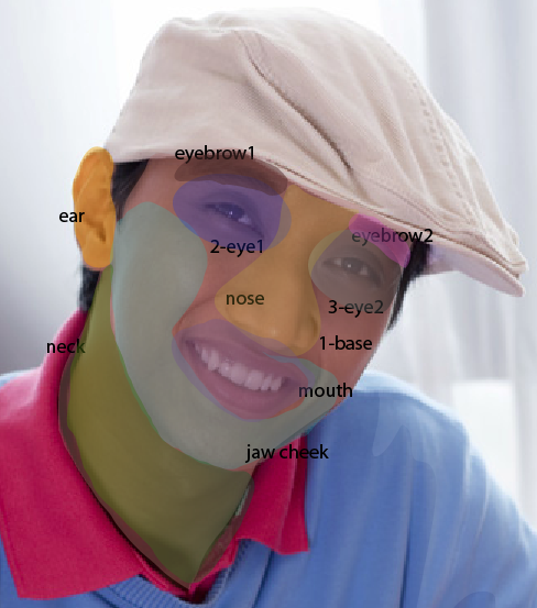
Step 1. Identifying Major Areas:

Visualize facial divisions (ie. Eyes, nose, mouth)

STA WikiWikiWiki image

Need to direct when to add layers/paths (add screenshot of the layers. and what order you should illustrate them (name the sections by layer) use when in illustrator


Step 2. SET UP:

Photoshop

How to start:

  1. Open the image file you want to recreate using Photoshop.
  2. Duplicate the image and place it side by side on the same file
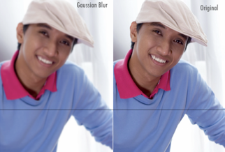
  3. Apply a light Gaussian Blur (Effects the tone of the images

STA WikiWikiWiki image

In Illustrator:

  1. Open both Photoshop files in Illustrator (Guassian and original image). Place the images side by side. This way you have a reference while you work on one of them

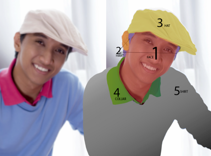
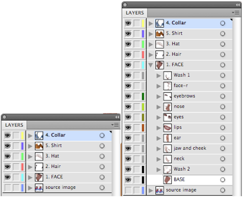
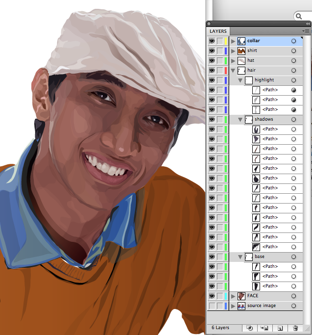
Organizing Layers

STA WikiWikiWiki image

  1. Now name each layer with the major sections you identified during observation; hat, collar, shirt, face, hair, and source image at the bottom on the layers

Step 3. ILLUSTRATION:

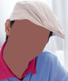
You have to start somewhere, so lets start with the objects that are the foundation of the image. For instance, the face is the farthest element from the viewer in terms of depth.

#1. The Face Color
#2. Picking Color for the base path
#3. TRACING Base Path
#4. Building the face with shadow shape paths:

  • Solid Color Shape Path
  • Shading with a Gradient Shape Path

#5. Building the face with light shape paths

FACE:

STA WikiWikiWiki image

IllustrationSteps Outlined:

  1. Creating Color Palette
  2. Select Color for Base Path
  3. Tracing base path
  4. Building the face with dark shape paths (example, eye)
  5. Building the face with light shape paths (example, eye)

#1. The Face: Color Palette

  1. On the source image layer, create a path for the color pallete.
  2. Create a color palette form dark to light for highlights and shadows in the face that will create the dimensions on the face. (a gradient color palette)
    1. Color pick the darkest color of the face and create a square path using the Rectangle Tool to the side of the image you are tracing off of (doesnt matter which side)
    2. Color pick the lightest color of the face and create a rectangular path using the Rectangle Tool 2 inches below the dark rectangle.
    3. Select both dark and light rectangles by clicking on the squares while holding the shift key down.
      • STA WikiWikiWiki image
    4. Go to Object>Blend>Blend Options.
    5. Set the options to Specified Steps: 6
      • STA WikiWikiWiki image
    6. Go to Object>Blend>Make
    7. This should create 6 different gradient steps from light to dark. You will be color picking from this palette to create the shadows and highlights of the face.
      • STA WikiWikiWiki image

#2. Picking a color for the base path

  1. Insert image of close up a show self picking color
  2. Color pick a base color for the face from the Gaussian Blur image. I usually try to find the color that occurs most in the face or a color that matches most of the colors.

#3. TRACING Base Path

The best place to start is with base shapes (on portraits, start with the face.) Were building this image using base shapes as a foundation for the highlight and shadow shapes.

STA WikiWikiWiki image

  1. Using the pencil tool (settings below), trace around the face using the color you picked for the base shape.
  2. Hide the path by clicking on the eye next to the path name. By hiding the path, you can add additional paths to the source photo without having to youre your paths around

#4. Building the face with shadow shape paths

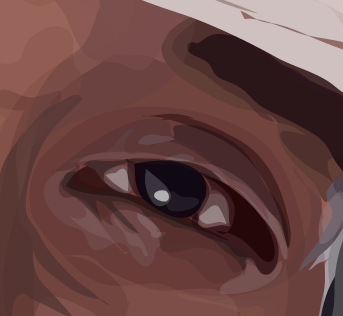
I will be using the eye to demonstrate the water color process, which can be applied to all aspects of the illustration.

STA WikiWikiWiki image

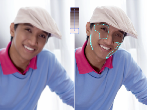
Focus on the darkest shadows in the face (around the nose, eyes, wrinkles, etc). There are two ways to approach tracing the shadows in the face. One is using the solid color shape path and two is using the gradient color shape path.

STA WikiWikiWiki image

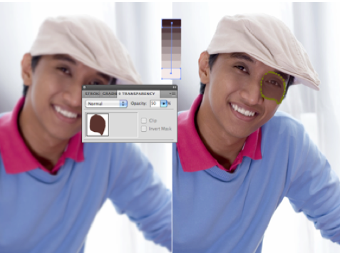
  1. Solid Color Shape Path
    1. Select a very dark color from the color palette.
    2. Hide the base color path so you can see the shadow you are tracing.
    3. Trace the shadows using the dark color you picked.
      • STA WikiWikiWiki image
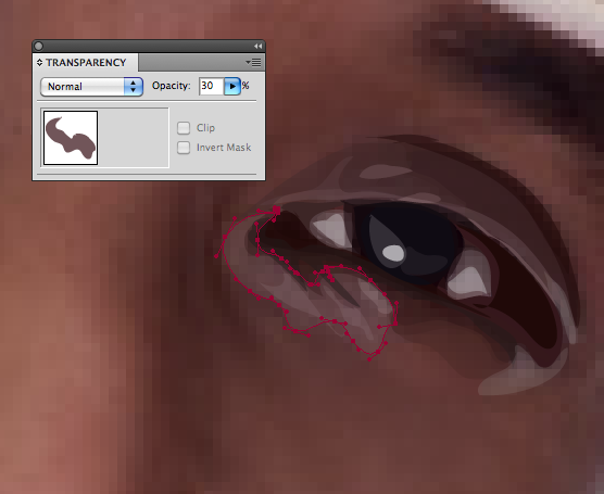
    4. Now adjust the transparency so it matches the shading in the area you traced
      • STA WikiWikiWiki image
    5. The shapes should be deliberate and reflect the shading in that area.
    6. Continue tracing shadowed areas and arrange the paths one top of each other in the layer palette.
      • STA WikiWikiWiki image
    7. Note the more transparent layers you add, the darker or lighter it will be
    8. Hide and unhide the base layer to see if the shading is correct Zoom in and out to see if the shapes work.
      • STA WikiWikiWiki image
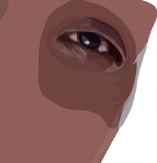
    9. FINAL(just shades)
      • STA WikiWikiWiki image
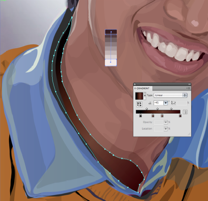
  2. Shading with a Gradient Shape Path
    1. STA WikiWikiWiki image
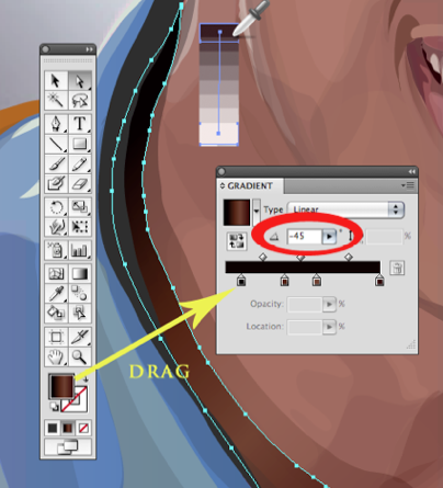
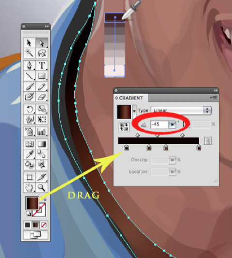
    2. Select a very dark color from the color palette that matches the color on the image. In this case it was black.
    3. Drag that color from the color selection area to the gradient slider.
      • STA WikiWikiWiki image
    4. Select the lightest color in the area you are tracing. In this case, the lightest area can be color picked from the Gaussian Blur image or colors in our gradient color palette
      • JUDGEMENT CALL: I played around with the color picker until I found a color that matched the color in the image
    5. Drag that color from the color selection area to the gradient slider. Adjust the slider to match the amount of dark and light color in the area you are tracing.
    6. Adjust the angle of the gradient to match the angle in the source image. I do this by focusing on the highlight and adjusting the gradient angle accordingly.
      • STA WikiWikiWiki image
    7. Hide the base color path so you can see the shadow you are tracing.
    8. Trace the shadows using the dark gradient you picked.
      • Tip: You can also use the transparent shape with a gradient and observe the colors that create the dimension.
      • Its very important to understand how light, dark and colors create a three dimensional form. Notice where the light sources is coming from and where highlights need to be. Notice what shadows are present.
    9. Continue to add layers of transparencies and shapes on top of each other till you get the dimensionality of the target area.
    10. Close up pinpointing light sources, shadows, highlighted areas.
      • STA WikiWikiWiki image
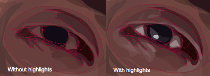
    11. Next! Creating highlights with a similar procedure to shading!

#5. Building the Face with Light Shape Paths

STA WikiWikiWiki image

Focus on the highlights in the face (around the nose, eyes, wrinkles, etc). Just like shading, there are two ways to approach tracing the highlights in the face. One is using the solid color shape path and two is using the gradient color shape path.

STA WikiWikiWiki image

  1. Solid Color Shape Path
    1. Select a very light color from the color palette.
    2. Hide and Unhide the base color path so you can see the shadow you are tracing.
    3. Trace the highlights using the light color you picked and adjust the transparency so it matches the lighting in the area you traced.
    4. STA WikiWikiWiki image
    5. The shapes should be deliberate and reflect the lighting in that area.
    6. Continue tracing highlighted areas and arrange the paths one top of each other in the layer palette.
    7. STA WikiWikiWiki image
    8. After adding Highlights, your illustration should look like this:
    9. STA WikiWikiWiki image

Continue this technique on the entire image you would like to illustrate. In the end your image will look something like this!

STA WikiWikiWiki image


Helpful Links

(include other website(s) or tutorials

Filed Under: General

HDR Imaging

April 26, 2011 By Dave Johannes

Photomatix Pro Tutorial: The Basics

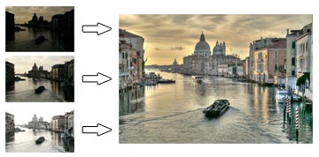
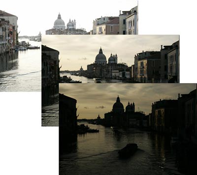
In this tutorial, you will learn how to create a High Dynamic Range (HDR) image using three photographs of the same scene taken under different exposures, and to process it with tone mapping and exposure fusion.

HDR image creation starts with taking photos of a High Dynamic Range scene as detailed inStep 1

Note: Photomatix allows you to process a single image with tone mapping, but this tutorial only covers HDR processing with multiple exposures. Note that a single image is not sufficient to capture the dynamic range of a high contrast scene.

STA WikiWikiWiki image

Step 1: Take photos of an HDR scene

To create the best HDR images, you need to take enough exposures to properly cover the dynamic range of the scene.

If your camera offers Auto-Exposure Bracketing (AEB), select the Continuous Shooting mode, make sure the camera is set toAperture Priority, and select an exposure increment of +/-2. The camera will automatically vary the shutter speed each time the shutter button is pressed, taking several exposures spaced by two-stop increments.

You may have to change the exposures manually if your camera does not offers AEB, or if it can only take 3 auto-bracketed frames when the dynamic range of the scene requires 5 or more.

Photomatix enables you to align images if the camera moved slightly between frames, but using a tripod is still recommended.

STA WikiWikiWiki image

Step 2: Load your bracketed photos

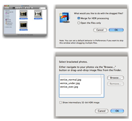
The easiest way to load your differently exposed photos is to select the files with the Finder and drag them together to the Photomatix icon on your Dock.

You will then get a dialog asking you what you would like to do with the dragged files. SelectMerge for HDR processingand click onOK.

The next dialog lists the files selected. If necessary, you can remove files or select others.

You can also directly access the dialog to select source images by either clicking on theLoad Bracketed Photosbutton on theWorkflow Shortcutspanel, or going to theFilemenu and clicking onLoad Bracketed Photos….

STA WikiWikiWiki image

Step 3: Preprocess and merge the photos

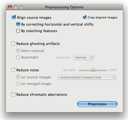
The next window lets you specify options for preprocessing and merging the photos.

If your photos were taken hand-held, check theAlign source imagesbox and select theBy matching featuresmethod. The three photos of the Grand Canal were taken using a tripod, but we still check the alignment option to correct for small alignment problems that may happen even with a tripod.

If your scene includes moving objects or people, check theReduce ghosting artifactsoption. Thesemi-manualoption is recommended for better results.

If the bracketed photos you loaded are RAW files, check theReduce noiseoption with theon source imagesselected. You may also check this option with jpeg or TIFF files.

STA WikiWikiWiki image

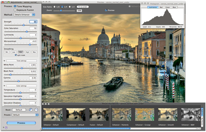
Step 4: Adjust the image to your liking

TheSettingswindow on the left lets you adjust the process, method and settings. There are two processes:Tone Mapping, which is applied to the merged 32-bit HDR image, andExposure Fusion, which combines the source photos directly.

ThePreviewwindow on the right shows a preview of the final tone mapped image. You can adjust the preview size using the radio buttons on top.

It is important to note that the preview is only an approximation — the final result may slightly differ in the case of the Details Enhancer and Fusion/Adjust methods.

The buttons at the bottom of theSettingswindow let you undo or redo settings, restore the default settings, and load and save presets.

You can also access presets directly by clicking on the thumbnails of thePreset Thumbnailspanel. The “Built-in” presets show by default.

STA WikiWikiWiki image

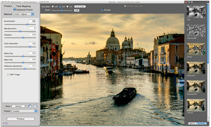
Step 4: Adjust the image (continued)

Try different processes and methods with your image.

TheExposure Fusionprocess tends to produce more natural-looking results and has the advantage of reducing noise.

TheTone Mappingprocess is the most versatile, offering a large variety of styles, or “looks”, depending on the method and settings.

There are two Tone Mapping methods: theDetails Enhancermethod increases local contrast and details, which makes it possible to process your image in creative ways. TheTone Compressormethod produces a more “photographic” look.

For a detailed tutorial on using the settings, please refer to thevideo tutorialon Tone Mapping.

Once you are satisfied with the method and settings, click on theProcessbutton so that you can thensavethe image.

STA WikiWikiWiki image

Step 5: Save the image

The Preview shows a low resolution representation of the image. To save the image at original resolution, you will have first to process it with the adjustments you selected. To do this, click on theProcessbutton located at bottom of theSettingswindow.

Once the processing has completed, chooseFile > Save As.

The processed image is in 16 bits/channel mode. However, you can choose to save it as 8-bit JPEG, if desired. Saving as 16-bit TIFF is recommended for further processing.


Helpful Links

Adapted fromhttp://www.hdrsoft.com/resources/tut_mac/index.html
HDR Examples

Filed Under: General
  • « Previous Page
  • 1
  • 2
  • 3
  • Next Page »

link to LAITS home page

Video STA Home

© 2025 Liberal Arts Instructional Technology Services | Production Credits