The ChiLDS Lab Site Redesign
Client: Maria Arredondo, The ChiLDS Lab
Task: Complete a site redesign for The ChiLDS Lab. The client wanted to keep most of the content, but wanted a refreshed and “cuter” design overall.
Status: In progress, low fidelity mock-ups created
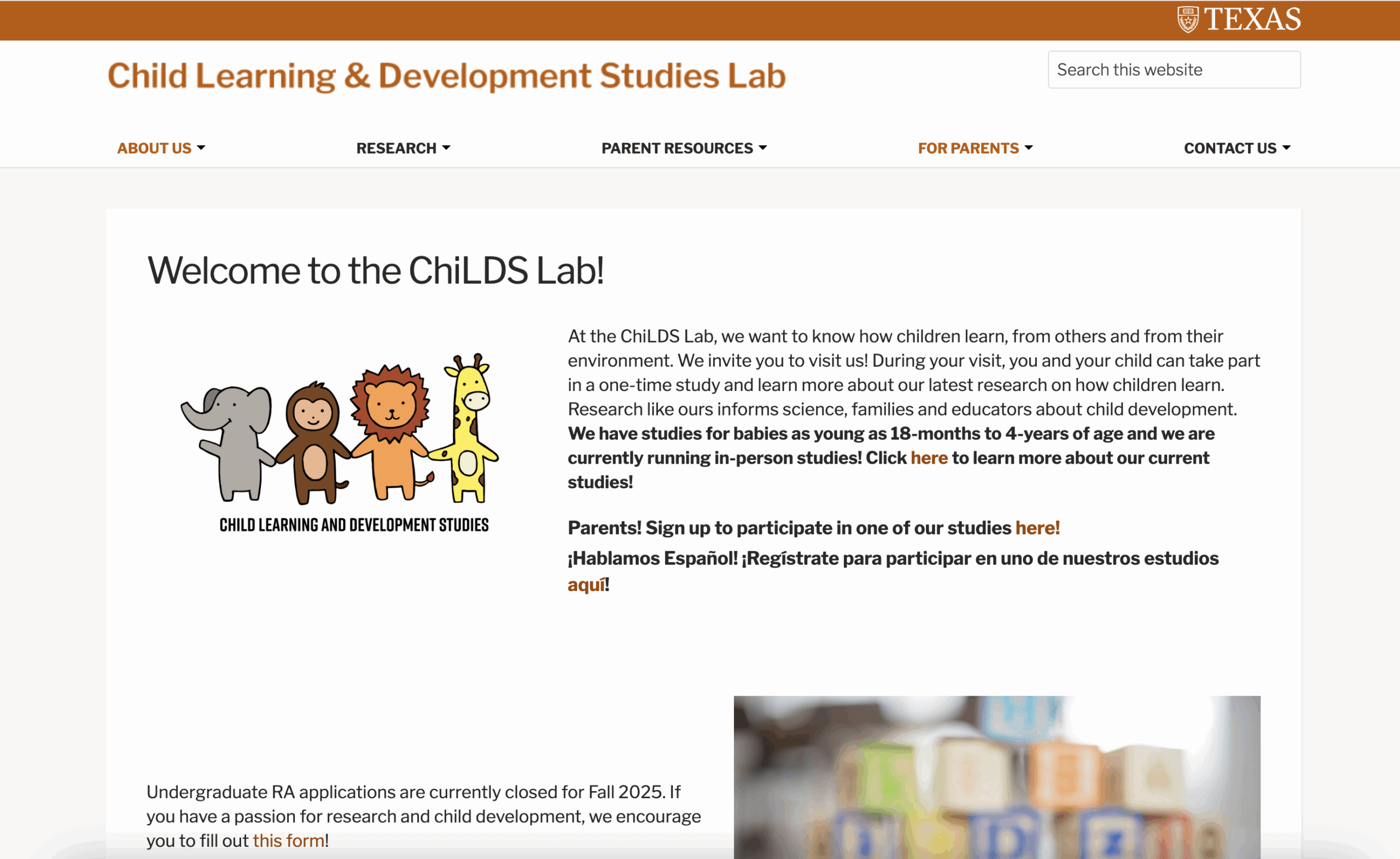
The Old Site
This was the initial site. The client wanted to move away from the standard university template and make it feel more invited and on theme with her lab. Since her target audience were parents of potential participants, researchers, and students, she wanted the website to be cute and attention grabbing, while still being professional and polished.
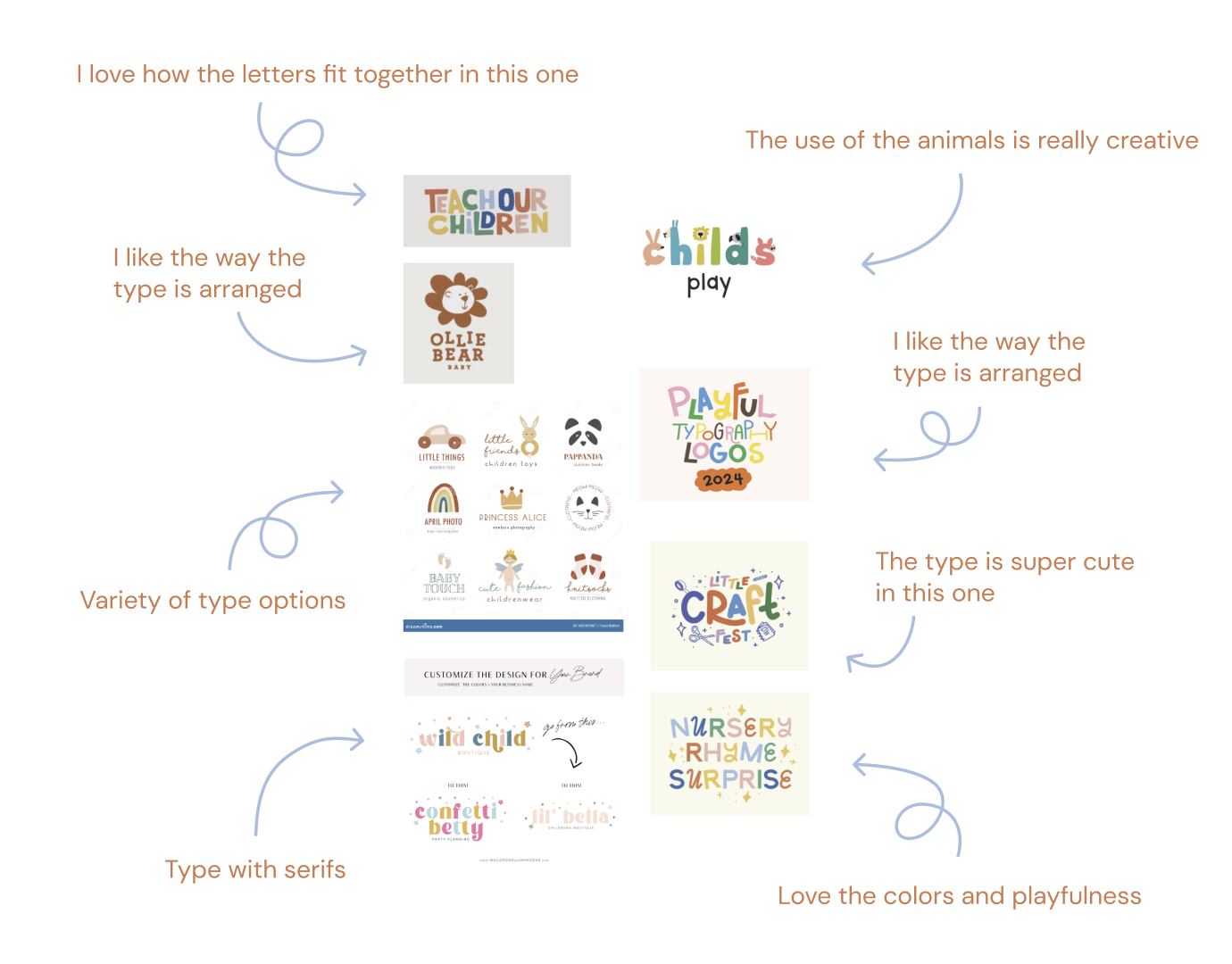
Logo Redesign
I started by creating a new logo. I took a lot of inspiration from other child-oriented brands and took note of both their typography and color choices.
A moodboard
Initial designs
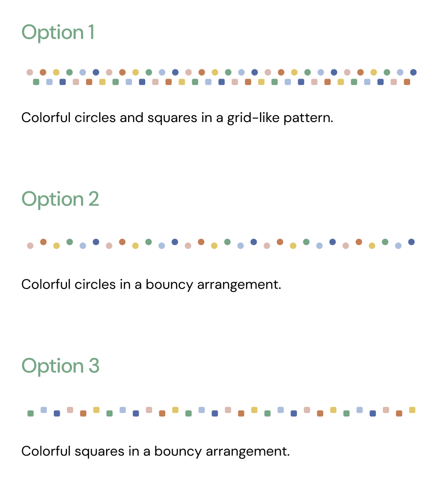
Abstract Banner
I also created content dividers as an easy way for the client to add personalization to the website.
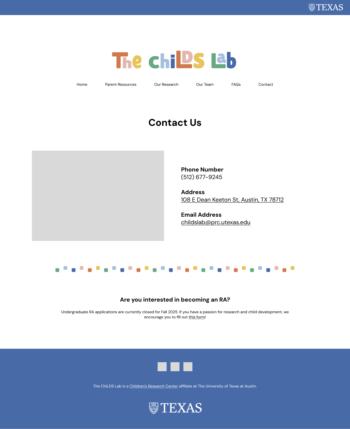
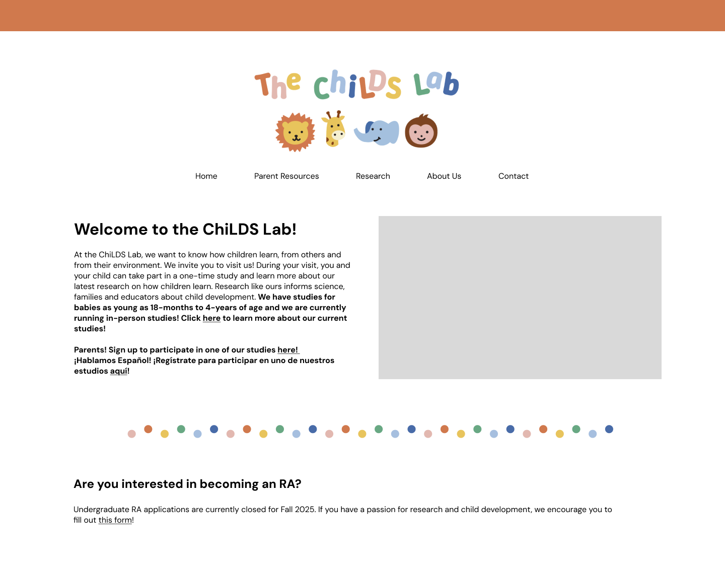
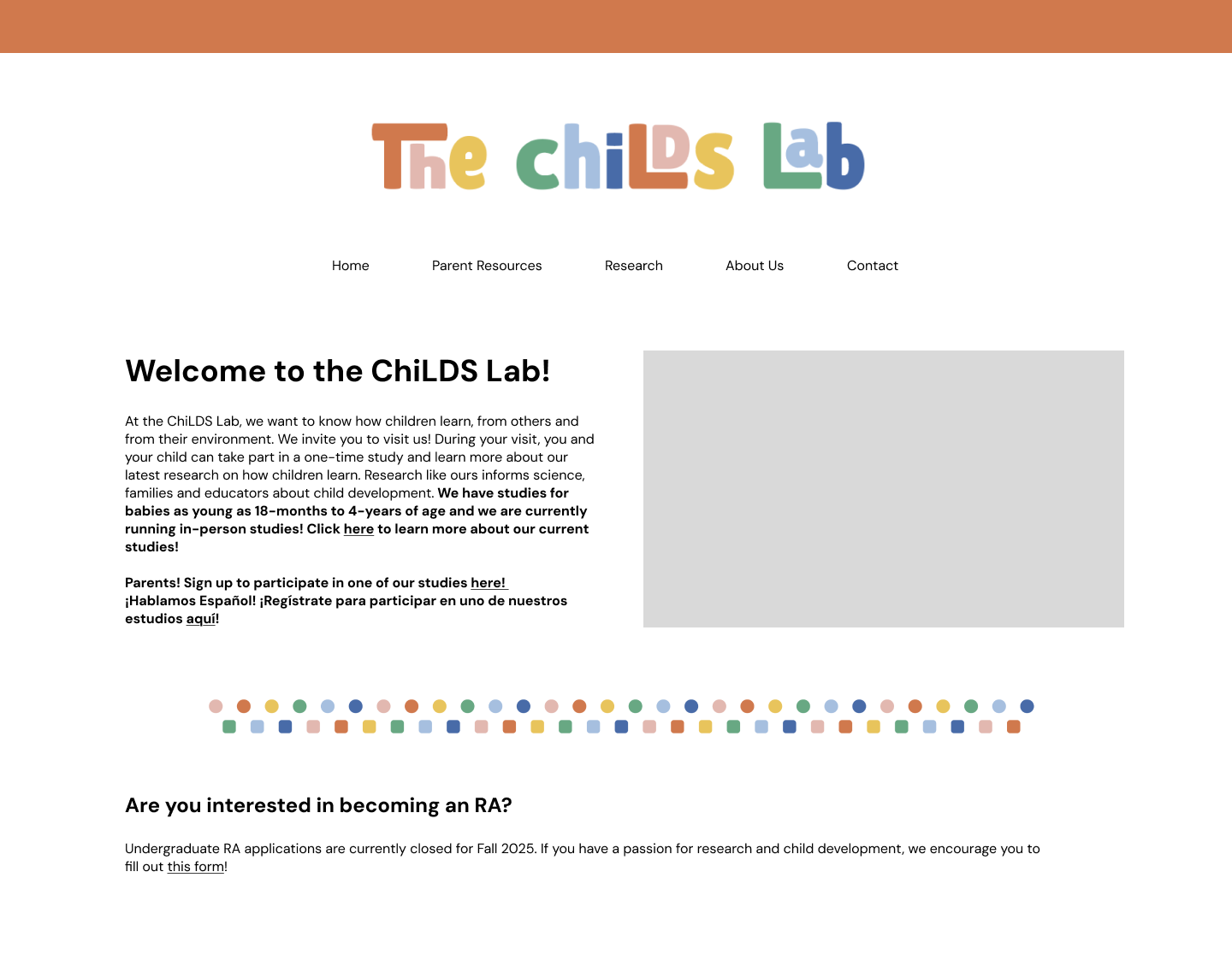
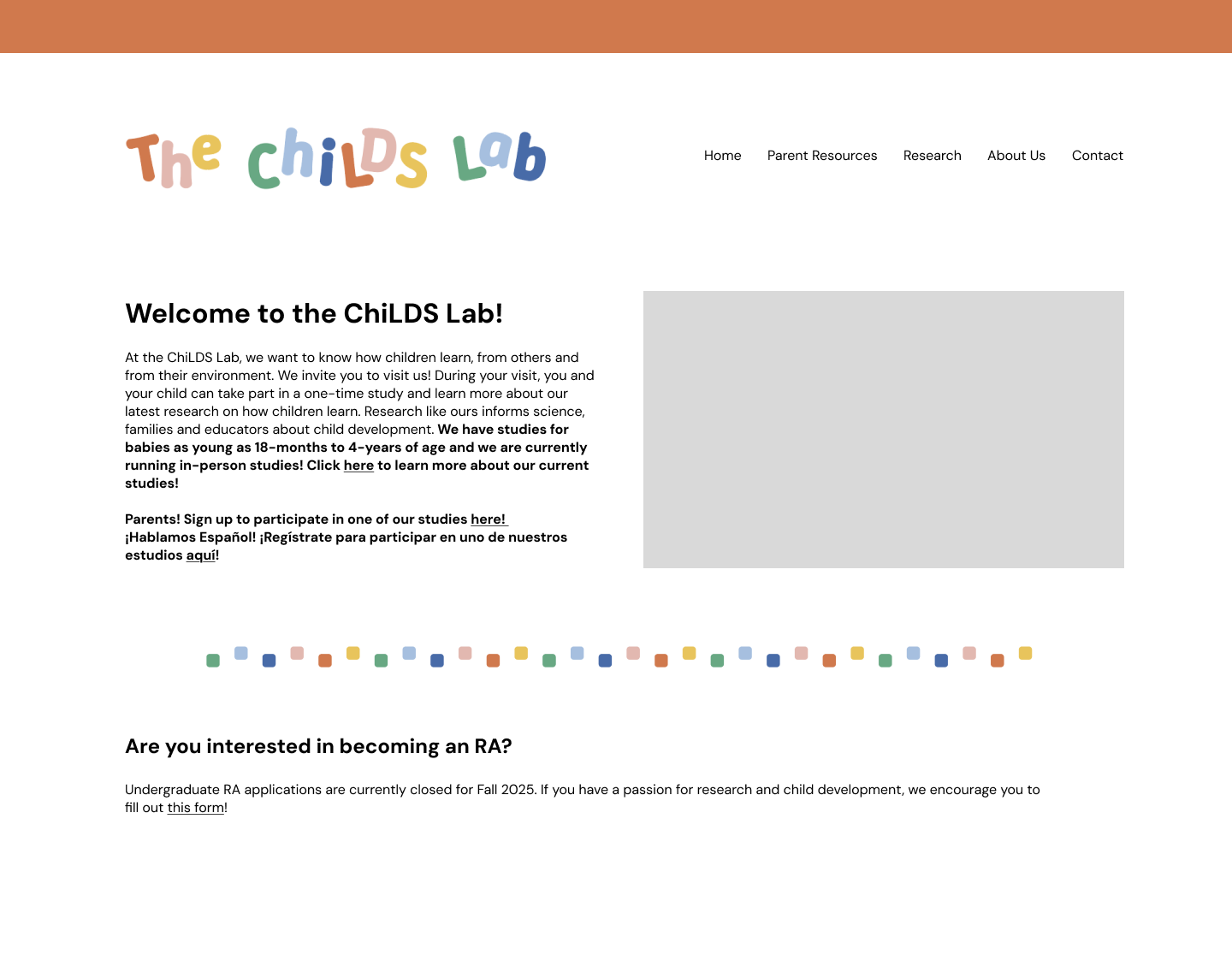
Possible Site Mock-Ups
Several options of implementations of the above assets.
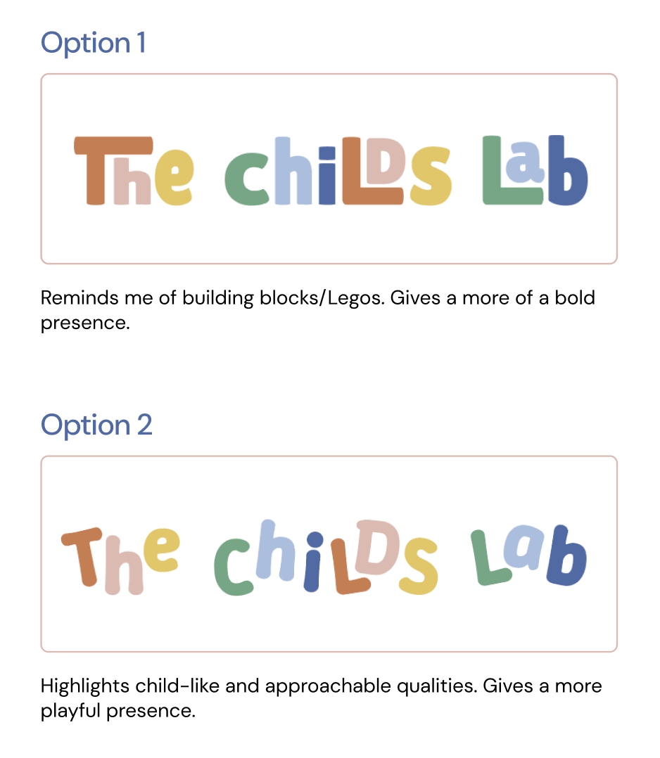
Client Feedback
Receiving edits and revising.
The client ended up choosing the “lego block” logo design, with some minor edits. After revising to meet her requests, the logo ended up looking like this:
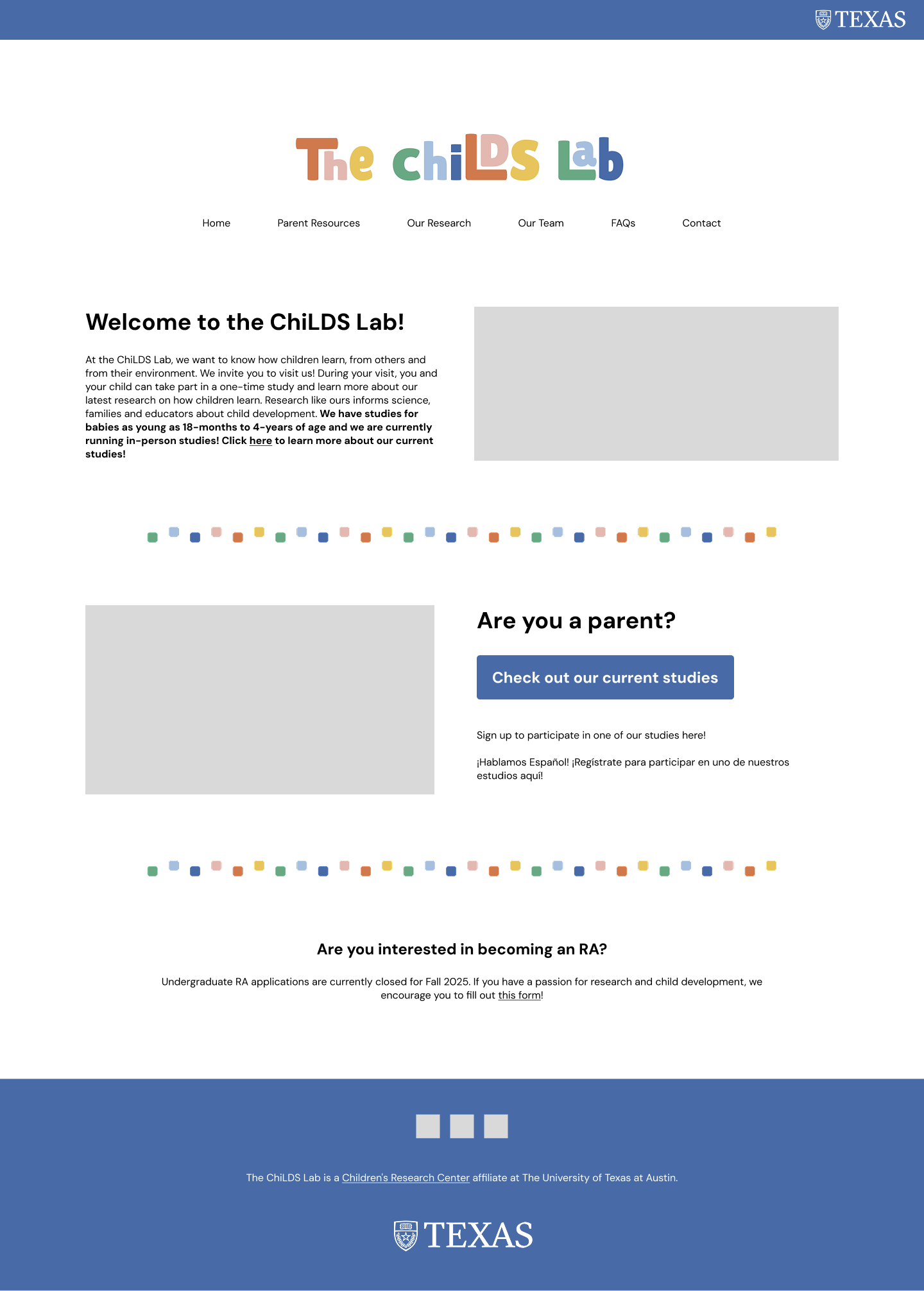
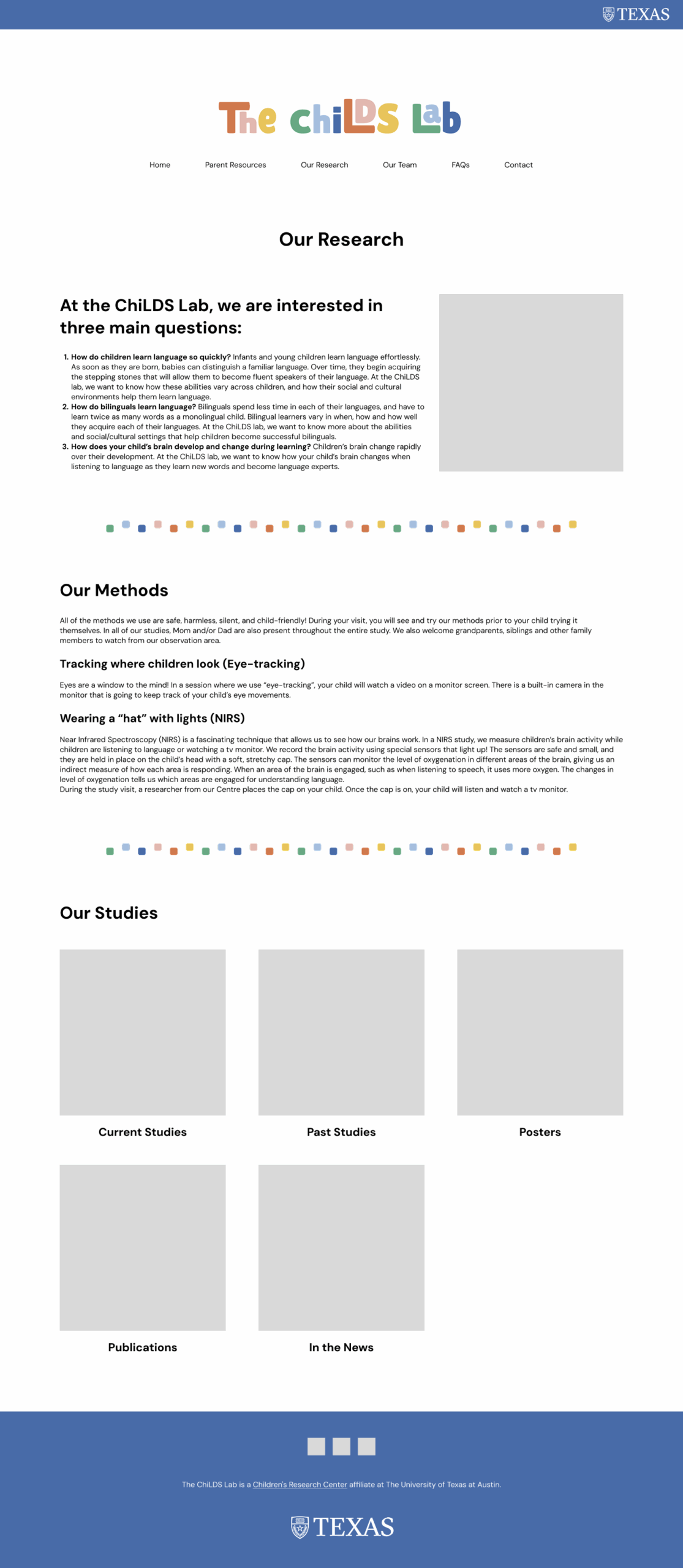
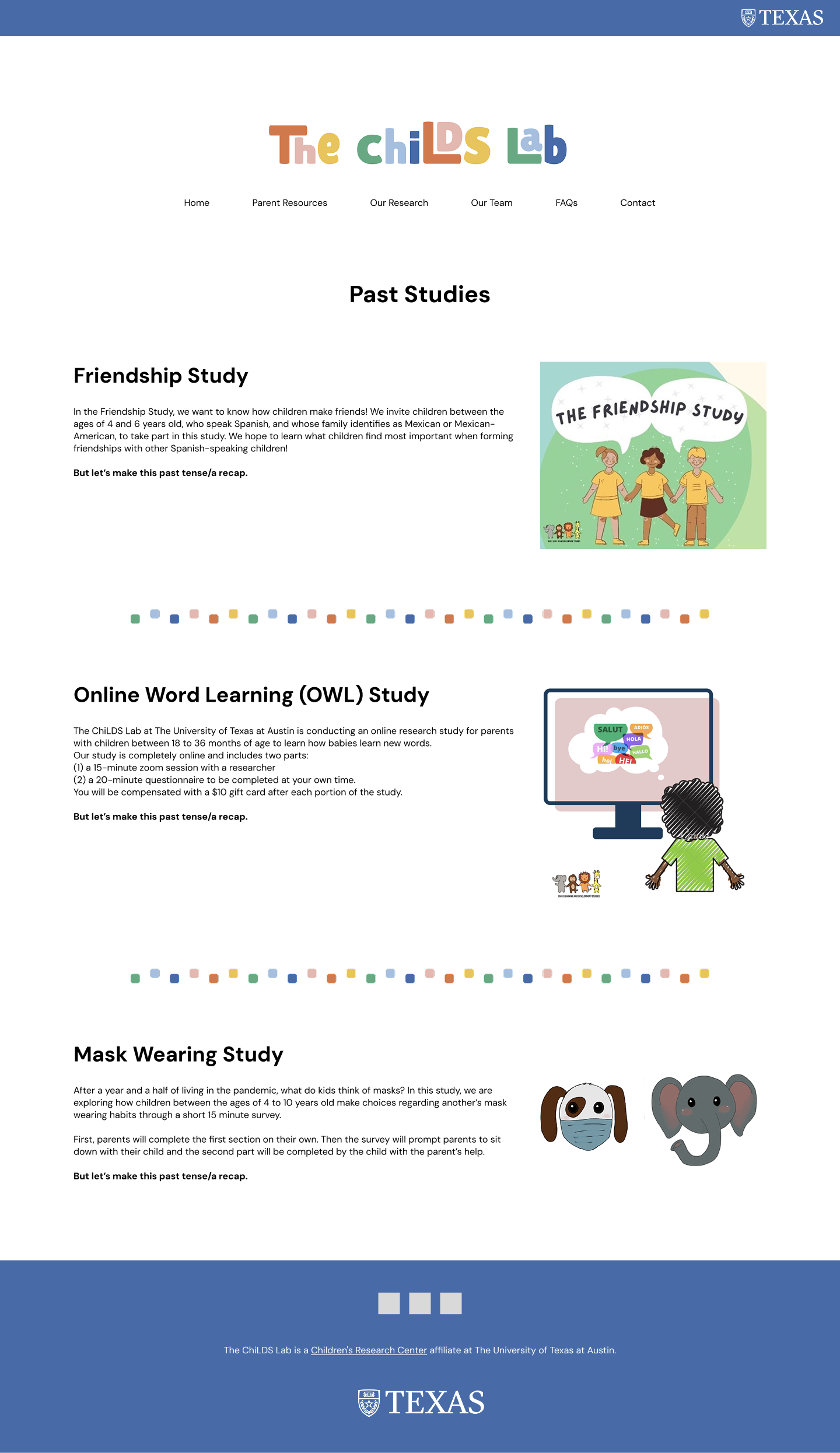
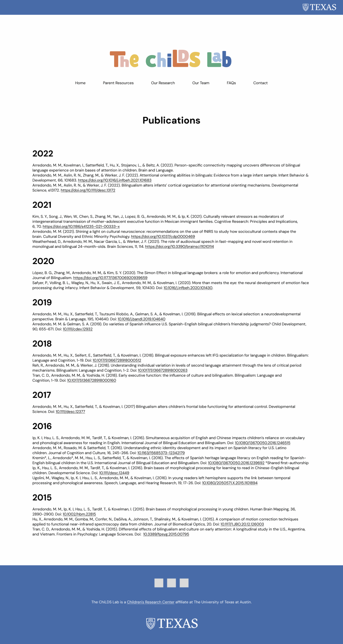
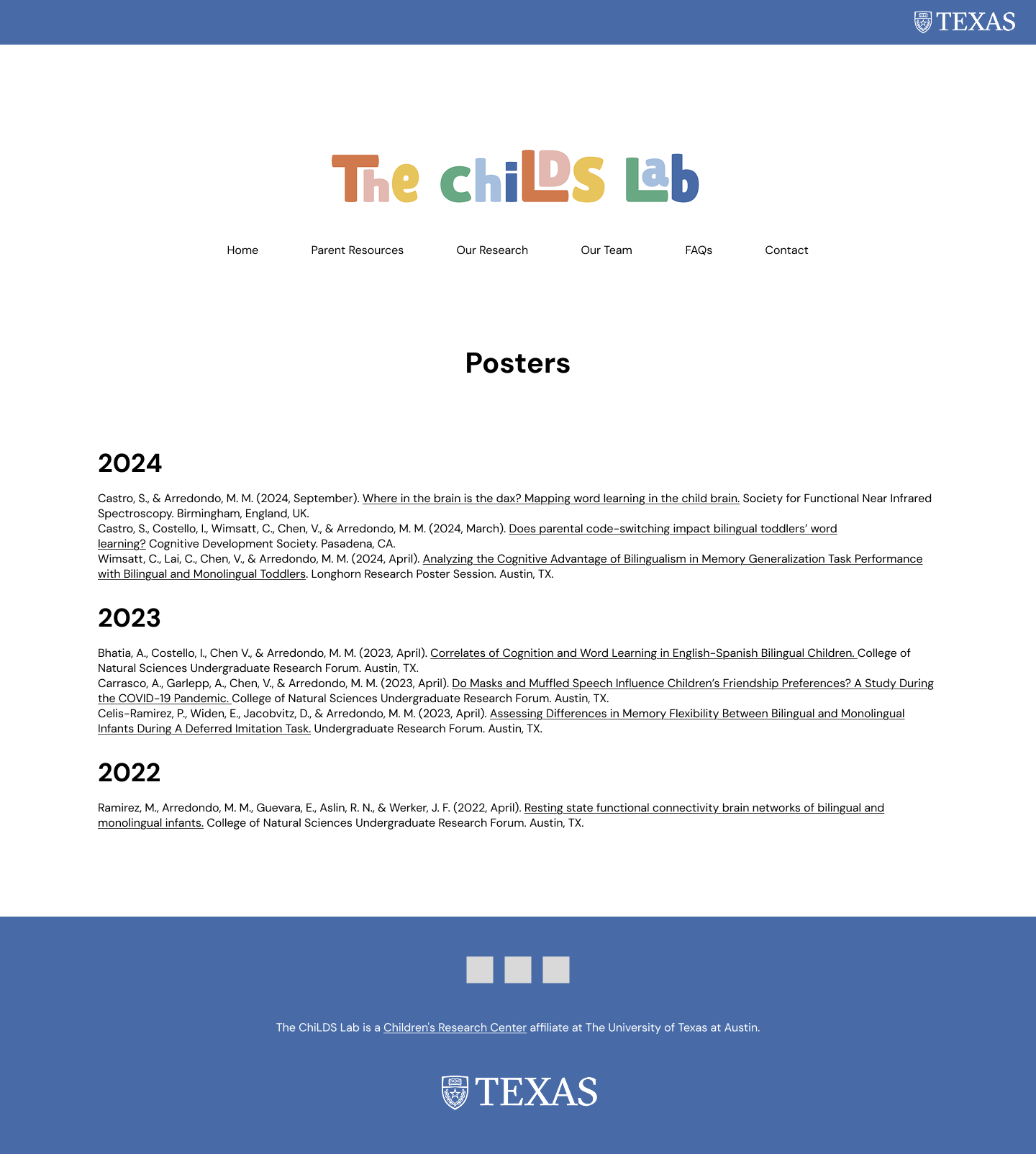
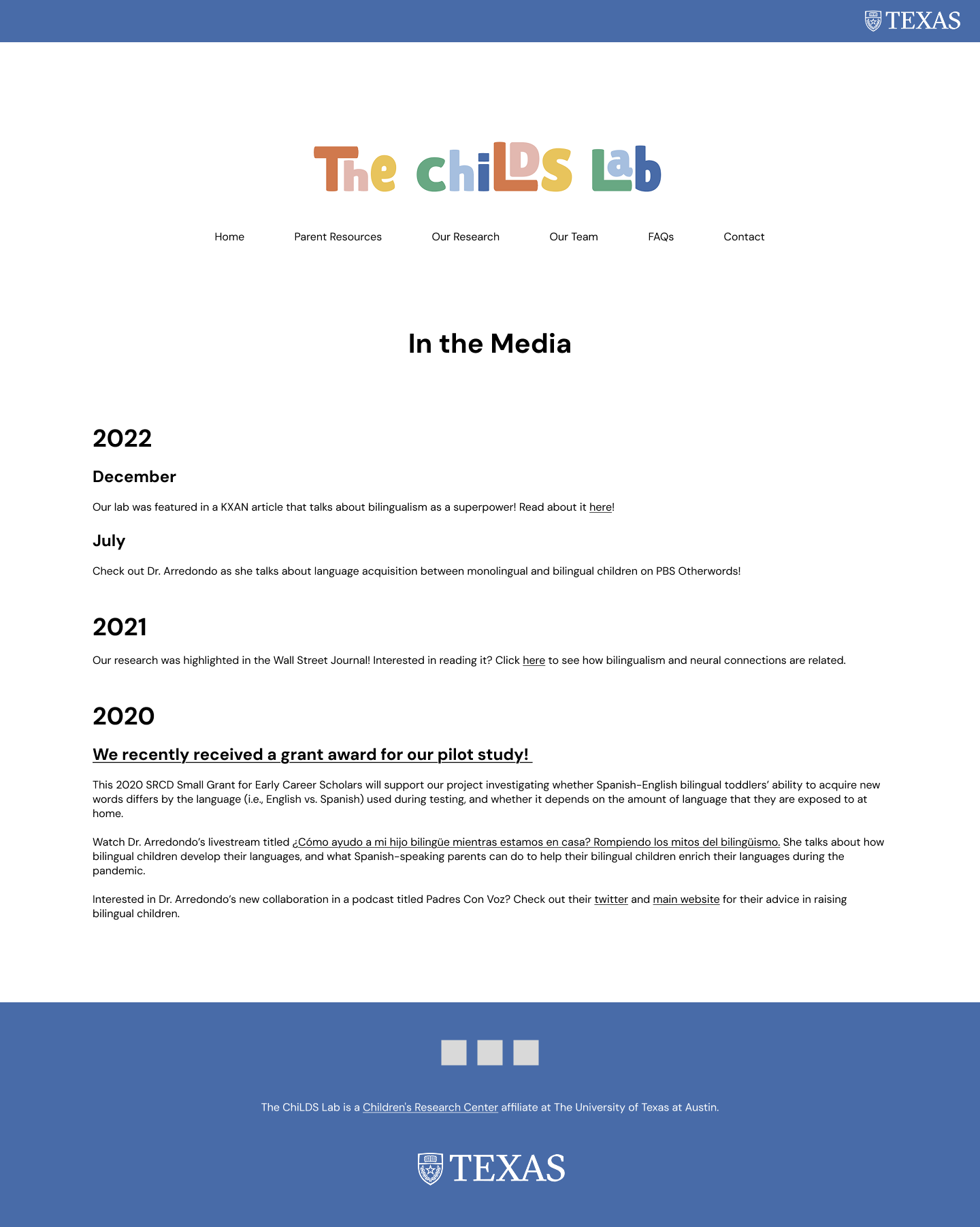
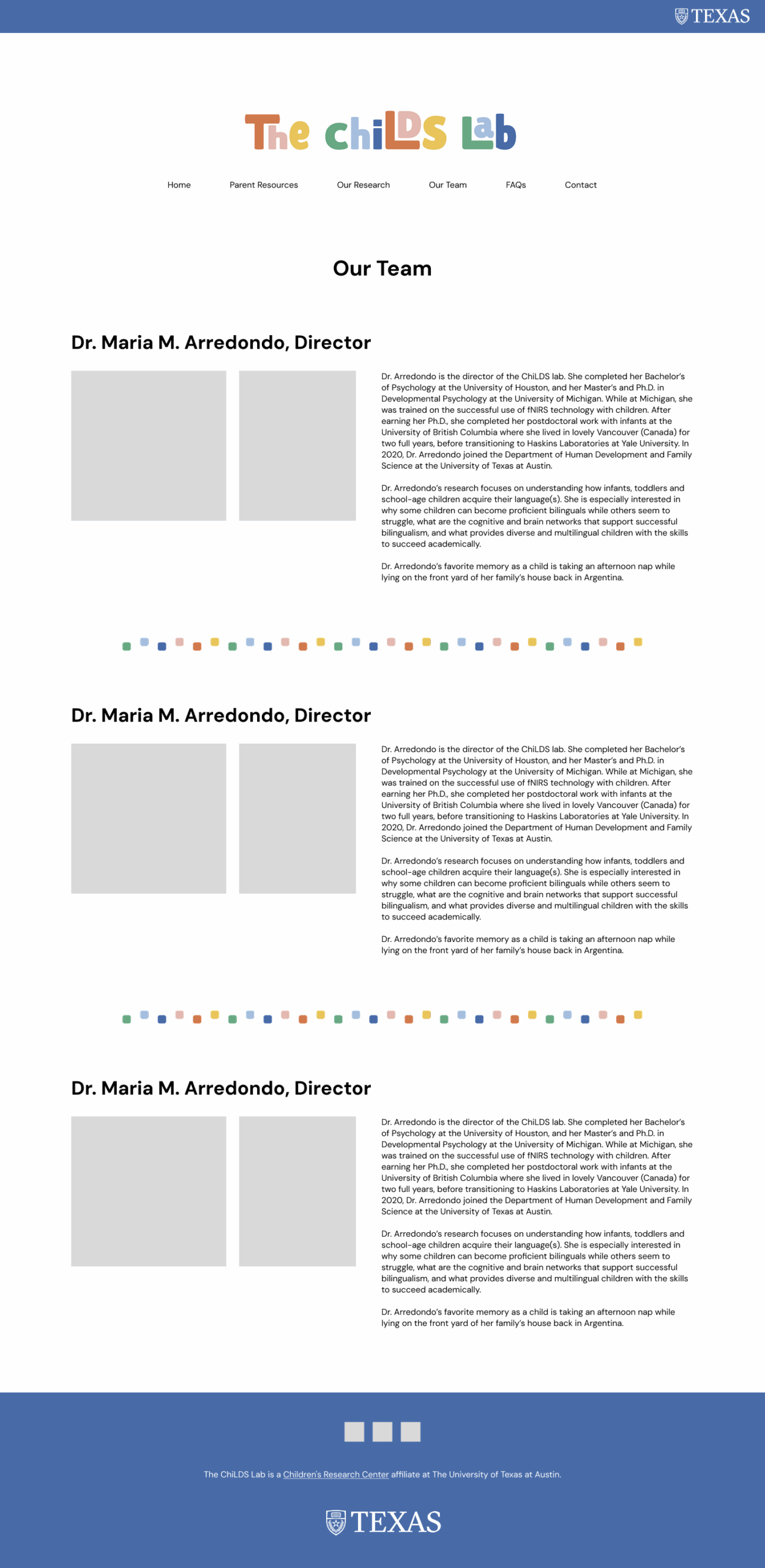
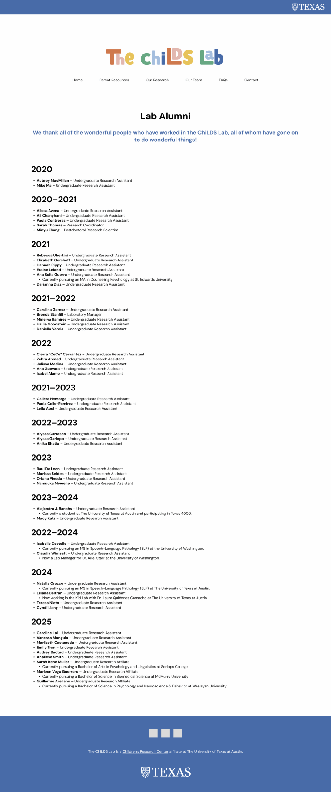
Low-Fidelity Mock-Ups
Lastly, I used my revised information architecture to mock-up some low fidelity prototypes of what the website could like, before handing it off to the client for implementation.