Made 49 exhibition pages this week. I feel accomplished.
x-103 exhibition pages to go
On another note: got a 100 on my statistics exam.
Made 49 exhibition pages this week. I feel accomplished.
x-103 exhibition pages to go
On another note: got a 100 on my statistics exam.

The typography training was more information with a short two question reflection at the end of it. Here were my answer:
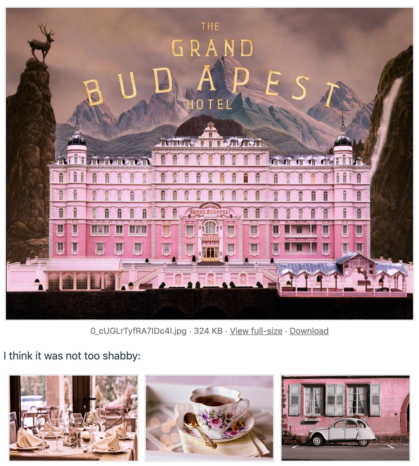
I liked this font pairing. I couldn’t source what fonts they use but I like the combination of sans-serif with a slab-serif. In my own design work I have a particularly difficult time trying to pair my sans/bolded text with a serif font and end up usually with two sans-serif fonts. This one is an example of where I think they are working really well together despite being very different. It could be due to the fact that they are using two fonts for a primary text and then one other front for a secondary instead of only one for each.
For display font I tend to find myself liking really bold, tight, and almost western 60s groovy font. It feels really inviting and like a hug of a font.
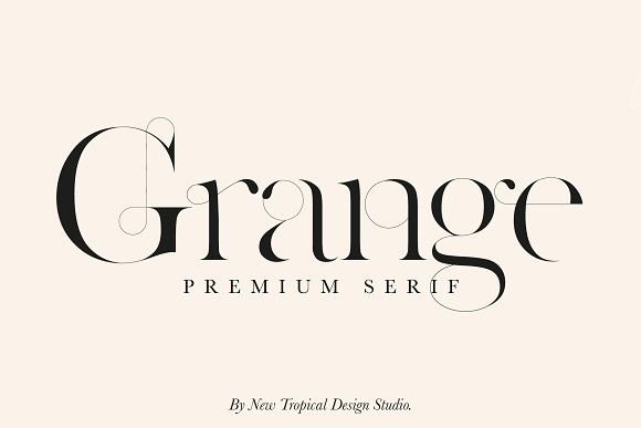
For a serif font I love when they get really delicate and elegant with curves and thin lines:
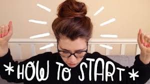
For script fonts, I kinda hate these but the one that I saw was from a youtuber “Fran” who is an illustrator and she handwrites onto her youtube thumbnails and I found it to be really cute:
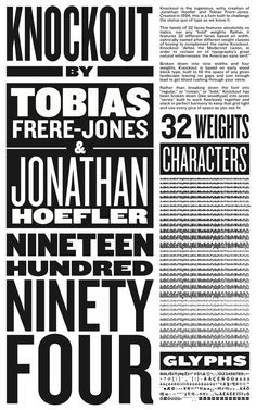
For sans-serif, I’m such a classic, I love the famous New York knockout font. I think it’s so cool and timeless.
For mono-type I feel as though I haven’t explored many to have a favorite but I like ALMA MONO because it doesn’t have the serif like the typical ones do.

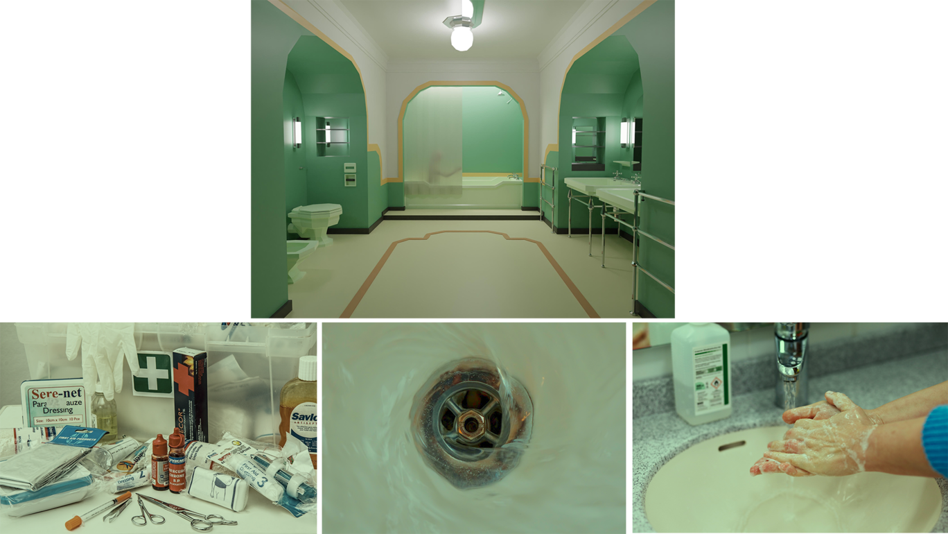
I only found one step that needed an additional line of instruction which I noted above. Other than that this was a really good training. It’s very simple but a technique I had no idea about. It does a great job at keeping color and lighting consistent across images for a certain color range of a scene or environment. This was also kind of fun to just make and find images like “What would I see in a hotel? Or in a restroom?”
Here is what the end results of my iconography training ended up looking like. I did the scenario in the training of making it for the Design college page. That one calls for yellow buttons. I did 3pt strokes and no fills. For the most part I feel like everything turned out cohesive visually.
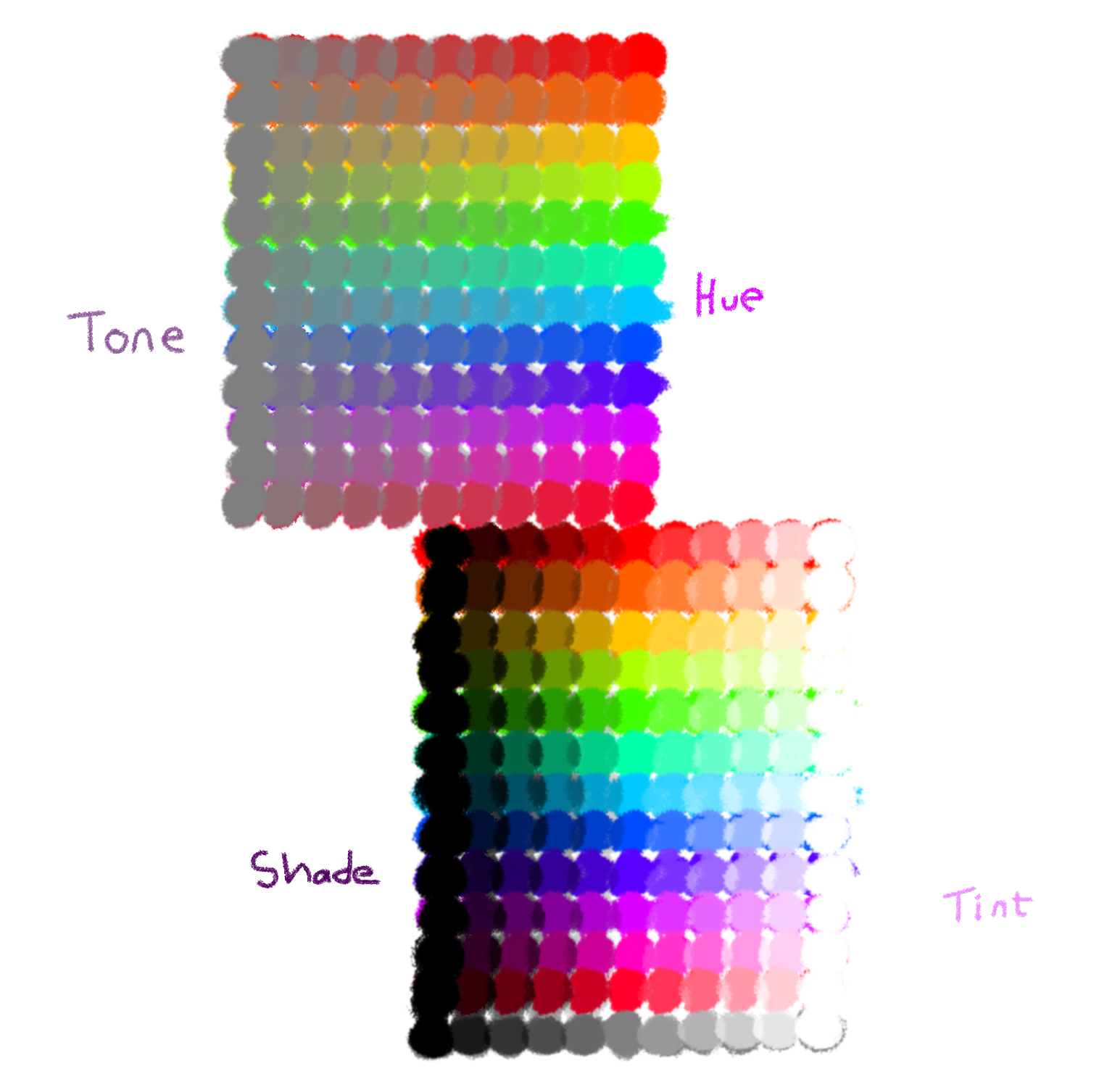
This week, I did the Color Theory training, which provided a lot of useful info on color design. The first section went over the physics of color, defining hue, tone, shade, and tint. The activity was to draw our own color wheel demonstrating all 4, of which mine turned out to be more of a grid, but oh well.
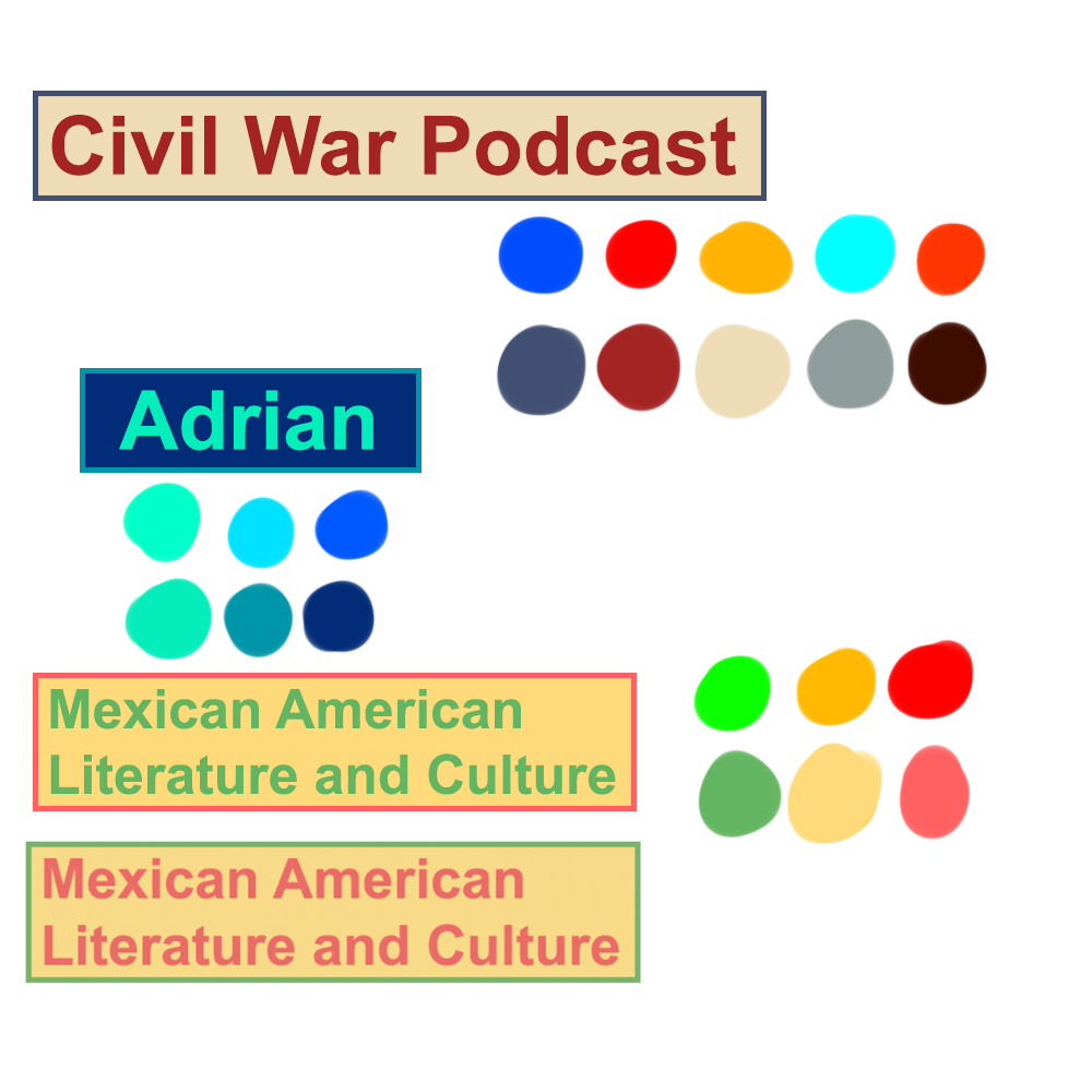
The second section covered color psychology and the palette design. The activity was to select a palette for 3 different fictional clients.
Below is my experimental new tutorial ranking system.
Theory:
☆☆☆☆☆
Great info here, I love reading about the history and science of something.
Technical skill:
☆☆☆★★
Not really the focus for this training, but it did explain how to set additive or subtractive color in Photoshop/Illustrator, and provided some color tools.
Instructional clarity:
☆☆☆☆★
I got slightly lost at the very last activity, but mostly because I jumped ahead.
Last week, I wrapped up my work for OCILL and Latinxpop Lab. This week, I have been developing an activity to complement the client communications KB (which is also being updated).
OCILL Concluded Pt. 2

Project: PSY-MUNA Lab
Client /Prof: Alexandra L. Clark (Assistant Professor alexandra.clark@austin.utexas.edu)
Completion Status: In-Progress
Staff guidance: Suloni, Estella
STA team members: Angie (me), Asmita
Description/plans:
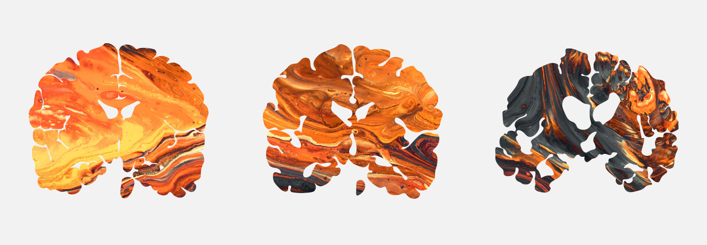
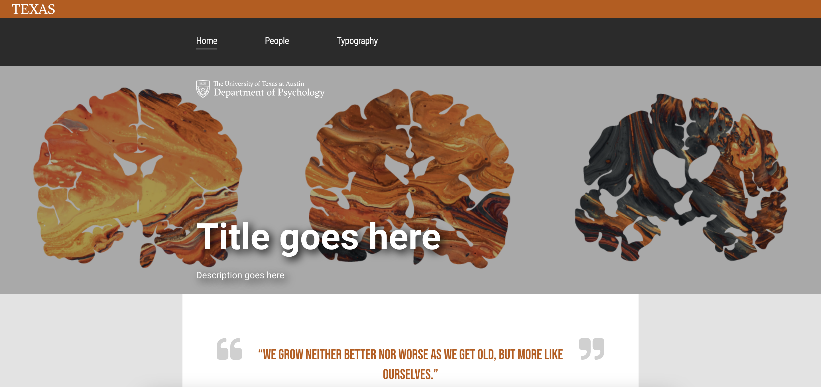
Use clients’ uploaded images to come up with banner design for home page
Create a ‘Tools’ diagram for the home page w/ copyright free images
To be completed: November