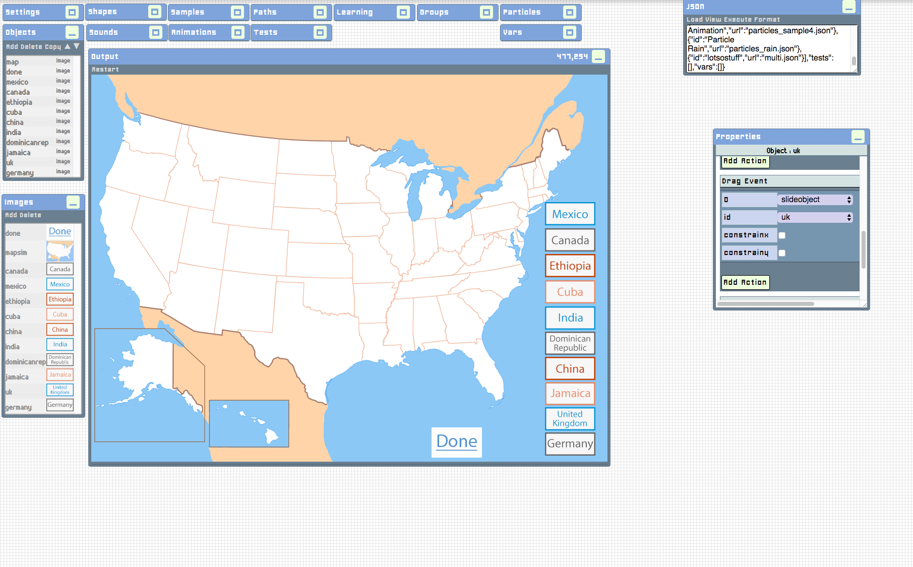
 Here is an interactive page I am working on for Texas Beyond History. It is a map of the US, and the purpose is to drag the name of each country to where you think most of the immigrants from these contries went in the US. I have to make each label, and there’s 10 more to do!
Here’s a close up of the map, and a demonstration of the labels dragged around on the map. (These are probably not the right answers…) I still have to add 10 more labels but I think it’s looking good so far!
Who We Are
LAITS: IT and Facilities Director, Joe TenBarge initiated the Student Technology Assistant program in 2004. STAs are UT students who work on a variety of projects in collaboration with UT faculty and LAITS staff members. STAs assist College of Liberal Arts faculty members and administrative staff with print and web design. From building presentations, to creating audio/visual works, and producing online classes in the LAITS film studios, STAs are instrumental in helping COLA faculty realize their vision for multimedia projects that enhance their teaching and the students learning experience. By the end of their student careers, STAs have portfolios which demonstrate their accrued technical and design skills.
Creative and technically inclined students are appointed as STAs for one year, with the possibility of being rehired as long as they study at the university. Applicants for the program are hired before both long semesters. Interested students may look for postings on Hire-A-Longhorn when positions are available. Positions will have Student Technology Assistant (illustrator or web designer) in the title of the job post.
Faculty & Staff with questions about services, please contact us.
https://liberalarts.utexas.edu/laits/contacts.php
Here’s a close up of the map, and a demonstration of the labels dragged around on the map. (These are probably not the right answers…) I still have to add 10 more labels but I think it’s looking good so far!
Today I began working on a logo rough draft for the new UTNY program using Adobe Illustrator. The client envisioned the logo to include “the Tower in the Manhattan skyline with UTNY figuring prominently below.” At the time being, there is no set font–the type used in the roughs is acting as a placeholder. I wanted to include Texas orange to add contrast and further distinguish the tower. Additionally, I created a version featuring grey to provide an alternative. Below are 2 versions of my first rough draft.

I am looking forward to this design evolving as I receive critique and continue familiarizing myself with illustrator.
And here are the second round of drafts after feedback from UTNY clients.


More feedback from the client ensured a third round of drafts; this time with the Flatiron building replacing the Statue of Liberty, lighted windows, and a larger (and more prominent) Tower.


And now a fourth edit. Utilizing suggestions of the clients, the Tower was centered, Flatiron building replaced by the One World Trade Center, and architectural detailing.


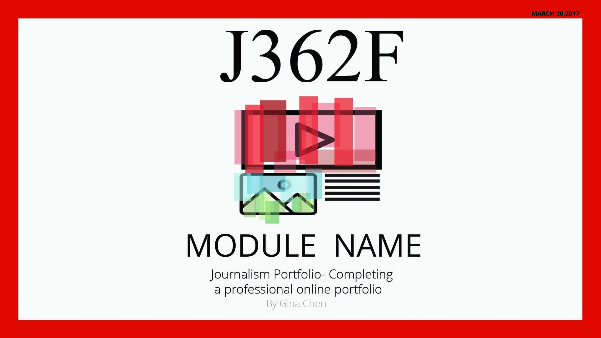
This week Lauren, Bethany and I were each responsible for producing one mockup of a graphic to be used in an online course in journalism. The professor wanted to convey the central idea of her class with one image, expressed either in the form of a social media newsfeed, newspaper, or magazine. Given some specifications, I first came up with the design below:
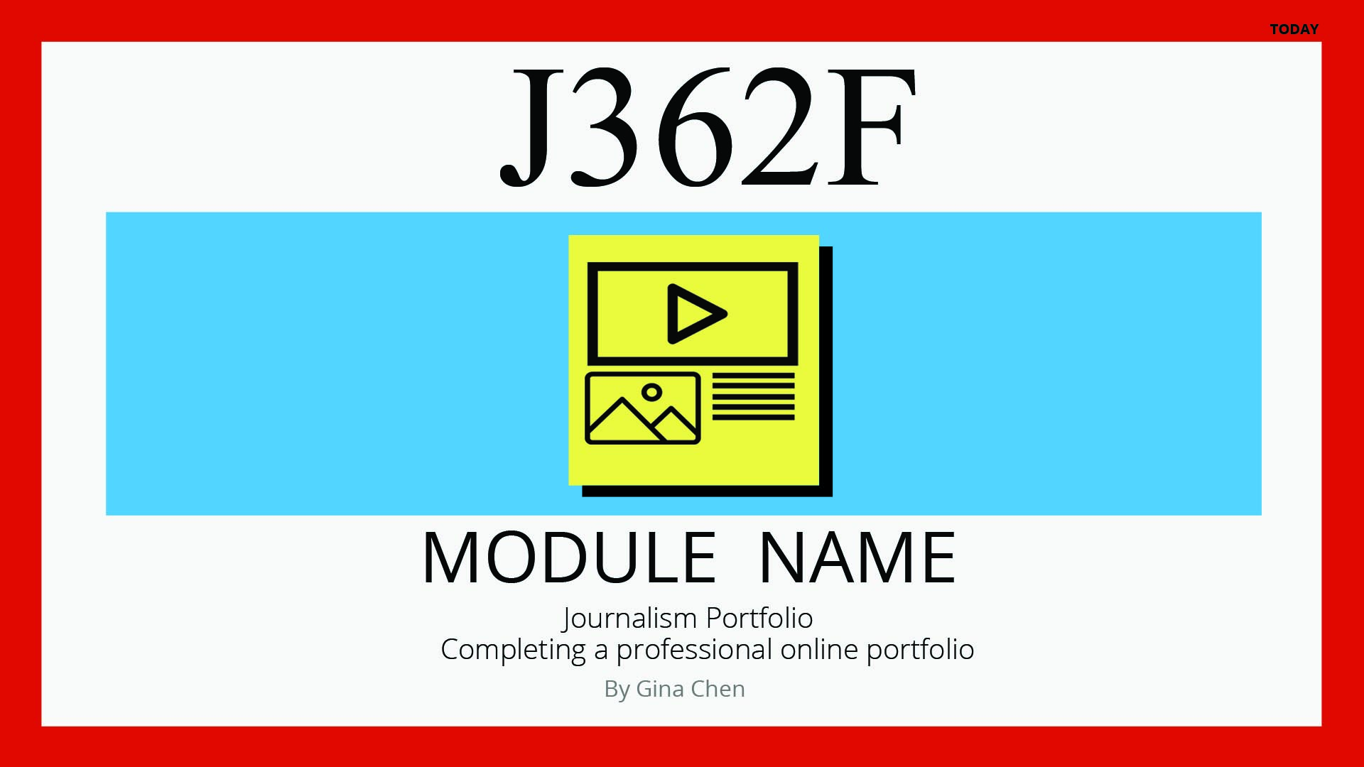
 I wanted to color the icon in an interesting way, but with the many elements on there it just ended up looking messy. Here are some later designs.
This one didn’t have the right colors
The design I submitted as final was the one above, with the hard drop shadow.