• We are STAs
    • Asha Rountree
    • Haley Ma
    • Kate Shih
    • Kyra Lee
    • Nicholas Peasley
    • Sasha Kenney
    • Shanda Horm
    • Shriya Atreya
    • Tomas Marulanda-Mesa
  • We were STAs
  • STA Presentation
    • STA Presentation 2017
    • STA Presentation 2016
  • Testimonials
  • Resources
  • Home

STA Blog

STA Work Blog

STAs: Student Technology Assistants

Who We Are
LAITS: IT and Facilities Director, Joe TenBarge initiated the Student Technology Assistant program in 2004. STAs are UT students who work on a variety of projects in collaboration with UT faculty and LAITS staff members. STAs assist College of Liberal Arts faculty members and administrative staff with print and web design. From building presentations, to creating audio/visual works, and producing online classes in the LAITS film studios, STAs are instrumental in helping COLA faculty realize their vision for multimedia projects that enhance their teaching and the students learning experience. By the end of their student careers, STAs have portfolios which demonstrate their accrued technical and design skills.


Prospective STAs:

Creative and technically inclined students are appointed as STAs for one year, with the possibility of being rehired as long as they study at the university. Applicants for the program are hired before both long semesters. Interested students may look for postings on Hire-A-Longhorn when positions are available. Positions will have Student Technology Assistant (illustrator or web designer) in the title of the job post.


Faculty and Staff:

Faculty & Staff with questions about services, please contact us.

https://liberalarts.utexas.edu/laits/contacts.php

  • Audio Services: Michael C Heidenreich, Audio Services Manager
  • Video Services: Kelly Webster, Video Production Supervisor
  • Graphic Design & Web Design Services: Suloni Robertson, Art Director / STA Program Manager

BASS Flyer Update

April 3, 2018 By Jaclyn Alford

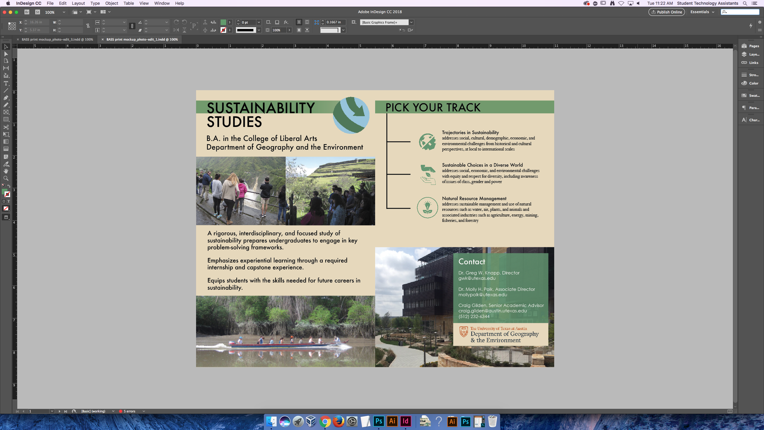
I was assigned to make a few simple updates to a BASS flyer that was created by a previous STA, Roopa, in 2016. The updates included added text, slight reformatting of text, and a changed photo on the back. I also opted to alter the logo placement. Below is the original created by Roopa, followed by the update:


Filed Under: 2017-2018

Visualization Branding

April 3, 2018 By Jaclyn Alford

Six GGPlot visualizations (maps showing online course enrollment in different locations) for social media sharing need branding added and titles edited. The project head did not want to use the LAITS logos featuring the grid icon, so a new logo was created with just text.

For all visualizations, the titles were centered and realigned for better balance and LAITS Development Studio branding was added.

Below is a before and after:


Filed Under: 2017-2018

LAITS Style Guide

April 3, 2018 By Jaclyn Alford

Since LAITS has never utilized a formal brand style guide, Suloni tasked me with the exciting project of creating one! Due in part to my advertising major, I am exceedingly interested in branding and overall style/voice/appearance of brands. Simply put, this is a dream project for me.

A style guide, in it’s most basic form, is a rule book for representing a brand and should include main aspects like logo, typography, and colors.
For preparation, I went through through the Branding Suite folder in box and reviewed other companies’ style guides such as Twitter, Southwest, and Marvel.
First, I created a Google Doc with all the info (unstylized) that needed to be included in the style guide. Using Illustrator, I formatted this information to make the guide as accessible and as easy-to-understand as possible; that’s the key to style guides–usability.

Below is the current version of the LAITS Style Guide (this project is still in progress).
LAITS-StyleGuide


Update:

After many hours and finding out that illustrator does not allow you to add clickable links, THE STYLE GUIDE IS FINISHED!

The tidy LAITS Brand Style Guide now lives in Box here: https://utexas.box.com/s/5itjmthobtj4x9dpvr15kb78ykba88o7


Filed Under: 2017-2018

Restarting Weekly Posts

April 2, 2018 By Rodrigo Villarreal

I’ve been a little sloppy about blog posts since we came back from spring break. Lots of things have changed. We finally finished all the TBH animations, therefore I have been assigned to focus on RBTL. It was tough restarting the project after so long but I think I have finally brought it up to speed. I developed the page called Enjambents based on my previous work, I think it really helped me remember what I was doing and how. Then I used the same ideas to make a page called Scansion. This one did not work at first. It took me a couple of hours to track a tiny bug but I got it working now. Pictures of both below, they look better in the site.

Now a little bad news, we are not done with TBH. We have been looking back at all the interactives we made. Some problems aroused with one of my first projects: the main menu for the Kids part of TBH (Kids-main). The animation works well but the way browsers handle tabs and information makes it not work. Suloni commissioned me to make a mock-up of a new main menu. I did and she managed to convince the lady in charge of the project to change it. It makes me sad to drop all my previous work, especially since it’s once of my favorite interactives, but it was necessary. It’s much subtler now, but also more functional.

Filed Under: 2017-2018

update for 03-20 meeting!

March 20, 2018 By Kathy Vong


To sum it all up: we’re almost done with RUS407!! Just one more illustration left and some generic figures to color in >:)

Filed Under: 2017-2018

Photo ID’s

March 19, 2018 By Esther Shin

Photo ID’s

I edited many, many photo IDs and it’s really easy! It only gets tough in certain situations but here is what I did.


This first example is a classic one. I edited the photo to be less pink/orange and increased the brightness a little bit and saved them as 80×90 and 20×30 (below).


Sometimes photos that are submitted to be edited are not too hard to edit. Just small amounts of color or more light often do the trick. However, in the next example, things get a little tricky.


Yikes! This one took a while for me to find a good balance in colors. First, I listed what needed fixing. The yellow is too strong and so is the blues. Just in general, the saturation and contrast is too much. Therefore, I decreased the saturation & contrast. Now I needed to decrease the specific colors (yellow and blue) and bring in other colors. I messed around with Levels and Curves. There was very little help in that area. Image>Adjustments>Color Balance seemed to help more. Certain colors I would decrease and others I would increase. Make sure to export the photo in the end as “Save for Web”!!! ** I tried my best editing and ended up with this:


Filed Under: 2017-2018

  • « Previous Page
  • 1
  • …
  • 19
  • 20
  • 21
  • 22
  • 23
  • …
  • 43
  • Next Page »

link to LAITS home page

Video STA Home

© 2025 Liberal Arts Instructional Technology Services | Production Credits