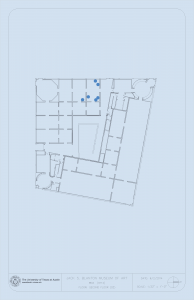
For ARH303, I helped create graphics for an app being developed for the class. I was provided with floor plans that I transformed and cleaned up. In total, I created nine floor plans, each that look similarly to the plan example shown below. Here is the before and after:
COLA Faculty Webpage Updates
For the past month, I have been corresponding with professors in the College of Liberal Arts, offering to help them update the information on their faculty webpages.
I have contacted 100 professors. 52 of them have responded and I have met with 20 professors. It has been interesting to see what each professor finds important to include on their site. Some are very interested in showcasing their work to other colleagues while others are mostly interested in having information available for press. It’s been fun to tailor each webpage plan to the professor’s needs.
I have officially finished helping Rebecca Bigler, Jeremi Suri, Madeline Hsu, Kurt Weyland, Jorge Canizares, Janet Davis, James Pennebaker and Christopher Beevers update their webpages.
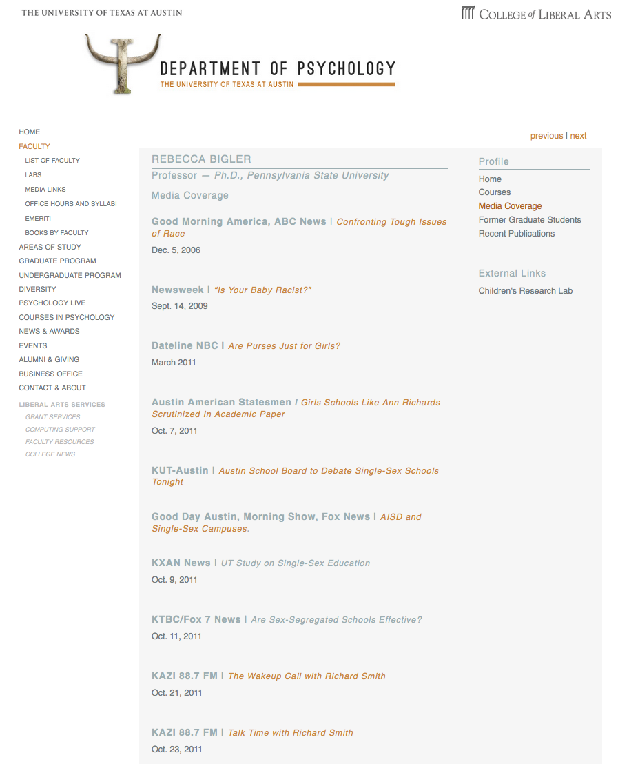
Bigler requested that I update her site to include media coverage. You can see the new custom tab created here:
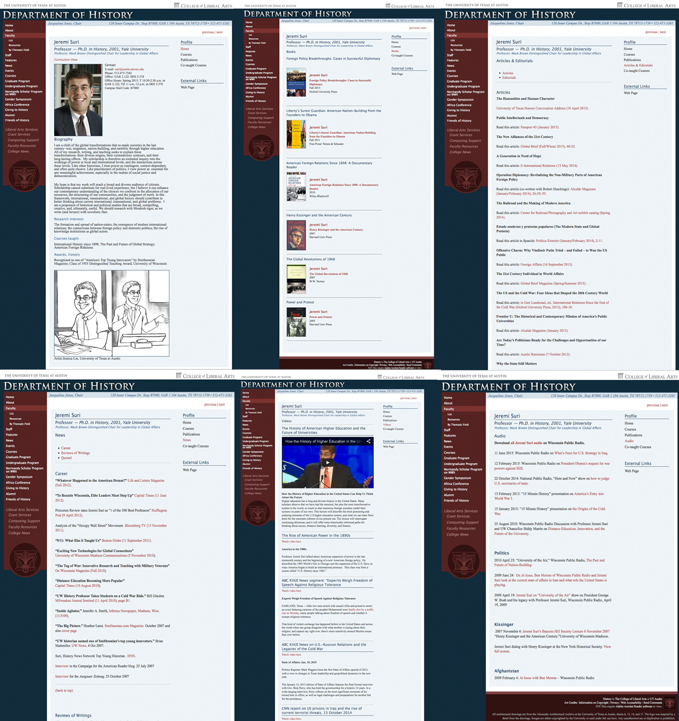
Suri asked for an entire webpage makeover, which I am proud to say has officially been completed. I helped him create six custom tabs. The six tabs I created were Books, Articles & Editorials, News, Videos, Audio and Past Graduate Students. I had fun learning how to code in order to embed videos and make webpages more responsive. Here are most of the tabs after I redesigned:
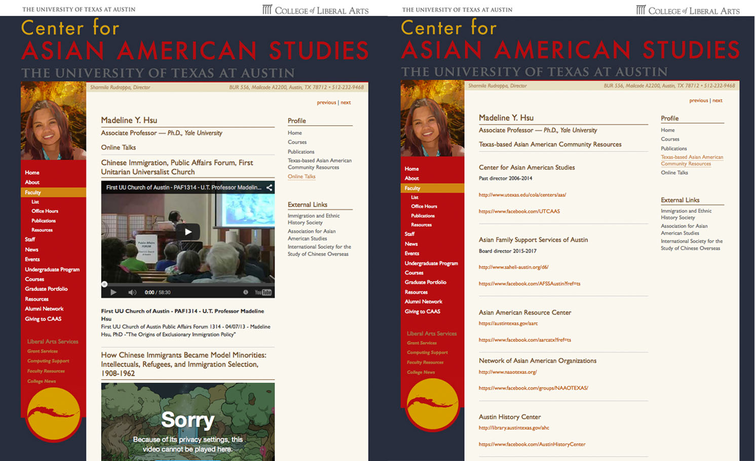
Hsu asked for two custom tabs:
Weyland wasn’t very interested in the initiative, but he did want to update his biography and make a custom tab for his published articles. Here is what the custom tab looks like: 
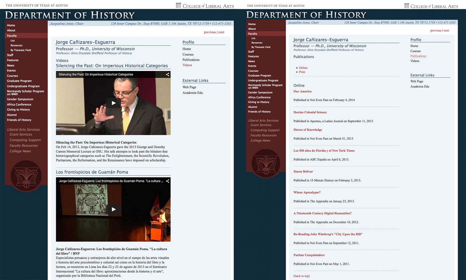
Here are the two custom tabs I created for Canizares:
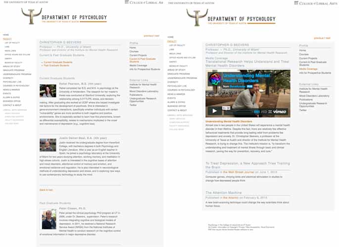
Christopher Beevers asked for two tabs; one for graduate students and one for media coverage.
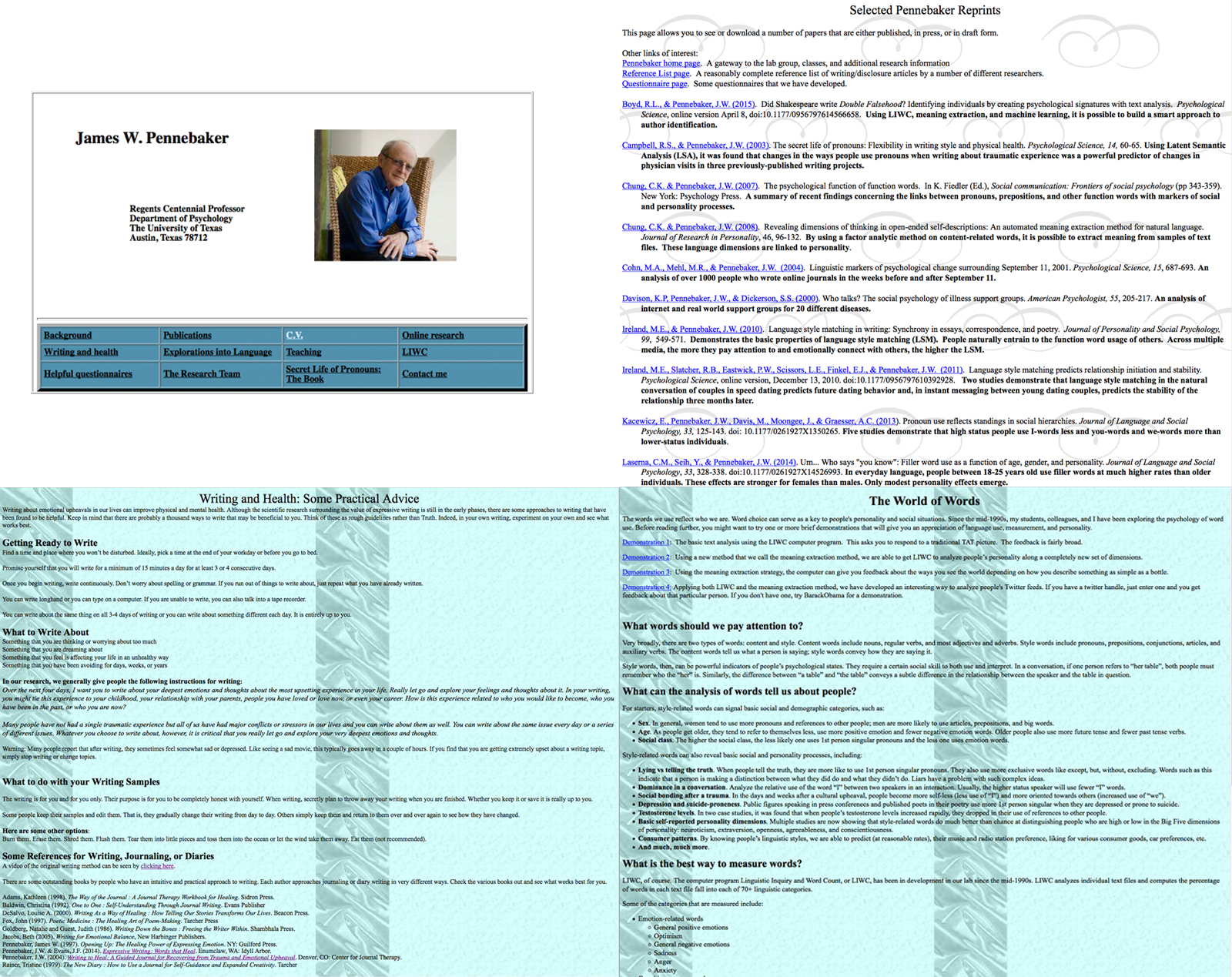
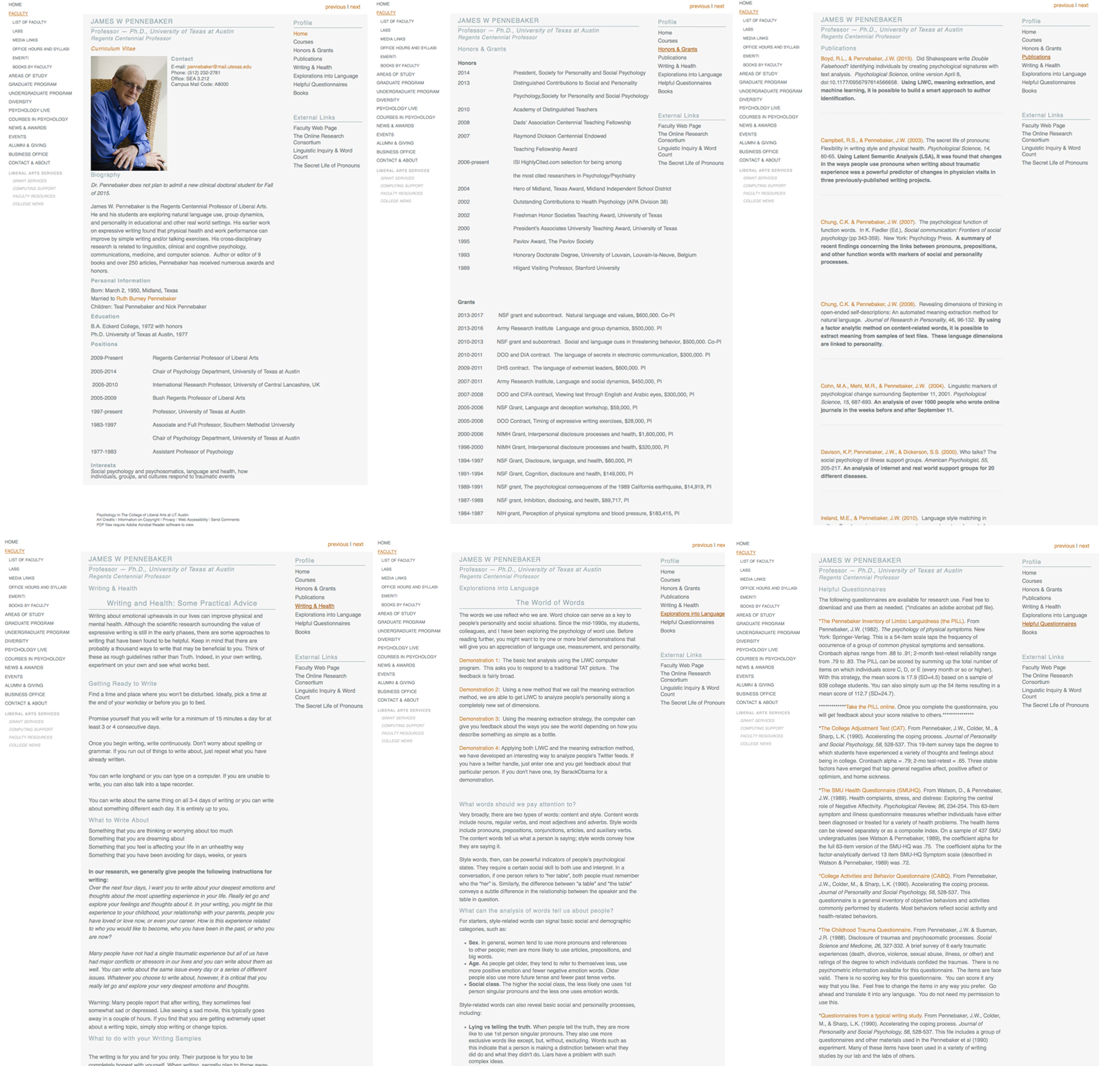
For James Pennebaker, I transferred all of the information on his old website. I also downloaded all of his publications off of the old psychology server and uploaded them into his UT Box. Here is his old website versus his new webpage:
Coming soon: Updated webpages for Shamira Rudrappa, Juliet Hooker and David Pedulla!
Color Wheel Assignment
For my STA training, I made a color wheel. It looks more like a color square. It’s actually a tesselation frame, which is created when a shape is repeated over and over again covering a plane without any gaps or overlaps.

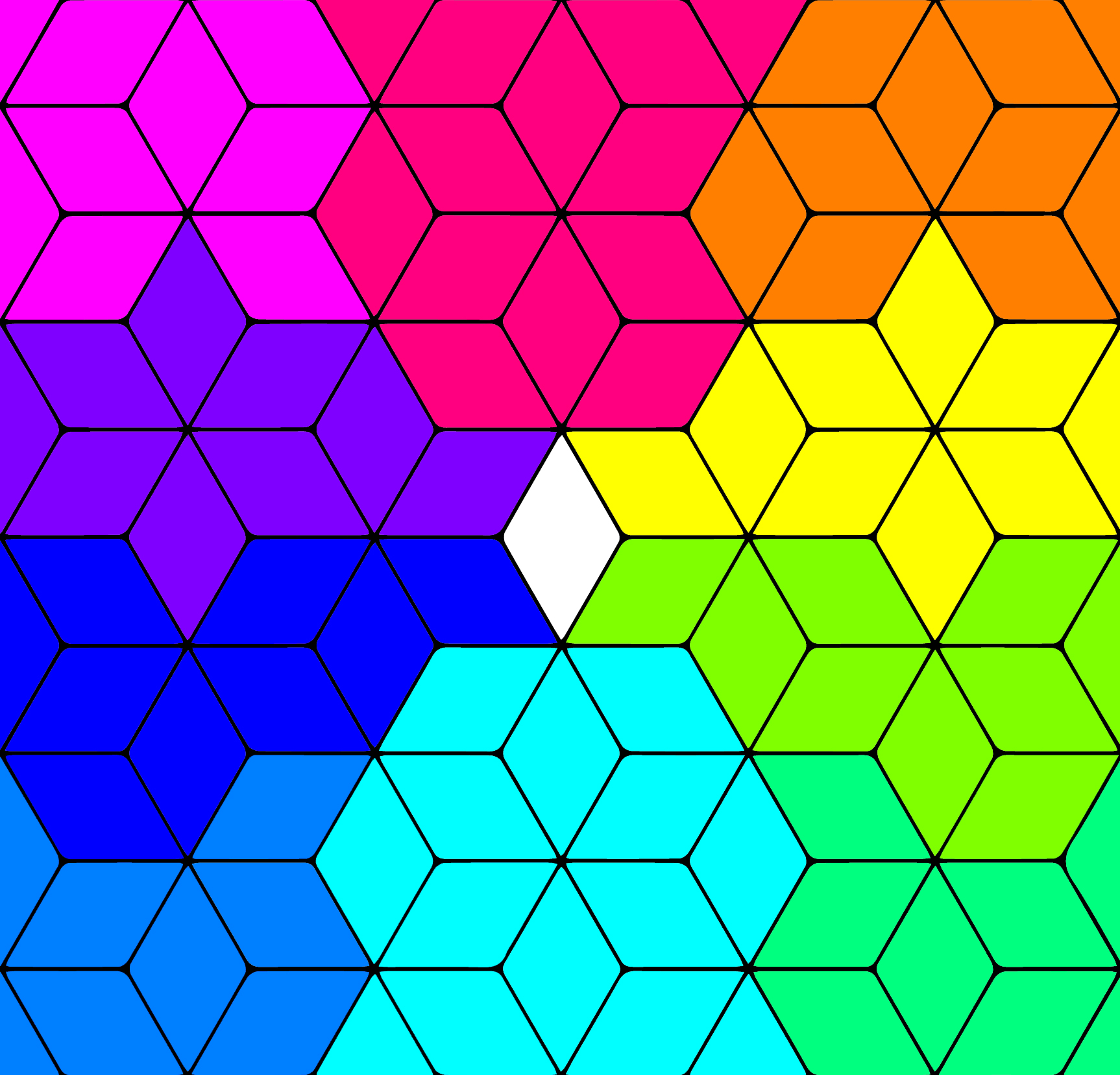
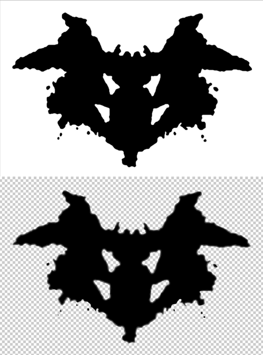
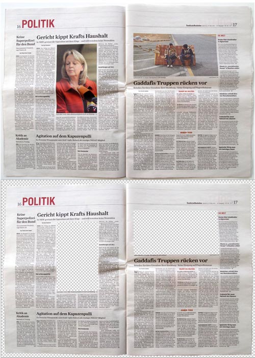
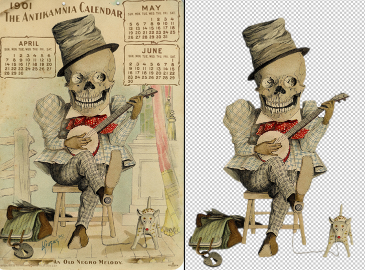
Image Cutouts for Psychology Department
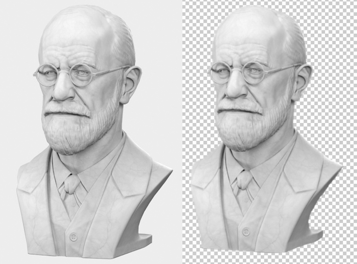
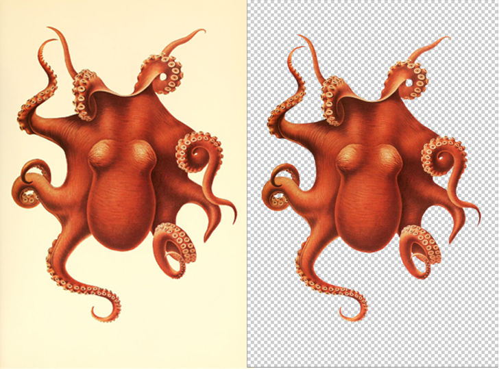
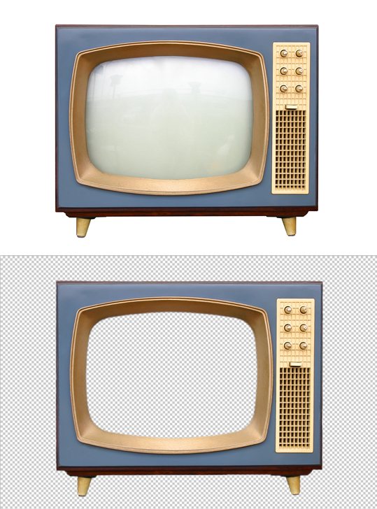
For the past couple days, I have been helping Suloni clean up some images for a presentation being created for an online psychology class. Here are the before’s and after’s for the images.

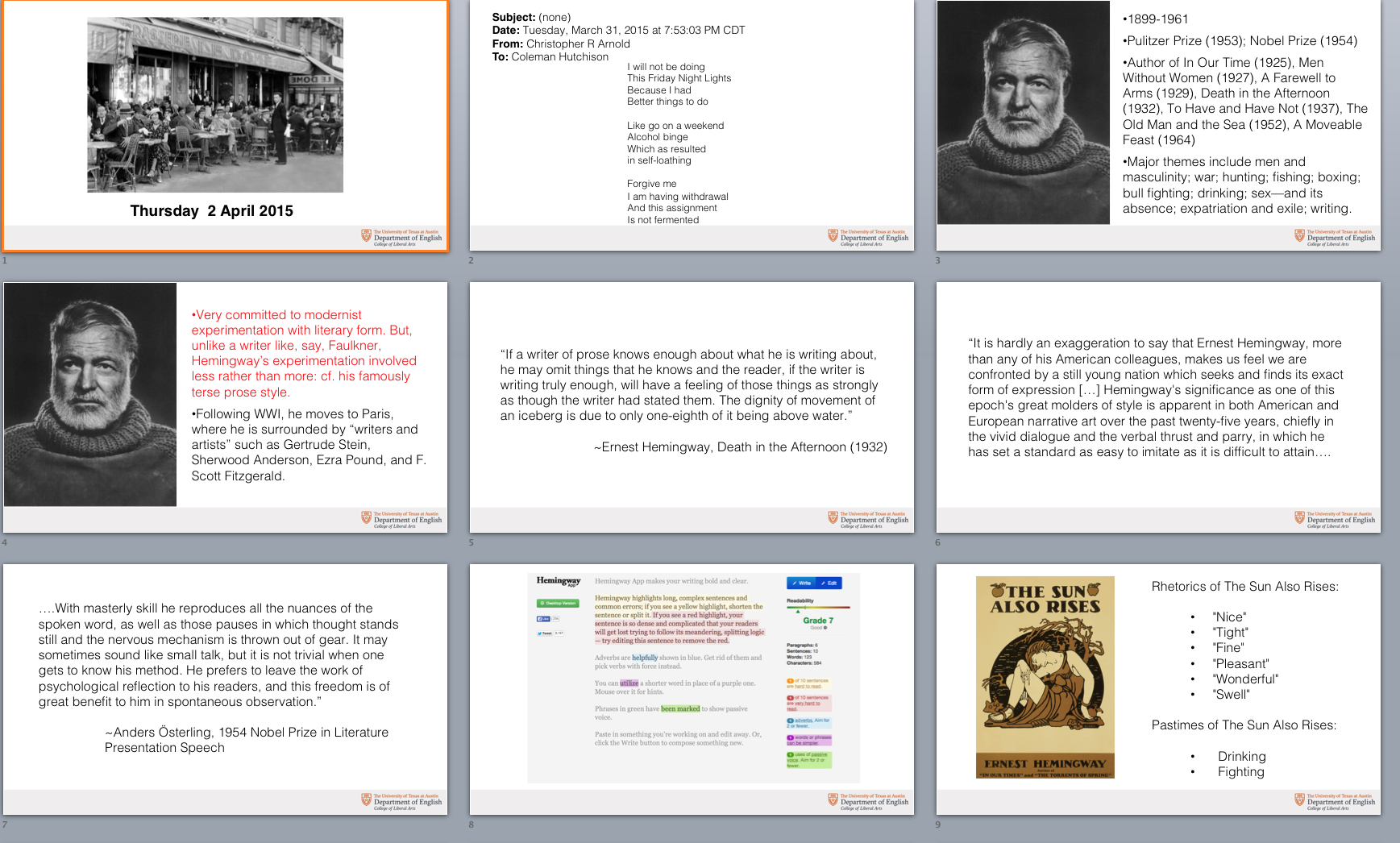
E216K PowerPoint Slides Redesign
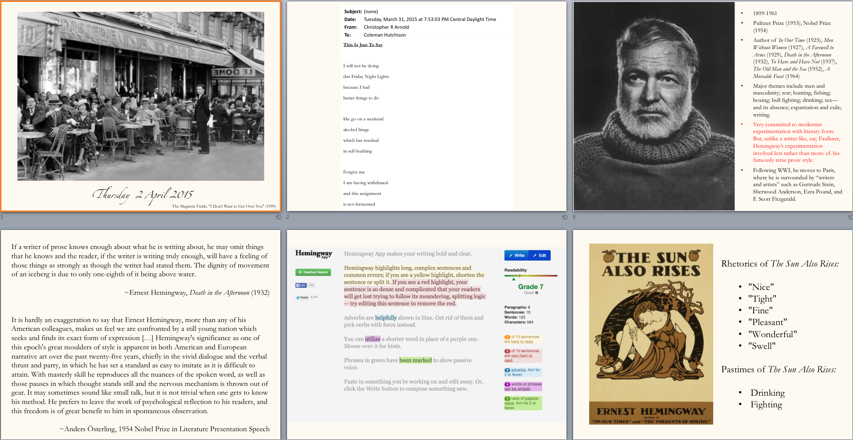
I assisted in helping two English professor’s redesign their PowerPoint slides for a new online class they will begin teaching in the fall. We wanted to make their slides easy to read, even on a teleprompter. The redesign was fairly simple I increased the font size, made it an easier to read font (Helvetica Light) and switched the design to a wide layout. Here is the before and after:
8-bit Gif
![]()
I designed this 8-bit gif of rain because I was feeling inspired by the month-long inclement weather we had in May.

