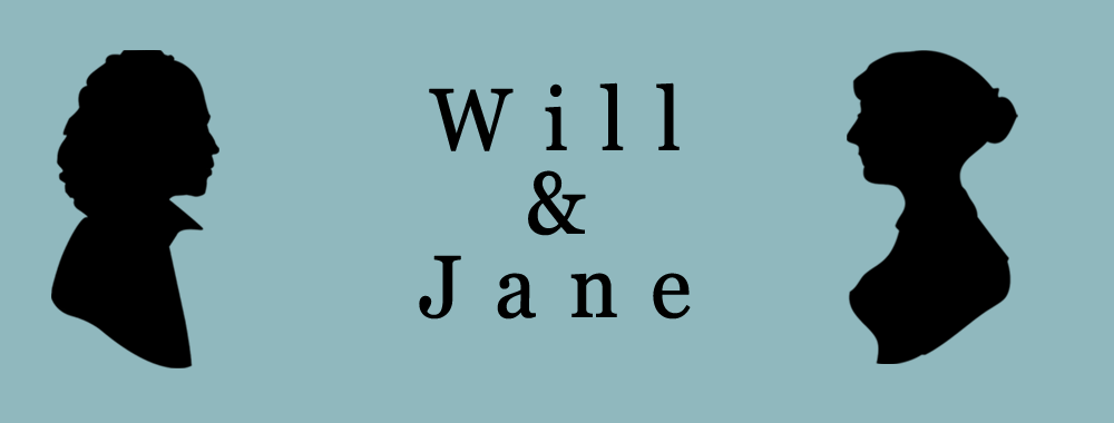
This is a beginnning draft of an image for “Will and Jane,” a site related to What Jane Saw.

This is a beginnning draft of an image for “Will and Jane,” a site related to What Jane Saw.
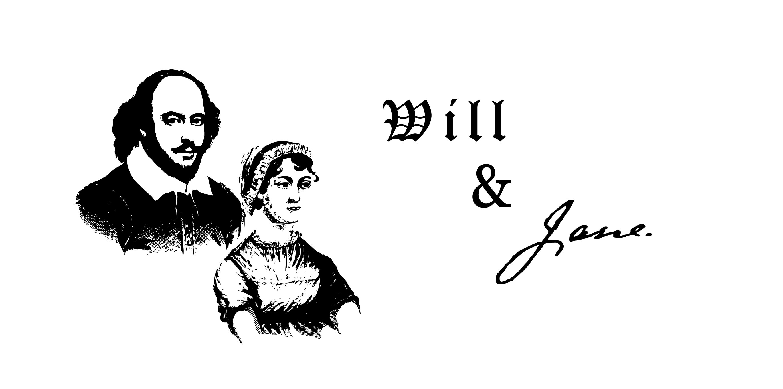
After getting feedback from my client on my first mockup (below), I created this second mockup. It definitely feels less modern and the figures are more recognizable. The images of Austen and Shakespeare were just quickly grabbed from the internet. If we choose to go forward with this design, I will spend more time creating better images of these figures.

![]()

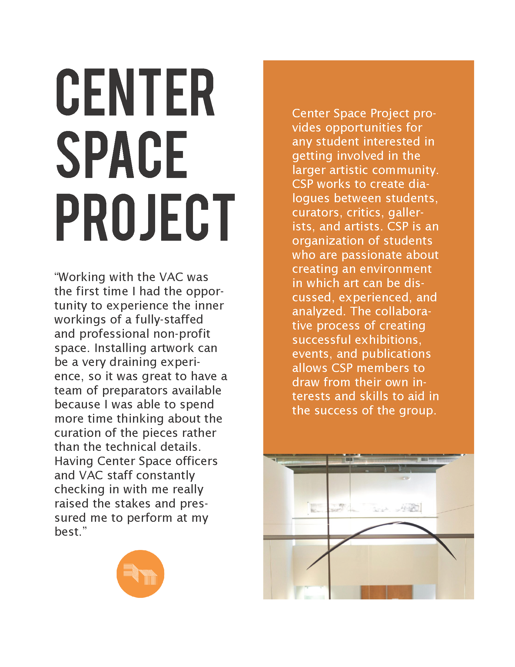
After watching a lynda tutorial, I created a practice Indesign document for a student org that I am a part of. I designed the layout, text, margins, & colors. The content of the text doesn’t really make sense where I placed it, but I was focusing on design more than content. (fyi: I copied text from our website, used our logo, and found the picture of the VAC on the internet.)
I feel way more confident with Indesign now!

