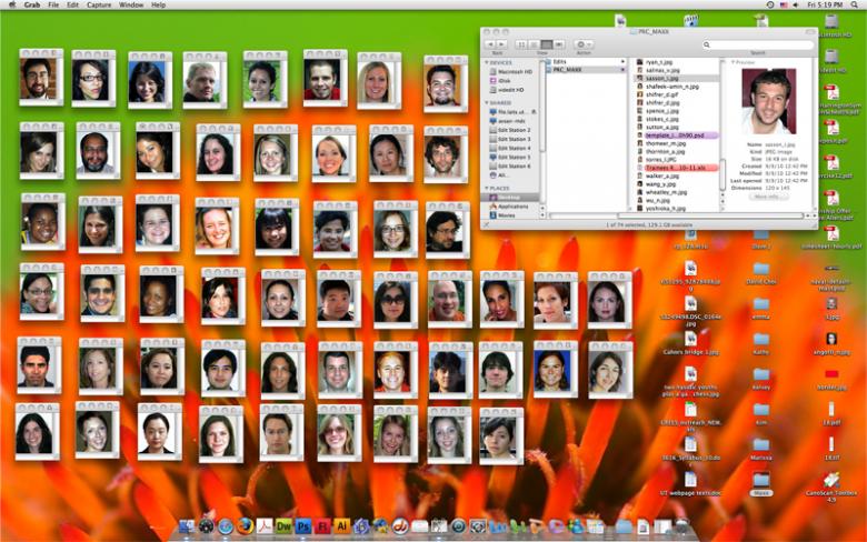
Today we had our Weekly STA meeting and shared site designs for E316K and other work. Approx time ~ 30 mins.
Also, we continued our training in Drupal with Kate. Next week we need to reply to Prof. Client with our ideas for how the site should look and function. Approx time ~ 1.25 hours
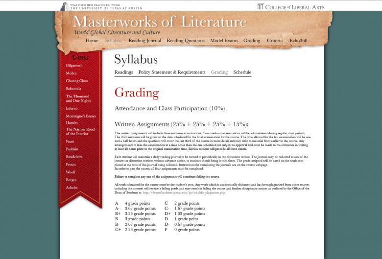
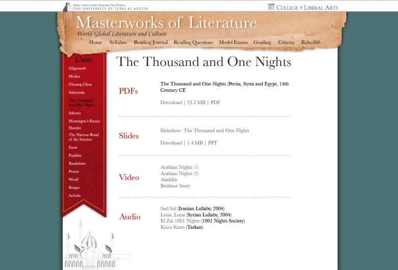
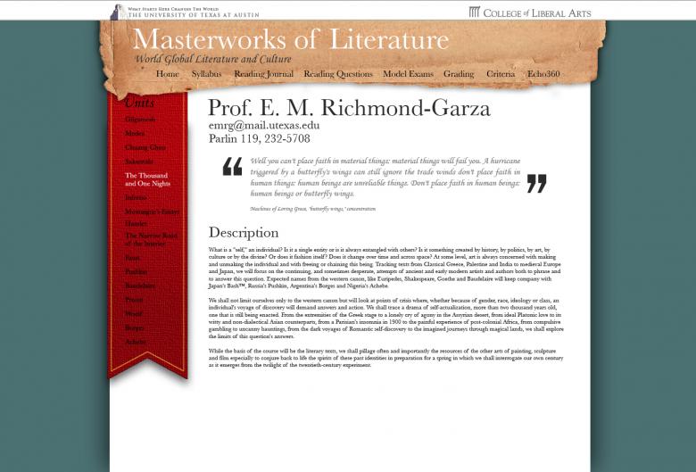
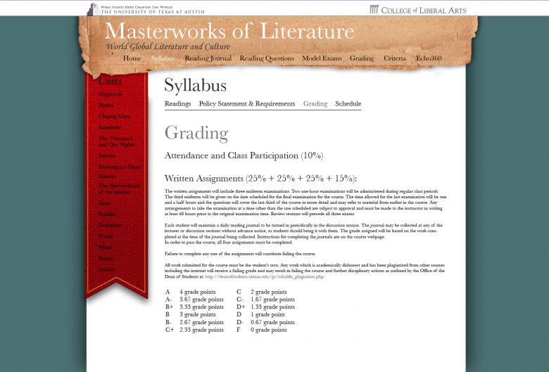
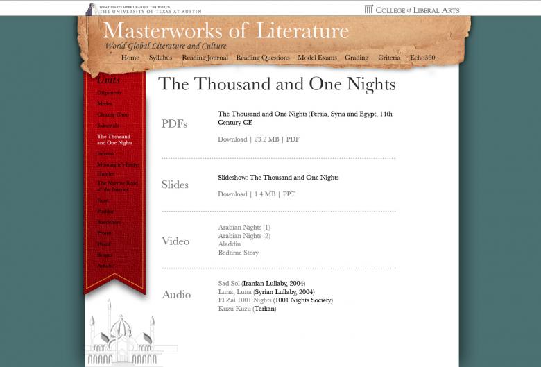
For the remainder, I edited part of my mockup for the E316K design. Someone mentioned a cool graphic such as the bookmark/ribbon unfurling onto the page as it loads (flash design?). Things I edited:
- Added some ‘accent’ colors, mainly adding the same red from the ribbon to some type.
- Changed black text to white on the ribbon for easier reading. Hovering and selected type will now be black on the ribbon.
- Lightened the ‘paper’ on the header for clearer text.
- Changed the hover/selected type to now be 55% gray instead of white due to lighter paper color
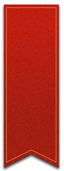
- Created a new, custom texture for the ribbon – instead of using a photoshop texture. Gives the ribbon more of a cloth look and less of cracked earth/clay.
- Reduce drop shadows on nearly everything, making the page appear more subtle.
- Added a very slight drop shadow to the “Masterworks of Literature” title
Attached are the Syllabus and Unit page to reflect some of the changes.
Approx time ~ 2 hours.
