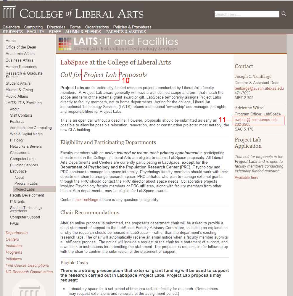
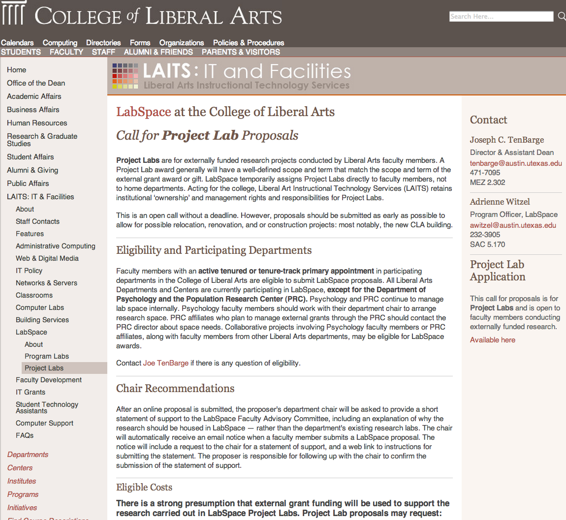
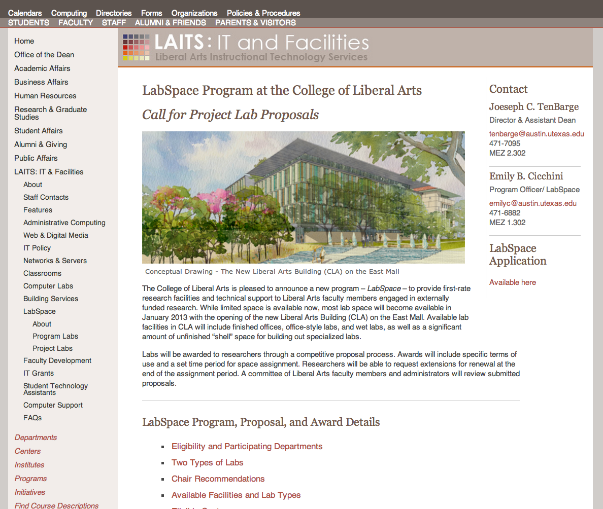
Project: Updating the LA ITS site
Completion Status: Done
Staff Guidance: Andre
Descriptions/Plans:
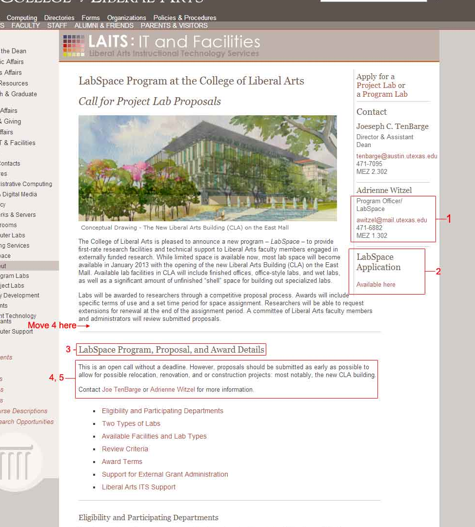
Just some minor corrections to the site that needed to be done. Mainly just updating e-mails and correcting any text.
By Leroy James
Project: Updating the LA ITS site
Completion Status: Done
Staff Guidance: Andre
Descriptions/Plans:
Just some minor corrections to the site that needed to be done. Mainly just updating e-mails and correcting any text.


By Leroy James
My favorite holiday, Halloween, and in celebration I present this part 1 of a mixtape I created to mark this special holiday.
(Warning: there’s probably a few cursewords here, overall though the language and themes are pretty PG-13.)
By Leroy James
Project: Color Correction
Completion Status: More than half way there.
Staff Guidance: Emma
Descriptions/Plans:
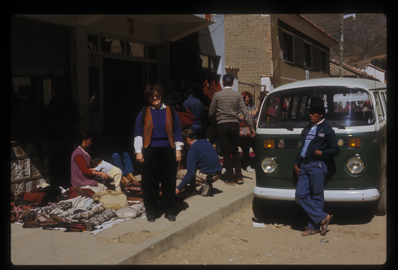
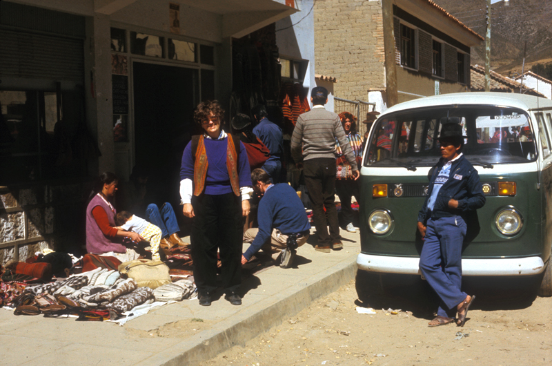
Color correcting images and fixing up COLA IDs with Photoshop. Fixing up images is honestly one of my favorite things to do, especially because there’s so many ways to go about it.


By Leroy James
Project: GIEL Site
Completion Status: Ongoing
Staff Guidance: Suloni
Descriptions/Plans:
Creating a visual identity and site for the new GIEL site, created to reach out to international educators.
The following are my mock ups:


By Leroy James
Project: Neuroimaging Lab site
Completion Status: Ongoing
Staff Guidance: Suloni
Descriptions/Plans:
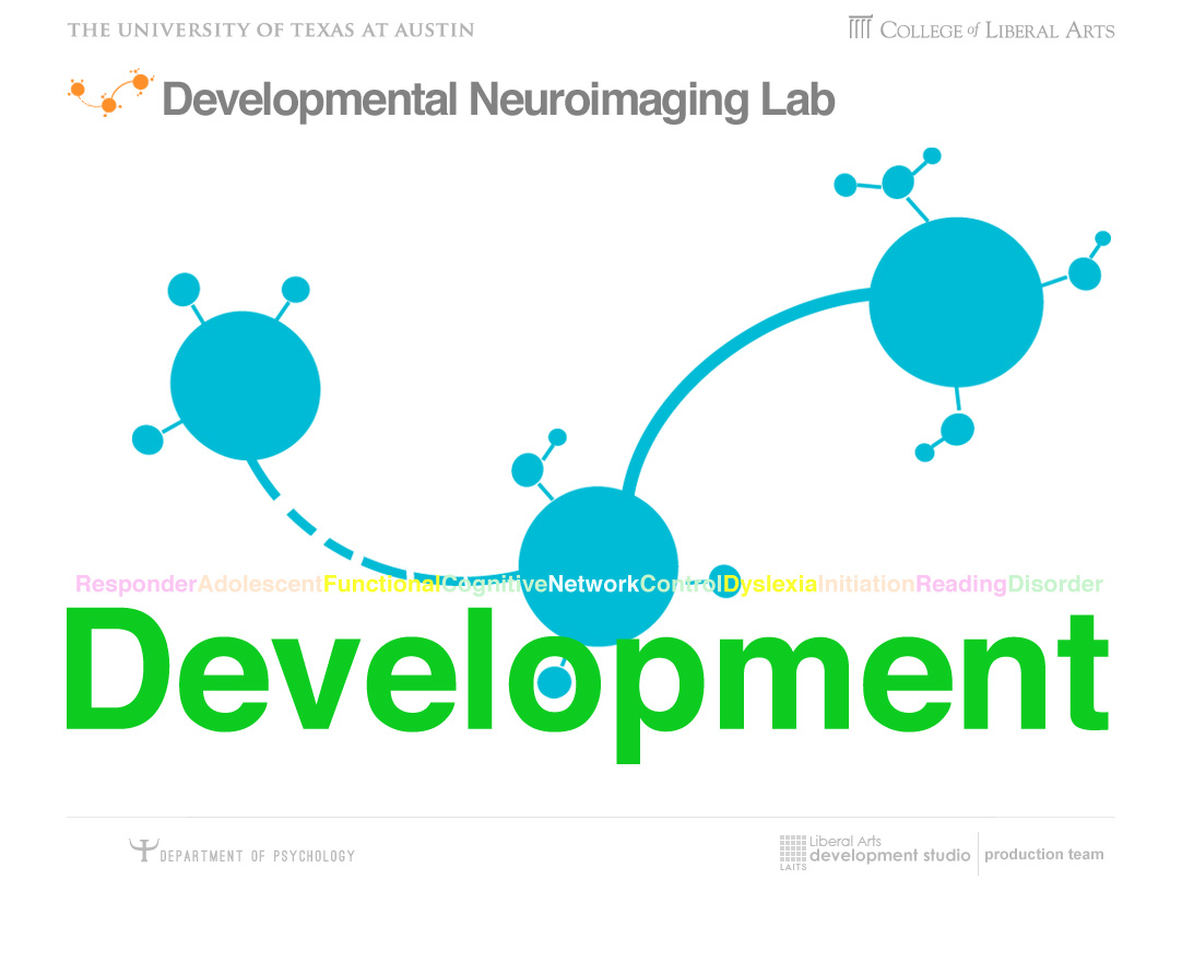
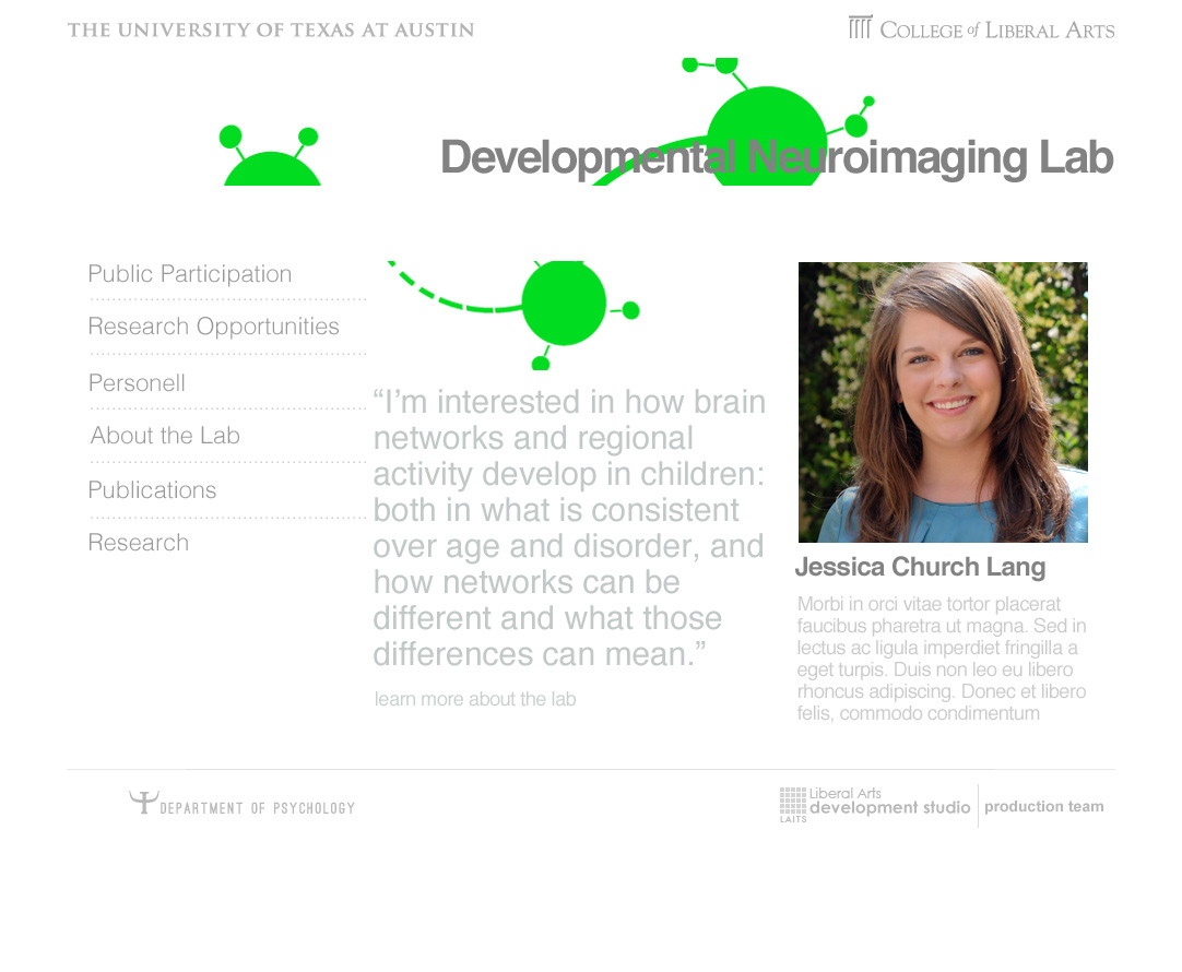
Simply put the assisngment was defined as to “llustrate an engaging concept for the Developmental Neuroimaging Lab visual identity”.
With that, I designed some roughs from the image the client provided:
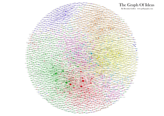
And developed this:


With some discussion on maybe another way to interpret development I thus thought about synapses and altered it to look like this instead:


By Leroy James
Project: Speech Presentation in Homeric Epics
Completion Status: Ongoing
Staff Guidance: Lauren, Suloni
Descriptions/Plans:
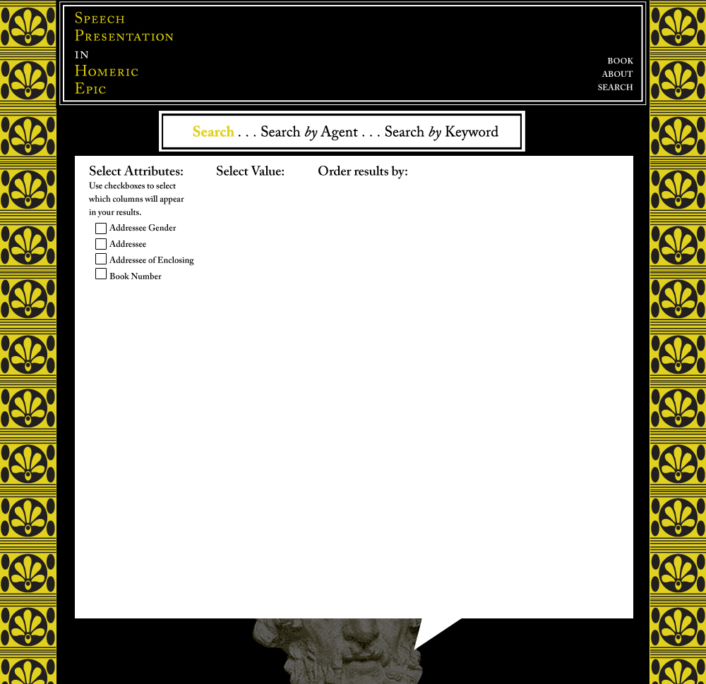
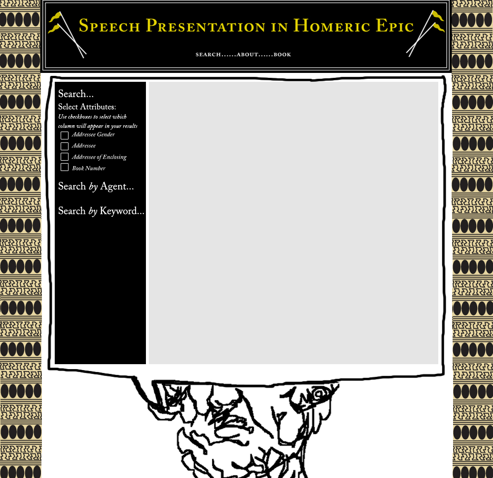
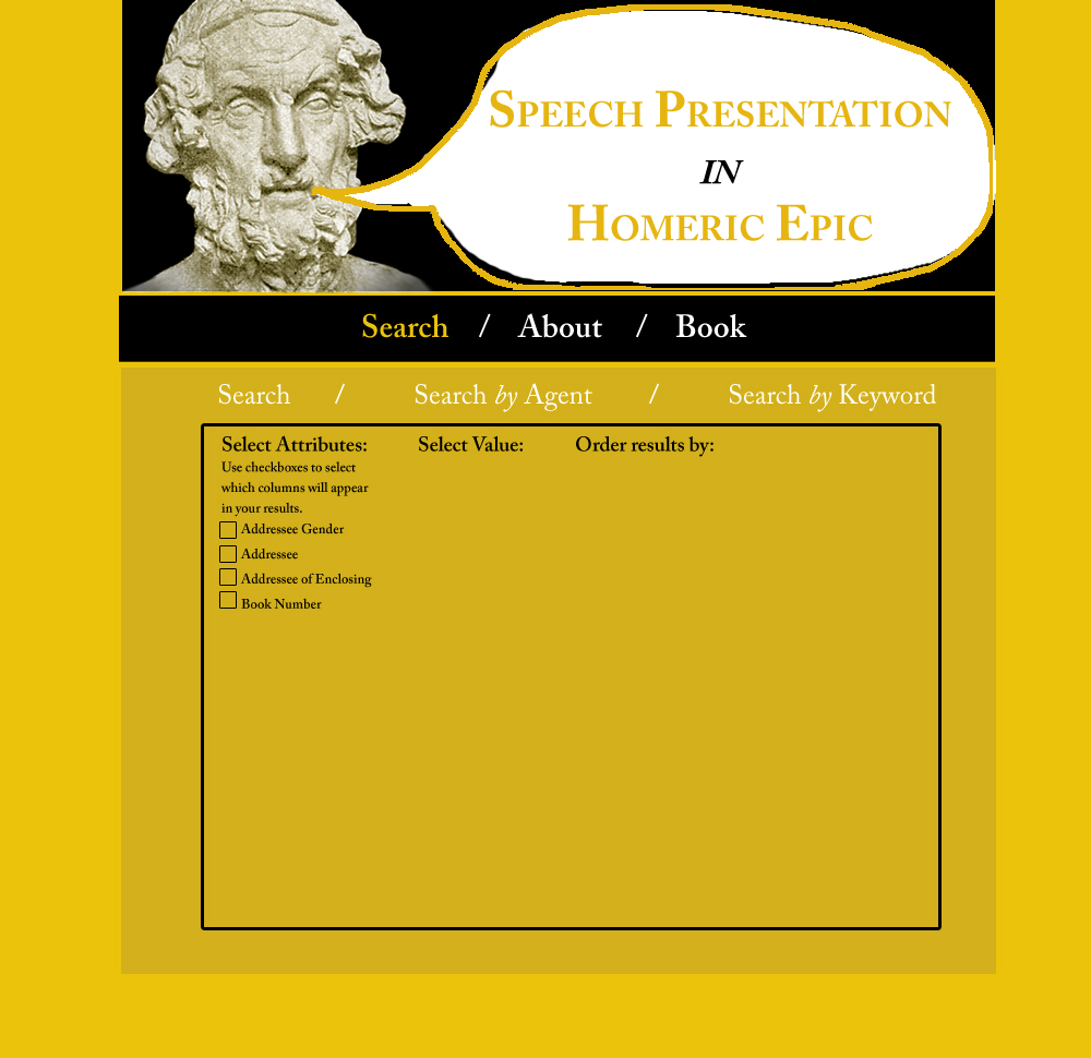
Dr. Beck wants to create a site to be a companion piece to her current book, Speech Presentations in Homeric Epics.
Most of what I had to work with was the cover of the book:

With that I was also told it was best to make something simple for less experienced web-users, and keep it visually catchy.
The following were my rough designs:
