• We are STAs
    • Asha Rountree
    • Haley Ma
    • Kate Shih
    • Kyra Lee
    • Nicholas Peasley
    • Sasha Kenney
    • Shanda Horm
    • Shriya Atreya
    • Tomas Marulanda-Mesa
  • We were STAs
  • STA Presentation
    • STA Presentation 2017
    • STA Presentation 2016
  • Testimonials
  • Resources
  • Home

STA Blog

Jaclyn Alford

Jaclyn Alford

RUS 407 Illustration–Rapids & Movie Scene

December 3, 2017 By Jaclyn Alford

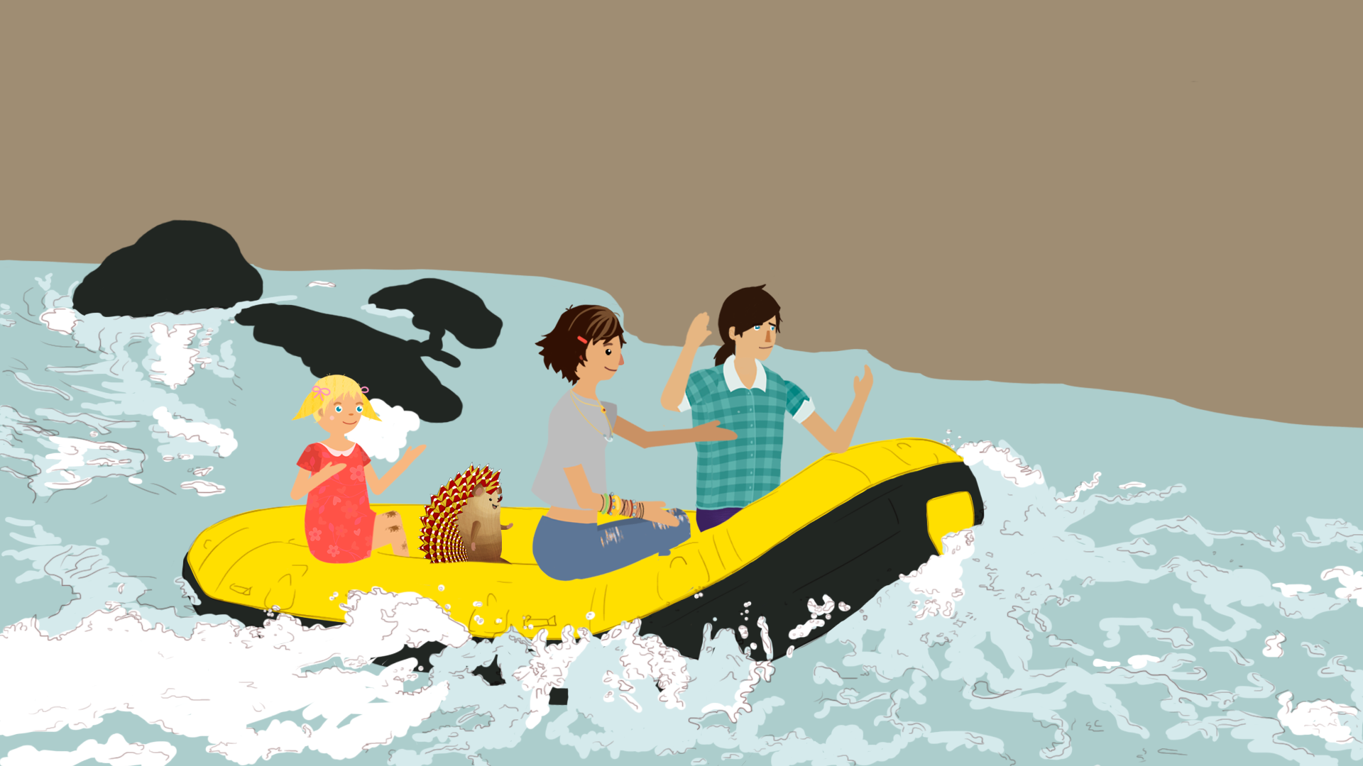
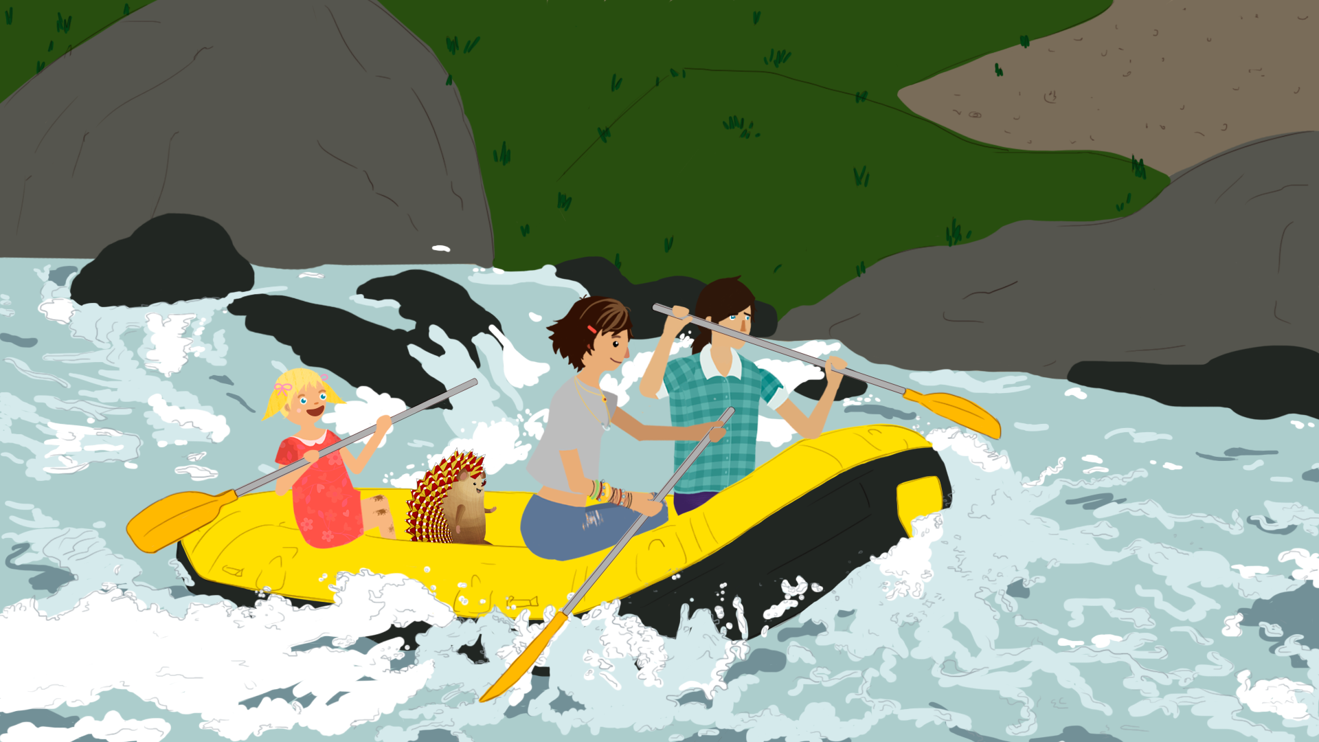
This rushing rapids scene was particularly challenging due to the river which needed to display movement and the luminescent/reflective qualities of water while maintaining the rather flat style of these illustrations. I spent the majority of my time that I worked on this illo on the water. Overall, I am quite satisfied with how it came out!


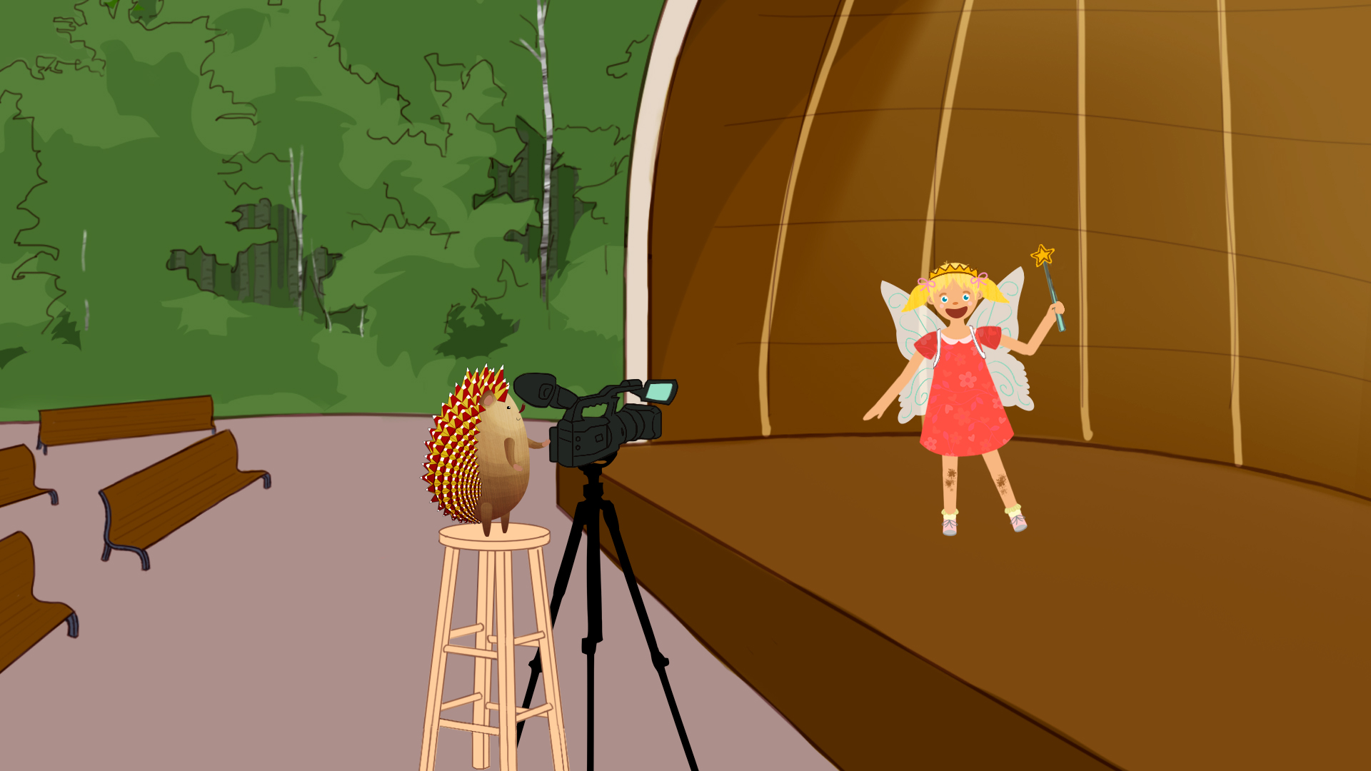
Shortly after, I finished this illustration of Polina and Oleg are at a pavillion where a movie is being shot. The pavillion background was borrowed from another illustration, and I drew the camera + tripod, stool, and fairy costume assets. The finished illo is below.

Filed Under: 2017-2018

Russian Apartment Buildings–Oleg Illustration

November 10, 2017 By Jaclyn Alford

For my most recent illustration, I drew Oleg and Polina on a playground in between apartment buildings. It is quite fulfilling to be able to view these images from steps in the illustrating process (from rough reference to final) together!


Filed Under: 2017-2018

AFR303 Powerpoint Reformatting

November 8, 2017 By Jaclyn Alford

Today I worked on my first powerpoint reformatting assignment. Essentially, I took the original 4:6 slides and converted them into 16:9 slides. Utilizing predetermined formatting guidelines (specifications on background, font, alignment, and color), I edited this lecture powerpoint to be cohesive with the others.

Filed Under: 2017-2018

History Faculty New Book Series Poster

October 30, 2017 By Jaclyn Alford

I was asked to create an 11″ x 17″ poster for the History Faculty New Book Series this academic year. The poster needed to contain event, author, and book information as well as photos of the authors and/or book covers. In order to display different styles, I created three initial drafts of the design varying in color scheme, layout, font, and graphical elements. These are pictured below:


I then chose only the latter two to send to the client for feedback per Suloni’s advice.

The client decided to go with the green poster’s style. Additionally, they requested the circular elements be changed to squares and that both the author portraits and the book covers be included in the design. Using this critique, the following designs were created:


Filed Under: 2017-2018

RUS 407 Oleg Illustrations

September 11, 2017 By Jaclyn Alford

Concerning RUS 407, I was assigned to illustrate as well as color scenes. For my first illustration (pictured below), I used a pre-made kitchen background since it has been used in prior scenes and drew additional assets that applied to the scene in which the characters are making dumplings. As this was first line drawing, it took somewhat longer than I initially expected. After the line drawing was approved, I added color and inserted the characters.


For my next illustration, I was asked to first create a rough photoshop collage to submit for approval before I moved on to a line drawing. The images below show my photoshop collage (using a background pieced together from two already existing backgrounds) and then the final.


Currently, I working on an ice cream shop scene. This entailed drawing an ice cream shop background from scratch, which has provided me practice in drawing interior spaces–something I have not had prior experience with. Below is my Photoshop collage and two images of my current progress.

Filed Under: 2017-2018

UTNY Logo

August 9, 2017 By Jaclyn Alford

Today I began working on a logo rough draft for the new UTNY program using Adobe Illustrator. The client envisioned the logo to include “the Tower in the Manhattan skyline with UTNY figuring prominently below.” At the time being, there is no set font–the type used in the roughs is acting as a placeholder. I wanted to include Texas orange to add contrast and further distinguish the tower. Additionally, I created a version featuring grey to provide an alternative. Below are 2 versions of my first rough draft.

I am looking forward to this design evolving as I receive critique and continue familiarizing myself with illustrator.


And here are the second round of drafts after feedback from UTNY clients.

More feedback from the client ensured a third round of drafts; this time with the Flatiron building replacing the Statue of Liberty, lighted windows, and a larger (and more prominent) Tower.

And now a fourth edit. Utilizing suggestions of the clients, the Tower was centered, Flatiron building replaced by the One World Trade Center, and architectural detailing.


Filed Under: 2017-2018

  • « Previous Page
  • 1
  • …
  • 7
  • 8
  • 9
  • 10
  • 11
  • Next Page »

link to LAITS home page

Video STA Home

© 2025 Liberal Arts Instructional Technology Services | Production Credits