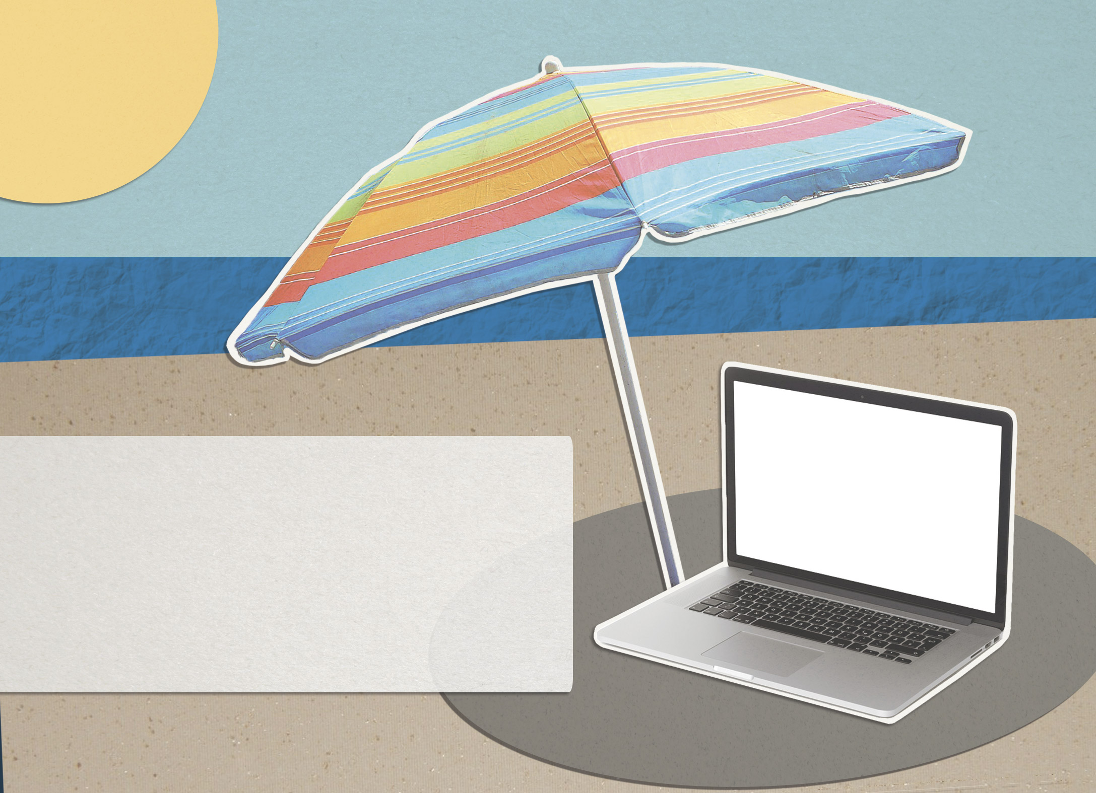
To correspond with the summer online postcard, an ad for 2018 summer online courses will be shown on screens around campus (i.e. Union, SAC, etc.). The design is complementary to the postcard with the same paper collage style, beach scene, and mixture of warm and cool tones.
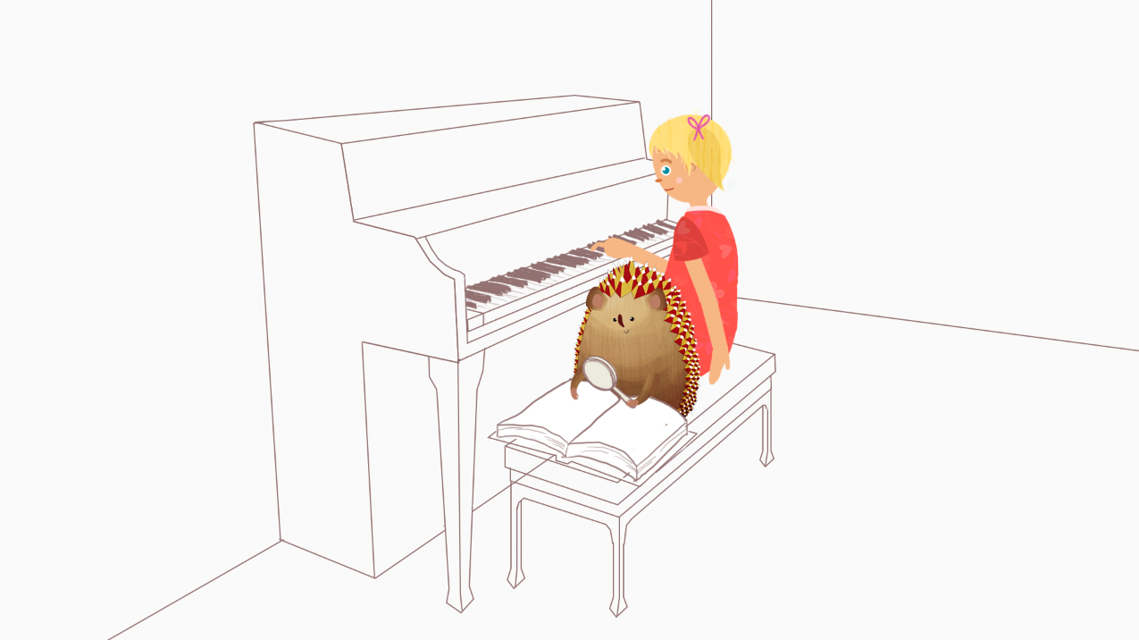
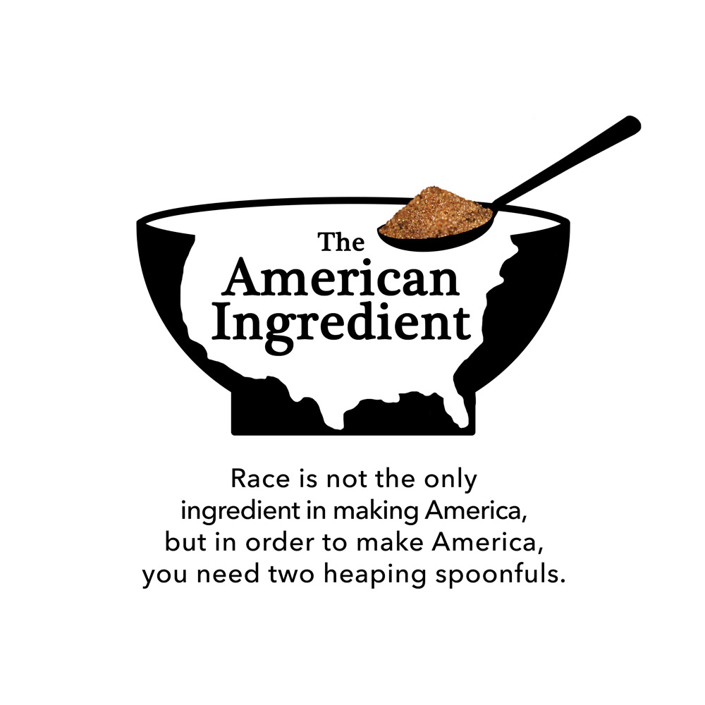
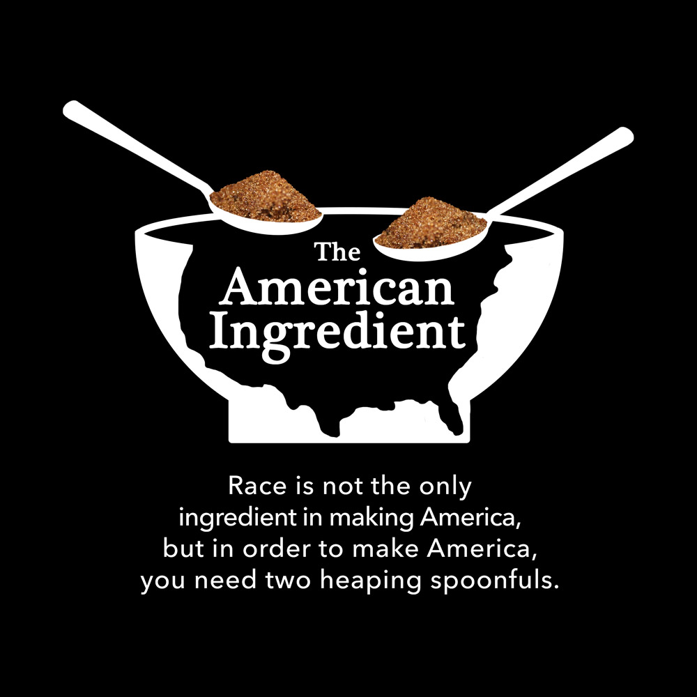
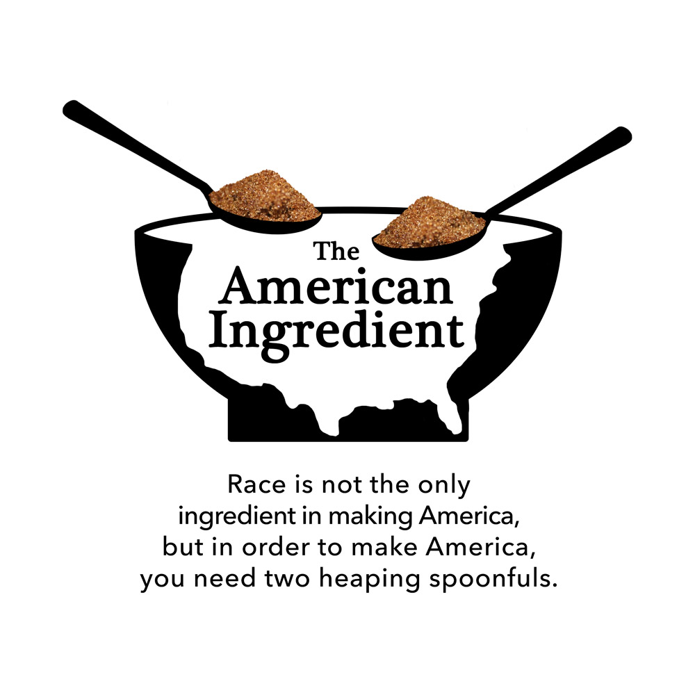
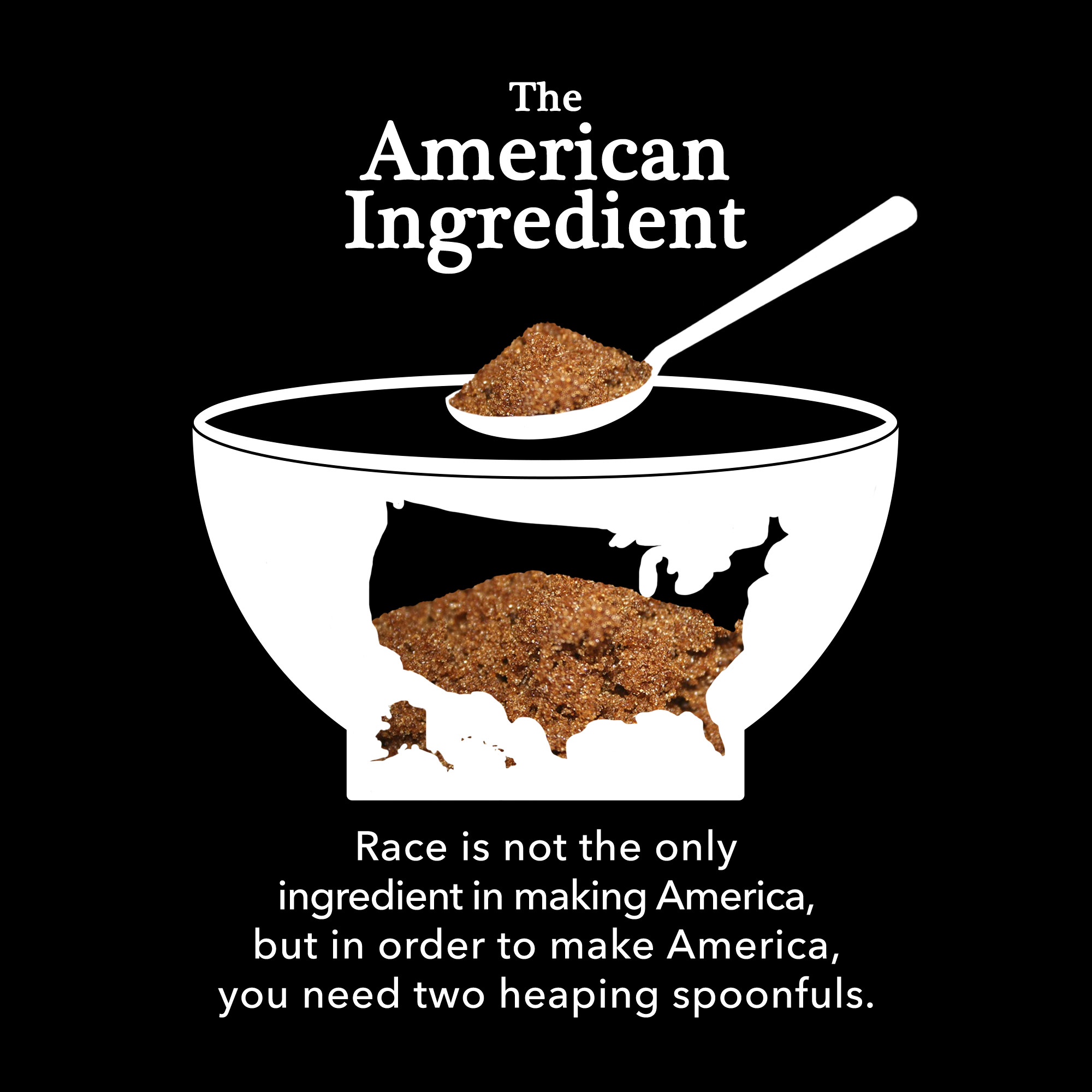
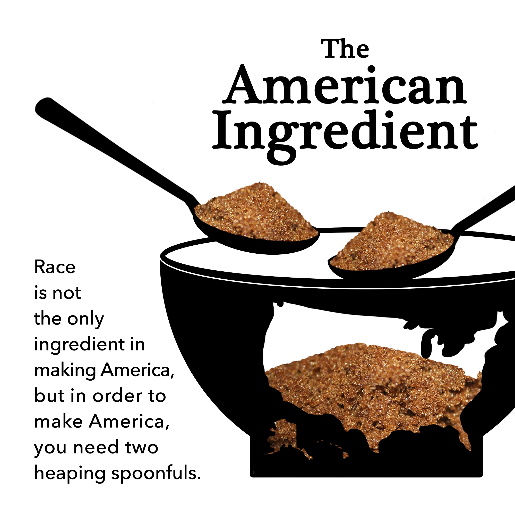
Below are the first drafts of the design.


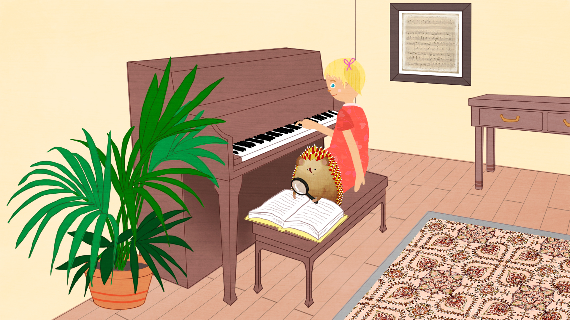
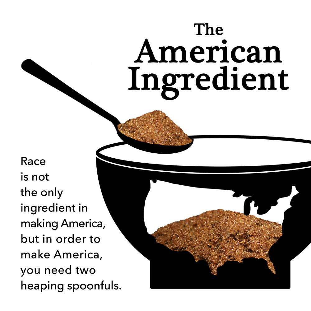
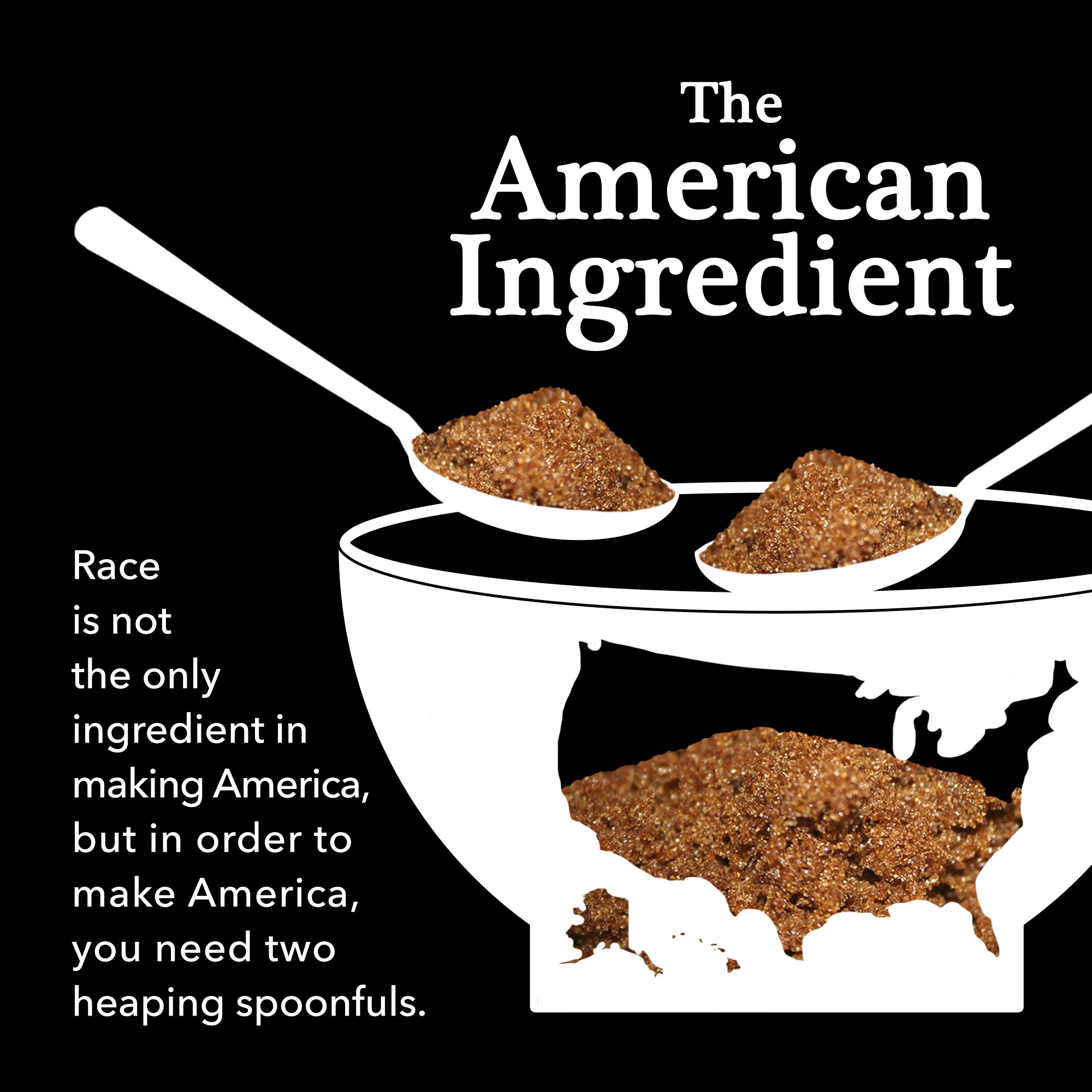
And here is the finalized design: