Drupal Training
- Presented site functionality
Met with Janet Swaffar
- Audio recording tutorial
- Slideshow tutorial
Not Even Past
- Met with Kate
- Drupal site and theming
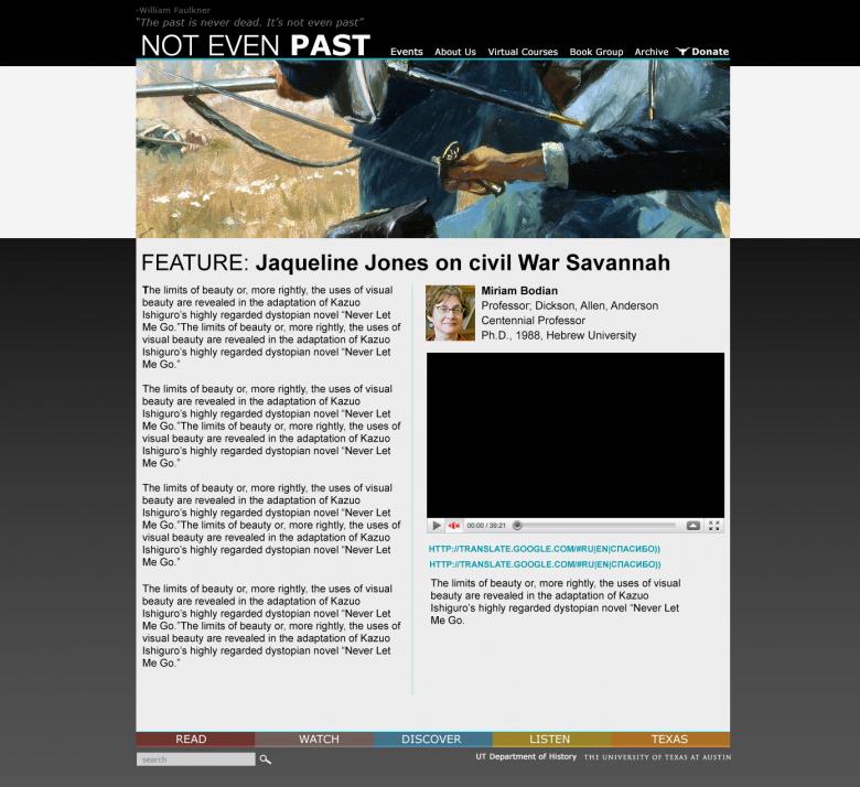
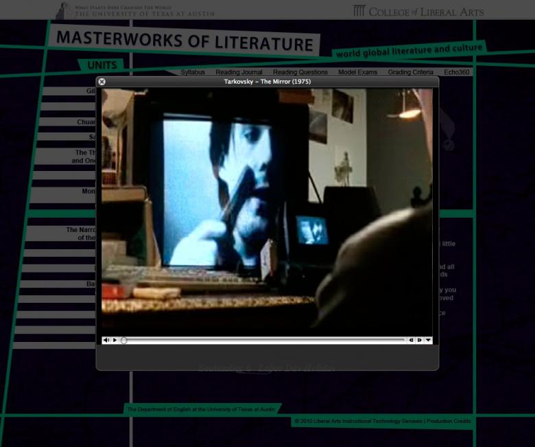
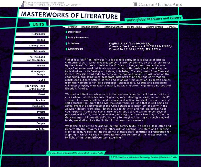
- Should look like this:
E316k Redesign
Drupal Training
Met with Janet Swaffar
Not Even Past

E316k Redesign


Photogtaphy and Dase

STA Drupal Training
ASLonline
Photography and DASE


STA Drupal Training
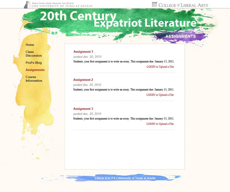
E316K
– Clicabrasil Sitehttp://dev.laits.utexas.edu/clicabrasil/
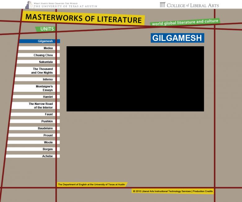
– E316k 2nd Mockup
– Drupal training meeting and assignments – 2 hours
– Clicabrasil Site http://dev.laits.utexas.edu/clicabrasil/– 2 hours
– Met with Janet Swaffar – 1.5 hour
– Wrote paragraph about E316K design – 0.5 hour
– Drupal training meeting and assignments – 2 hours
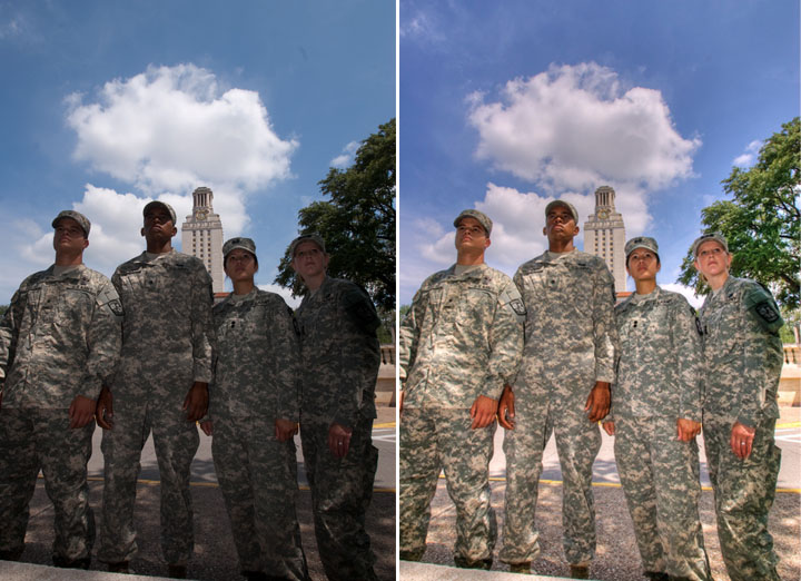
– Image editing for ROTC – 2 hours
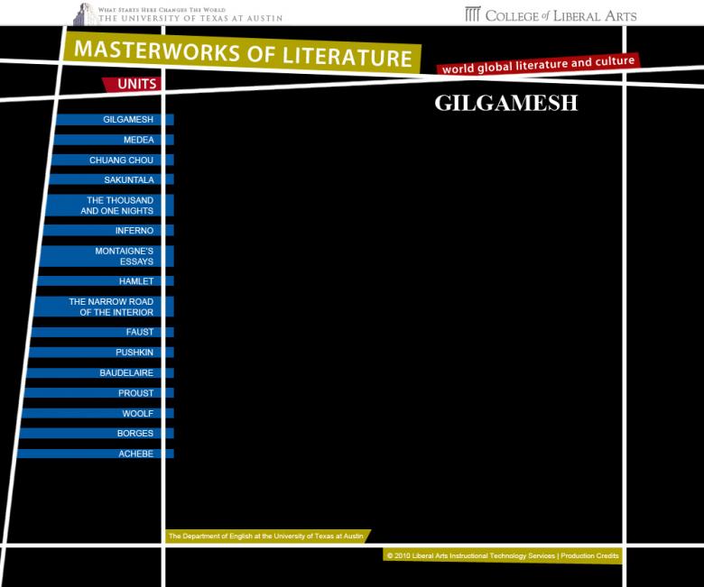
The text below is the concept behind my E316K redesign
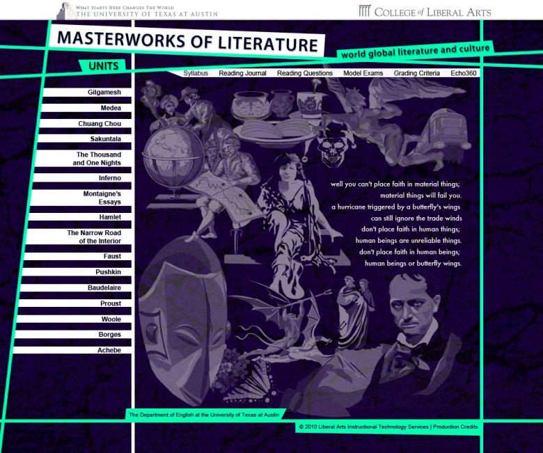
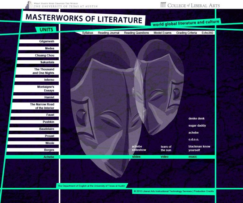
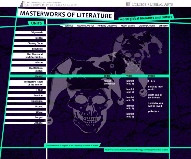
Johannes Gutenberg is arguably the father of movable type and the printing press.This mechanization and printing technique stimulated the advent of the mass production of books, and therefore, accessible literature. My E316K redesign is an homage to Gutenberg. Letters, words, and text are the medium in which authors convey their message, and I wanted the typographical emphasis of my design to accentuate that very sentiment. The monochromatic grayscale design is reminiscent of the oil-based inks originally used in the printing press. A multitude of font’s are used, especially in the abstracted excerpt that dominates the home page. The uninhibited melange of serif and sans-serif fonts communicates the idea that literature is a medium in which authors can express themselves freely. Literature has no prejudice. Varying weights and intensities of the fonts are utilized and placed strategically so that each element fits into the design like a puzzle piece. Each design feature has it’s place, and no space is wasted.
The typographical abstraction from the home page is duplicated subtly in the secondary pages. The Gilgamesh page, for example, contains said element in the title. Website users are teased with excerpts and associations of the subject matter at hand, enabling students to further explore the relevant media (videos, pictures, music, etc). I also recontextualized the illustrations from the old site into the title of these inner pages. The clean illustration to the left of the title is included as if pressed with ink onto the page using a metal type piece cast with Gilgamesh’s silhouette. The page elegantly collapses and expands as each media type is chosen for viewing, which decreases the visual clutter of the page and focusing the user’s attention to the specific content he/she wishes to view.