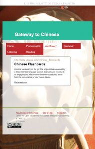
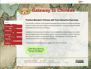
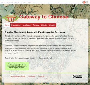
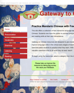
The original logo contains a long line that breaks when the screen size is reduced. I took a screenshot of the logo, opened it in Photoshop, and cropped the image into a circle with a transparent background. The edited logo has to be uploaded to the server and placed inside the same folder as the original logo for these changes to take effect. Before I replace the image, I need to test how this change would look so I’m trying the “object-fit” and “object-position” properties to create the look of the edited logo.
Responsiveness progress – header restyling
Today I worked on restyling the header. The image next to the text is problematic when responding so I’ve hidden it. I’m thinking of a new style that will suit the page, then I will try to reincorporate the original image. First, I will work out the kinks associated with the multiple divs that make up the header. I will place the image back in once the divs respond in unison.
Responsiveness progress check
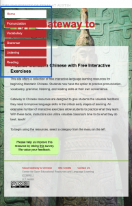
The last time I worked on this webpage, I left off on styling the menu to be responsive. Now the menu is displayed horizontally to not conflict with the rest of the content on the page. The major elements are all responsive so the next steps would be to style them properly, like giving the list items in the menu enough padding, and then fix the smaller issues that arise when the screen size is reduced.
COLA IDs
I practiced reducing hotspots in three photo IDs. The first two had bright reflections of light on the forehead, cheeks and nose. The third photo had a bright reflection on the side of the head. I didn’t entirely remove the hotspots, I just reduced the brightness so that areas were not blown out of the photo and looked more natural. I like editing the photo IDs because each photo presents its own problems which pushes me to learn a new tool or technique that I hadn’t used before.
One new issue I encountered was the combination of dark glasses and a bright, white shirt that was blown out. I couldn’t bring the brightness of the shirt down because the quality would degrade since the pixels that were blown out aren’t there anymore. And the darkness in the lenses couldn’t be brightened much while also maintaining an even color across the face. I brightened the photo a bit but I wonder how others would approach this issue.
Documenting for Knowledge Base
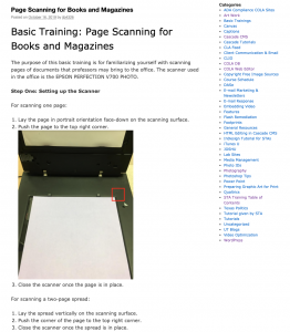
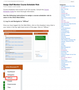
I created two pages on the Knowledge Base that document the processes for some STA tasks. One page is for scanning documents like books and magazines, the other is for how to give a staff member the role of a course scheduler. The process involves writing detailed, step-by-step instructions and adding labeled pictures and screenshots. There was some Photoshop editing involved to blur out sensitive staff member information from the example screenshots. Overall, the process of writing and publishing was straightforward and I hope the guides are useful to other STAs.
Responsiveness project
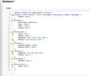
I’m learning webpage responsiveness so I can update older UT sites to be compatible on various screen sizes. The problem is that when the site is viewed on a smaller screen, the content is cut off instead of resizing to adapt to the smaller screen. I’ve started learning responsiveness by using a Google extension called Stylish to apply css to one of the unresponsive webpages. So far, I’ve made most of the elements on the home page responsive by adding media queries that tell the page to adjust the content when the screen size is less than 1000 pixels wide. The next element I’ll work on is the navigation menu which either needs to be changed to a hamburger menu so that the contents are collapsed, or the menu items need to be listed horizontally. Once I make all the elements on the homepage responsive, I’ll move on to apply media queries to the rest of the site.
