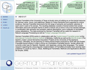
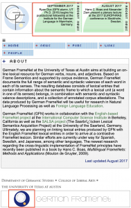
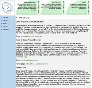
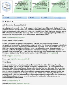
After meeting with Stacy, he suggested a few more improvements to the German FrameNet website. The “recent news” section hides some segments when the page width is reduced, in order to make the remaining segments more readable. Also, I created another version of the logo that has a white background which is used when the page responds. Lastly, I evened out the left-hand margins so that all the content starts at the same place.
German FrameNet finishing touches
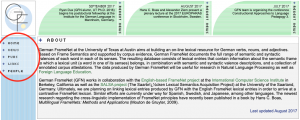
I’ve added the last few touches to the German FrameNet site. The site now has a collapsible menu that displays the list items horizontally. The menu items wrap as the page width shrinks. I’ve also hidden the menu background to allow the body to start from the far left of the page which gives more space for the content to display. I applied these changes to each page within the site. Creating the responsive menu was particularly challenging because the original menu is actually one image. In order to create a horizontal menu, I made the menu items into singular components. Then, I wrapped the items into one div that highlights each link when they’re hovered over. Overall, this site gave me a lot of practice with working my way around problems that arise when faced with older web design practices.
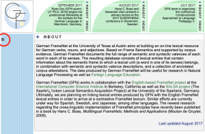
Above 800 pixels vs. Below 800 pixels:
German FrameNet Website
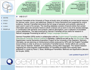
I’m working to make the German FrameNet website responsive. I’ve given a flexible width to all of the body content and made the side menu collapse into a hamburger menu when the screen width is under 800 pixels. The other pages within the site need these changes added to them. The “recent” area also needs to be updated to a newer style.
Static site:
Responsive site:
Collapsible menu:
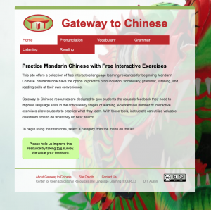
Approved design for Chinese website
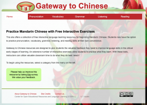
I had the latest design approved by Nathalie so it is the final style of the responsive website. Now, the focus is to maintain functionality across all of the pages within the site because the content varies from the home page to the other pages. Also, to ensure responsiveness on significantly small screens.
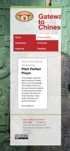
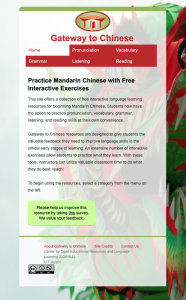
To accommodate screen sizes in the width range of 800 to 400 pixels, I added a second media query that restyles the logo and site title. The additional media query reduces the font size, places the logo above the site title, and centers both of the items. Before adding the second media query, the style wouldn’t fit on screens at 500 pixels but now the content works well at this size.
Photo ID edits
Here are a couple of photo IDs I edited for two Liberal Arts grad students. The first photo needed the yellow tones removed from the skin to have a more natural appearance. Then, I increased the contrast of the photo and deepened the dark colors and shadows to add back some of the depth that was lost from the bright lighting. In the second photo, the graduate student’s head is tilted to the right so the image needed to be realigned to the left. Also, I slightly reduced the shadow that is cast by the hair on the left side of the face.
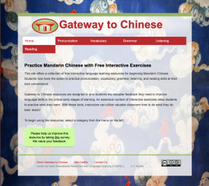
New Designs for the Gateway to Chinese Website
I’ve been in contact with the creator of this website, Nathalie, to get feedback on different designs for the responsive site.
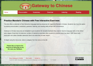 The first design needed transparency in the header to make the background more visible.
The second design follows the style of the original design and has more transparency but the width of the content covers most of the background.
The third, and most recent design, has transparency in the header and I’ve added more padding to the content to make the background visible around the sides.
