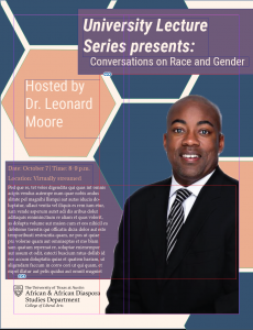
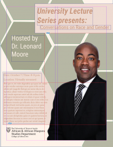
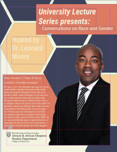
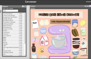
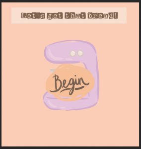
Worked on Studio Course Trainings last week along with putting the final touches on my Canvasser.
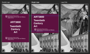
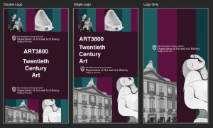
Here are some images of the 2 designs I was thinking of for my Studio Course Training. Overall they both used collage, with the exception being that one has color and one does not. The little color I did have, revolved around jewel tones, which I think will best reflect what’s being talked about in the class which is Twentieth-century art.
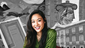
After feedback from Maddy, we decided to go with the black and white design. Before I reached the below image, there were some edits I needed to make, mostly about making the background more cohesive and focusing more on showcasing the professor. I also added a newspaper texture behind the “middle ground” of the image to help push the professor even more forward. I like it!
