Project: UT IN CONTEXT Logo
Stage I: We met with Celeste and gathered these basic parameters for the logo:
- No burnt orange
- No images of the tower or buildings
- No symbolism of UT in general
- The do not want the “UT in Context” to be turned into a logo, they would like an image to be alongside the name of the site.
- Suloni would like to see a logo version using roots, Abriella suggested magnifying glass
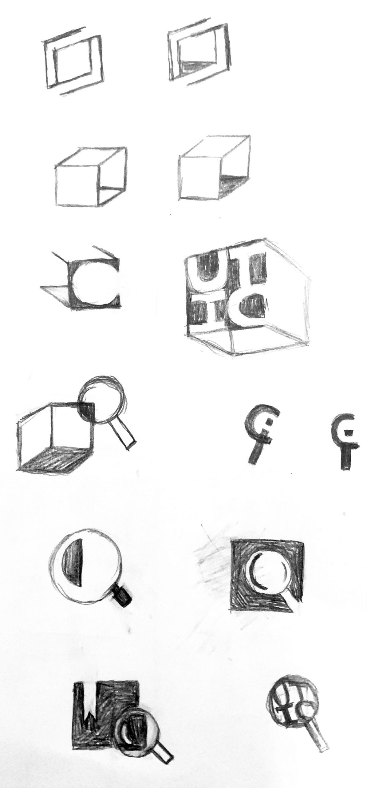
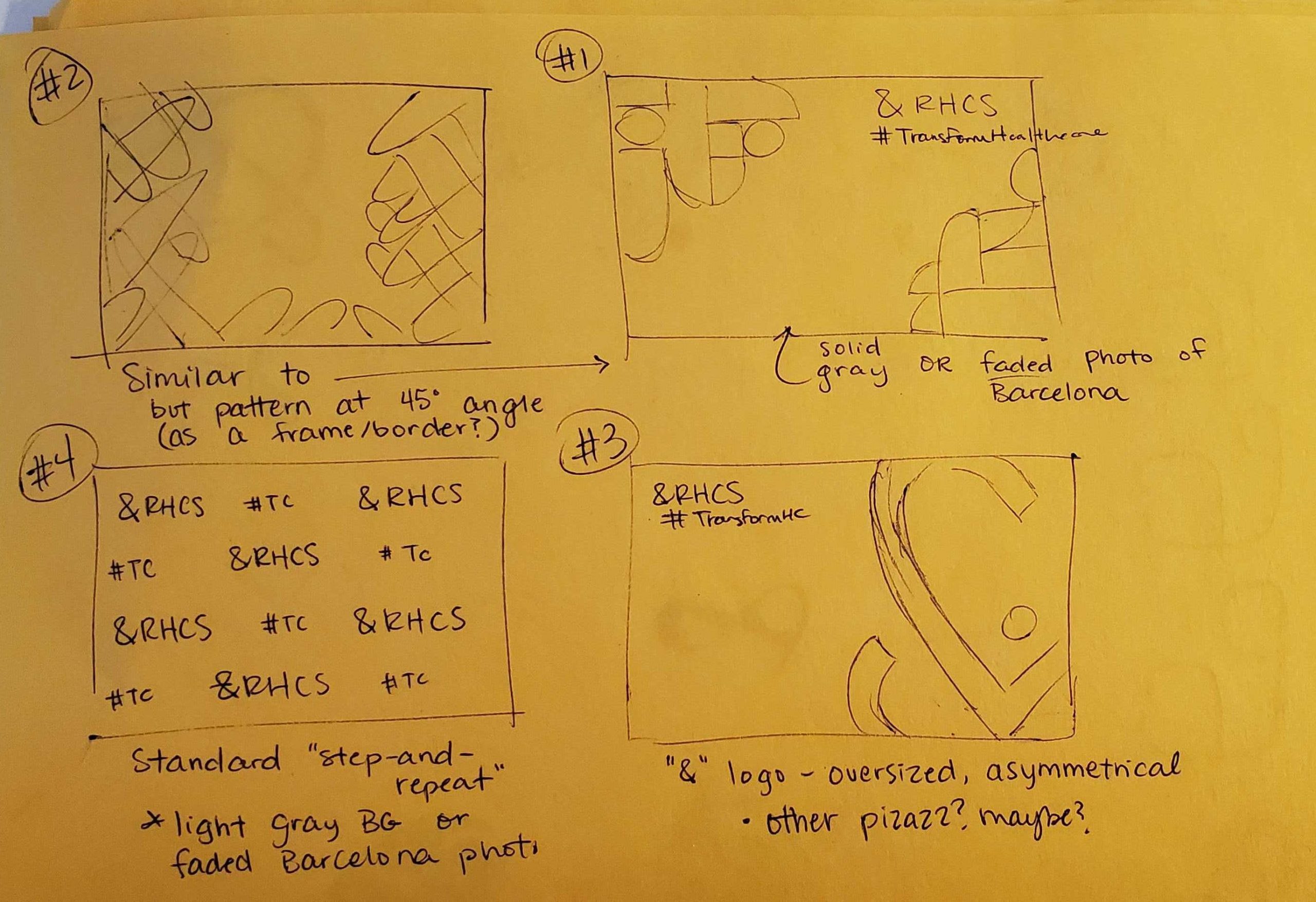
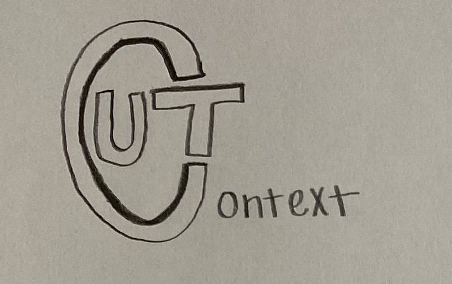
I went for a box design since the client seems to like the “in” aspect of UT in Context, but before we get to develop my first draft, Suloni had another meeting with the client and brought back the news that the client would like to see their original draft refined. So we are moving forward with one of the sketches they provided us:
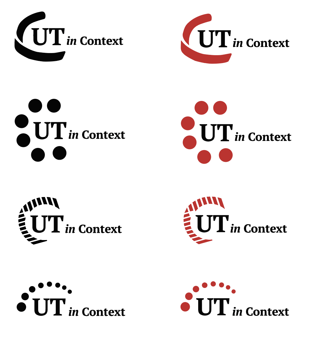
Stage II: New parameters provided by the client:
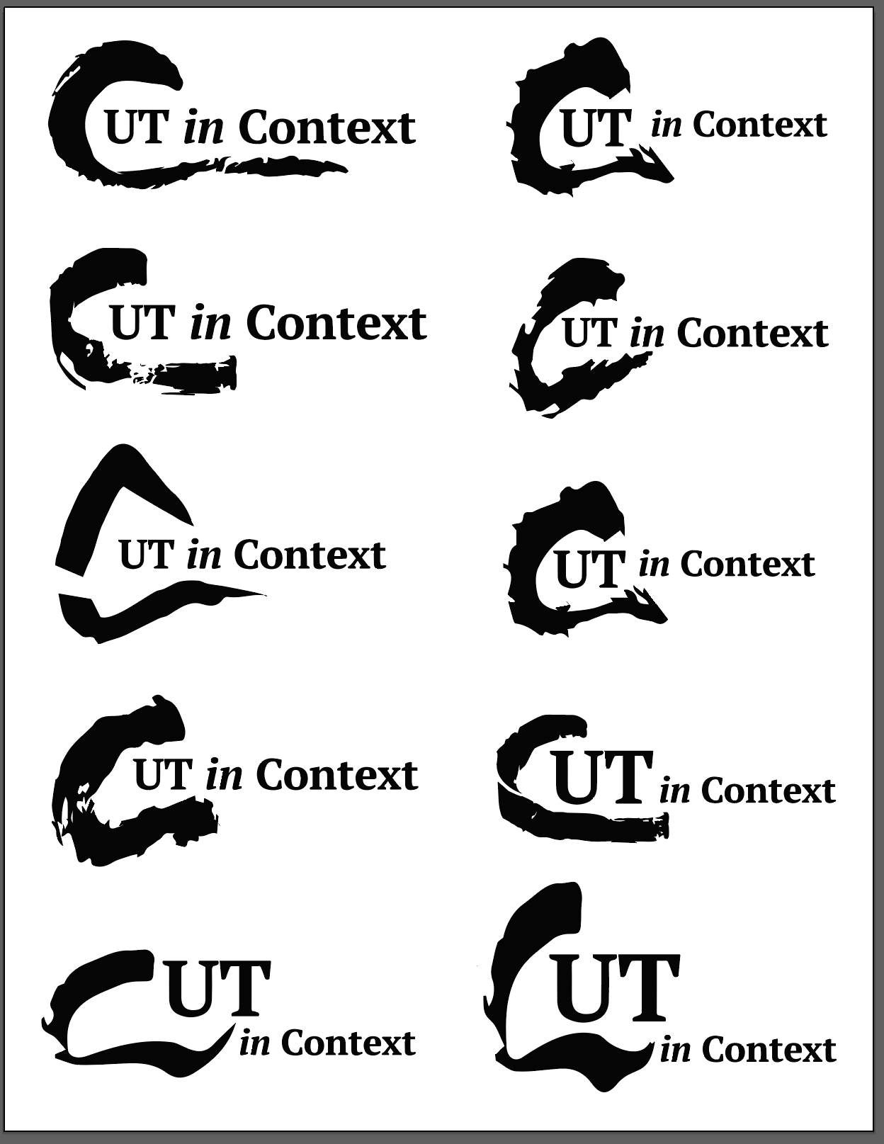
- Does not want it to read “Cut,” make the “C” a design element/art object
- Would like a encapsulating/enclosed shape that is holding “UT”
- “C” will be more like a stroke/shape, “UT” will be a font that goes with the website
- Suloni would like to see a version where the “C” shape is made out of dots
- The “C” shape should be able to stand by itself, iconic, recognizable, distinctive
- Start with monochromatic versions, eventually “C” shape will be read and “UT” will be black
- Test out how the “C” shape looks next to the full title(play with different placements)
- Try a version with drop shadow(like the sketch above)
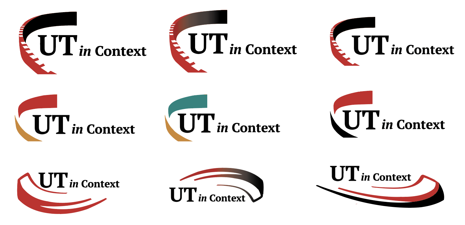
Abriella and Suloni both suggested to try the paint and scan method, so here’s me trying it:
1. Made some “C” with different brushes and paint
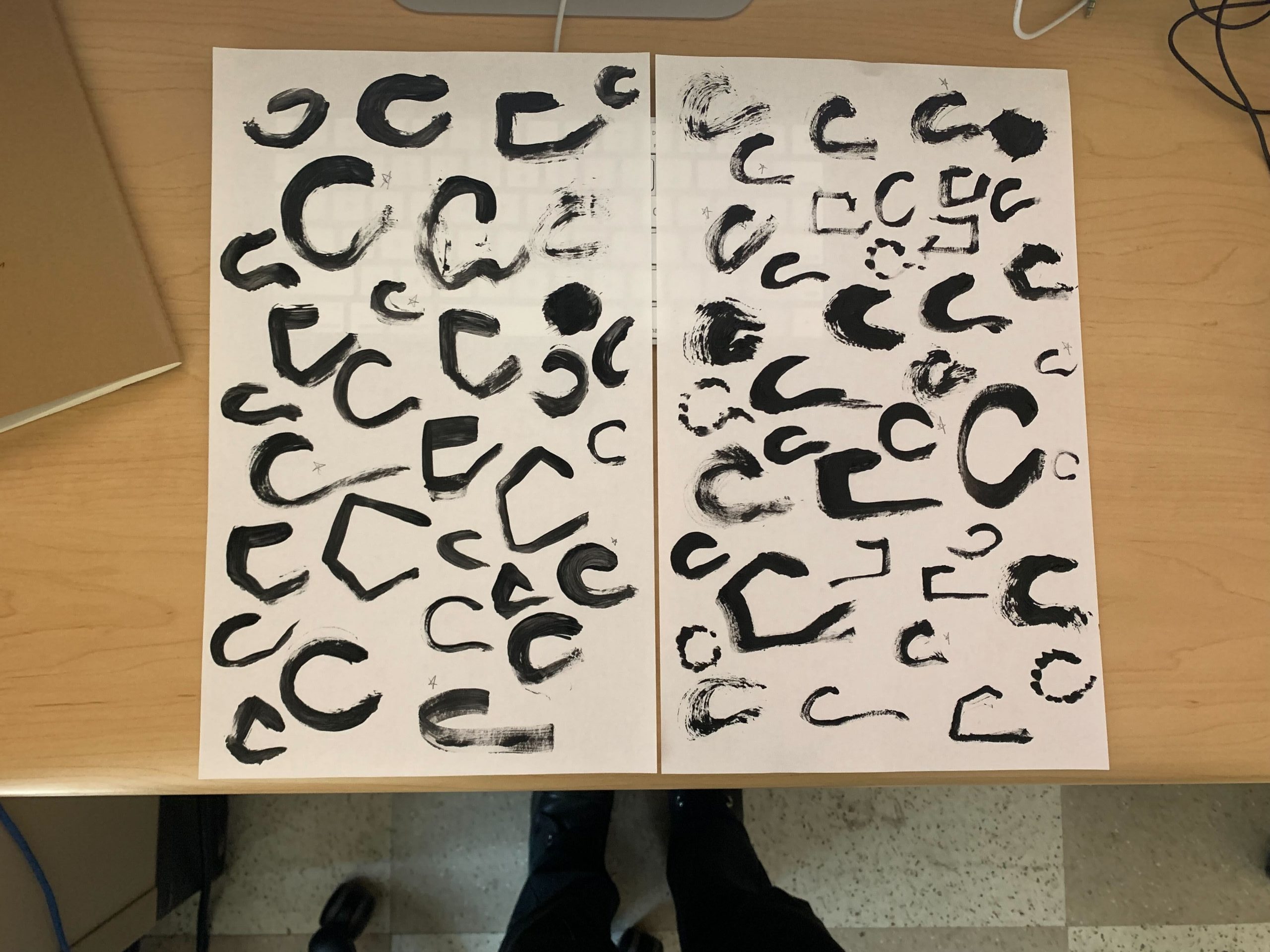
2. Scanned and vectorized
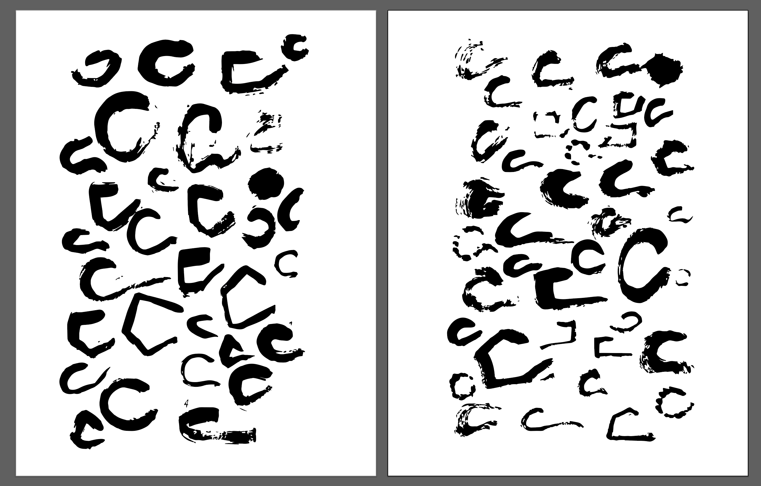
Abriella marked the ones with potential, I will continue developing and refining those.
Suloni suggested less texture and wanted to see versions with dots.
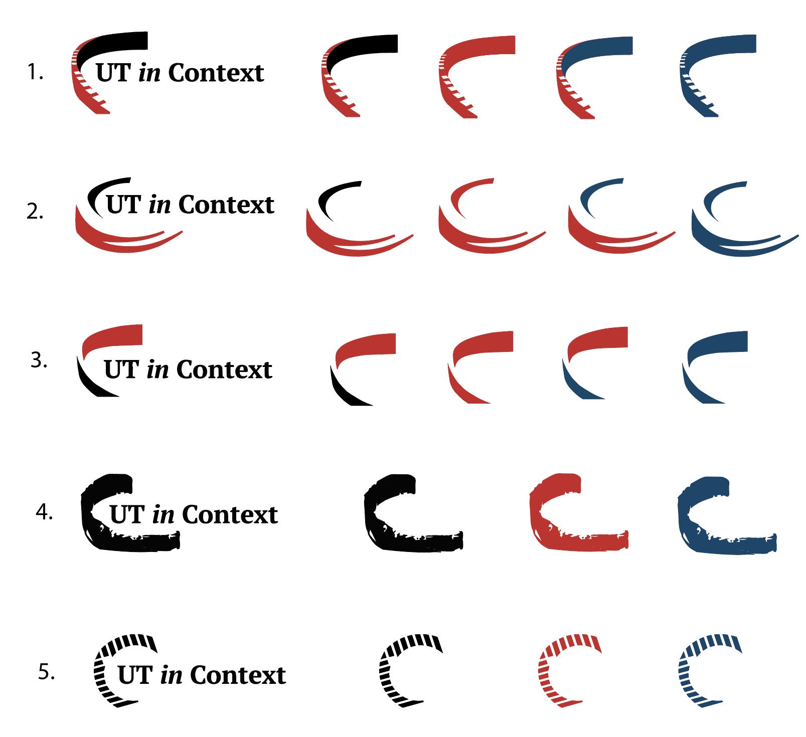
Stage III:
Got rid of texture