Update: Comparative Literature Banner (WIP)
Update: Comparative Literature Banner (WIP)
I’ve been using livetrace a lot lately, so I decided to make a new basecamp avatar. I added a duotone effect in Photoshop using gradient maps before I used the livetrace function in Illustrator. The photo I traced is the one that I took at one of the studios downstairs.
This week has been less busy, as TBH has been put on hold, but I’ve been asked to work with Bethany on a banner for the Comparative Literature Program with Dr. Elizabeth Richmond-Garza. We are both coming up with ideas. The aesthetic we’ve been told to pursue is art nouveau and we’ve additionally been told to focus on jewel tones for the color palette.
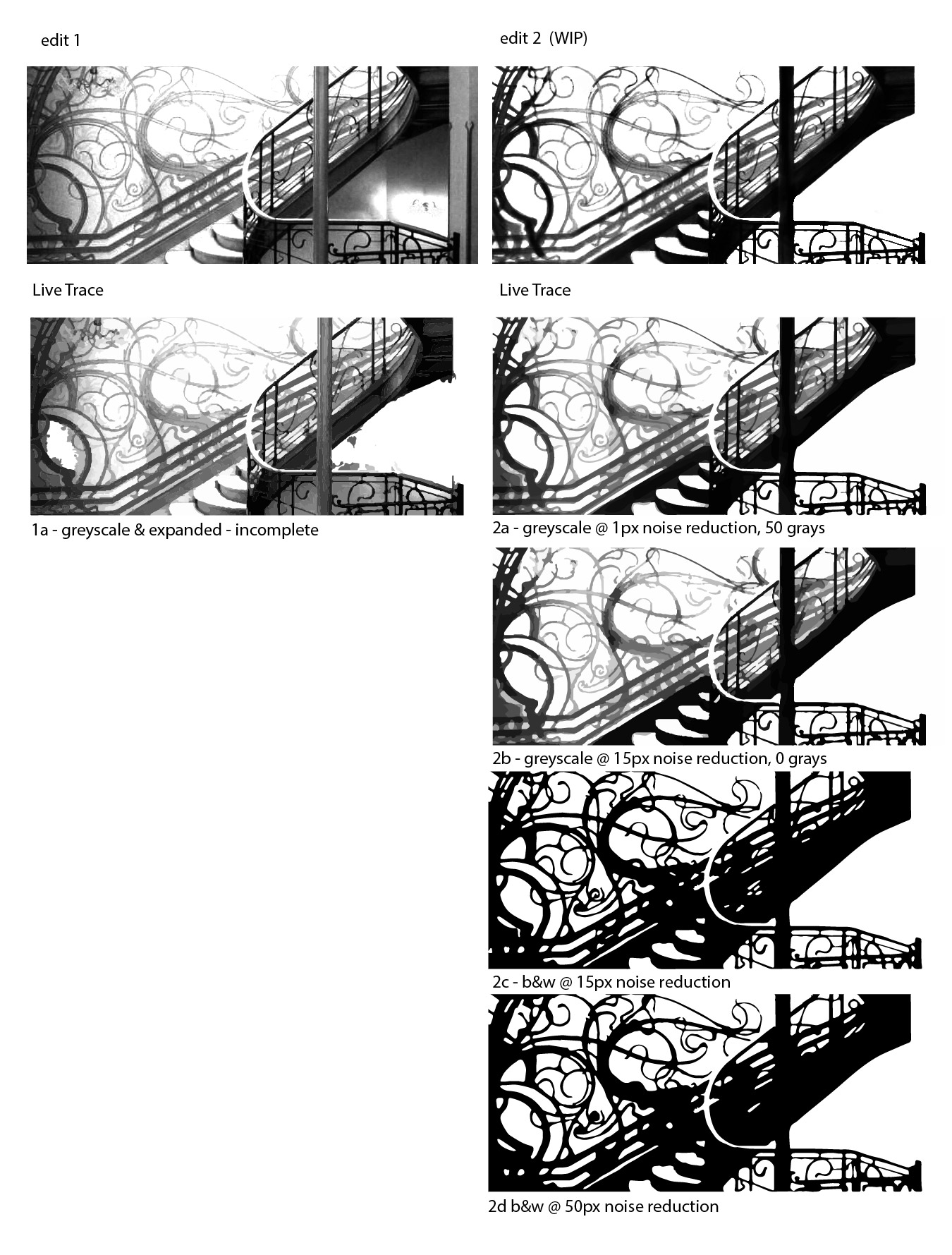
Below is the first Illustrator draft of a banner idea:
I’m still working on modifying the text and line art. I’m not sure how to incorporate the referred characters in the design, but for this design at least, I’m leaning towards doing away with the pages and maybe making a sort of curlicue design with the characters in a darker yellow or the same hue but at 50ish% opacity. Colors are not finalized.

Additional drafts:

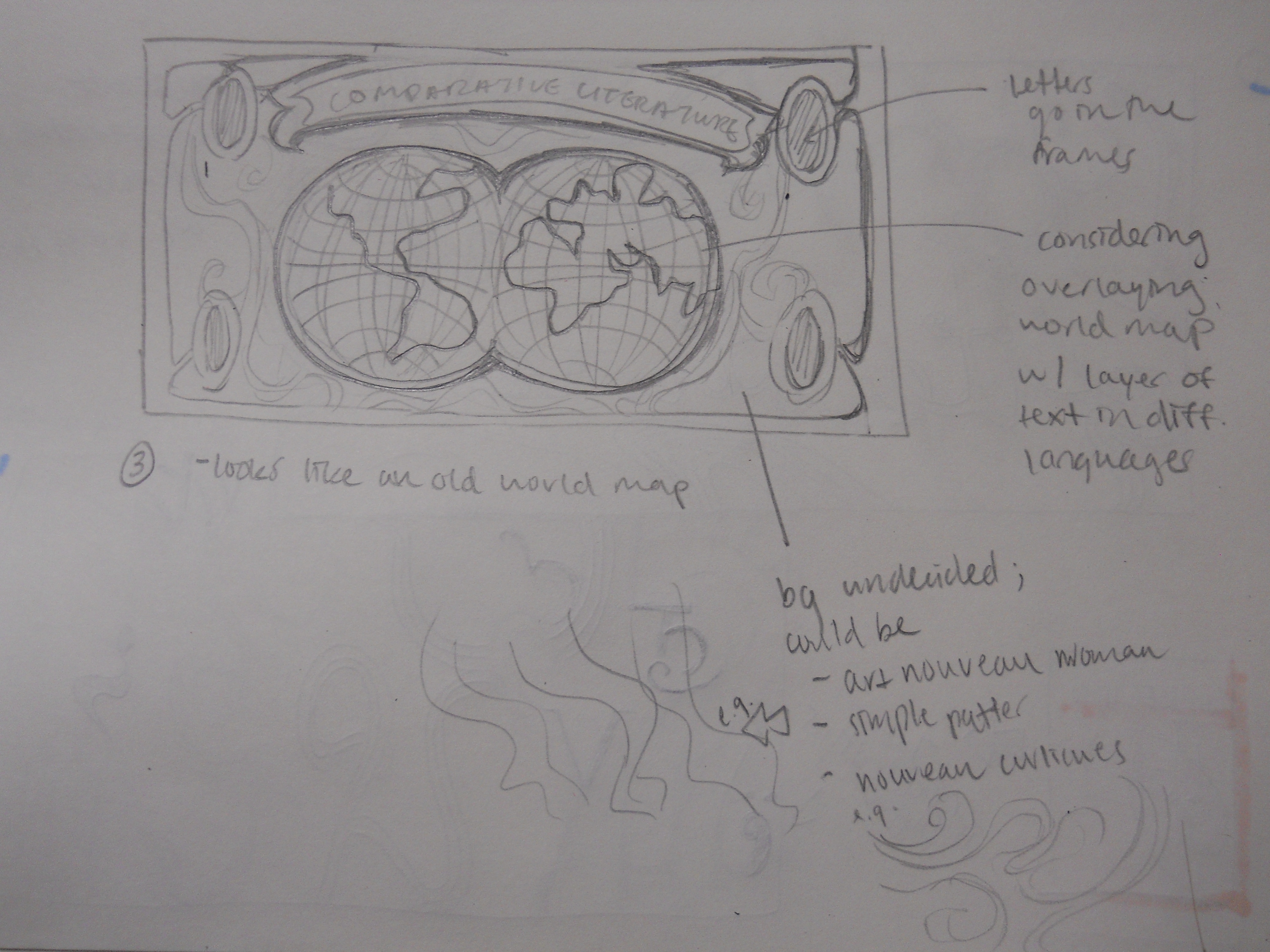
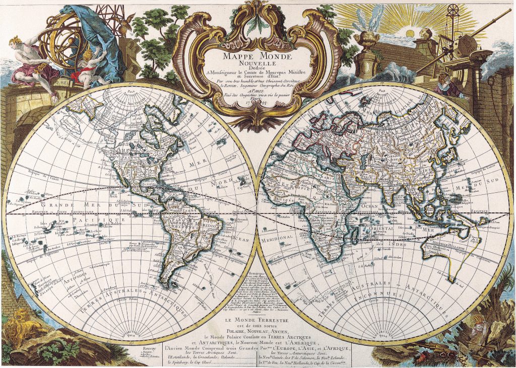
Reference Images for Option 3:


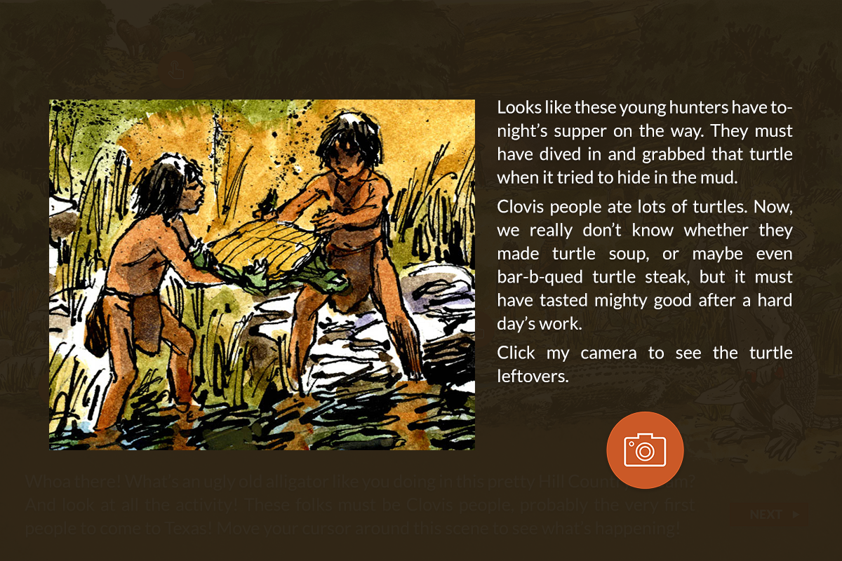


I added a darker shadow to Jun’s “clickable” buttons in Photoshop to distinguish them from the rest of the image. I also decided to stylize the text box: I created a rectangle backdrop (#hex code here), used eraser (in various brushes) to subtract from the box while accomplishing a stippling effect, and then I used a texture at XX% opacity to make a clipping mask over the rectangle.
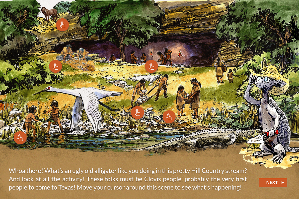
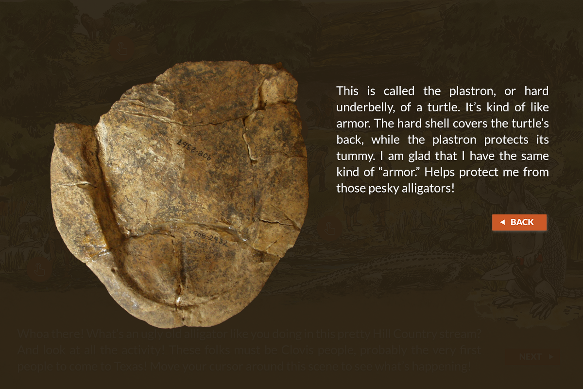
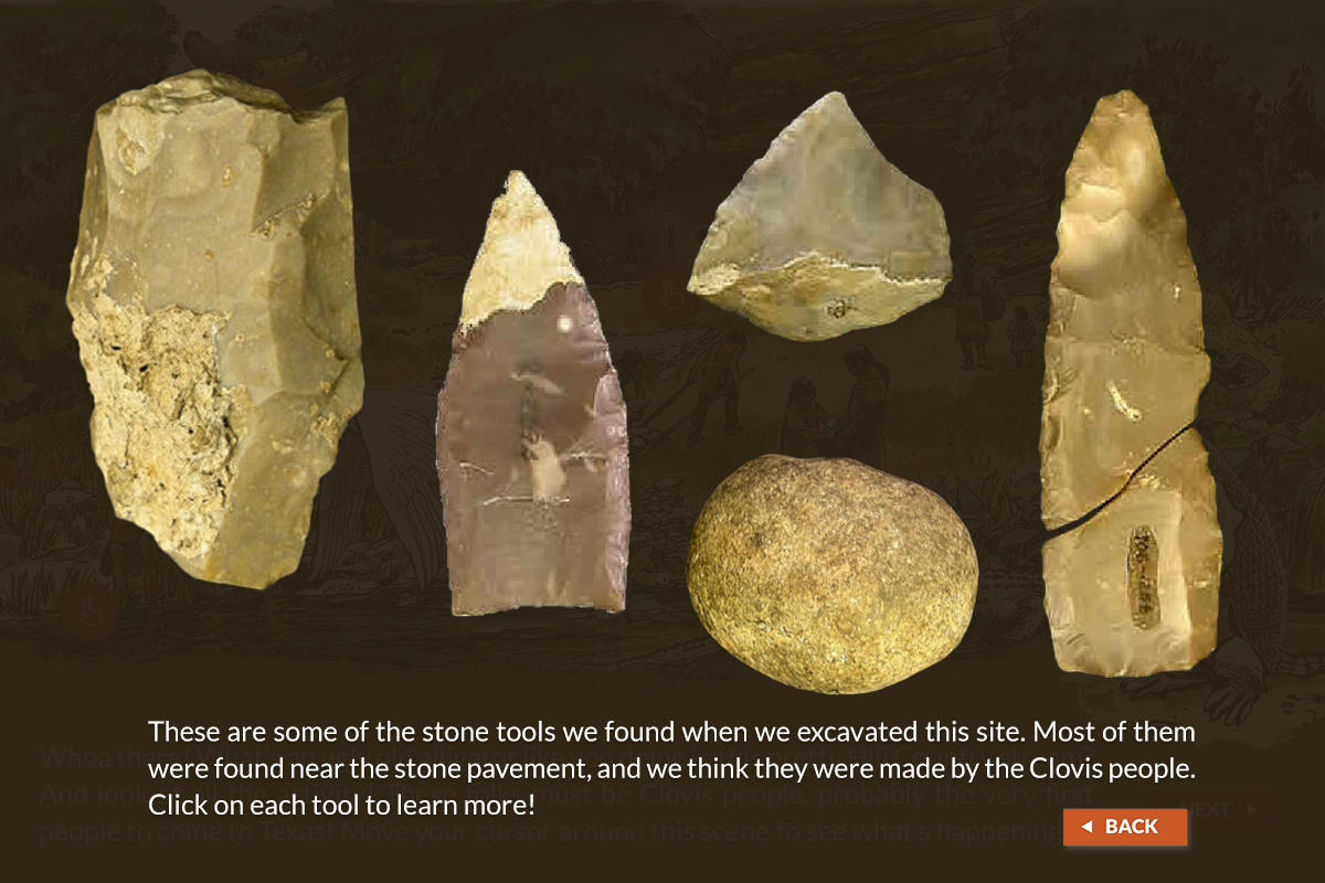
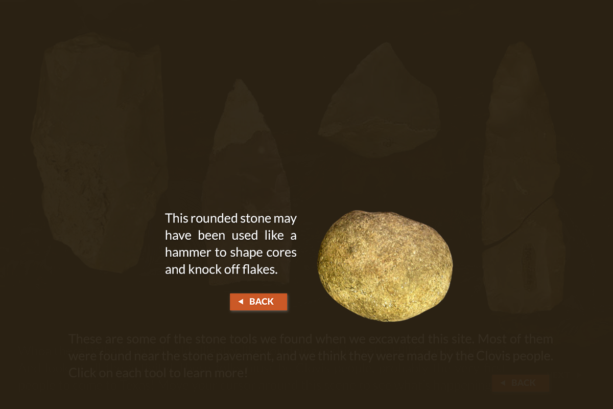
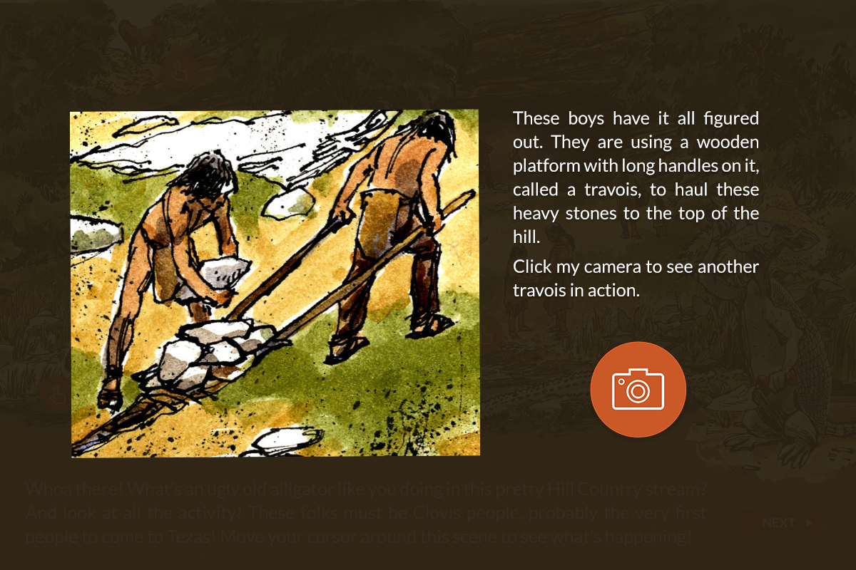
So far, I’ve decided to go and make the old pop-ups into pop-up lightboxes. I also created another camera icon that matched the style of other the buttons. The camera button is necessary because it’s in the provided script/audio. I haven’t really played with layout yet. I’ll do that once I get everything on the mock-up.
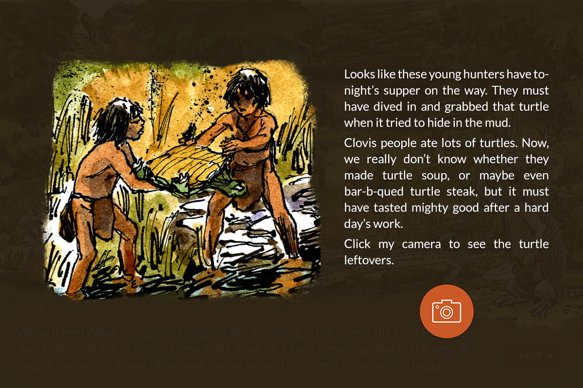
For this alternative, I used eraser again to add texture to the image to match the text-box in the Shaw scene. This was an attempt at thematic consistency.
I just used the Jun’s back button here, but I’m considering making an “X” button for the interactive. It would be better to get rid of the coloration in the drop shadow in the actual draft since the lightbox is dark and not orange.
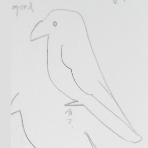
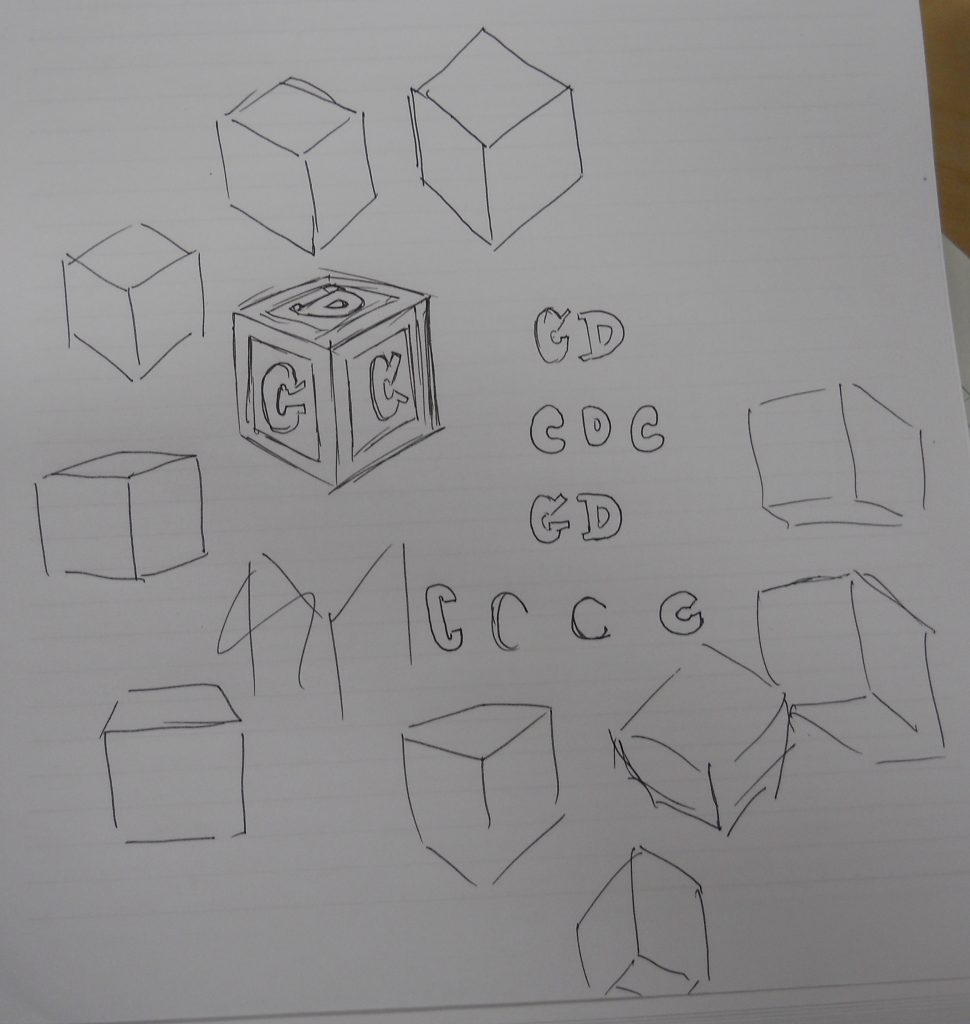
Here are some sketched designs for three icons commissioned for the Children’s Research Labs.
Parrot: Language Development Lab; currently under review.
Elephant: Center for Learning and Memory; currently under review.
ABC Block: Child Development in Context; the design is currently an ABC block, but ideas for the icon have not been finalized.