Week 2 & 3 – 4/8 – 4/18: Time to Start Training!
Intro Training: Style A&B Course Graphics
After completing my STA orientation, it was time to start my basic training. The first training course was a walkthrough on how to customize online course graphics based on two basic styles: A and B. Professors can choose from either of these depending on their preference and they will receive a simple and cohesive asset packet for their course. For the training, I chose to make graphics for my favorite class this semester: Social Psychology in Film.
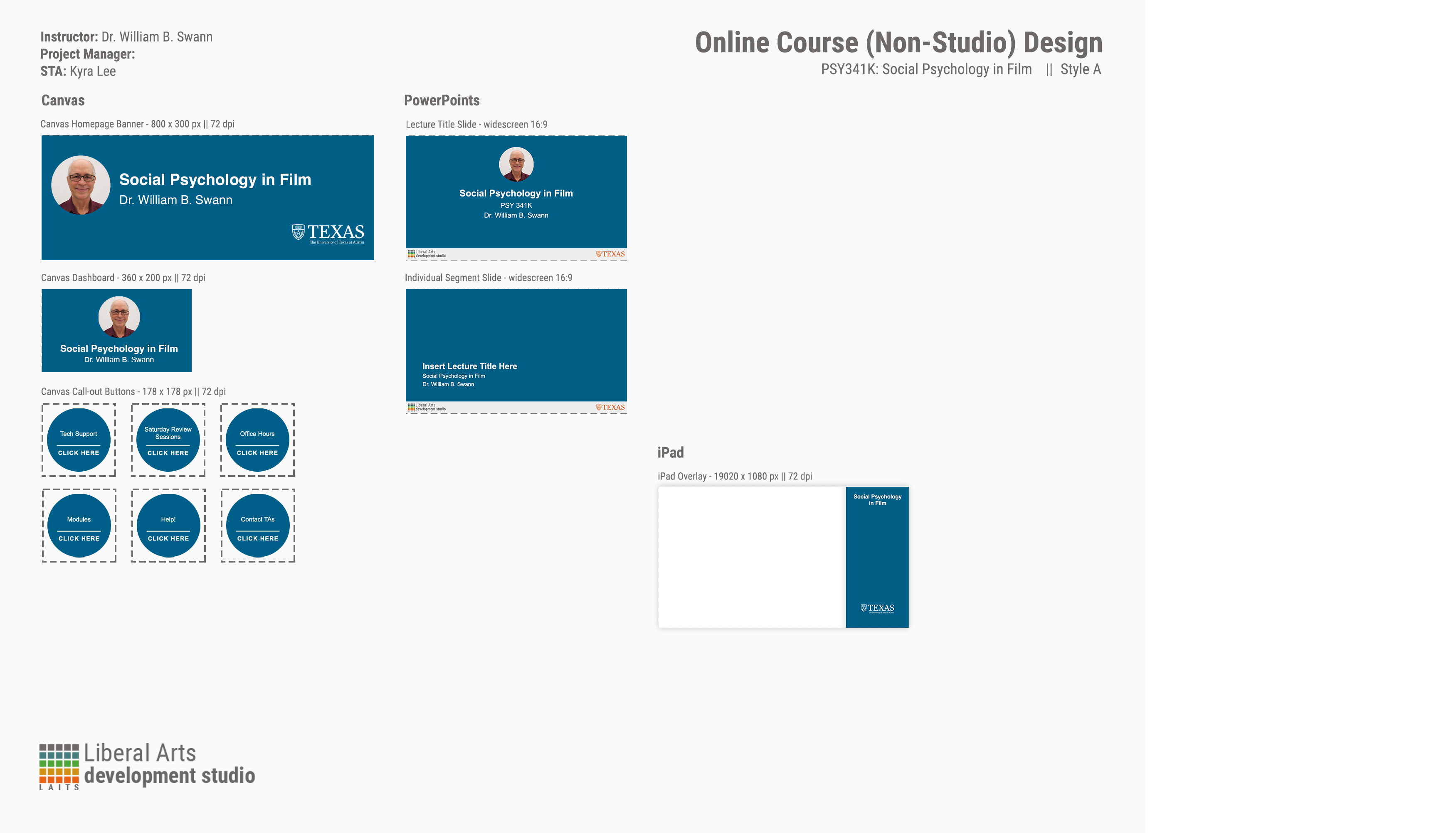
Here is style A:
And style B:
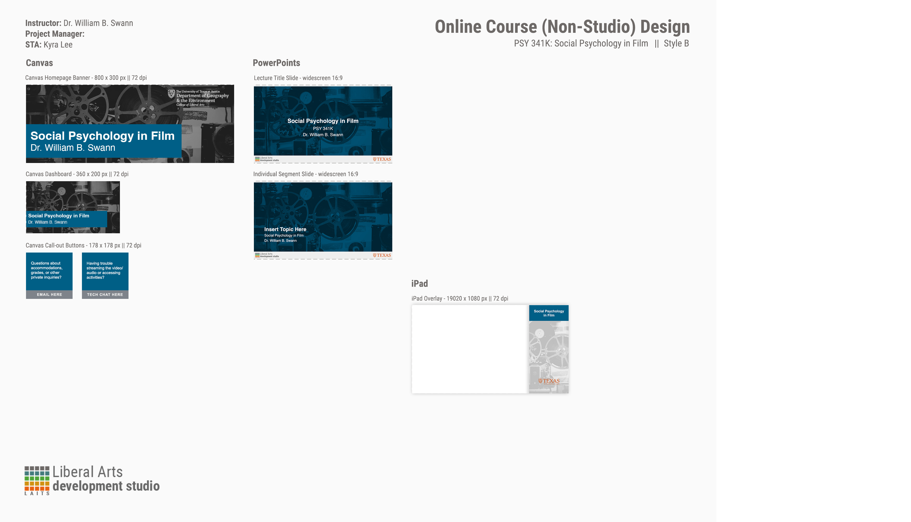
This was pretty simple to complete because there are easy-to-alter templates already in place. It mainly consisted of changing color overlays to make a cohesive design and adjusting opacity to make the photo in style B subtle but still visible. I also learned how to properly organize and name files.
Intro Training: Custom/Studio Course Graphics
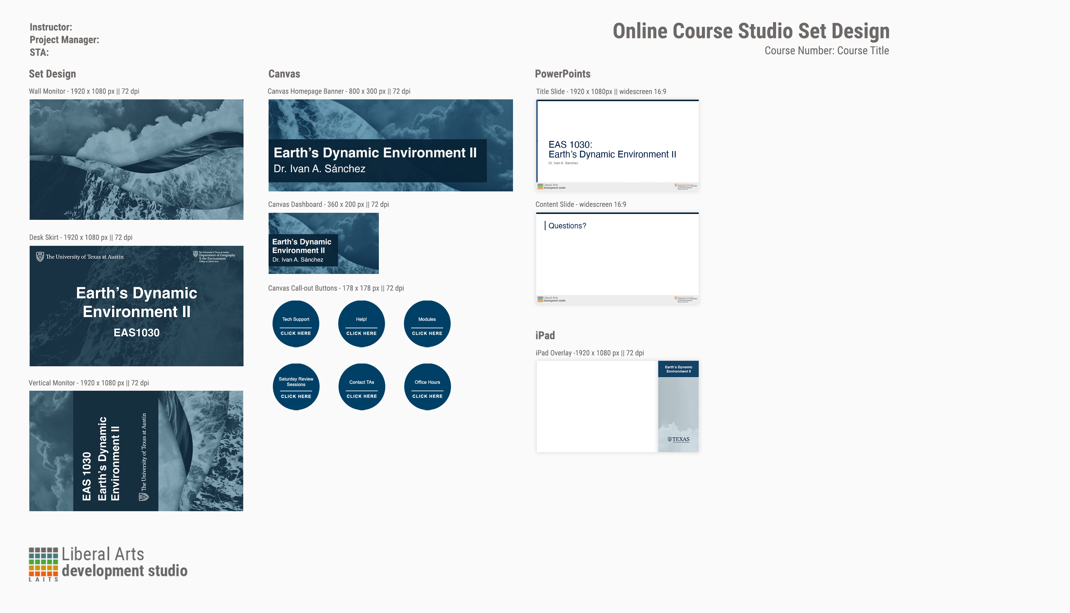
For the next training, I got to choose between two courses to make a custom set of graphics based on the professor’s request. I chose EAS1030: Earth’s Dynamic Environment II. The client notes said he liked orange, but was open to other designs. In my first attempt I tried to incorporate orange by adding a sepia filter over a collage of photos:
Draft 1

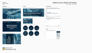
After working on this for a bit, I decided I didn’t really like the color scheme because it didn’t properly represent what the course was about. I thought the sepia color made it hard to see what the course was really about, which is the ocean and atmosphere. That lead me to my second attempt in which I stuck to blues and created movement by cutting and collaging images of the ocean and clouds. Here is a design menu of my second attempt:
Draft 2

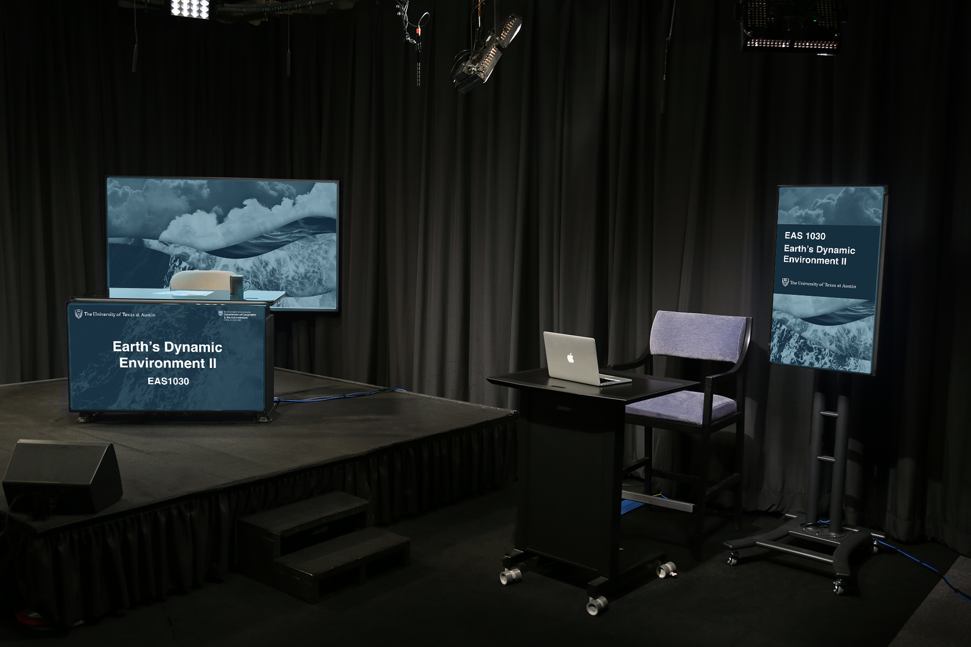
I really like the depth and movement created by the cutout images of water layered on top of each other to look like waves. I also think using blue better represents the course topic. I posted this design to Basecamp and received feedback from the STA trainer. She liked the concept and suggested adjusting the blues for the in-studio assets because they can show up different on camera. I also lightened the blue of the buttons and other Canvas graphics because they were appearing black on screen. Here is close up of one of the studio graphics, a mockup of the designs in-studio, and a design menu with the suggested changes:
Draft 3

At first I was a little overwhelmed by the design freedom of this training, but after a few attempts and valuable feedback, I came up with something that I really like.